
There is a quiet power in empty space. Minimalist wall decor has transformed modern interiors by proving that restraint is one of the most sophisticated design choices a homeowner can make. Unlike maximalist approaches that fill every inch with pattern and color, minimalism invites the eye to rest, breathe, and appreciate what is truly there. This philosophy turns walls into intentional canvases rather than cluttered surfaces.
Thoughtful wall design shapes how a room feels emotionally and functionally. Purposeful simplicity communicates confidence, calm, and refined taste. Whether you live in a compact urban apartment or a sprawling suburban home, minimalist wall styling adapts to any space with remarkable versatility. It balances aesthetics with practicality in a way few other design movements can match.
This article explores what makes minimalist wall decor so enduringly impactful. From the psychology of negative space to the power of a single statement piece, we unpack the principles that make this style resonate so deeply. Each section offers actionable insight to help you transform your walls with intention, clarity, and lasting visual appeal.
1. The Psychology of Negative Space
Negative space — the empty area surrounding an object — is not wasted space. It is active design. In minimalist wall decor, the blank wall surrounding a single piece of art or a lone shelf does as much work as the object itself. The human brain naturally rests when it encounters open space, reducing visual fatigue and creating a sense of calm.
Research in environmental psychology confirms that cluttered environments elevate cortisol levels and increase stress. Minimalist walls do the opposite. They create breathing room that makes a space feel larger, more organized, and more welcoming. This is why so many wellness spaces — spas, yoga studios, meditation rooms — embrace minimalism instinctively.
When you intentionally leave wall space empty, you are making a bold compositional choice. That restraint communicates to visitors that every element present was chosen deliberately. Negative space amplifies the impact of whatever you do place on the wall, giving each piece room to speak clearly and powerfully.
- Leave at least 60% of your wall surface empty to let focal pieces breathe
- Resist the urge to fill gaps — emptiness is part of the design
- Choose one wall per room as your intentional feature wall
- Use negative space to guide the eye toward your most meaningful piece
- Step back and evaluate how much empty space feels visually balanced
2. The Power of a Single Statement Piece
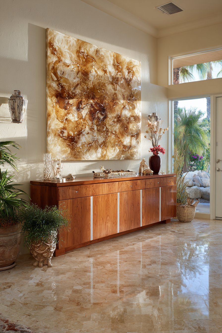
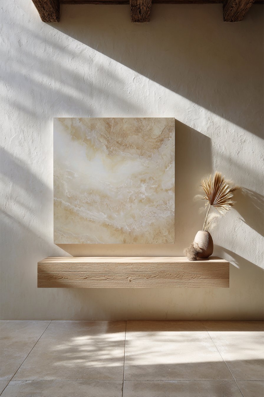
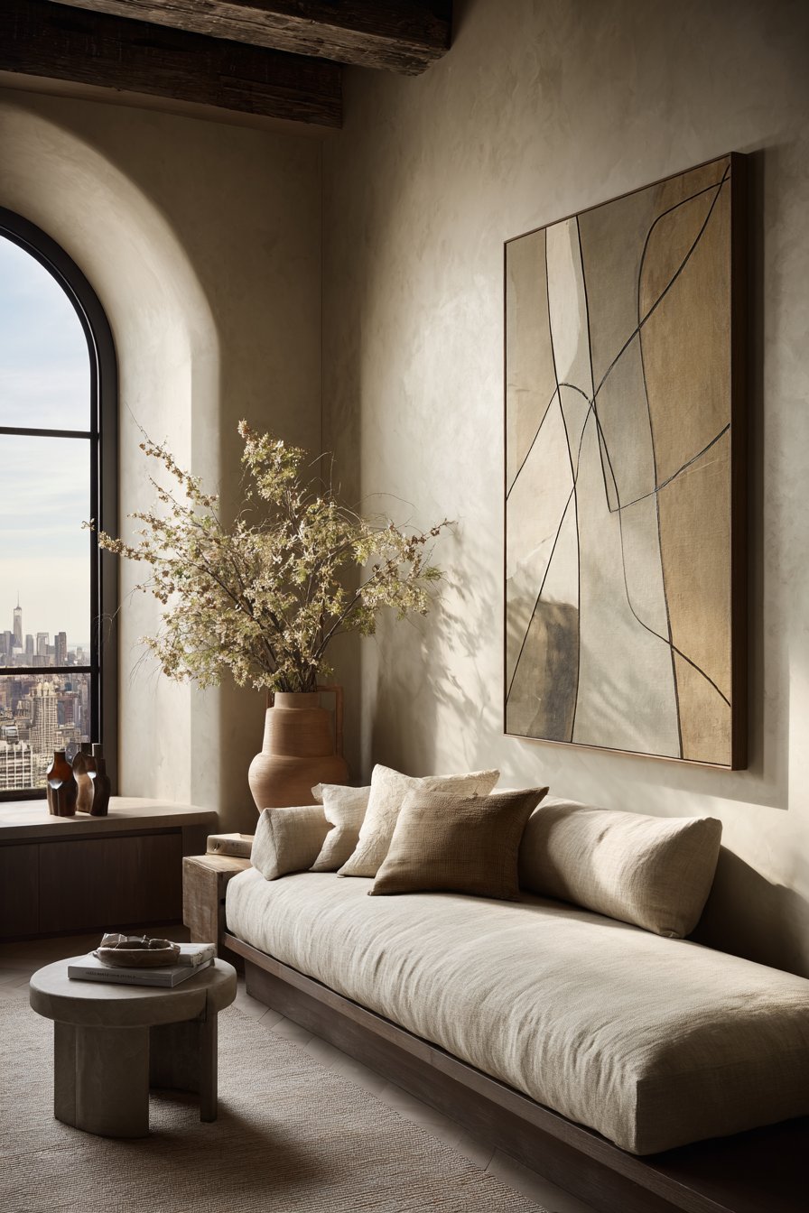
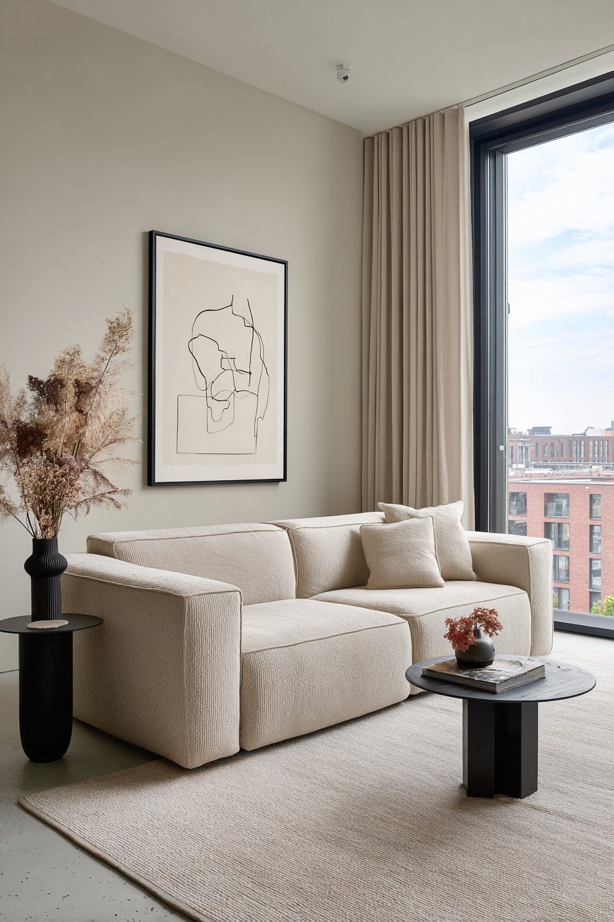
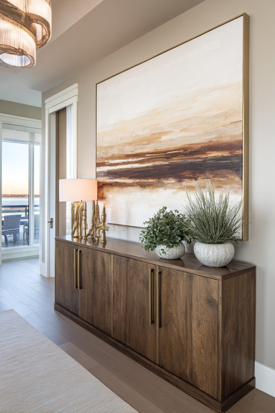
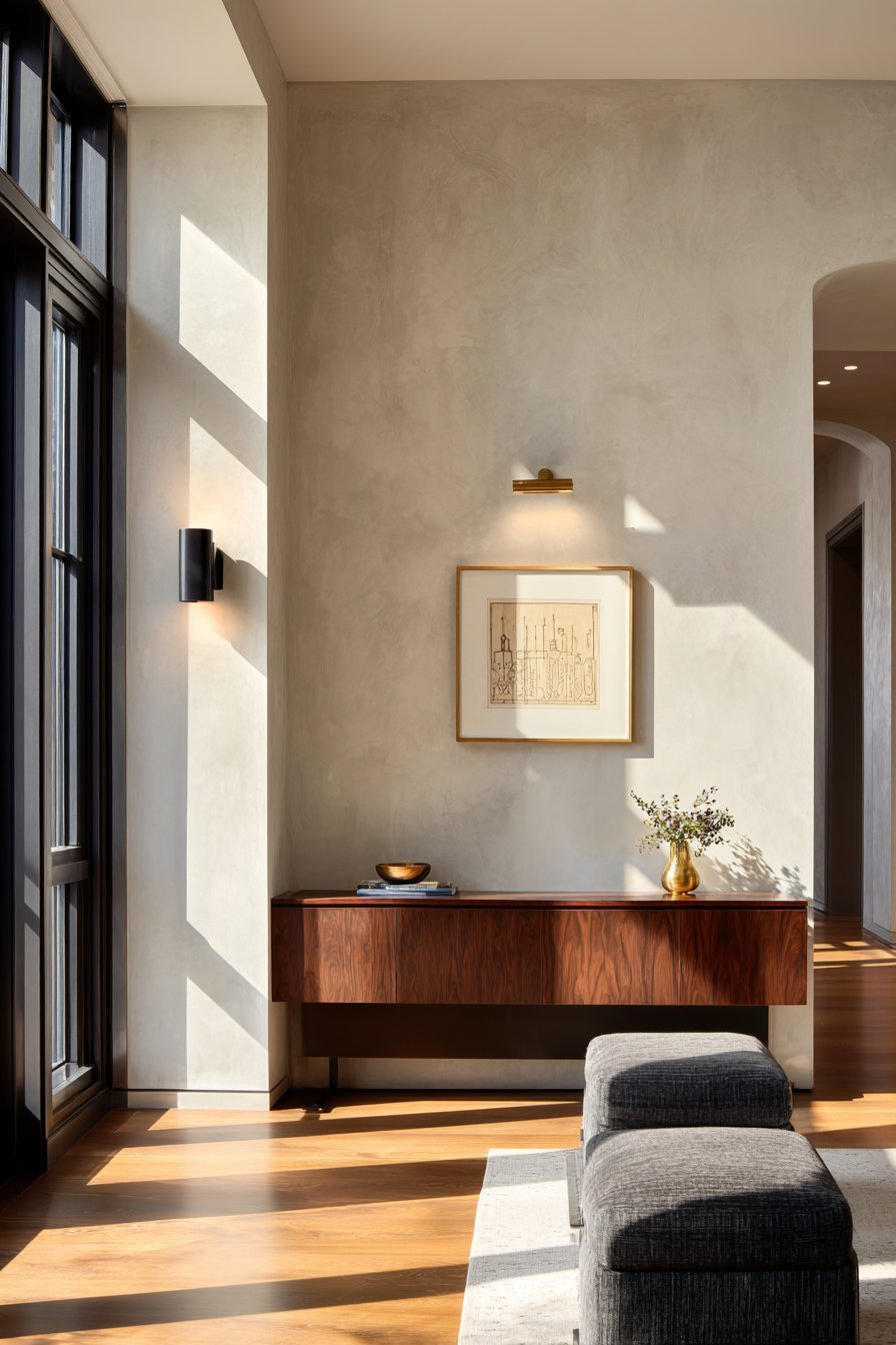
One well-chosen artwork can define an entire room. Statement pieces work in minimalist design because they carry the full visual weight of the wall without competition. A large-format photograph, an abstract canvas, or a sculptural wall installation becomes the anchor of the space when nothing else competes for attention.
Choosing the right statement piece requires understanding scale and proportion. A piece that is too small on a large wall gets lost and feels tentative. Most designers recommend artwork that spans at least two-thirds of the furniture it hangs above. This creates a grounded, cohesive relationship between the wall decor and the room’s furnishings below.
The subject matter and palette of your statement piece set the emotional tone for the entire room. Monochromatic artwork, line drawings, or abstract minimalist prints reinforce the style naturally. That said, a single bold color piece can create stunning contrast against a neutral wall — proving that minimalism does not mean boring.
- Choose artwork sized at two-thirds or more of the wall width for impact
- Hang the piece at eye level, roughly 57–60 inches from floor to center
- Opt for simple, clean frames that complement rather than compete
- Let the artwork’s palette inform your room’s accent color choices
- Avoid grouping multiple pieces — let one piece own the wall completely
3. Neutral Color Palettes That Amplify Impact
The wall color itself is a core element of minimalist decor. Neutral tones — whites, warm creams, soft grays, and muted greiges — act as the ideal backdrop for minimalist wall styling. They reflect light beautifully, make rooms feel more spacious, and never compete with the decor elements placed against them.
Not all neutrals are equal, however. Undertone awareness is critical when selecting your wall color. A warm white with yellow undertones will clash with cool-toned artwork or metallic fixtures. A true white can feel clinical in a cozy bedroom. Testing paint samples in your actual lighting conditions before committing is an essential step that many homeowners skip.
Beyond white, deep neutral tones like charcoal, slate, or even matte black are increasingly popular in minimalist interiors. These dramatic backdrops make a single piece of light-toned or metallic wall art pop with extraordinary force. Dark minimalism is a sophisticated trend that proves the style can be both restrained and bold simultaneously.
- Test at least three paint samples on your actual wall before deciding
- Consider warm whites like Sherwin-Williams Alabaster for welcoming spaces
- Use matte finishes to reduce light reflection and enhance depth
- Try deep charcoal walls for a bold minimalist statement in living or dining rooms
- Ensure wall color coordinates with flooring and furniture undertones
- Revisit color choices seasonally — natural light changes dramatically
4. The Role of Line and Form in Wall Art
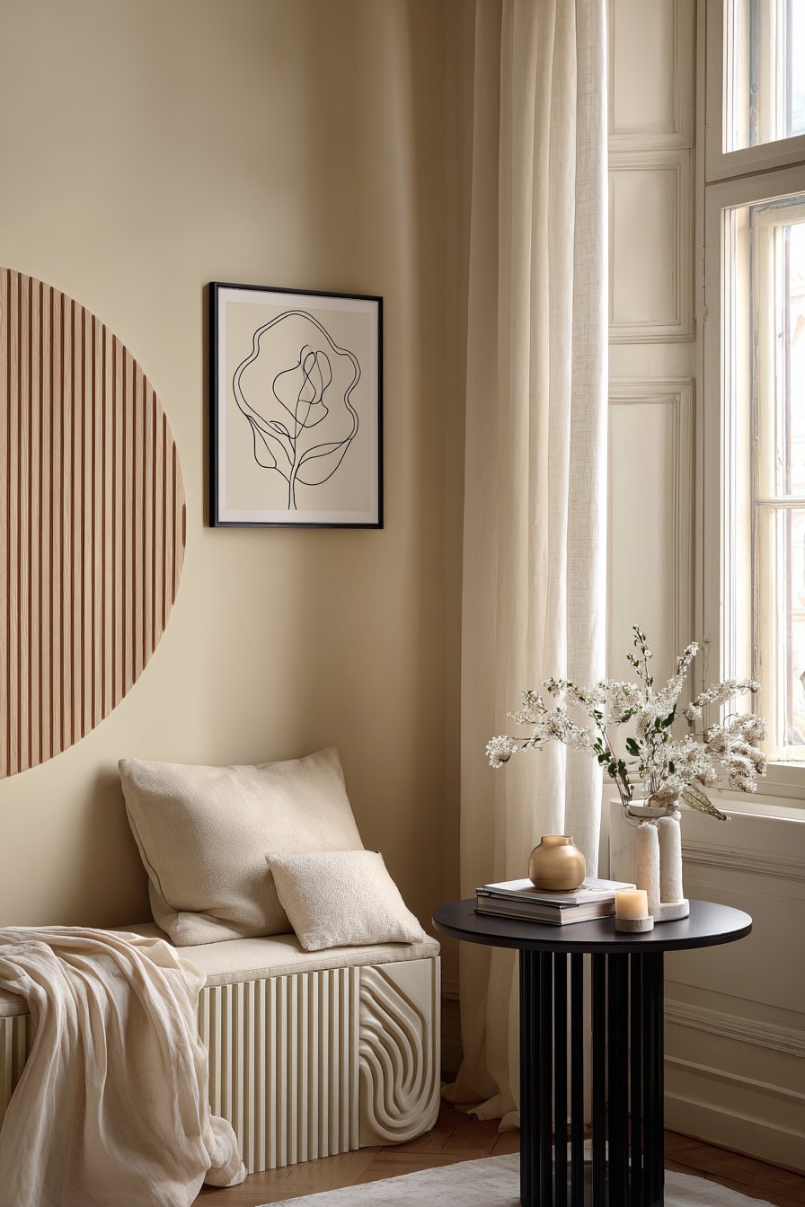
Minimalist wall art frequently features clean lines and geometric forms. These elements work so well in minimalist interiors because they echo the architectural lines of the room itself — door frames, window edges, and furniture silhouettes. This visual harmony creates a sense of order and cohesion throughout the space.
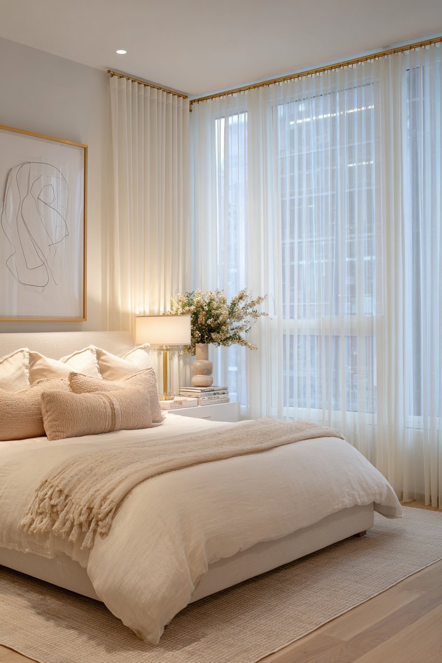
Line art, in particular, has become one of the defining aesthetics of contemporary minimalist decor. Single-line drawings of figures, botanicals, or abstract shapes communicate elegance with remarkable economy of means. They demonstrate that maximum expression does not require maximum detail — a philosophy that mirrors minimalism itself.
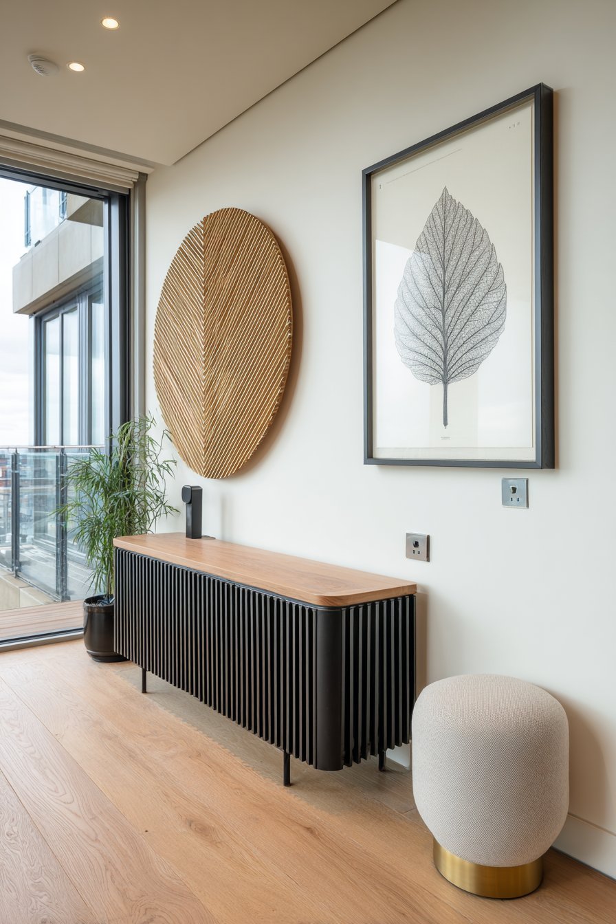
Sculptural wall elements — such as wooden geometric panels, ceramic wall discs, or woven fiber art — add dimension without visual noise. These three-dimensional pieces introduce texture and shadow that flat prints cannot achieve. They catch light throughout the day, subtly shifting the wall’s appearance from morning to evening and keeping the space feeling dynamic.
- Seek out single-line or contour drawings for effortless minimalist art
- Mix flat art with one subtle 3D element for tactile interest
- Echo your room’s architectural lines through your chosen art forms
- Avoid overly complex or busy patterns that contradict minimalist principles
- Choose natural materials like wood, ceramic, or linen for wall sculptures
- Consider custom line art commissions for truly personalized minimalist walls
5. Strategic Use of Typography and Text Art
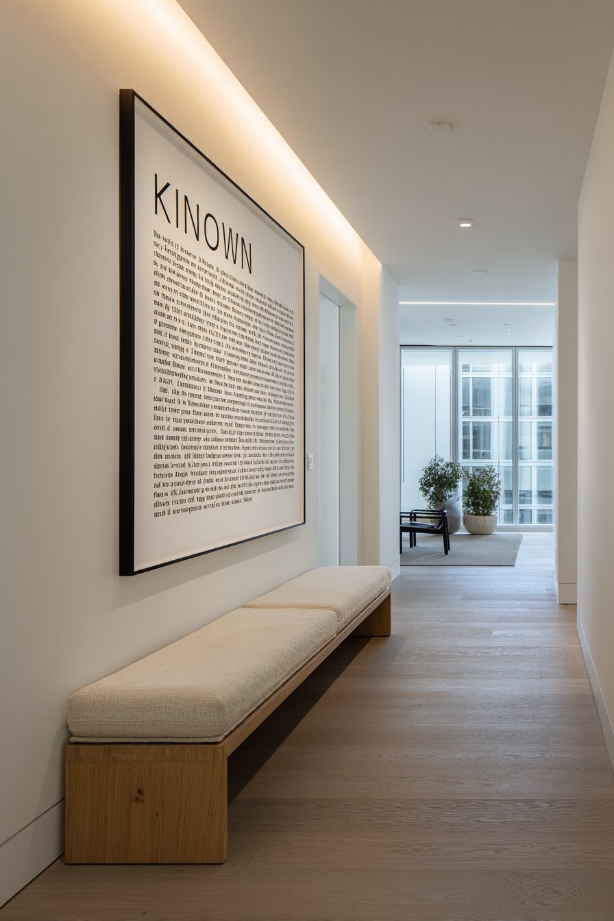
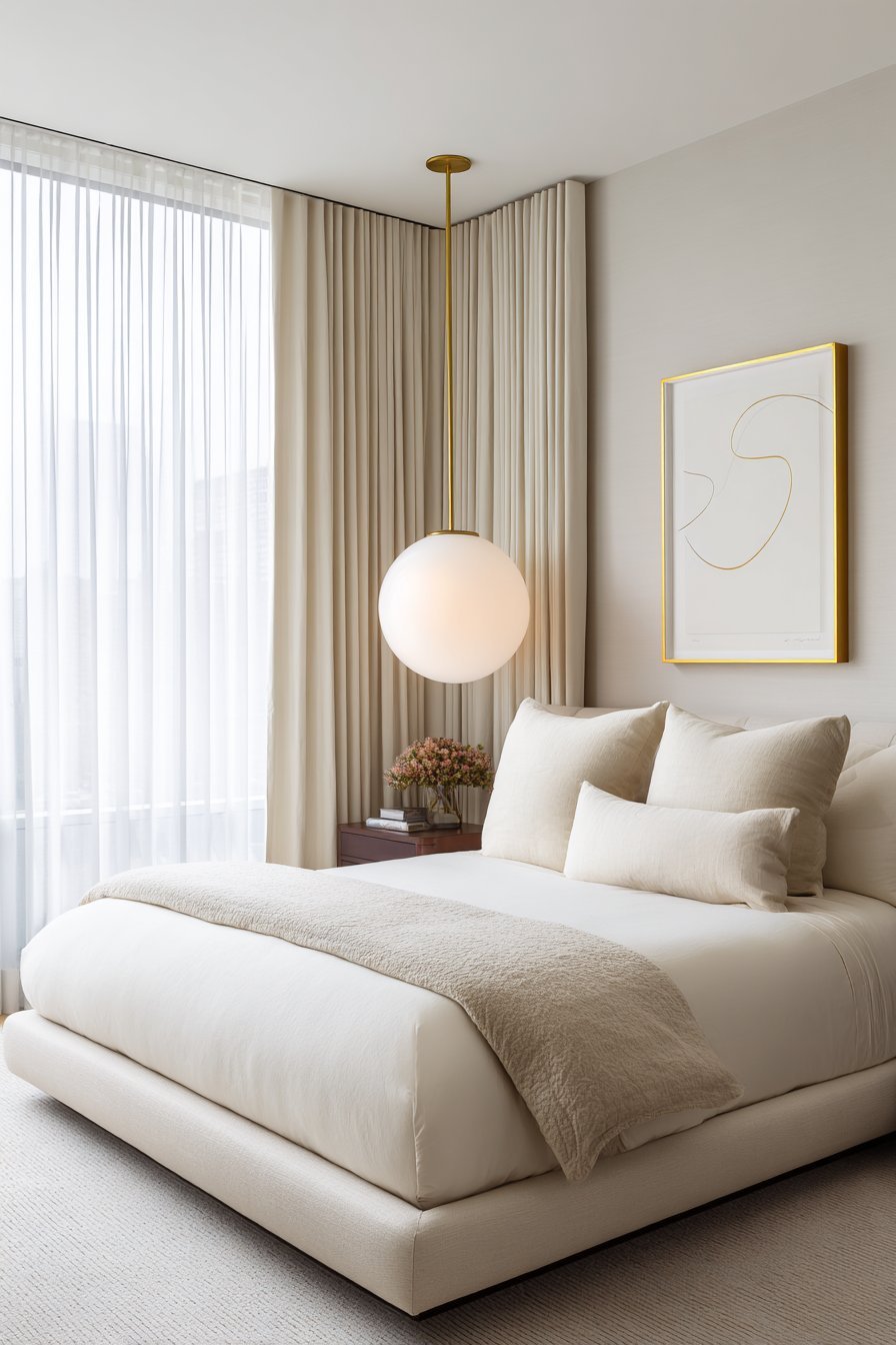
Words on walls can be powerful when handled with restraint. Minimalist typography art uses clean fonts, meaningful words, and generous white space to create pieces that are both decorative and emotionally resonant. A single word, a short phrase, or a meaningful date rendered in an elegant typeface can anchor a wall beautifully.
The key is typographic hierarchy and simplicity. One word in a bold serif font against a white wall is impactful. Ten motivational phrases crowded together is noise. Minimalist text art succeeds by saying less and meaning more — a single chosen word like “breathe,” “create,” or “home” can carry enormous emotional weight when given room to exist.
Font selection matters enormously in minimalist text art. Serif and sans-serif fonts each carry distinct personalities. Serifs feel warm, literary, and classic. Sans-serifs feel modern, clean, and architectural. Match your font choice to your overall interior aesthetic to ensure the text art feels native to the space rather than added as an afterthought.
- Use one or two words maximum for high-impact minimalist text art
- Choose font styles that align with your overall interior aesthetic
- Print or frame text art in monochrome to maintain visual consistency
- Scale text art generously — small text on a large wall feels timid
- Avoid inspirational quotes that feel generic — choose personally meaningful words
- Consider custom typography prints for a truly unique and personal touch
6. Curated Gallery Walls Done the Minimalist Way
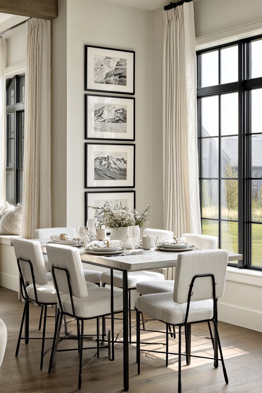
Gallery walls and minimalism can coexist when approached with discipline. A minimalist gallery wall differs from a traditional one in every key way: fewer pieces, consistent framing, generous spacing, and a cohesive color palette. The result feels curated and intentional rather than collected and crowded.
The most effective minimalist gallery walls follow a strict visual grammar. This means matching all frames in the same finish — all black, all natural wood, or all white — and maintaining consistent mat widths. This uniformity creates the visual quiet that minimalism demands, even when multiple pieces are present on the same wall.
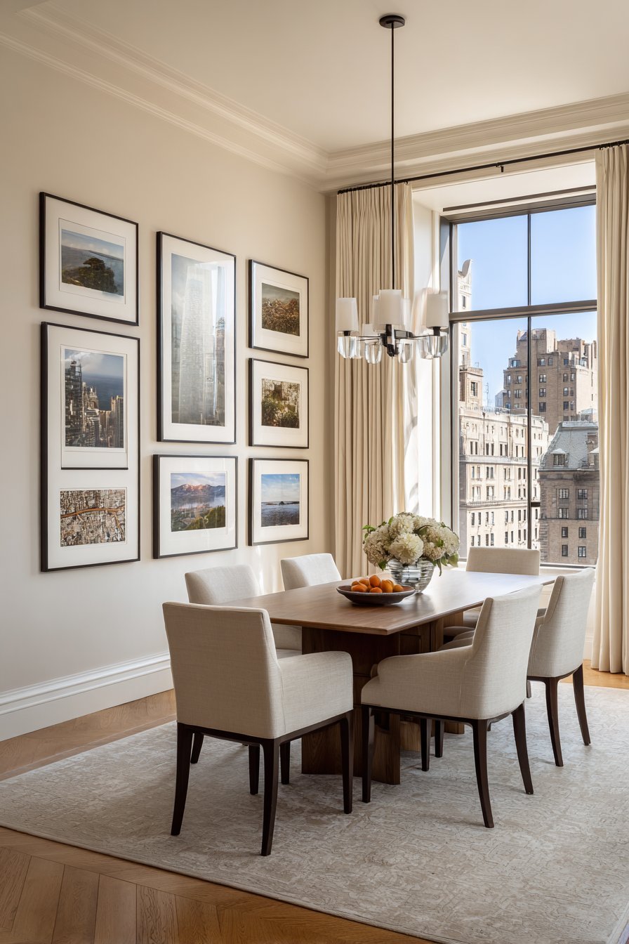
Spacing between frames is as important as the frames themselves. Where traditional gallery walls pack pieces tightly, minimalist arrangements breathe. Aim for at least 3–4 inches between frames. This spacing prevents the grouping from reading as clutter and ensures each individual piece retains its own identity within the arrangement.
- Limit minimalist gallery walls to five pieces or fewer for best results
- Use identical frames in a single consistent finish throughout
- Maintain uniform mat widths for a polished, cohesive appearance
- Space frames a minimum of 3–4 inches apart for breathing room
- Stick to a two-color palette across all artwork in the grouping
- Plan the arrangement on the floor before committing to wall placement
7. Texture as a Subtle Design Tool
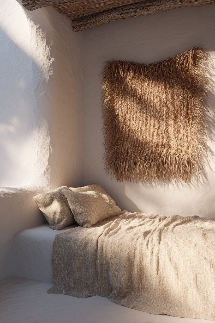
Minimalist wall decor does not have to mean flat and featureless. Textural elements introduce visual interest without color or pattern complexity. Woven wall hangings, plaster relief panels, stone-effect wall tiles, and raw linen art pieces all add depth through surface variation rather than decorative busyness.
The beauty of texture-forward minimalism is its subtlety. A natural jute wall hanging against a white wall creates shadow and warmth without introducing competing colors or patterns. A raw concrete panel adds industrial sophistication. These elements reward close inspection while remaining visually quiet from across the room — a hallmark of genuinely sophisticated design.
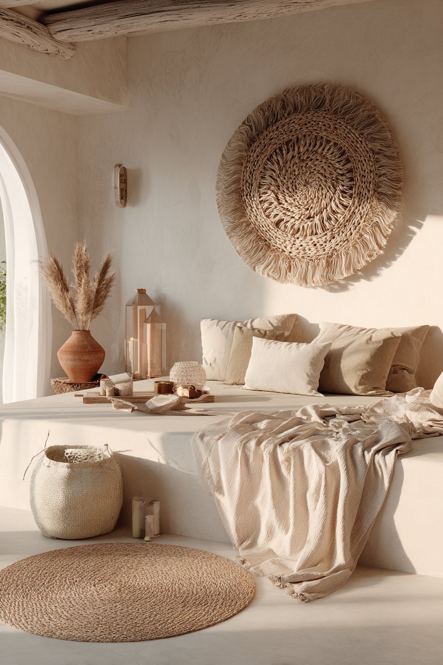
Layering textures thoughtfully creates a sensory richness that purely flat minimalist walls can sometimes lack. Combining a smooth painted wall with a single textured fiber art piece, for example, creates contrast that feels luxurious and considered. The key is using texture as an accent, not a pattern — one textural element per wall is typically the most elegant approach.
- Introduce natural fiber wall hangings for warmth and organic texture
- Try plaster wall panels or bas-relief art for architectural dimension
- Contrast smooth painted walls with one rough or woven element
- Choose textures that complement your flooring and furniture materials
- Keep color consistent even when varying texture — tone-on-tone is elegant
- Consider DIY plaster or clay wall art for an affordable textural statement
8. Lighting That Elevates Minimalist Walls
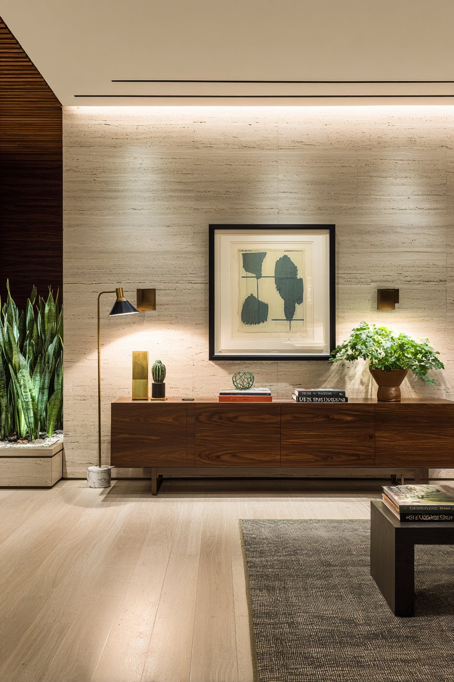
Lighting is the invisible layer of wall decor that most homeowners overlook. Strategic wall lighting transforms the way minimalist art and decor is perceived. A single picture light above a statement artwork, a pair of sconces flanking a minimal shelf, or a floor lamp casting upward light onto a textured wall can dramatically enhance the mood and impact of your design.
Directional lighting creates shadows and highlights that add depth and drama to even the simplest wall arrangement. A recessed spotlight aimed at a white relief panel turns a subtle textural piece into a theatrical focal point. This technique, borrowed from museum and gallery design, is one of the most effective ways to elevate residential wall decor.
Natural light should also be considered in your wall decor placement strategy. South-facing walls receive abundant natural light that shifts throughout the day, making them ideal for displaying pieces that benefit from variable illumination. North-facing walls receive cooler, more consistent light — better for photography or pieces with fine detail that might be washed out by strong direct sun.
- Install picture lights or track lighting to spotlight statement wall art
- Use warm-toned bulbs (2700–3000K) to complement neutral wall palettes
- Consider plug-in wall sconces as both lighting and decorative elements
- Test how art looks under both natural and artificial light before hanging
- Use uplighting from floor lamps to add drama to textured wall surfaces
- Avoid fluorescent or harsh cool lighting near minimalist art displays
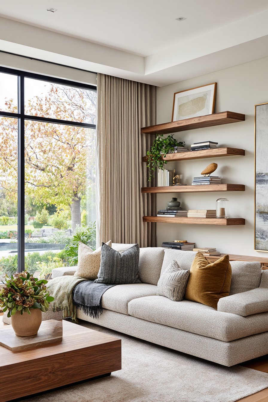
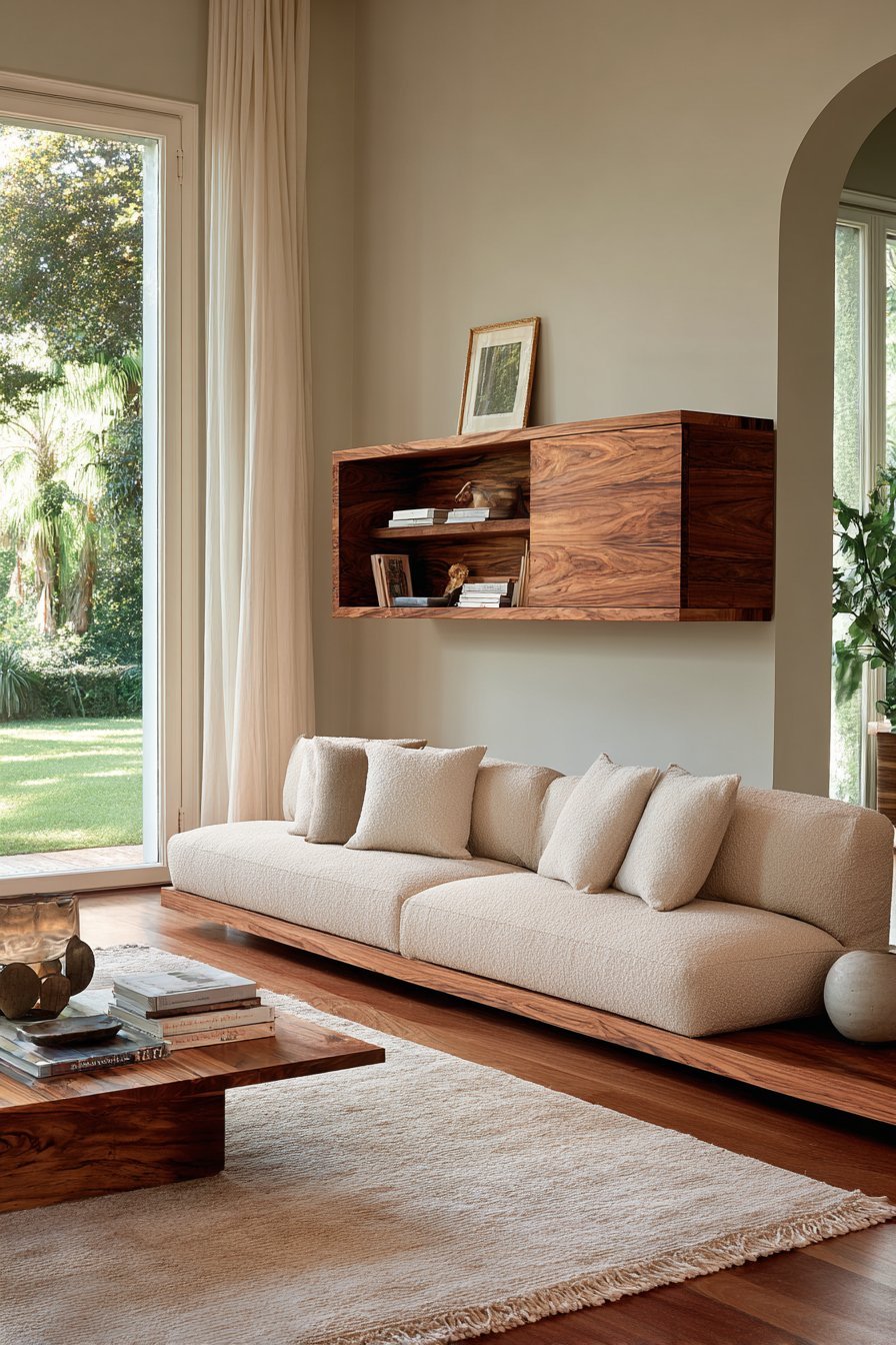
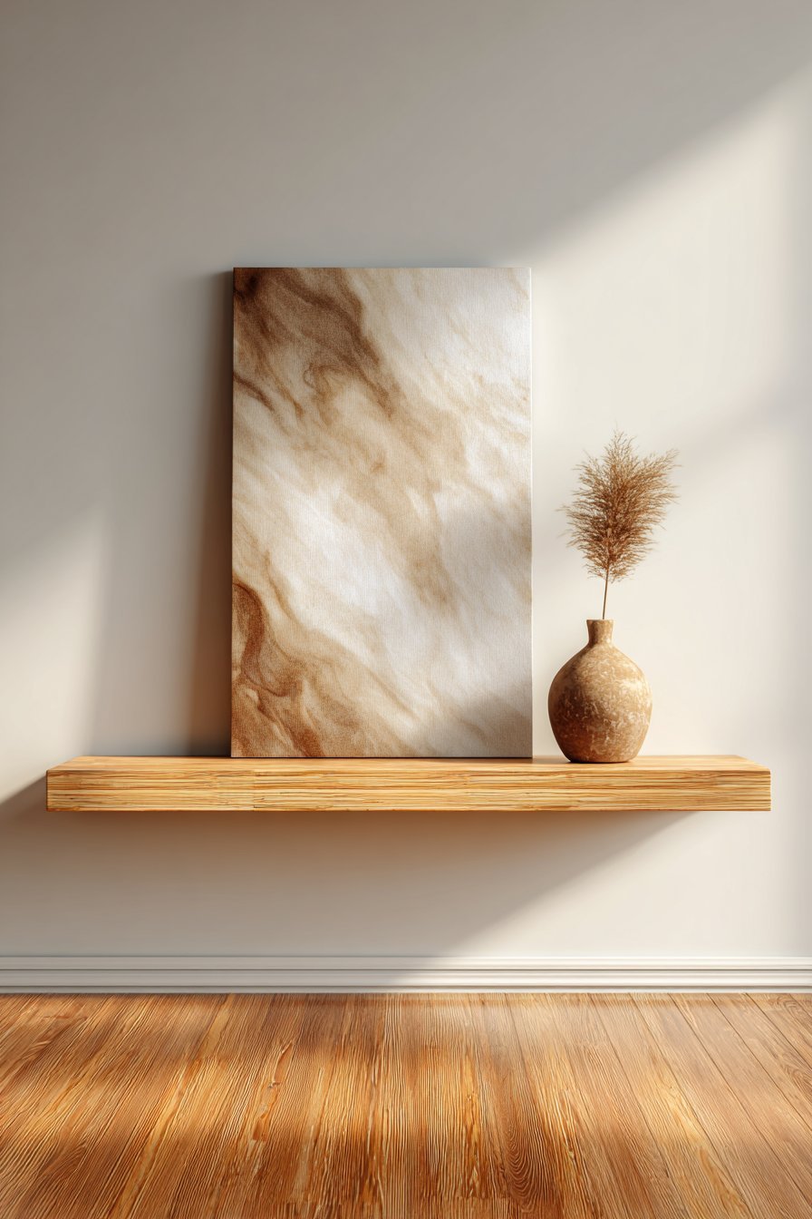
9. The Minimalist Shelf as Wall Decor
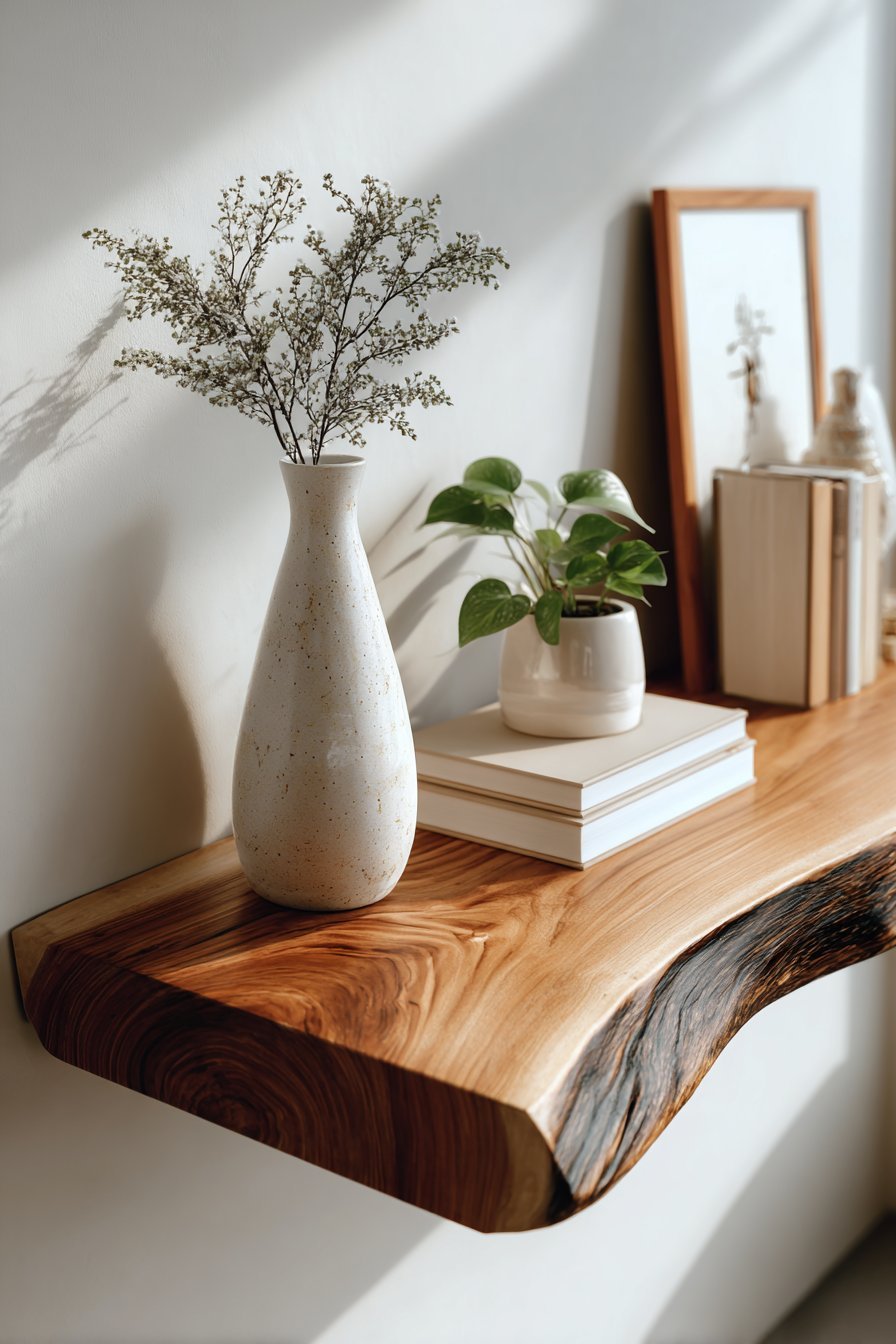
A single, well-styled floating shelf can function as complete wall decor in minimalist interiors. Floating shelves combine function with aesthetics in a way that purely decorative wall art cannot. When styled with discipline — three to five carefully chosen objects, generous empty space, and a cohesive material palette — a shelf becomes a dynamic, living display.
The objects chosen for a minimalist shelf display follow the same principles as the wall decor itself. Choose items of varying height to create visual rhythm. Select materials that complement each other — a ceramic vessel, a small plant, a single book, a natural stone. Limit the color palette to two or three tones. The arrangement should feel effortless, though achieving that quality requires deliberate editing.
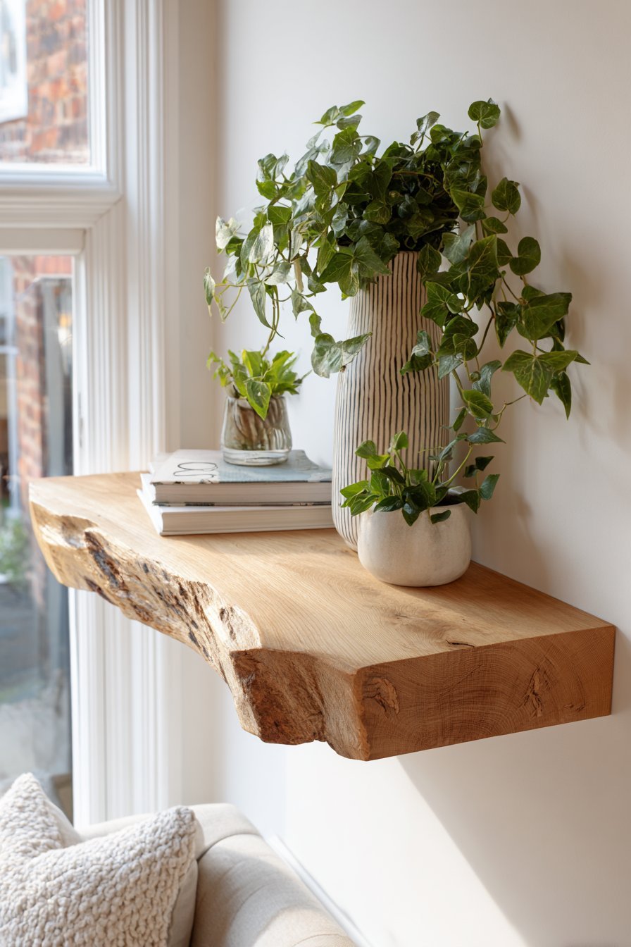
Shelf material and finish contribute significantly to the overall design statement. A thick slab of live-edge wood brings organic warmth. A sleek white lacquered shelf reads as clean and architectural. A black metal shelf adds industrial edge. Match the shelf’s material language to the overall interior style to ensure it reads as intentional rather than arbitrary.
- Style floating shelves with five objects or fewer for a clean look
- Vary object heights to create visual rhythm across the shelf
- Include at least one living element — a small plant or fresh stems
- Choose a shelf material that echoes existing wood or metal tones in the room
- Edit ruthlessly — remove anything that doesn’t serve the composition
- Refresh shelf styling seasonally to keep the display feeling current
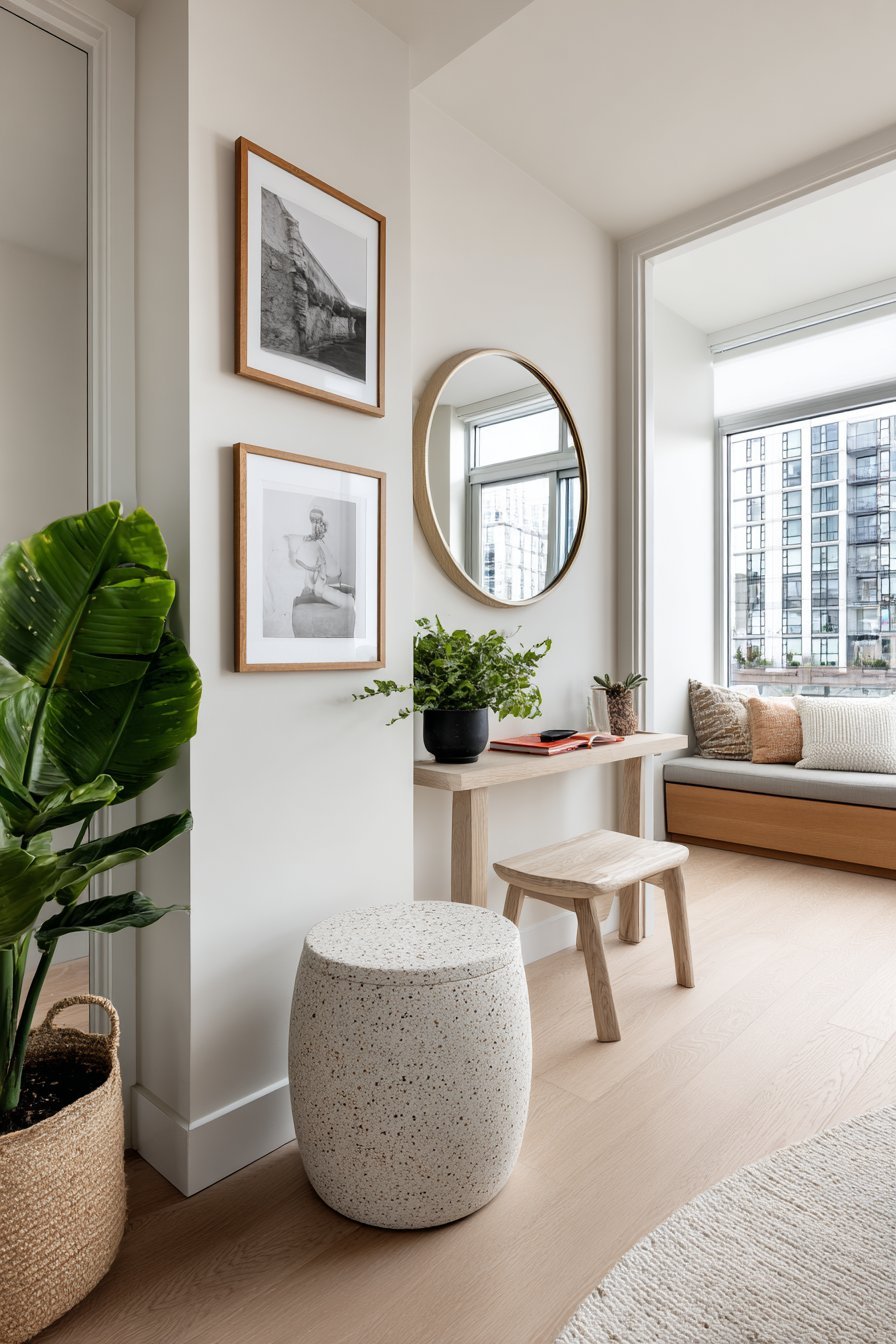
10. Mirrors as Minimalist Wall Statements
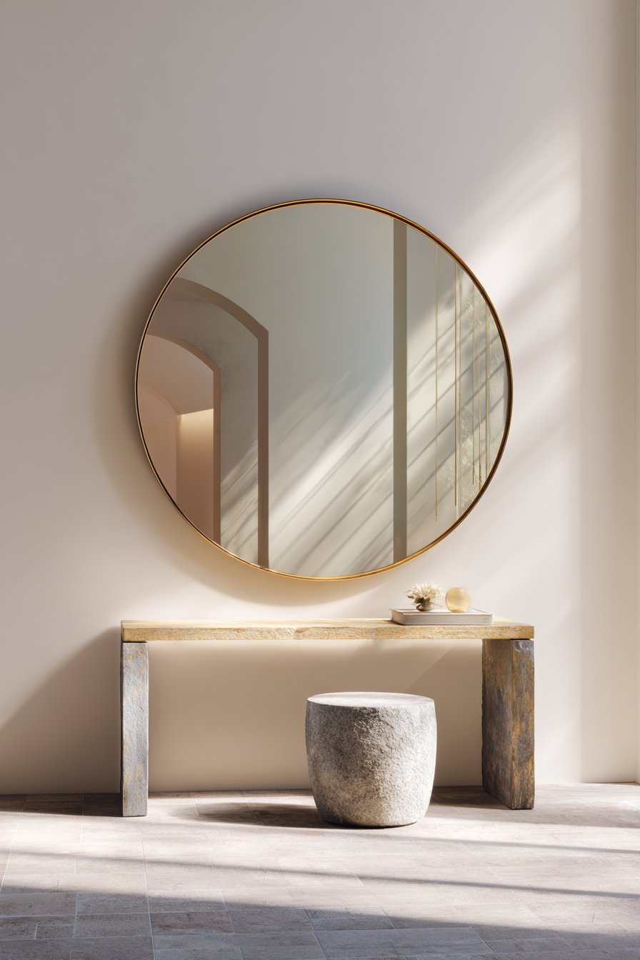
A well-chosen mirror is one of the most powerful and multifunctional wall decor elements in any designer’s toolkit. In minimalist interiors, a single large mirror with a simple frame serves simultaneously as art, light amplifier, and space expander. The reflective surface doubles the perceived depth of a room while contributing to the clean, uncluttered aesthetic.
Frame selection is critical when using mirrors as minimalist wall decor. Frameless mirrors read as architectural and modern. Thin black or brass frames are sophisticated and graphic. Thick ornate frames contradict the minimalist philosophy entirely. The mirror’s shape also carries meaning — round mirrors soften angular rooms, while rectangular mirrors reinforce clean geometric lines.
Placement of a mirror should be deliberate and strategic. Hanging a mirror to reflect a window doubles the natural light in the room. Positioning it to reflect a piece of artwork creates a dynamic visual dialogue between two elements. Avoid placing mirrors where they reflect clutter or unattractive architectural features — what the mirror shows is as important as the mirror itself.
- Choose large-format mirrors (at least 24 × 36 inches) for maximum impact
- Select thin or frameless designs to maintain a clean minimalist profile
- Position mirrors to reflect natural light sources for brightness
- Use round mirrors to soften rooms with strong angular architecture
- Avoid clustering multiple small mirrors — one statement mirror per wall
- Ensure the mirror’s reflection shows something beautiful or intentional
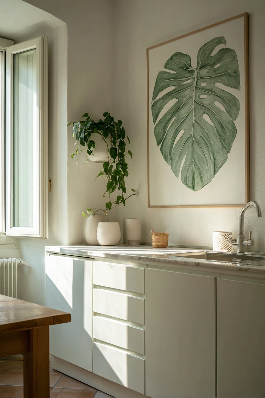
11. Plants and Botanicals as Living Wall Decor
Nature brings life to minimalist walls in a way that no manufactured object can replicate. Living wall elements — whether a single trailing plant on a shelf, a mounted air plant display, or a framed botanical print — introduce organic energy that softens the clean lines of minimalist design. The contrast between structured walls and natural, irregular plant forms creates visual tension that feels inherently dynamic.
Botanical prints are among the most enduringly popular choices for minimalist wall art. A single large-format fern, palm leaf, or botanical illustration in a simple frame works beautifully because it bridges nature and design elegantly. The organic lines of botanical subjects complement minimalist compositions without adding visual noise or complexity.
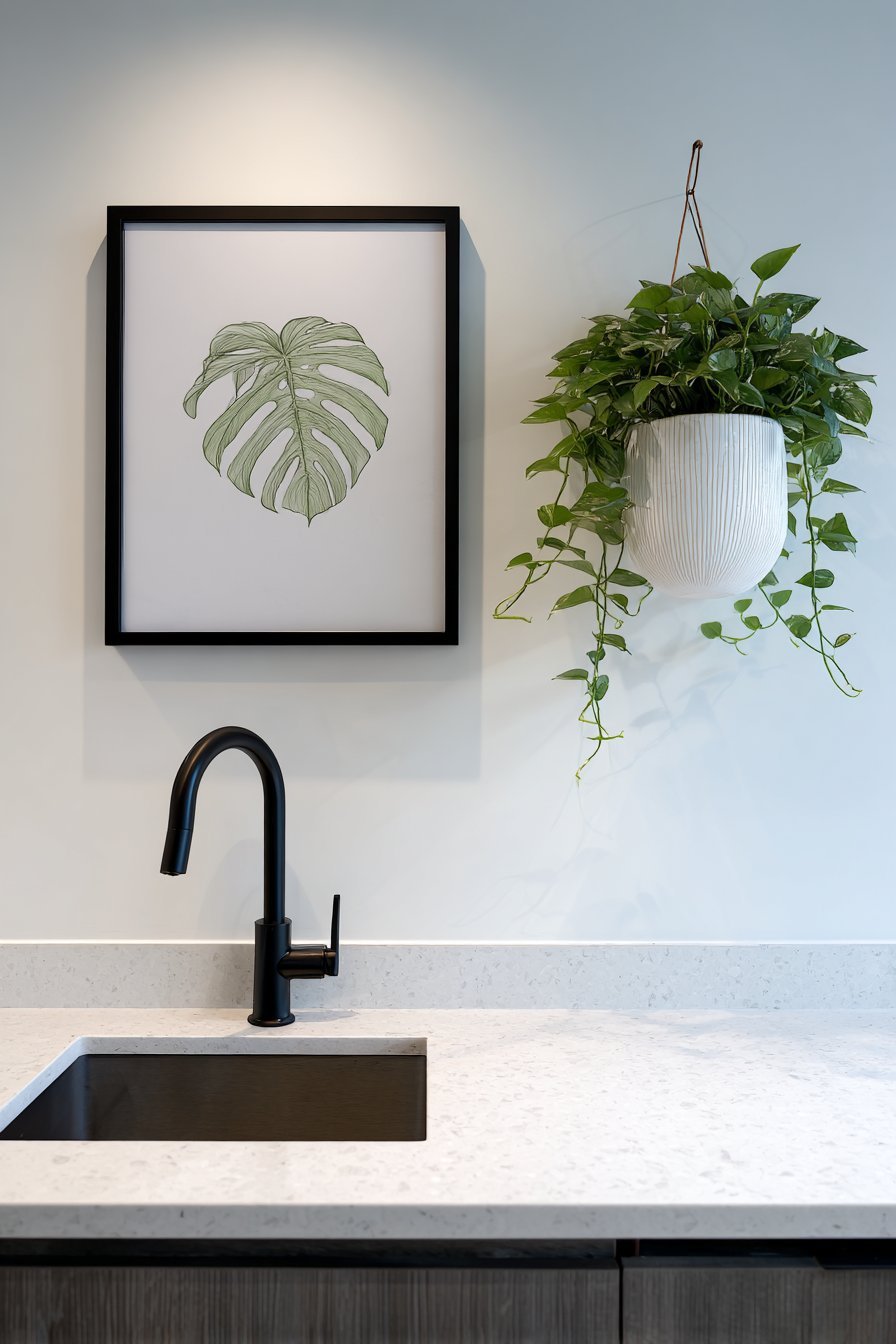
For those who prefer living plants, wall-mounted planters offer a sophisticated approach to vertical gardening. A single ceramic wall planter holding a trailing pothos or a sculptural air plant becomes both botanical display and art object. This approach works particularly well in kitchens, bathrooms, and home offices where traditional framed art can feel overly formal.
- Choose one large botanical print rather than several small ones
- Mount a single ceramic planter as a sculptural art object on the wall
- Select plants with architectural forms — snake plants, monsteras, air plants
- Use simple, unadorned frames for botanical prints to maintain minimalist clarity
- Consider a preserved moss panel as a maintenance-free living wall element
- Coordinate plant pot materials with existing metal or wood tones in the space
12. Consistency and Cohesion Across the Room
Individual minimalist wall decor elements only succeed when they work as part of a cohesive whole. Every piece on every wall in a room should feel like it belongs to the same family — sharing palette, material language, or stylistic sensibility. Inconsistency is one of the most common mistakes that undermines otherwise well-intentioned minimalist interiors.
Visual cohesion does not mean monotony. It means that a viewer moving through the space feels a continuous design narrative rather than a series of disconnected choices. Repeating a material — such as natural wood in a shelf, a frame, and a sculptural object — creates a thread that unifies diverse wall elements into a singular design story.
Editing is the final and most important skill in minimalist wall design. The ability to remove rather than add separates truly impactful minimalist spaces from half-hearted attempts. Before hanging anything new, ask whether it earns its place. Ask whether it adds to or detracts from the existing composition. The best minimalist interiors are built through disciplined subtraction, not accumulation.
- Repeat one or two materials across all wall decor in a room for unity
- Limit your wall decor color palette to two to three tones maximum
- Conduct a full room audit before adding any new decorative element
- Remove one item every time you consider adding one — maintain balance
- Walk away and return with fresh eyes to assess your wall compositions
- Trust that less truly is more — restraint always reads as sophistication
Conclusion
Minimalist wall decor is impactful precisely because it demands intention. Every element present has been chosen, placed, and lit with purpose. The absence of clutter is not emptiness — it is clarity. It is confidence. It is the visual equivalent of a well-considered thought, expressed without excess or noise.
Start small. Choose one wall. Remove what does not belong. Add one piece that truly resonates with you. Give it space to breathe and light to be seen. The transformative power of minimalism reveals itself not in grand gestures, but in the quiet discipline of doing less, better. Your walls have something to say — minimalist design simply ensures they are heard.