Color has always been a powerful force in interior design. But in recent years, a bold new trend has taken the design world by storm — color drenching. This approach goes far beyond painting a single accent wall. It involves coating an entire room — walls, ceiling, trim, and even furniture — in one unifying hue. The result is an immersive, enveloping environment that feels intentional and deeply personal.
What makes color drenching so compelling is not just its visual impact. It is rooted in real psychological principles. The colors we surround ourselves with influence our mood, behavior, and even our perception of space. Understanding the psychology behind color drenching helps you make smarter, more intentional design choices for your home.
This article explores the fascinating intersection of color psychology and interior design. From the calming power of deep blues to the energizing influence of warm terracottas, we cover everything you need to know. Whether you are a seasoned decorator or a first-time homeowner, these insights will inspire you to transform your living spaces with confidence and creativity.
1. What Is Color Drenching and Why It Works
Color drenching is the practice of applying a single dominant color to every surface in a room. This includes walls, ceilings, woodwork, skirting boards, and sometimes even upholstered furniture. The effect creates a seamless, cocoon-like atmosphere that feels cohesive and luxurious.
The reason it works so well is rooted in visual psychology. When the eye has no sharp contrast to jump between, the brain enters a state of visual calm. Distractions fade away. The room feels unified and purposeful. This is why color-drenched spaces often feel more sophisticated than rooms with multiple competing tones.
Interior designers describe this technique as creating a sensory envelope around the occupant. The space wraps you in a single emotional experience rather than fragmenting your attention. It is a powerful tool for creating rooms with strong personality and intention.
- Choose one color family and commit to it fully across all surfaces
- Include trim, ceilings, and doors in the same hue for true drenching
- Use varying sheens and finishes (matte vs. satin) to add depth without contrast
- Start with a smaller room like a powder room or study to test the technique
- Reference paint brand color families to find harmonious shades within one hue
- Consider how natural light changes the color throughout the day
2. How Color Affects the Brain and Emotions
The relationship between color and the human mind is well-documented in color psychology research. Colors trigger emotional and physiological responses. These responses are both universal and deeply personal. Understanding them is essential when choosing a drench color for any room.
Warm colors like red, orange, and yellow stimulate the nervous system. They raise energy levels and encourage social interaction and appetite. Cool colors like blue, green, and violet have the opposite effect. They slow the heart rate and promote relaxation and introspection. Neutral hues like warm white and greige create feelings of safety and openness.
When you drench an entire room in one color, these effects are amplified significantly. A blue-drenched bedroom does not just feel calm — it feels profoundly restful. A red-drenched dining room does not just feel warm — it feels passionate and alive. This amplification is precisely why color choice matters so much in the drenching technique.
- Research the emotional associations of your chosen color before committing
- Consider who uses the room most and what emotional state they need there
- Test large paint swatches on multiple walls before making a final decision
- Look at the room at different times of day under natural and artificial light
- Consult a color psychology guide or work with a professional color consultant
- Trust your instincts — personal emotional response to a color matters enormously
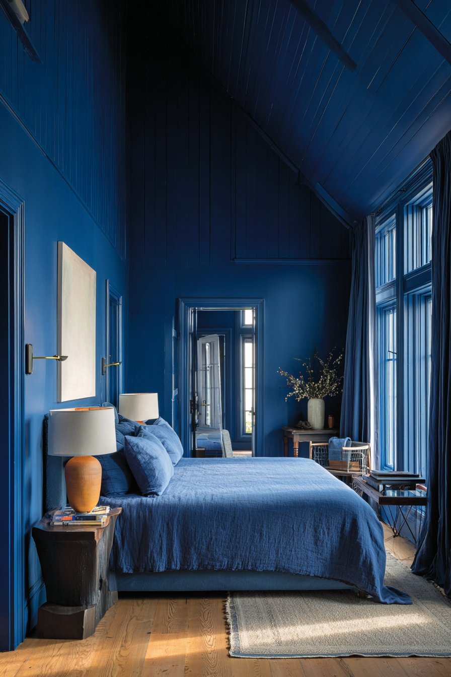
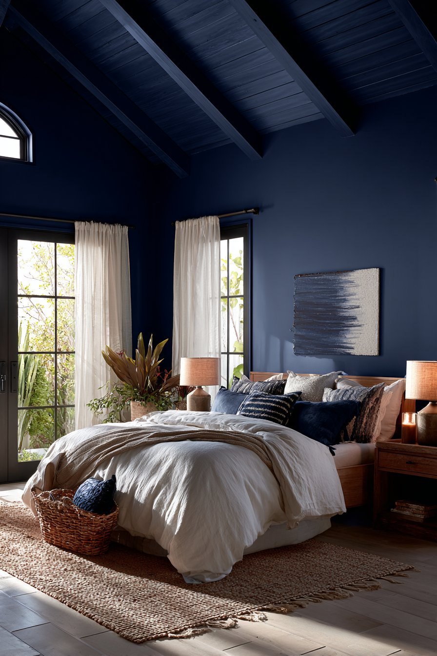
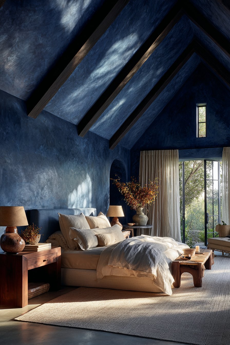
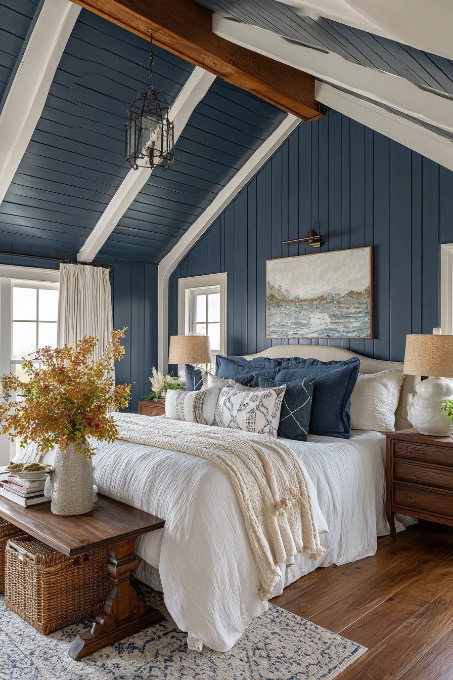
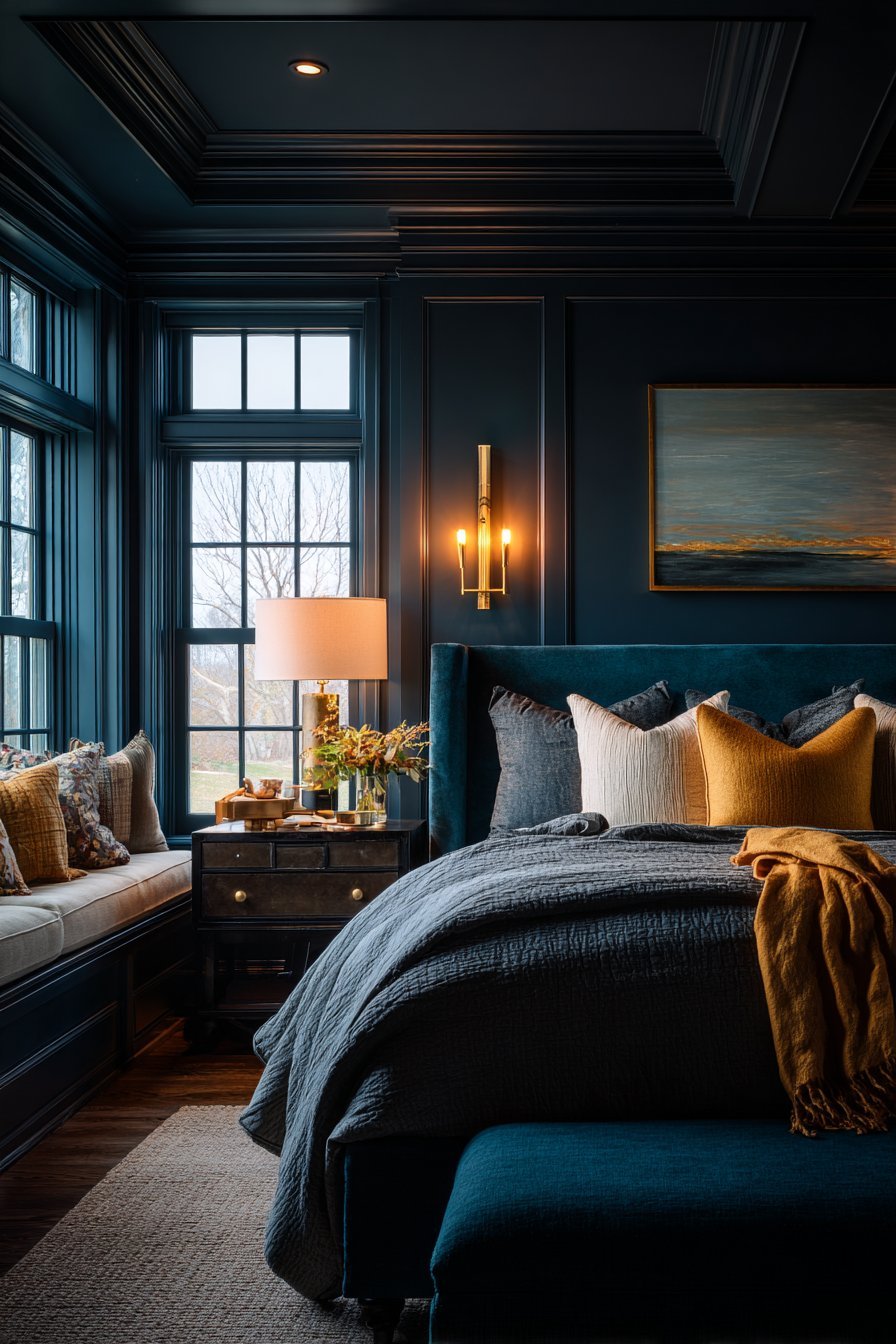
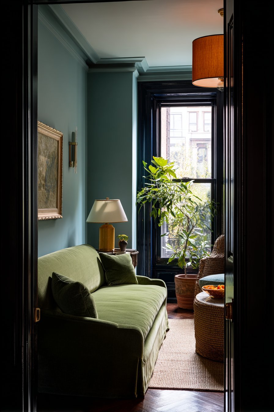
3. The Power of Blue in Color Drenching
Blue is one of the most popular choices for color drenching, and for good reason. It is deeply connected to feelings of calm, trust, and serenity. Studies show that exposure to blue environments can lower blood pressure and reduce feelings of anxiety. It is the color of sky and water — two of nature’s most naturally soothing elements.
In a color-drenched bedroom, deep navy or dusty blue creates a sanctuary-like atmosphere. The room feels protected and restful. Pale blue drenching in a bathroom evokes spa-like tranquility. Mid-tone blue in a home office promotes focused, clear thinking without inducing drowsiness.
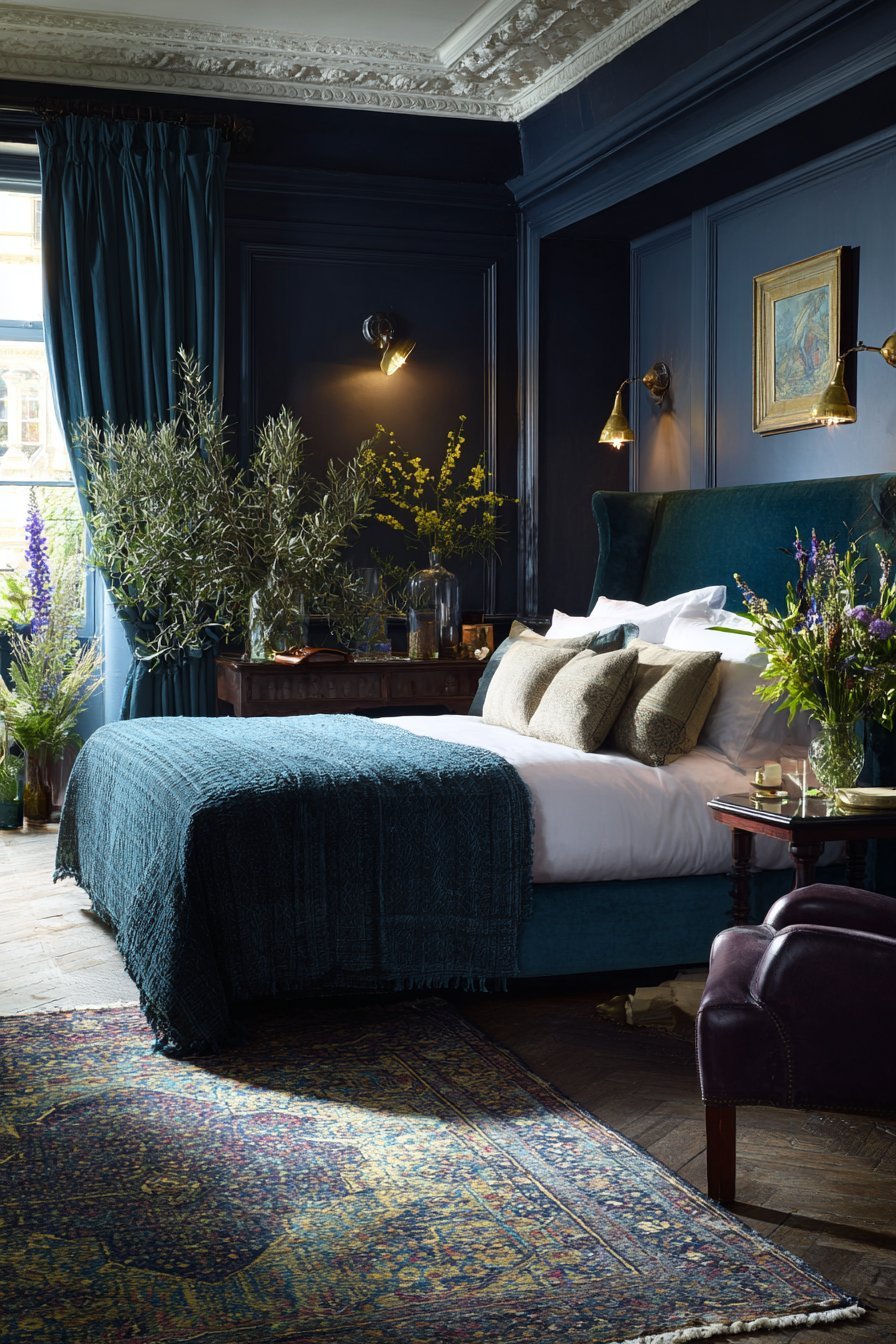
What makes blue especially versatile in drenching is its wide tonal range. From barely-there powder blue to dramatic midnight navy, there is a shade for every personality and room size. Lighter blues expand a small space visually. Darker blues create intimacy and depth in larger rooms.
- Use dark navy drenching in a bedroom for a dramatic, cocoon-like retreat
- Pair blue drenching with brass or gold hardware for warmth and contrast
- Choose muted, dusty blues over bright primary blues for a more sophisticated look
- Layer blue textiles — cushions, throws, rugs — to add tactile richness
- Avoid cold, stark whites with blue drenching; opt for warm-toned neutrals in accessories
- Consider soft sage or teal as adjacent alternatives if pure blue feels too cool
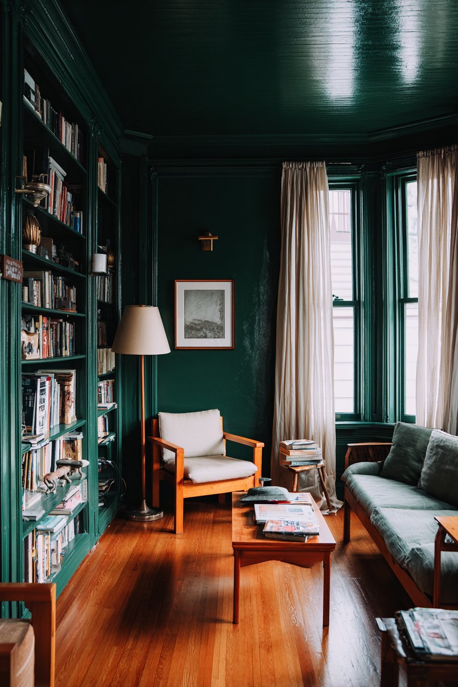
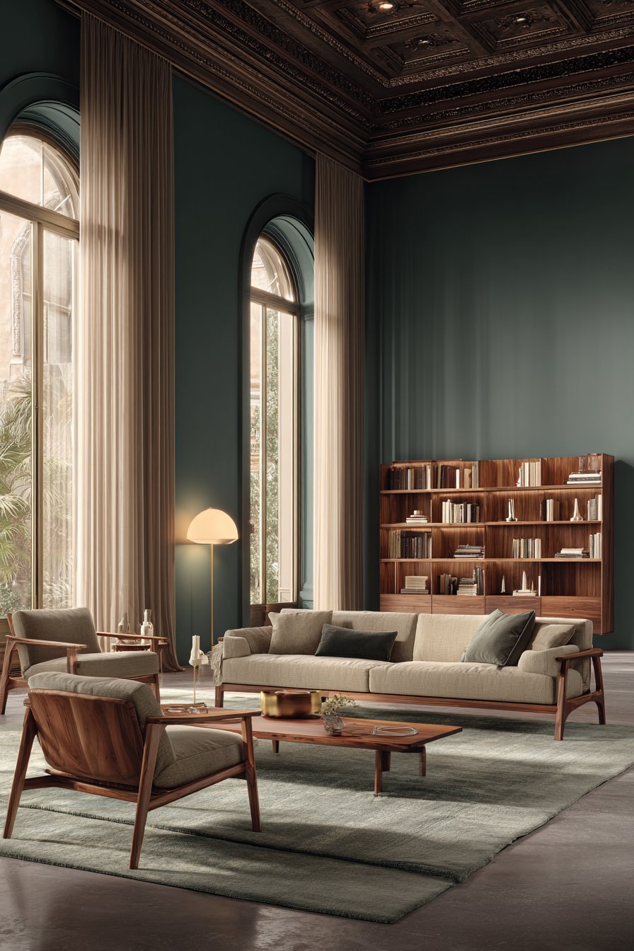
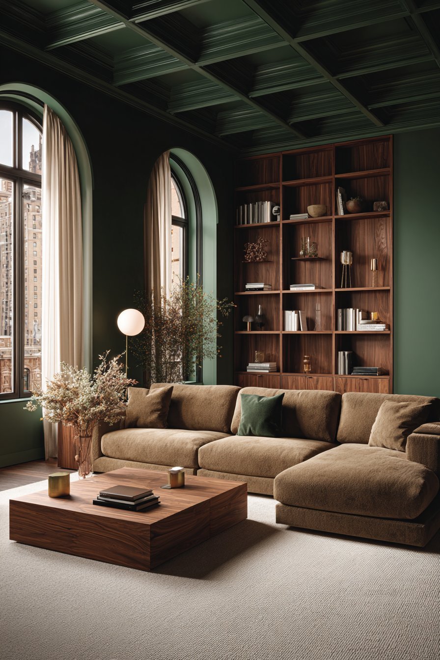
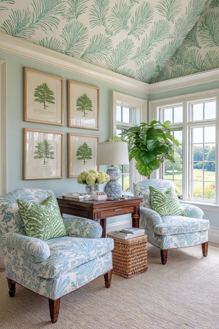
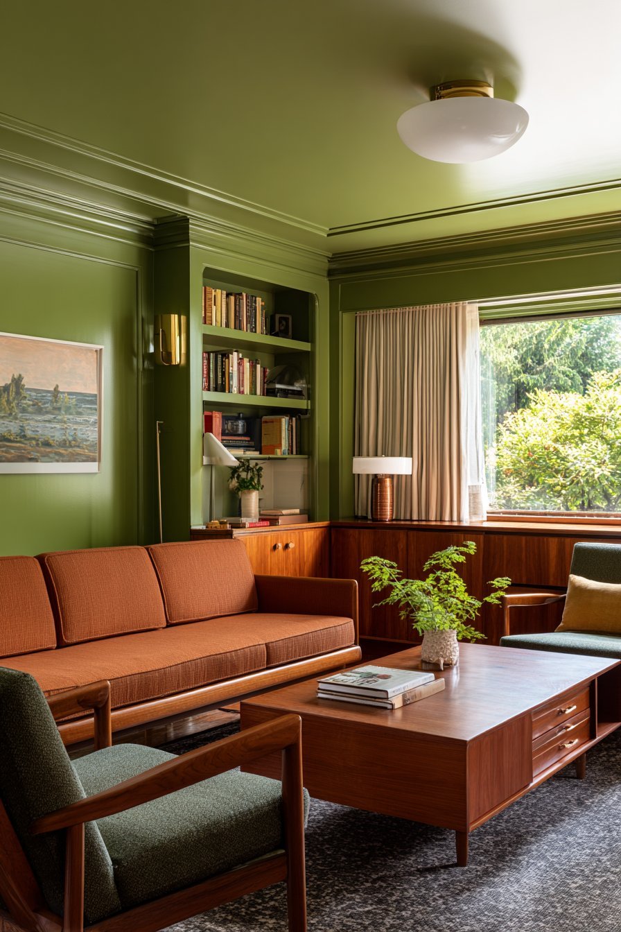
4. Green and Its Grounding Psychological Effect
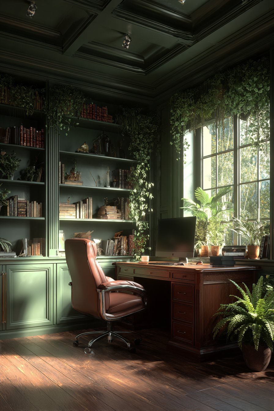
Green is the color most closely associated with nature and renewal. It sits at the center of the visible spectrum, making it the easiest color for the human eye to process. This ease of processing translates into feelings of balance, harmony, and emotional stability. It is no surprise that green is a deeply popular choice in contemporary color drenching.
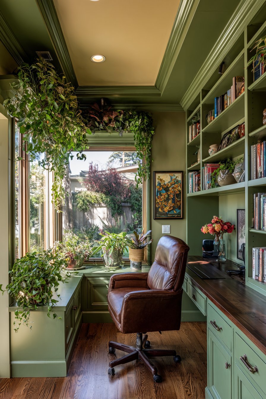
A room drenched in sage green, forest green, or olive green feels immediately grounded and restorative. These shades connect the interior to the natural world. Biophilic design principles support this connection, showing that nature-adjacent colors reduce stress and improve wellbeing. Green drenching in a living room creates a welcoming, relaxed social environment.
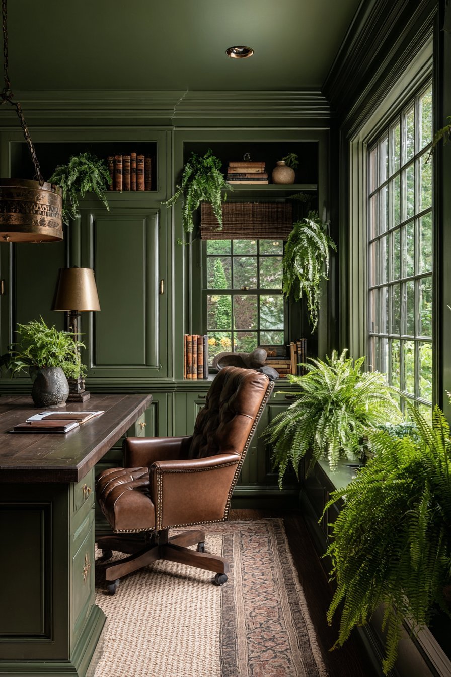
Deeper greens like bottle green or hunter green add a layer of richness and drama. These shades work beautifully in studies, libraries, and dining rooms where an atmosphere of focus and intimacy is desired. Lighter greens like mint or celadon bring airiness and freshness to kitchens and bathrooms.
- Drench a home office in sage green to promote calm, focused productivity
- Pair green drenching with natural wood tones for a biophilic, organic feel
- Use matte finishes on walls and satin on trim to add subtle dimension
- Avoid overly bright or neon greens, which can feel visually fatiguing over time
- Introduce plants into a green-drenched room to amplify the natural atmosphere
- Consider an olive or khaki green for rooms that receive warm, golden-toned light
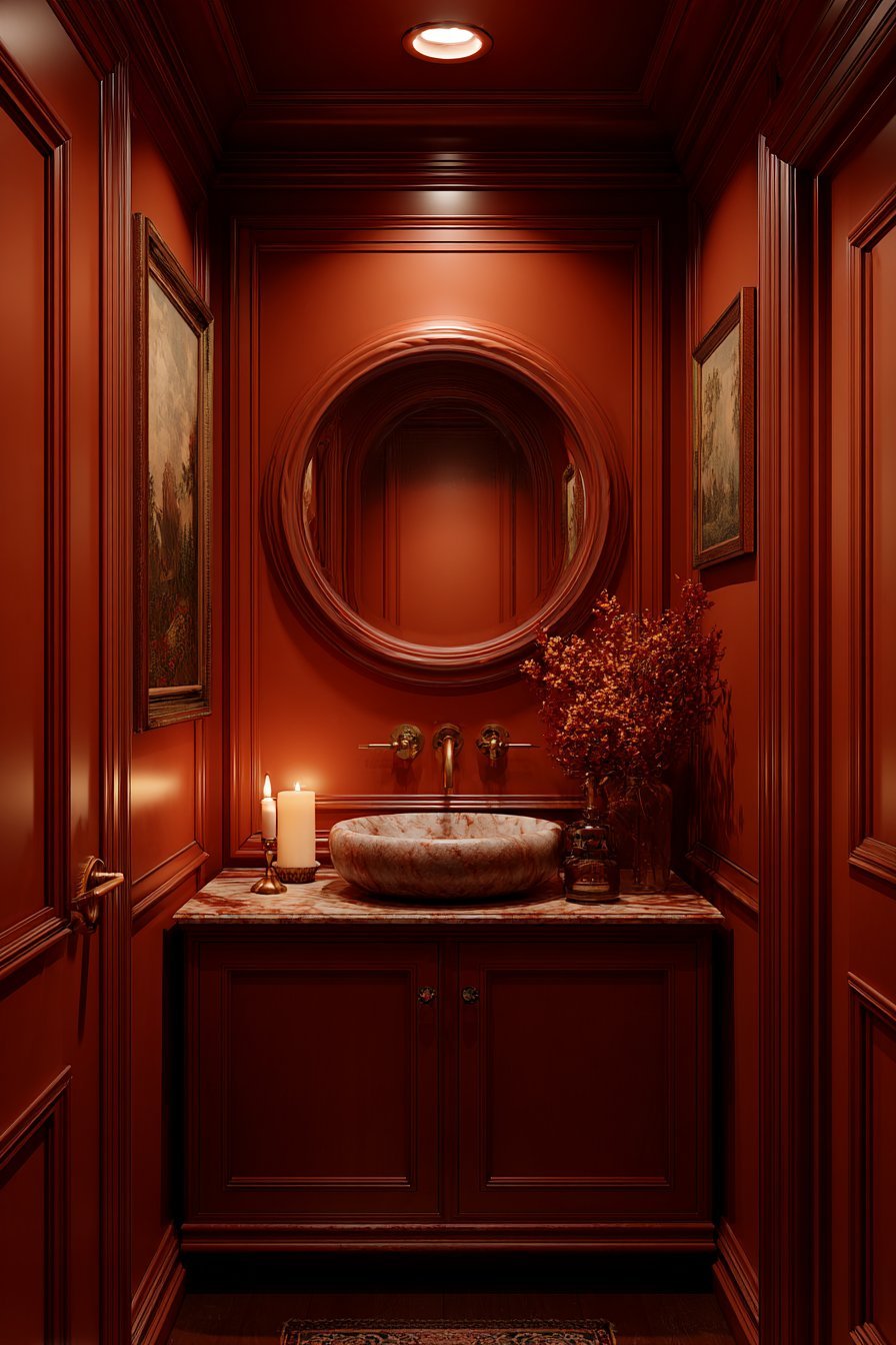
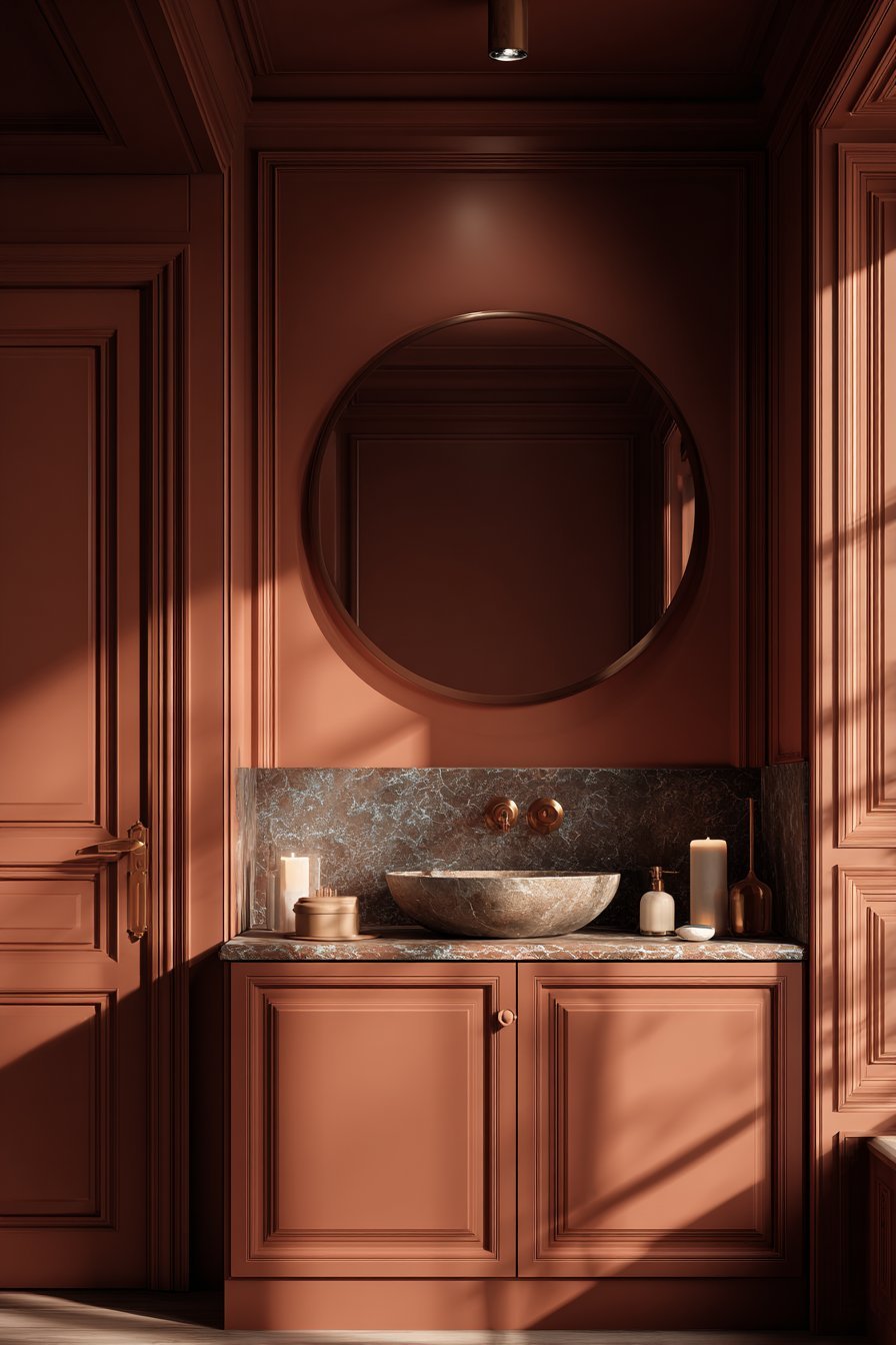
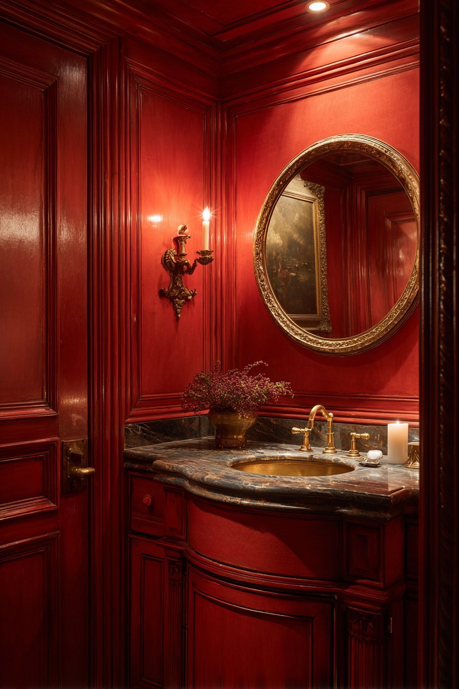
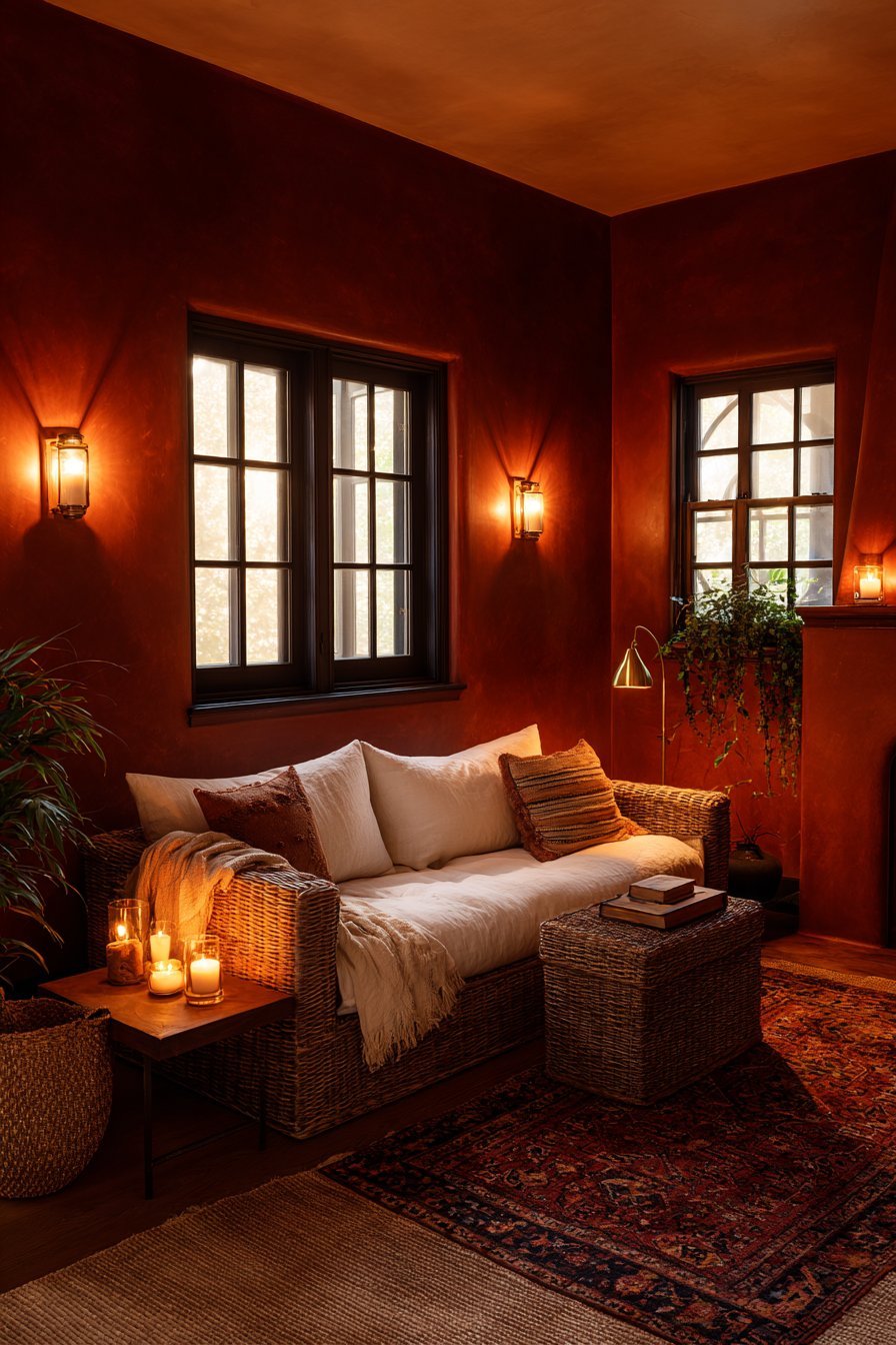
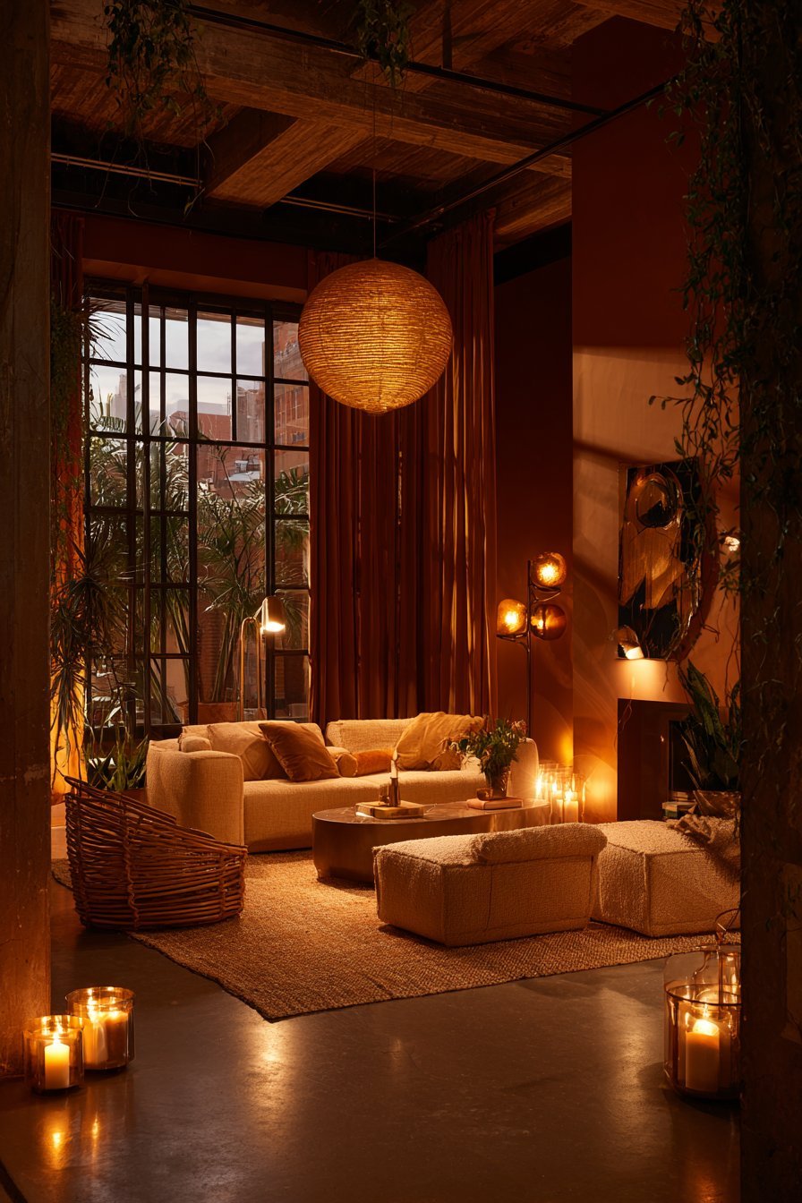
5. Red and Orange Drenching — Bold Emotional Statements
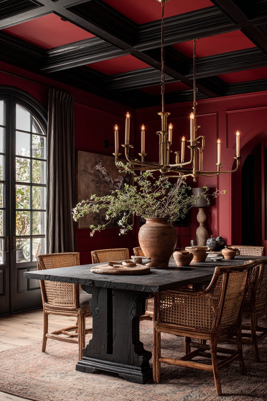
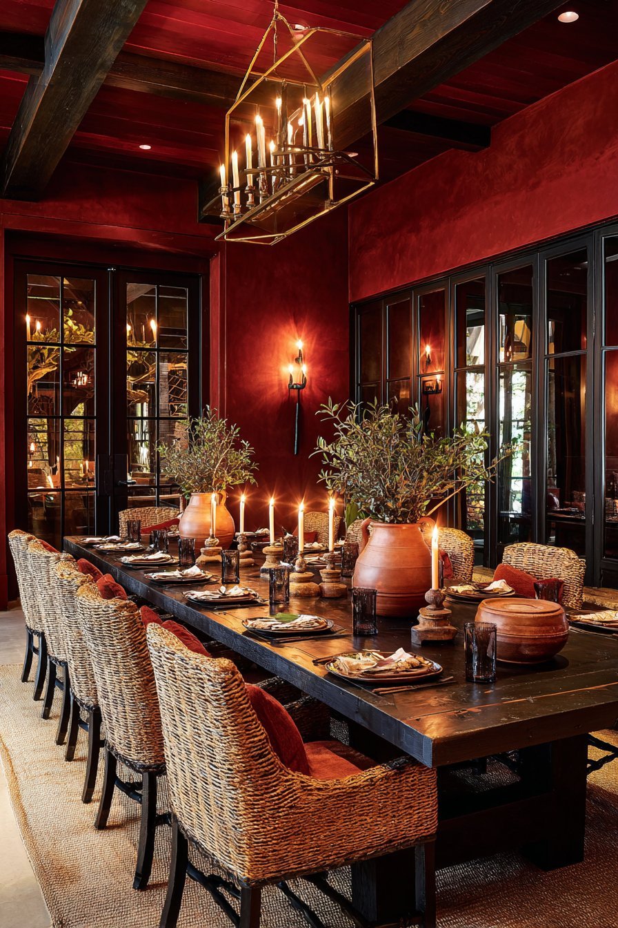
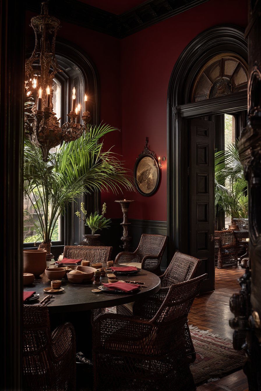
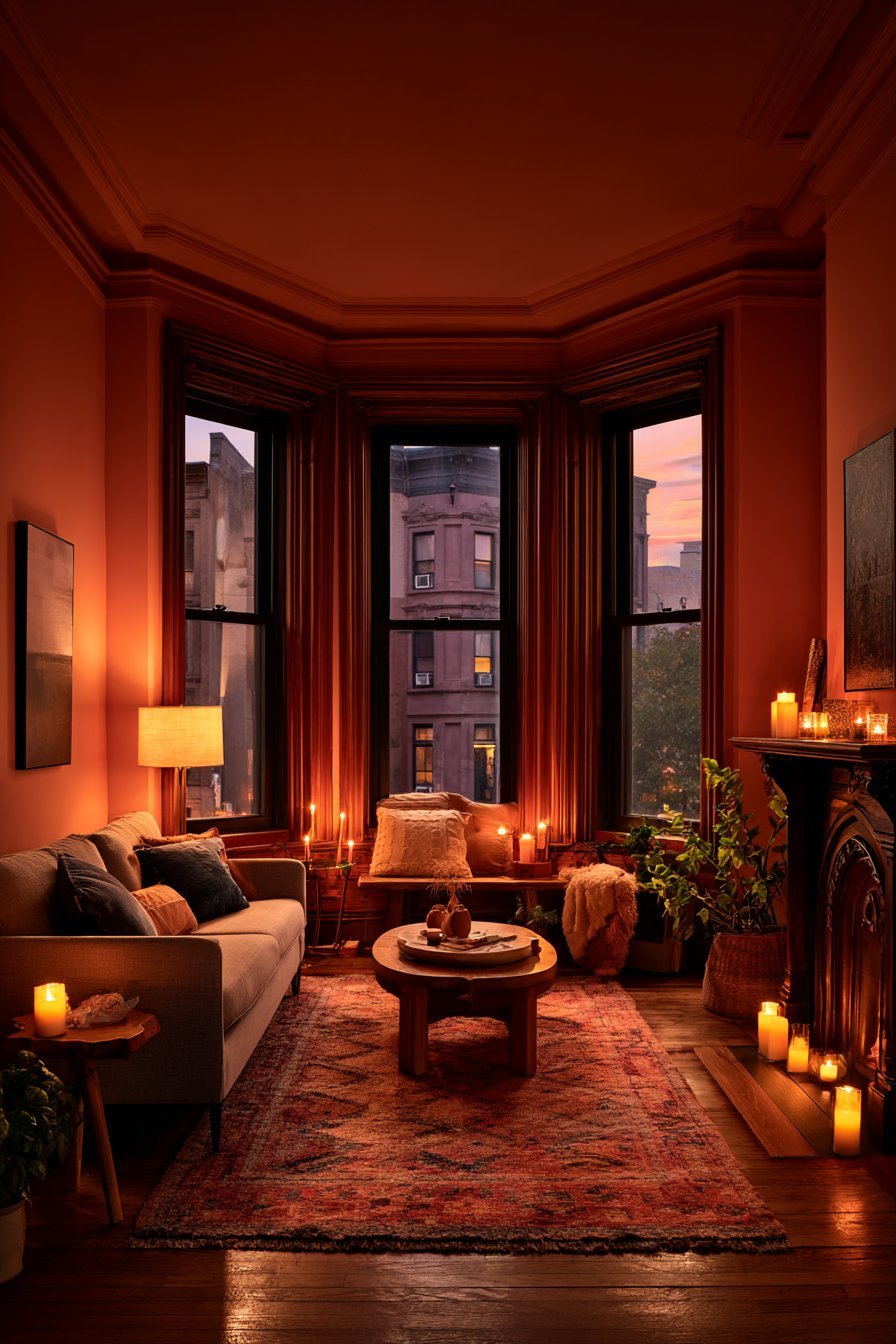
Few colors command attention the way red does. In color psychology, red is linked to passion, energy, and appetite. It is the most emotionally intense color in the spectrum. Drenching a room in red creates an experience that is impossible to ignore. It is a bold design choice that signals confidence and drama.
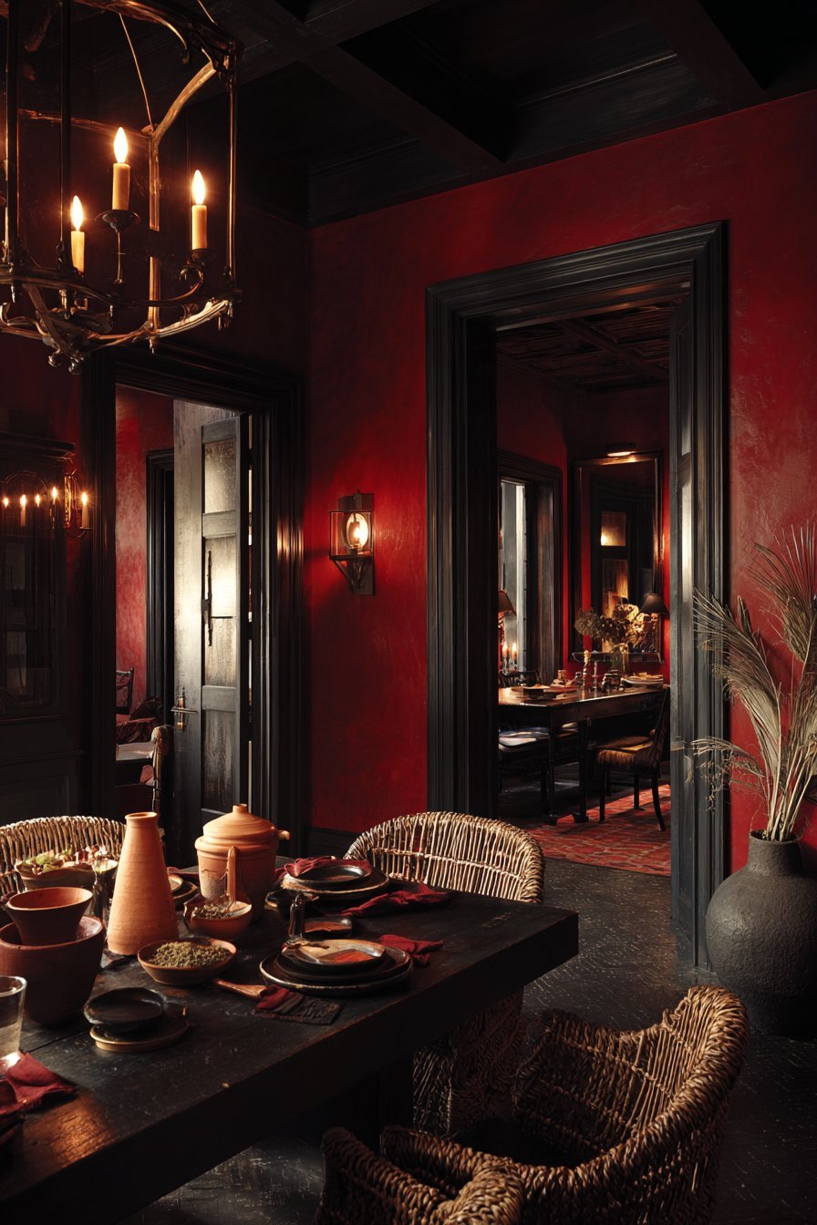
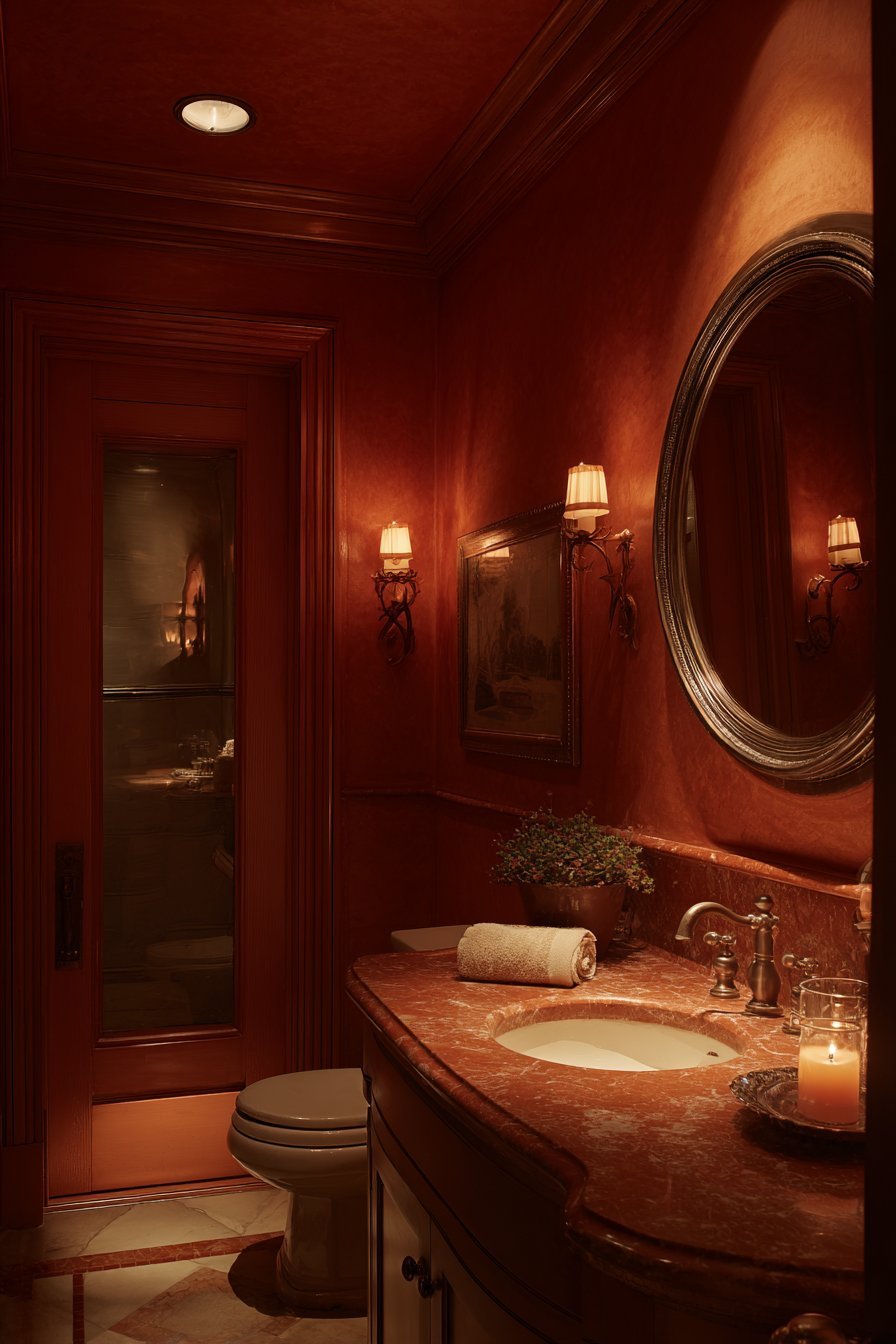
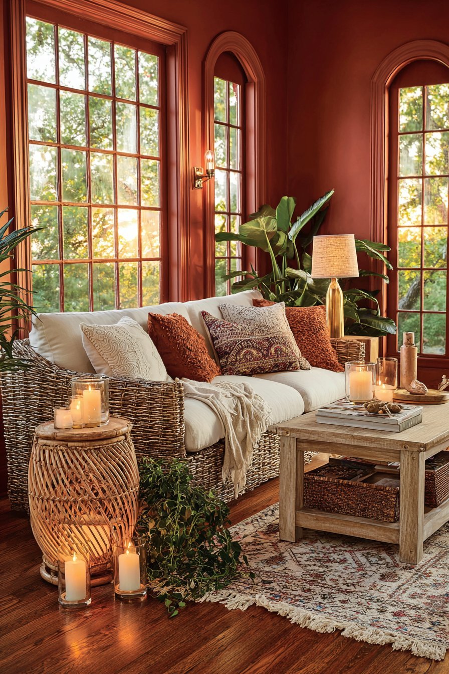
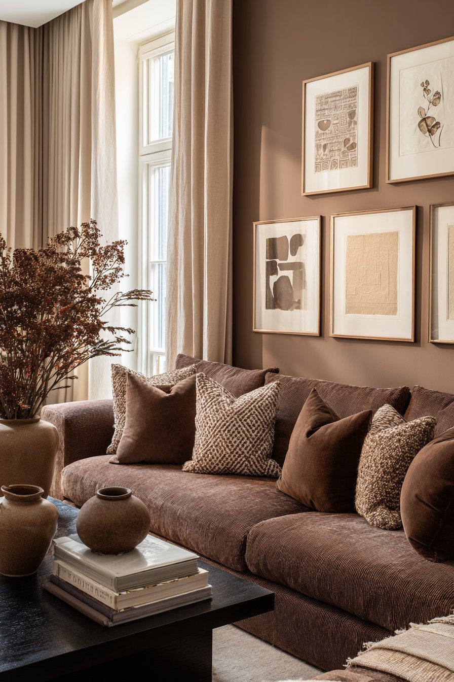
Red drenching works best in dining rooms and entertaining spaces. The color stimulates conversation and appetite, making meals feel like events. Deep burgundy and terracotta red are softer alternatives that retain warmth without the visual intensity of a true red. These earthy tones feel grounded and sophisticated rather than aggressive.
Orange, red’s warmer cousin, brings optimism and creativity into a space. A burnt orange or terracotta drenching in a creative studio or playroom feels energizing and joyful. It is one of the most welcoming hues in the color wheel, combining the energy of red with the cheerfulness of yellow. Orange drenching in a hallway creates an immediate sense of warmth and welcome.
- Reserve true red drenching for dining rooms or home bars where drama is desired
- Choose terracotta or brick red for a warmer, earthier interpretation of red drenching
- Balance the intensity of red drenching with natural textures like linen and rattan
- Avoid red drenching in bedrooms or spaces meant for relaxation and rest
- Use candlelight or warm-toned bulbs to enhance the richness of orange-drenched rooms
- Pair red or orange drenching with dark wood furniture for a sophisticated, moody look
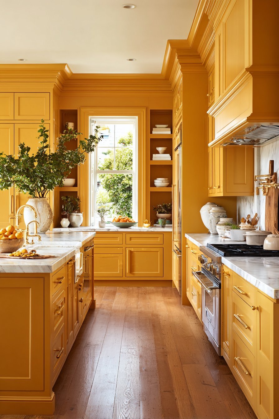
6. Yellow and the Psychology of Light
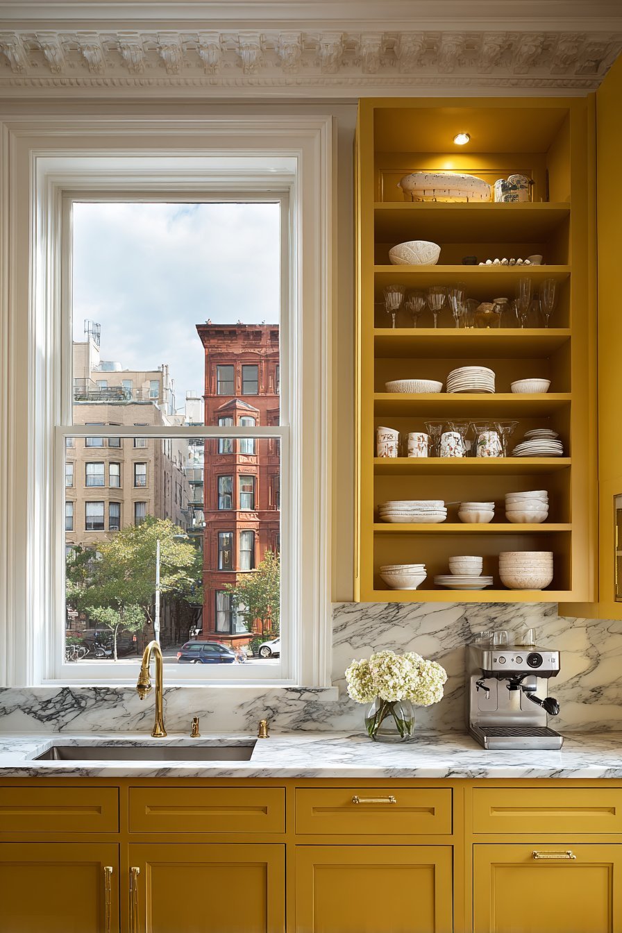
Yellow is the color of sunlight and optimism. It is one of the most psychologically stimulating colors in the spectrum. Yellow activates the brain’s serotonin production, promoting feelings of happiness and mental clarity. In interior design, yellow drenching can transform even the darkest room into a space that feels bright and alive.
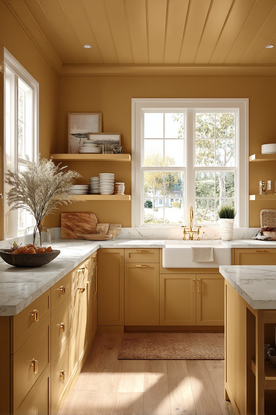
However, yellow requires careful handling. Overly bright or saturated yellows can become visually overwhelming very quickly. The key to successful yellow drenching is choosing muted, sophisticated shades. Mustard yellow, ochre, and warm butter tones drench beautifully without inducing visual fatigue. These tones feel timeless and elegant rather than childlike or garish.
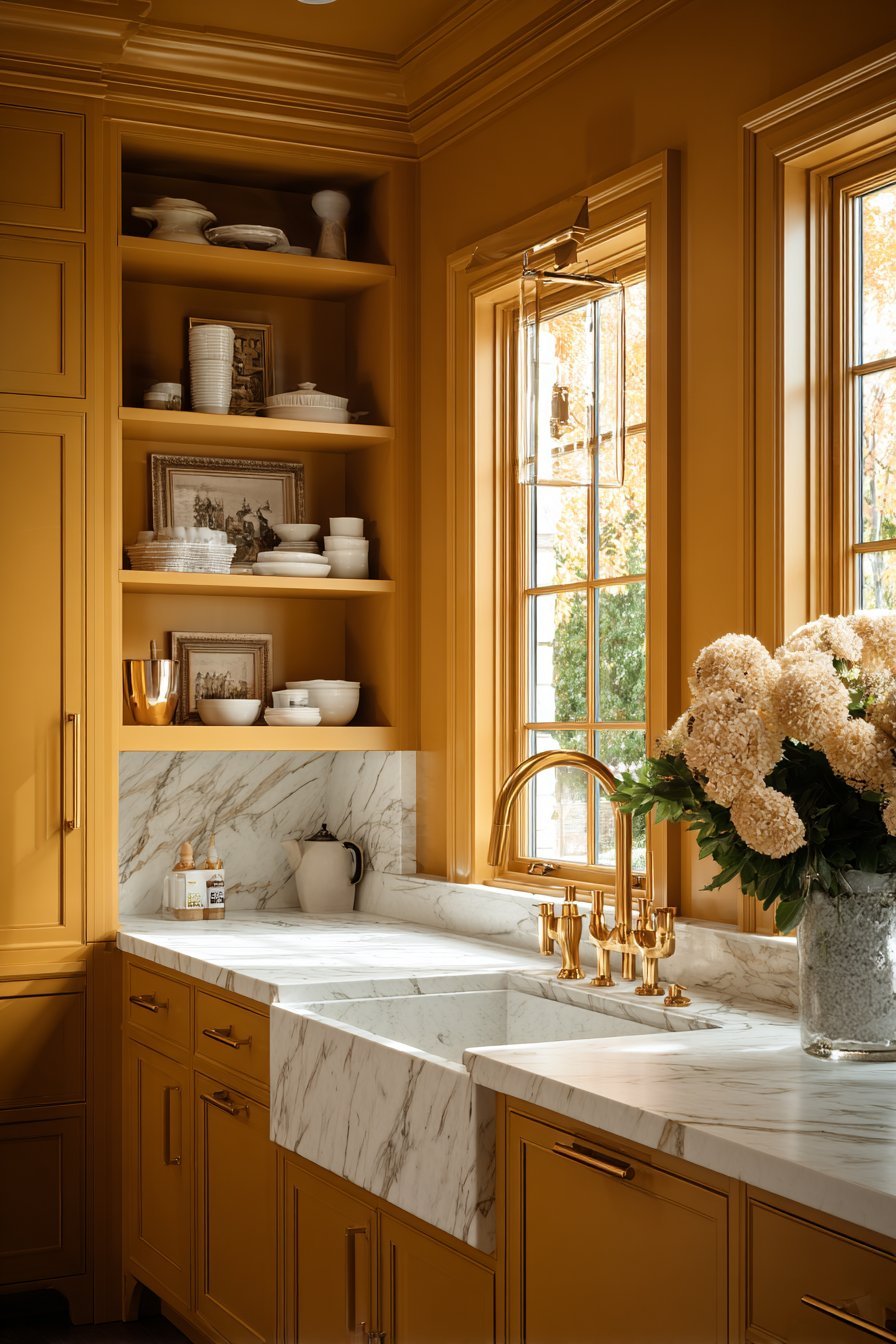
Yellow drenching works wonderfully in kitchens, breakfast rooms, and creative studios. These are spaces where mental alertness, positivity, and energy are desirable. In north-facing rooms that receive little natural light, a warm yellow drench can completely transform the atmosphere by mimicking the warmth of sunlight.
- Choose muted ochre or mustard yellow over bright primary yellows for a sophisticated drench
- Use yellow drenching in north-facing rooms to counteract cold, grey light
- Layer warm metallic accents — aged brass or antique gold — with yellow drenching
- Avoid yellow drenching in rooms where relaxation or sleep is the primary purpose
- Test the yellow under both natural and artificial light before committing
- Pair yellow-drenched walls with deep, contrasting upholstery in navy or forest green
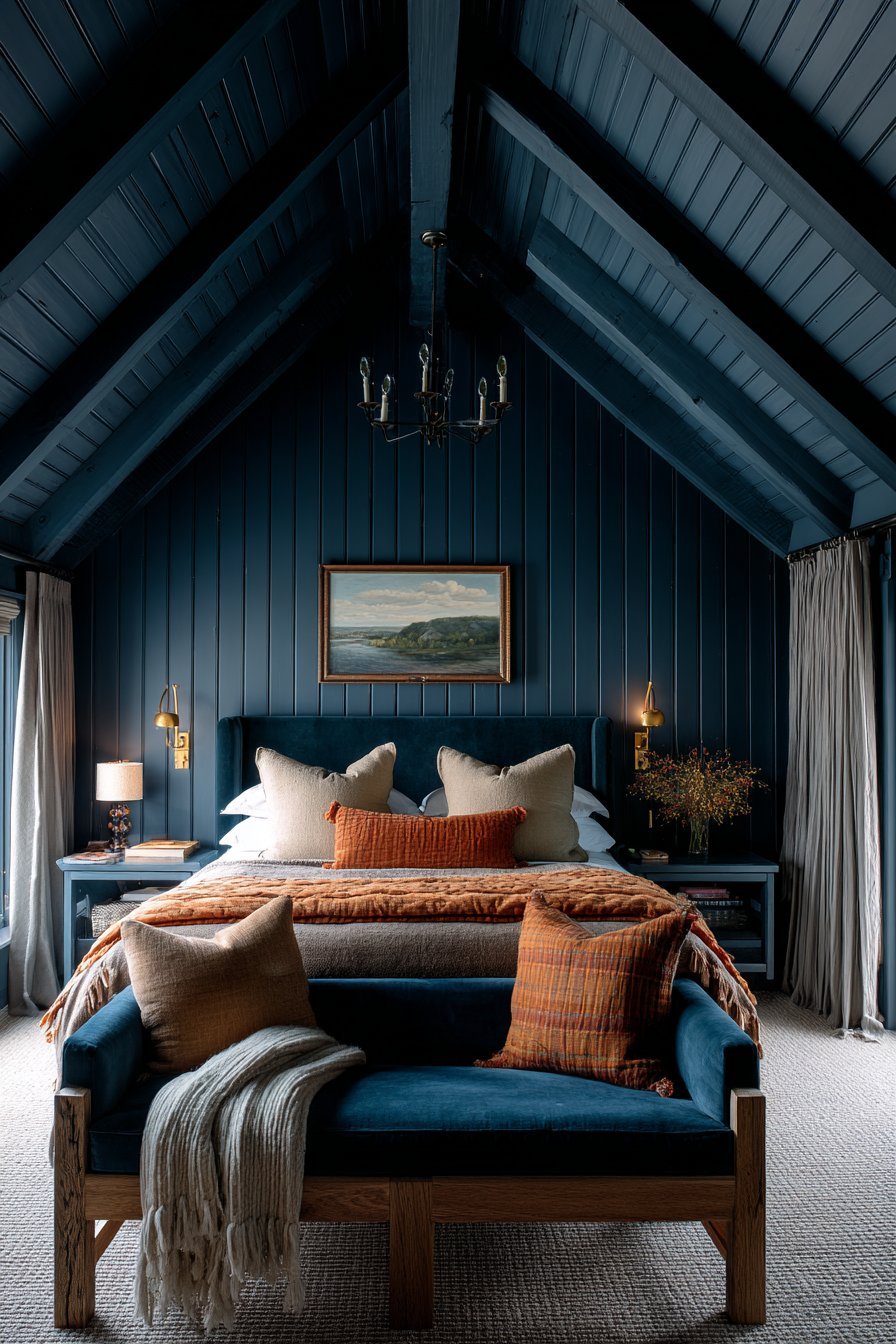
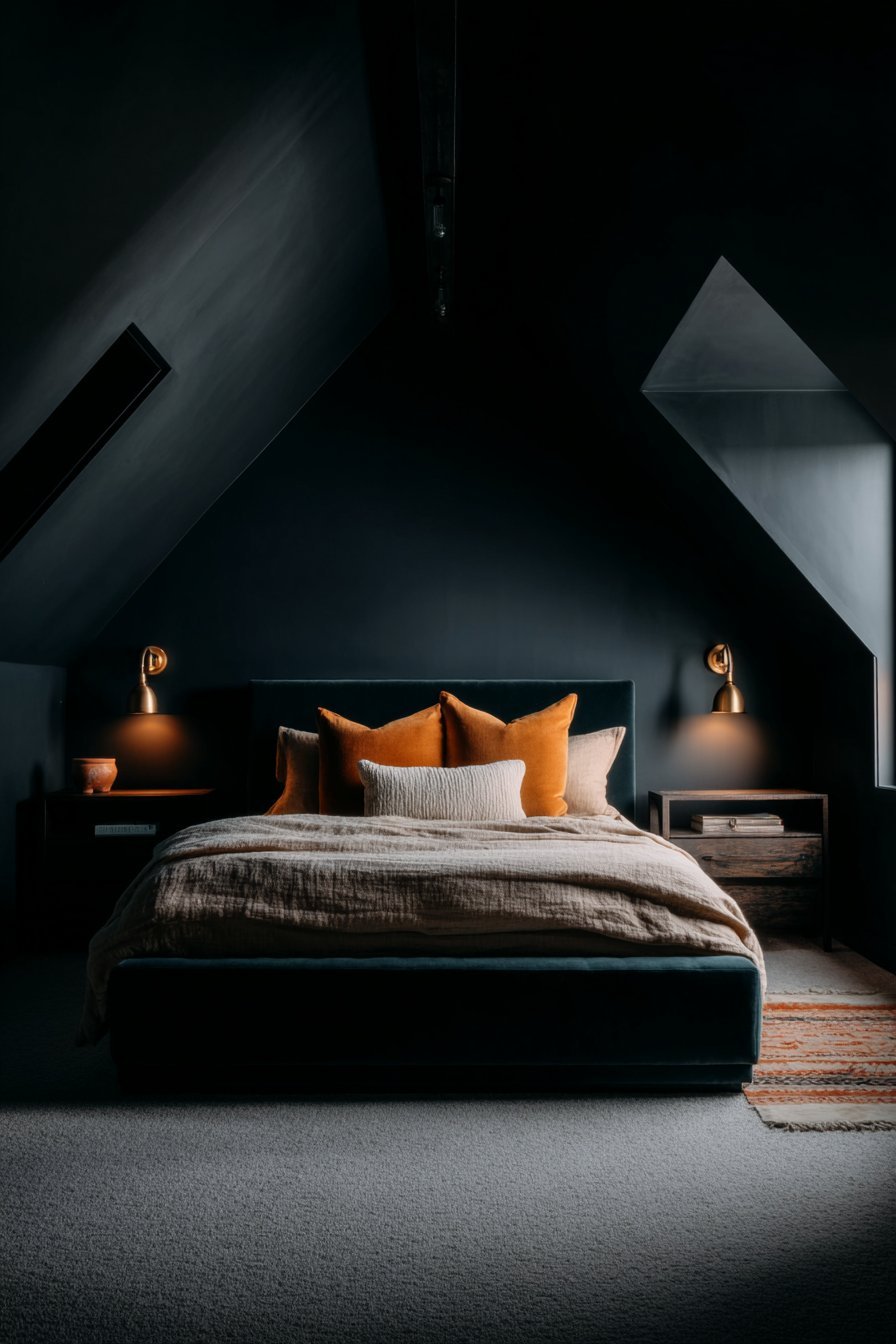
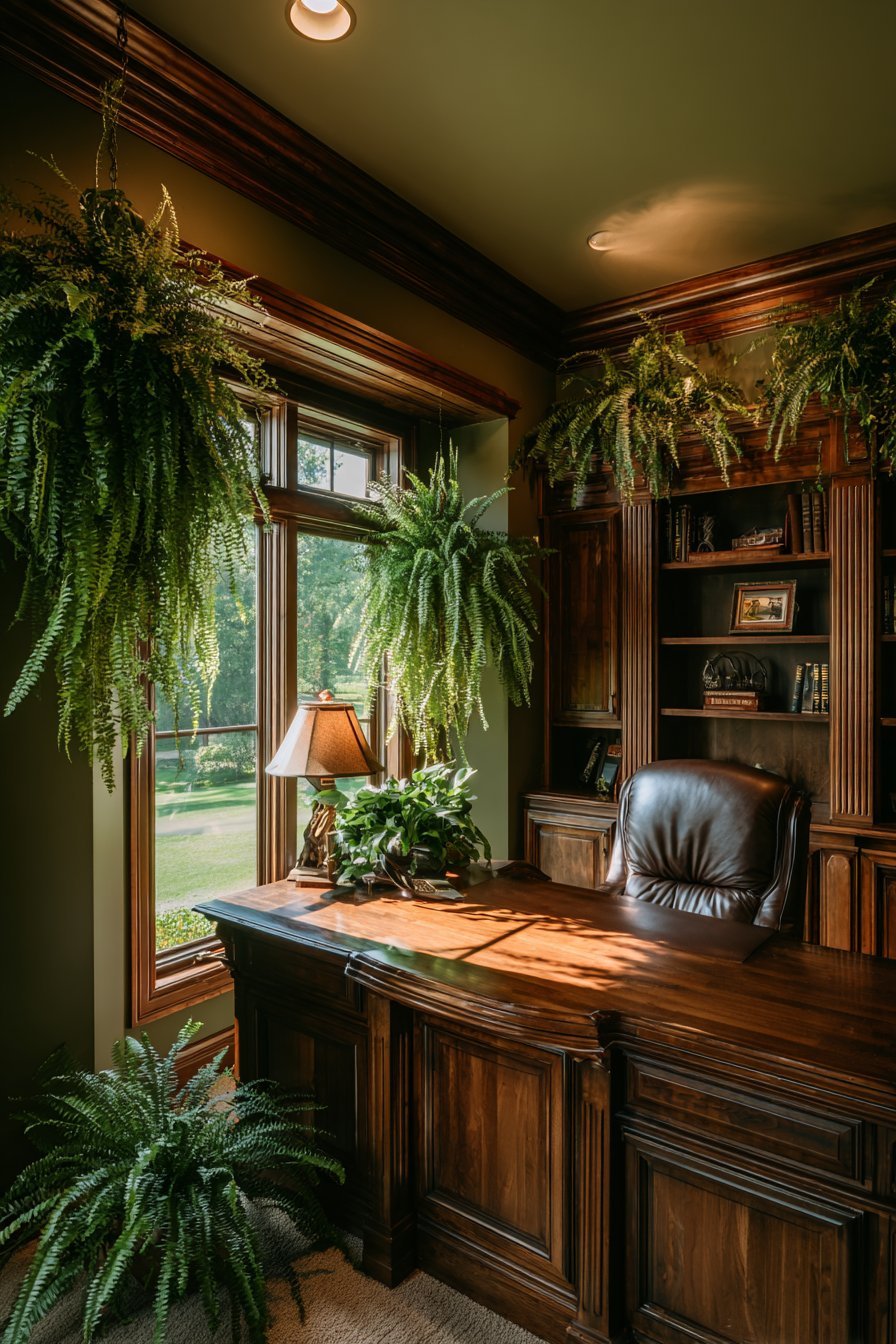
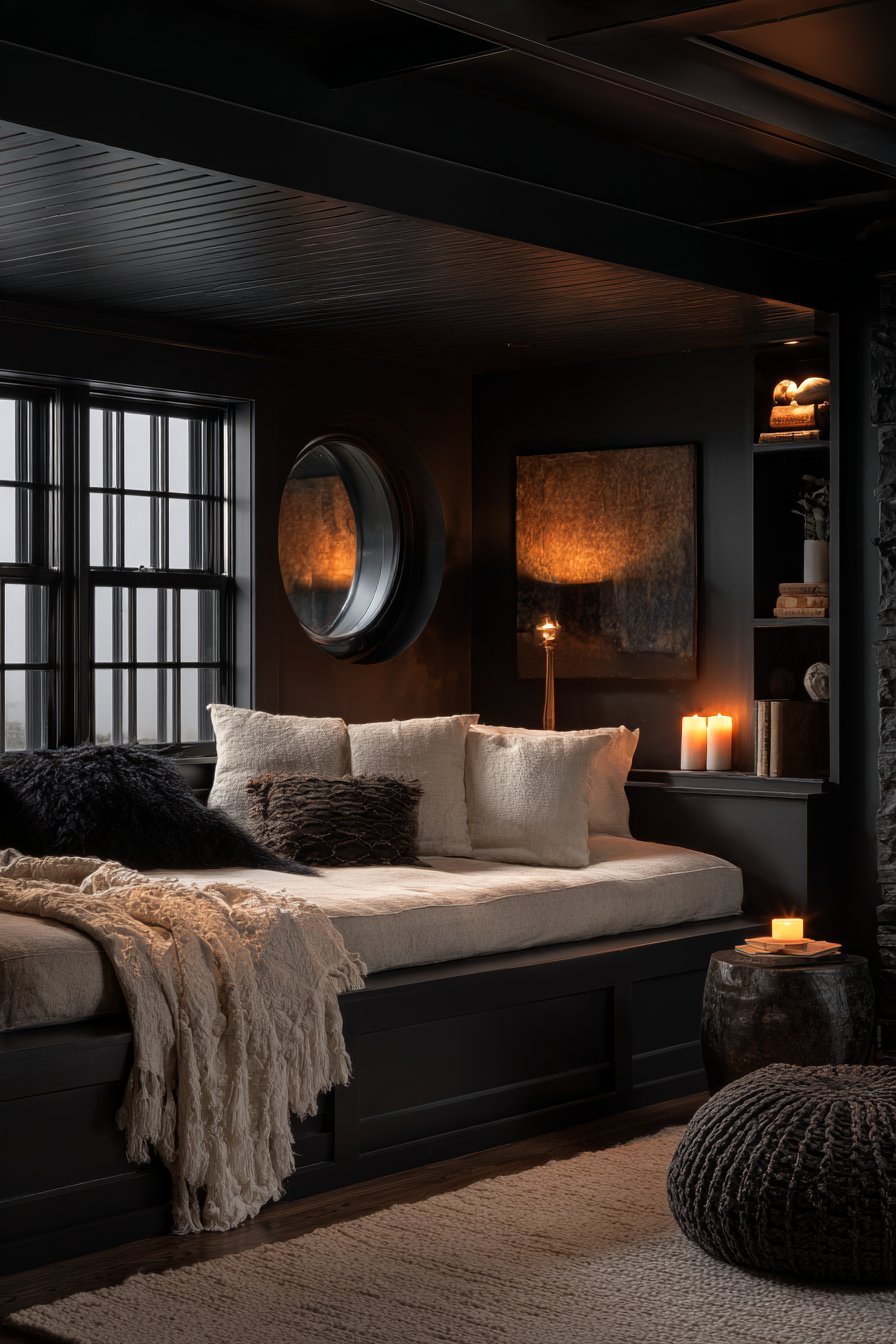
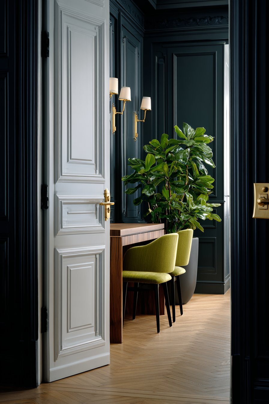
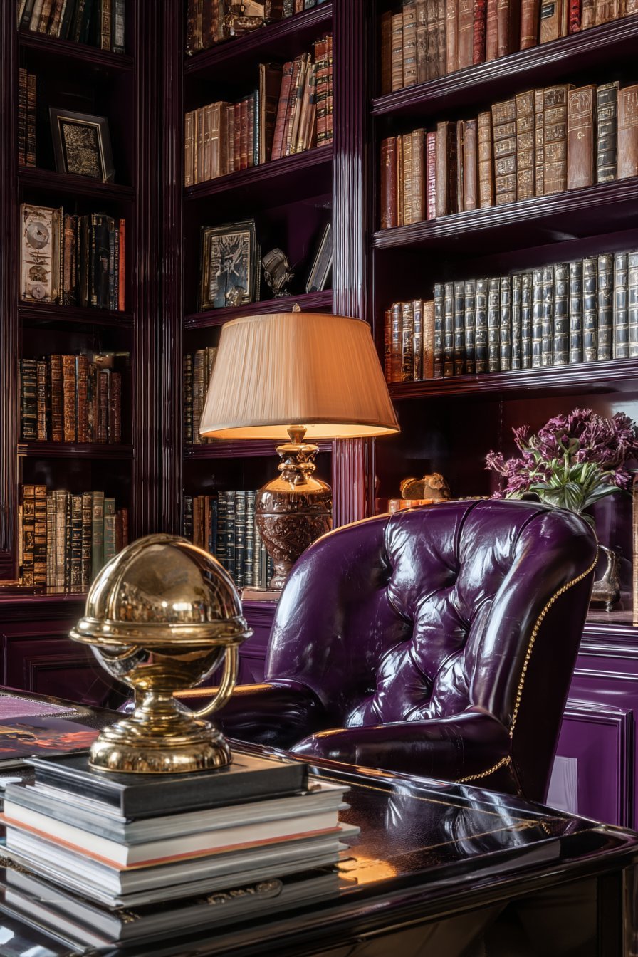
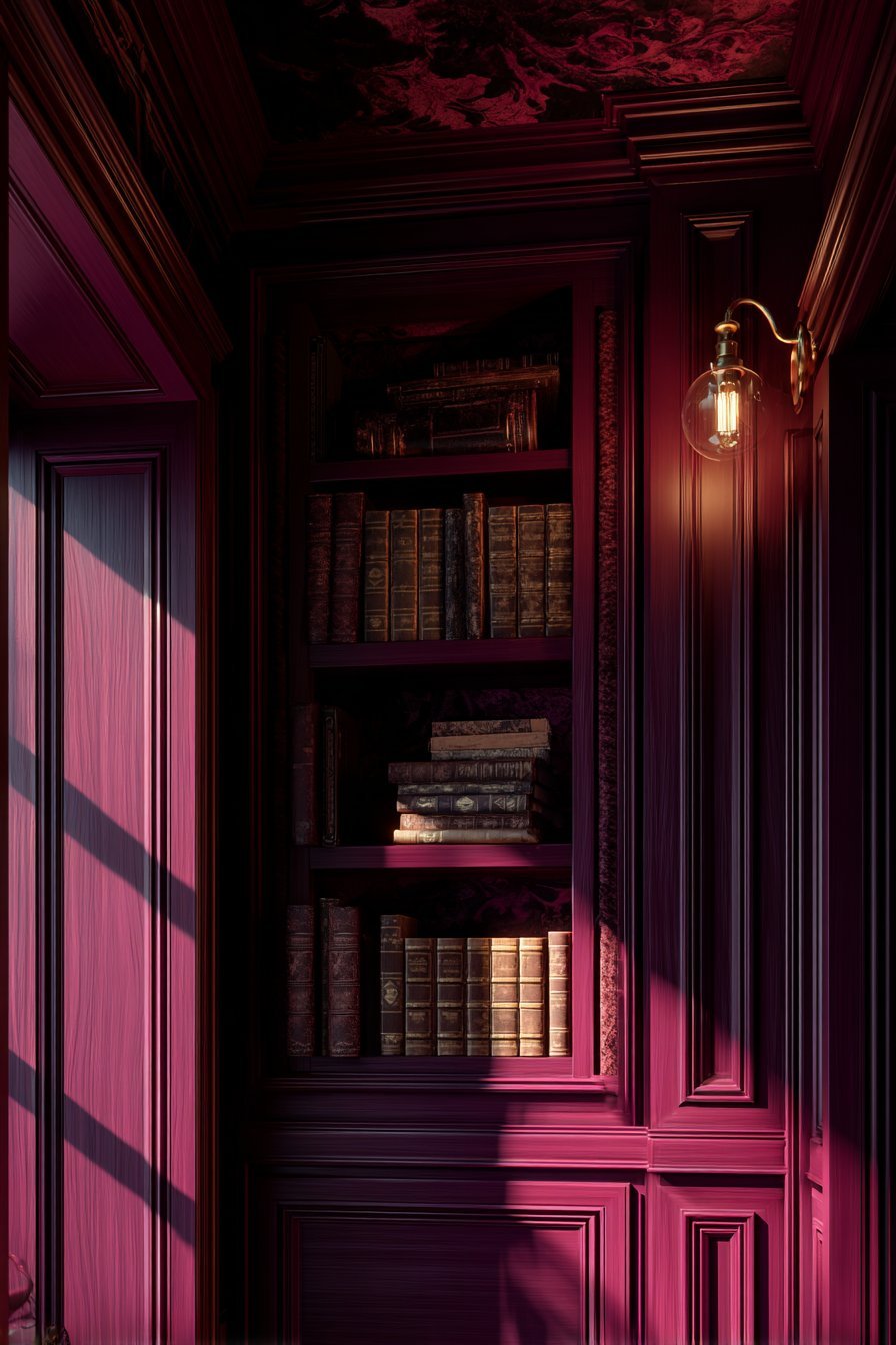
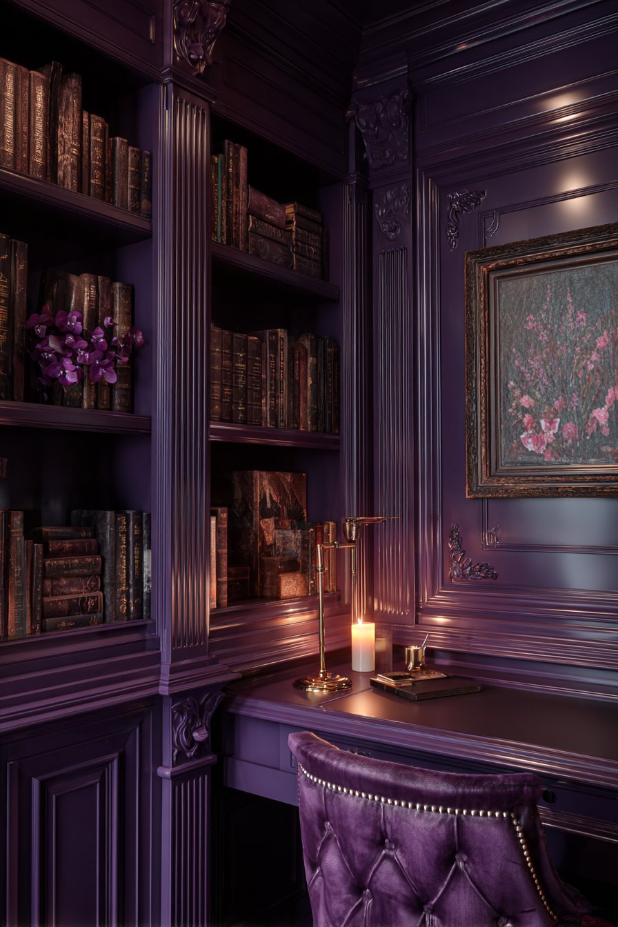
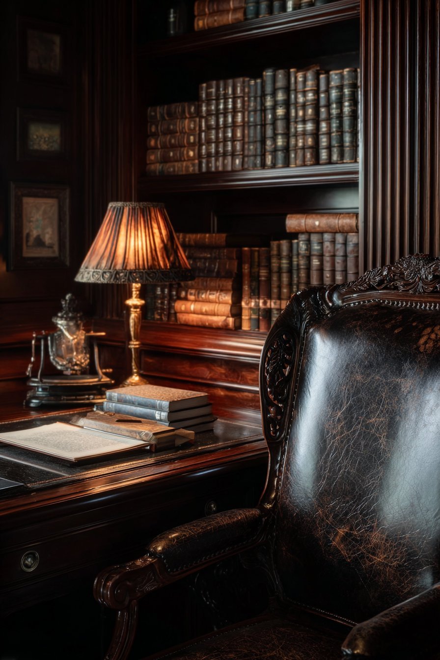
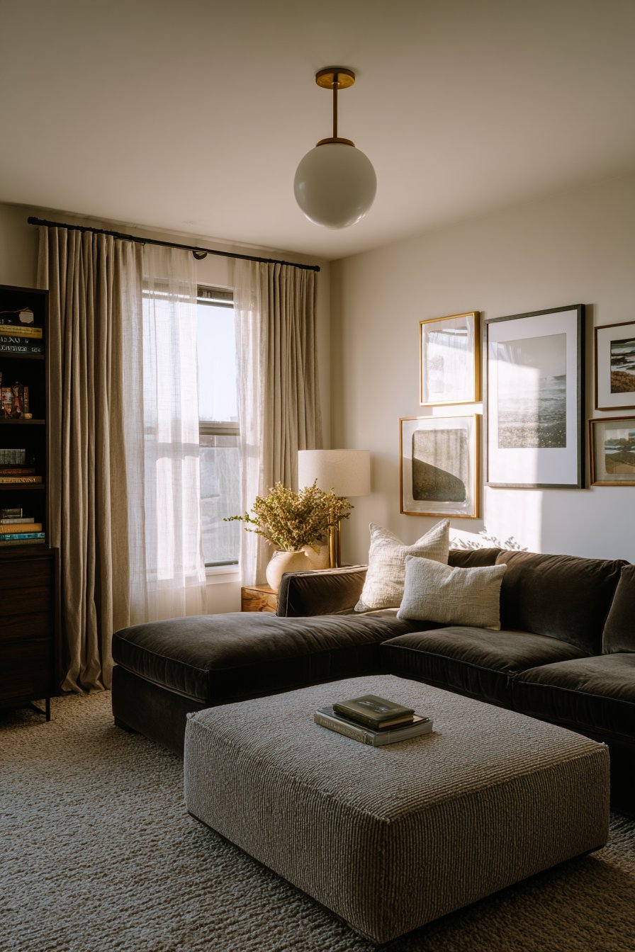
7. The Intimacy of Dark and Moody Color Drenching
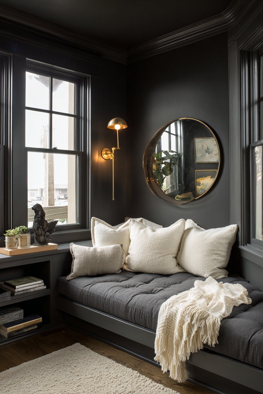
Dark color drenching is perhaps the most dramatic expression of this design technique. Colors like charcoal, deep plum, midnight navy, and black create rooms that feel intimate, cocooning, and theatrical. These shades absorb light rather than reflecting it, making spaces feel smaller and more enveloping — which can be a highly desirable quality.
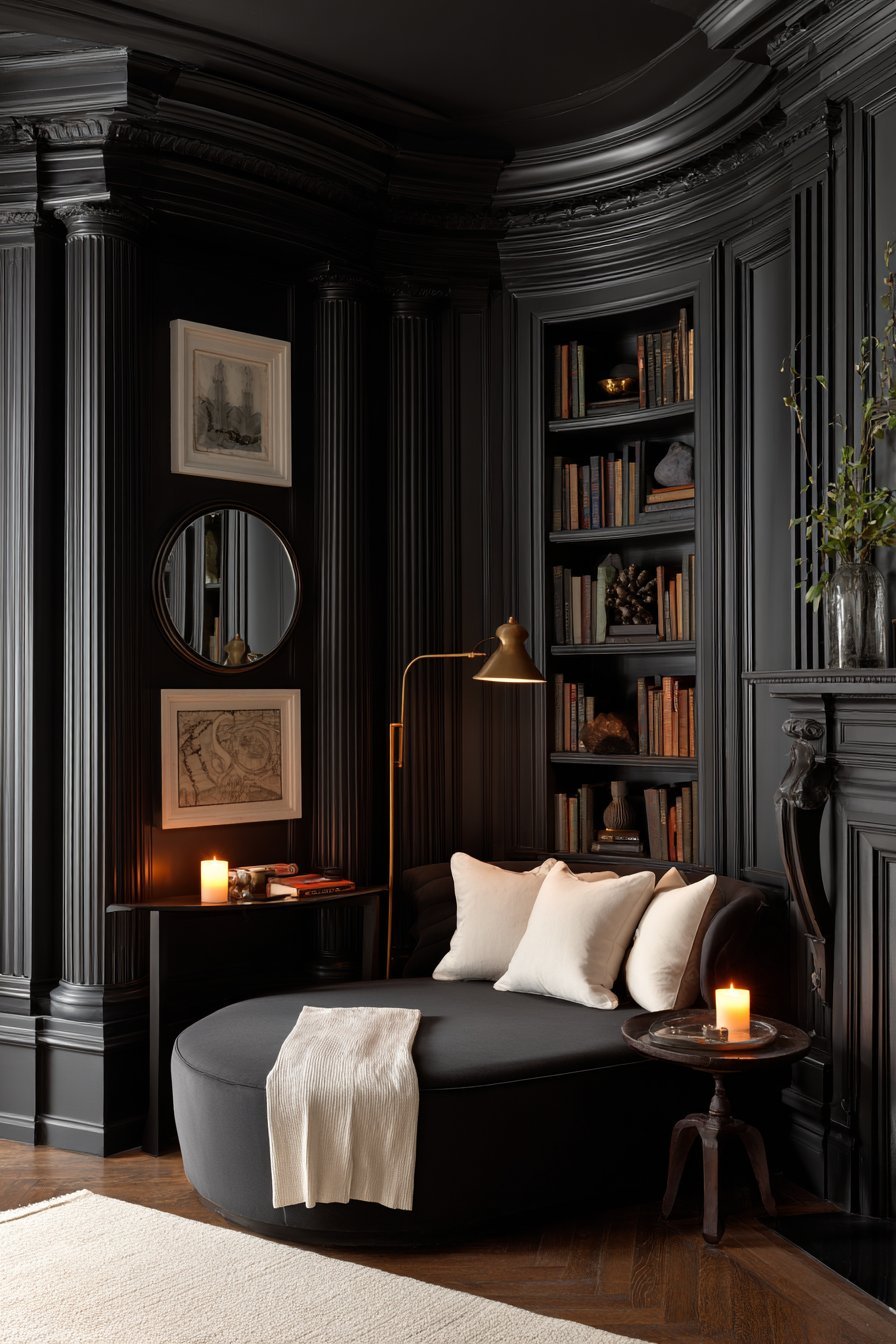
The psychology behind dark drenching is connected to the human instinct for shelter and protection. Darker environments trigger a sense of safety and enclosure. This is why dark-drenched bedrooms often feel extraordinarily restful. The room becomes a cave-like sanctuary, shielding the occupant from the outside world.
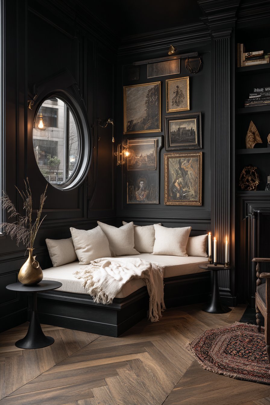
Dark drenching also has a remarkable effect on art and furnishings. Objects placed in a dark-drenched room become more visually prominent. Paintings pop off the wall. Sculptural objects appear more three-dimensional. The dark background functions like a stage set, making every object in the room a focal point.
- Use matte black or charcoal drenching in a bedroom for a deeply restful atmosphere
- Dark drenching works especially well in rooms with ample artificial lighting
- Layer multiple light sources — sconces, table lamps, floor lamps — in dark-drenched rooms
- Choose deep plum or aubergine for a romantic, opulent dining room aesthetic
- Do not fear dark colors in small spaces — they can make rooms feel intentionally intimate
- Balance dark drenching with light-colored textiles and reflective surfaces like mirrors
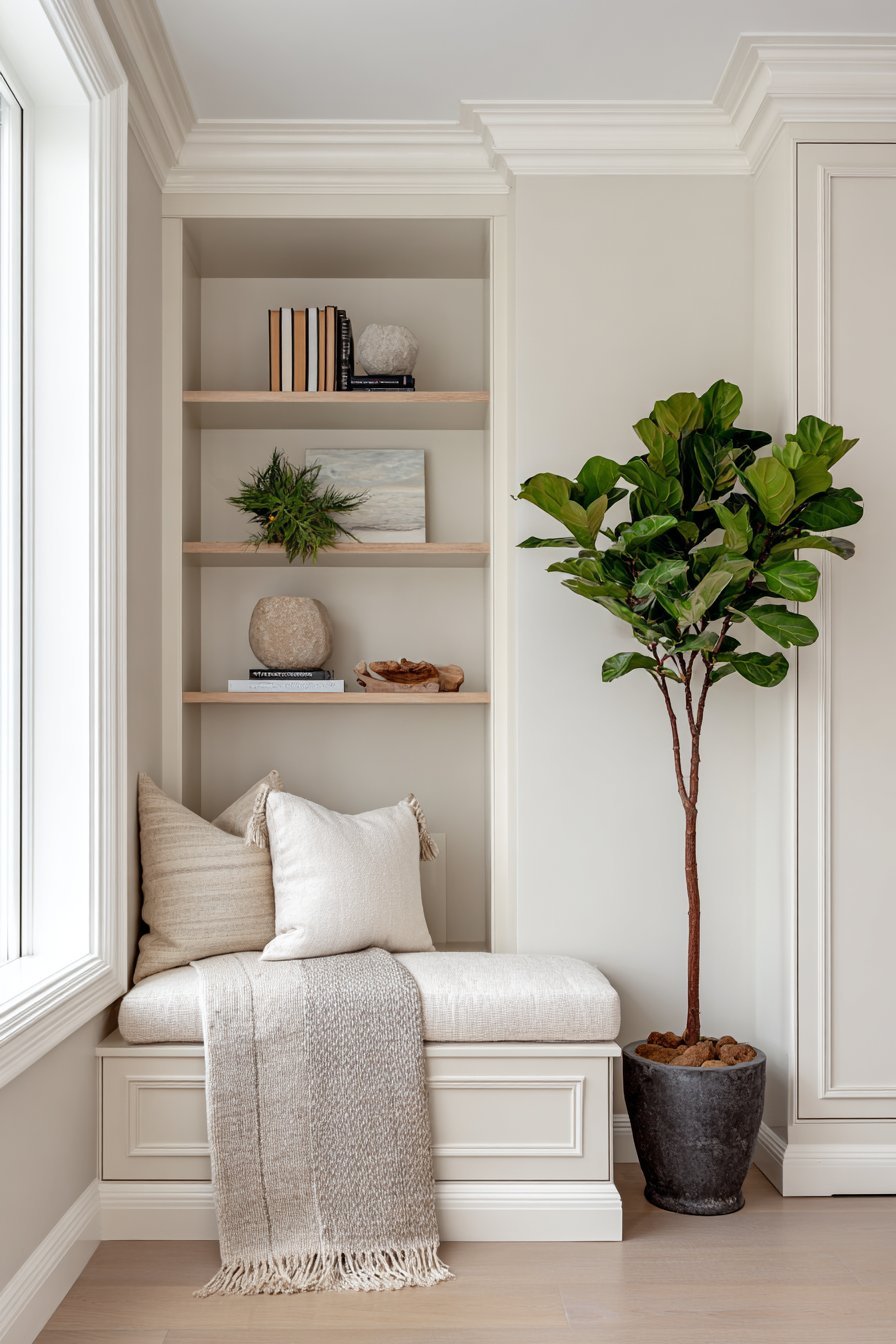
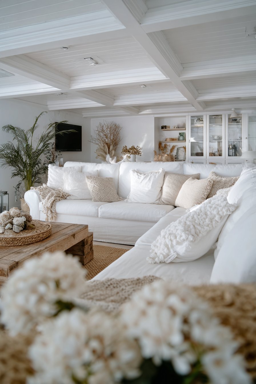
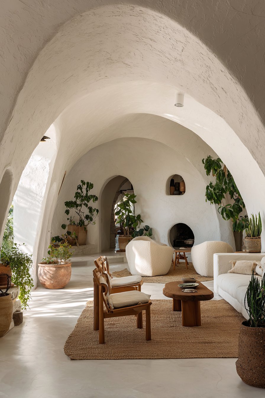
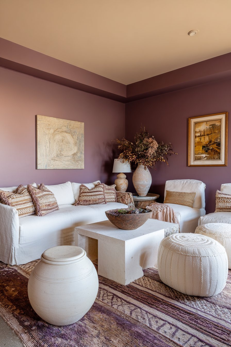
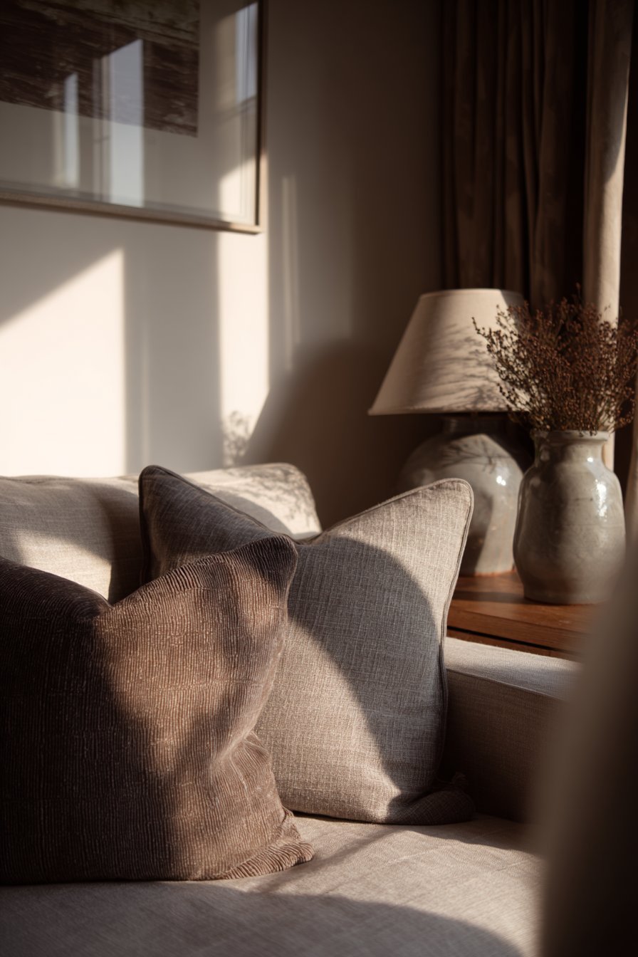
8. White and Neutral Drenching — The Psychology of Simplicity
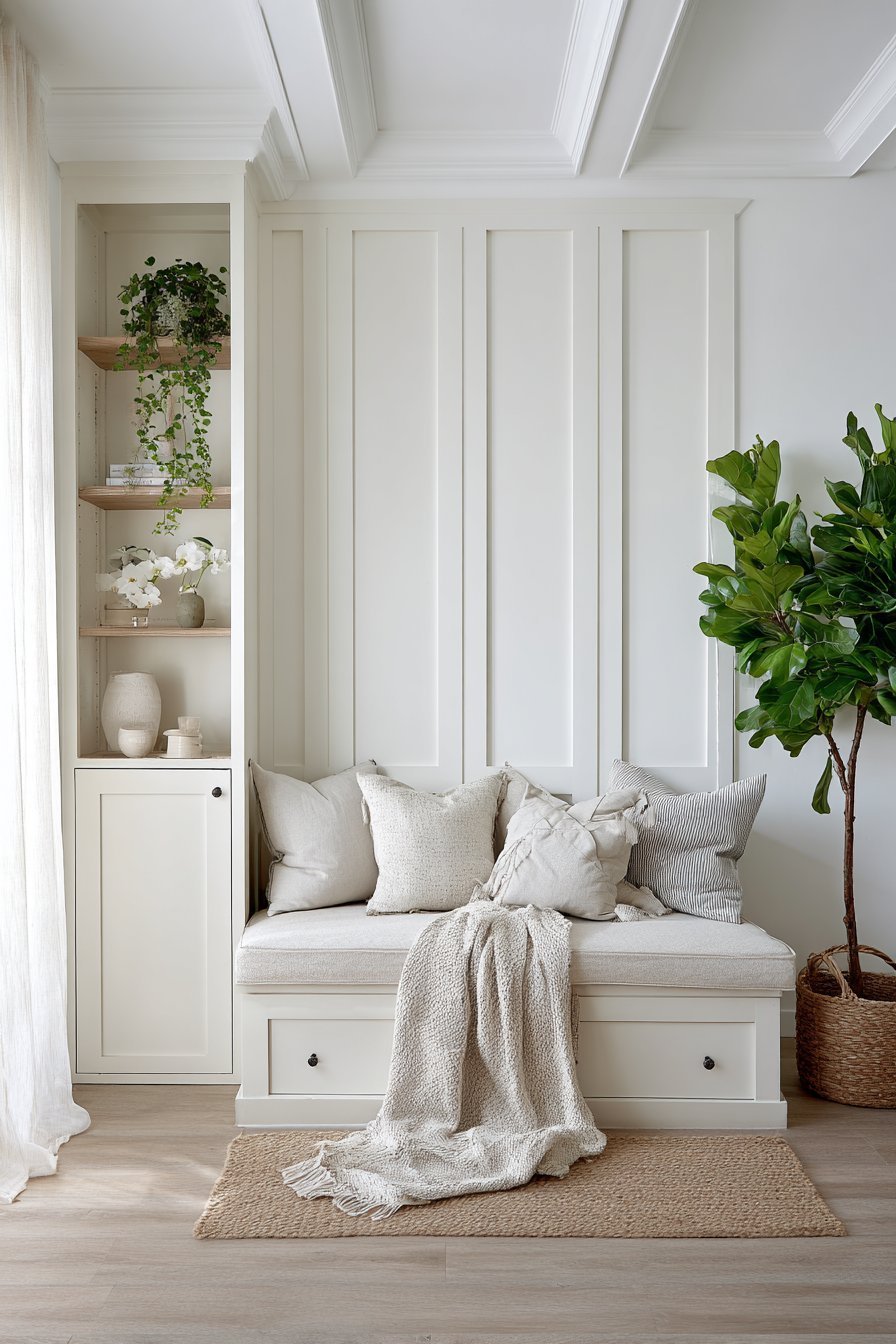
White drenching might seem like a contradiction — using a neutral to create an immersive experience. But all-white or warm neutral drenching is one of the most psychologically powerful approaches in interior design. It communicates clarity, purity, and openness. It is the visual equivalent of a deep breath.
The psychological effect of white and near-white drenching is a feeling of mental spaciousness. Clutter disappears visually. The mind relaxes. This is why white drenching is so popular in minimalist and Scandinavian-inspired interiors. It creates a blank canvas that feels inherently peaceful and undemanding.
Warm neutral drenching — using shades like warm white, cream, greige, or soft putty — adds the same sense of simplicity but with greater emotional warmth. These tones feel welcoming rather than clinical. They work beautifully in living rooms, bedrooms, and open-plan spaces where a sense of airy elegance is desired.
- Choose warm white over bright white to avoid a clinical, cold atmosphere
- Layer textures — linen, wool, jute — within a white-drenched space to prevent sterility
- Use tonal variation in whites (cool white ceiling, warm white walls) for subtle depth
- Keep accessories minimal in a white-drenched room to preserve the sense of calm
- Add organic elements like wood, stone, and plants to bring life to a neutral drench
- Consider warm putty or greige drenching as a sophisticated alternative to pure white
9. The Spatial Perception Effects of Color Drenching
One of the most fascinating aspects of color drenching is its ability to alter spatial perception. Color profoundly affects how large or small a room appears. Understanding this allows designers to use drenching strategically to solve architectural challenges.
Pale, cool-toned drenching — especially in blues, greens, and whites — creates a sense of visual expansion. Walls appear to recede. Ceilings feel higher. The room breathes. This technique is invaluable in smaller homes and apartments where creating a feeling of spaciousness is a priority. Light-drenched rooms trick the brain into perceiving more square footage than actually exists.
Conversely, dark and warm-toned drenching draws walls inward. This creates a sense of intimacy and enclosure that can be incredibly desirable in large, cavernous rooms that feel cold or unwelcoming. A dark drench can transform an oversized room into a warm, inviting space with a strong sense of human scale.
- Use pale blue or sage drenching to visually expand a small room or low-ceilinged space
- Apply dark drenching to large, cold rooms to create warmth and intimate atmosphere
- Drench ceilings in the same color as walls to remove the sense of a hard ceiling line
- Avoid using different colors on different surfaces if the goal is spatial expansion
- Use the same color on doors and trim to remove architectural breaks and unify the space
- Consult with a designer about color’s effect on your specific room’s proportions
10. Choosing the Right Finish for Psychological Impact
The finish you choose for a color drench is almost as important as the color itself. Paint sheen dramatically affects how a color is perceived and the emotional atmosphere it creates. Matte finishes absorb light, making colors feel deeper and more meditative. Glossy finishes reflect light, making colors feel brighter and more energetic.
For moody, contemplative spaces — bedrooms, studies, libraries — matte or flat finishes are the ideal choice. They create a velvety, enveloping quality that amplifies the psychological depth of the color. The surface almost seems to breathe. There is a tactile quality to matte paint that feels intimate and luxurious.
For more energetic or playful spaces — kitchens, bathrooms, hallways — a satin or eggshell finish is more appropriate. These finishes are also more practical in high-traffic areas as they are easier to clean. A subtle sheen adds a layer of vibrancy and light-reflectivity that keeps the color feeling fresh and alive.
- Use matte finish on walls and ceilings for a deep, meditative color drench
- Apply satin or eggshell on trim and woodwork for subtle tonal variation
- Consider a high-gloss finish for a small, dramatic powder room drench
- Avoid flat paint in kitchens and bathrooms where moisture and cleaning are concerns
- Test the same color in different sheens side by side before making a final decision
- Remember that glossy finishes amplify imperfections in walls, so surface preparation matters
11. The Role of Lighting in Color Drenched Spaces
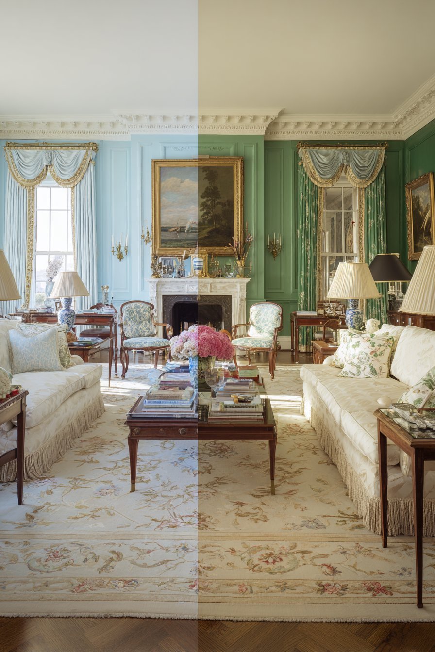
No conversation about color psychology and drenching is complete without addressing lighting. Light is the single most powerful variable in how a color reads in a room. The same paint color can look entirely different under warm incandescent light versus cool LED light. Understanding this relationship is critical to achieving your desired psychological effect.
Natural light quality varies dramatically by the direction a room faces. North-facing rooms receive cool, indirect light that can make colors appear more muted and grey-toned. South-facing rooms are bathed in warm, golden light that enriches warm tones and softens cool ones. East-facing rooms have bright morning light; west-facing rooms glow in warm afternoon and evening light.
Artificial lighting adds another layer of complexity. Warm-toned bulbs (2700K–3000K) enhance reds, oranges, yellows, and warm neutrals. Cool-toned bulbs (4000K and above) complement blues, greens, and grey tones. Layering multiple light sources at different heights in a color-drenched room creates dynamic visual depth and prevents the space from feeling flat.
- Always assess your paint color under the actual lighting conditions of the room
- Layer warm, ambient lighting to enhance the psychological warmth of a color drench
- Use dimmer switches in color-drenched rooms to control mood and atmosphere
- Add candlelight or firelight in dark-drenched rooms for a deeply atmospheric effect
- Avoid single overhead lighting in drenched rooms — it flattens the color and kills depth
- Consider color-temperature adjustable smart bulbs to shift the room’s mood throughout the day
12. Personalizing Your Color Drench — Making It Psychologically Yours
Ultimately, the most powerful color drench is one that resonates personally with the people living in the space. While color psychology provides a valuable framework, individual associations with color are deeply personal. Your positive emotional response to a color is the most important factor in choosing a drench.
Think about the colors that appear consistently in your wardrobe, art collection, and nature preferences. These are the colors your nervous system genuinely responds to. The colors you are drawn to instinctively are the ones that will create the most authentic and emotionally resonant drenched environments in your home.
Do not be afraid to trust your intuition alongside the science. Color psychology is a guide, not a rulebook. Some of the most successful color-drenched interiors exist because a homeowner followed their gut. The result is a space that feels deeply personal and authentically expressive — which is ultimately the highest goal of interior design.
- Reflect on your personal color memories and associations before choosing a drench color
- Consider the mood you want to feel every day when you enter the room
- Look to your existing belongings — art, textiles, nature — for color inspiration
- Work with a designer or color consultant if you feel uncertain or overwhelmed
- Commit fully once you have chosen — half-hearted drenching rarely achieves the intended effect
- Revisit and repaint if needed — color drenching is bold, but it is never permanent
Conclusion
Color drenching is one of the most psychologically rich and visually impactful techniques in modern interior design. By understanding the science and emotion behind each hue, you can create spaces that do far more than simply look beautiful. They can restore, energize, inspire, and protect the people who live within them.
The psychology behind color drenching rooms teaches us that our environments profoundly shape our inner lives. Every color choice is an opportunity to design not just a room, but an emotional experience. Armed with this knowledge, you are ready to drench your spaces with intention, confidence, and a deep understanding of color’s extraordinary power. Go bold, go immersive, and create the home that truly reflects who you are.