
Blush pink is one of the most beautiful, most versatile, and most universally beloved colors in nursery design. Soft, warm, and deeply nurturing, it creates an atmosphere of gentle comfort that feels perfectly suited to welcoming a new life into the world. Yet despite its popularity and its seemingly forgiving nature, blush pink is a color that can go wrong in a nursery context in surprisingly specific ways — producing results that feel flat, cold, overwhelming, or simply off in ways that are difficult to pinpoint without knowing exactly where the design went astray.
The difference between a blush pink nursery that takes your breath away and one that simply feels like a pink room lies almost entirely in the decisions made around the color rather than in the color itself. Shade selection, complementary tones, lighting choices, textile layering, and the balance between pink and non-pink elements all play critical roles in determining whether blush pink delivers its full, extraordinary potential or falls disappointingly short of the dreamy atmosphere it promises.
This article identifies the seven most common blush pink nursery mistakes — the specific, avoidable errors that consistently undermine this beautiful color’s potential in nursery environments. Understanding each mistake and its solution will help you design a blush pink nursery that is genuinely, memorably beautiful — one that feels as warm, calm, and deeply considered at midnight as it does in the golden light of a summer afternoon.
1. Choosing the Wrong Shade of Blush Pink
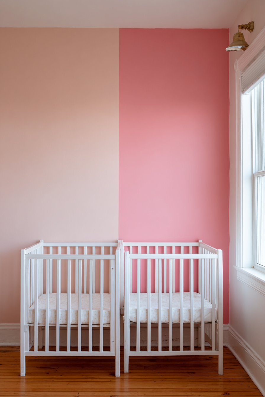
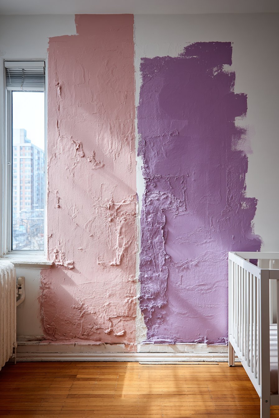
The single most consequential mistake in any blush pink nursery project is selecting the wrong shade of pink — and it is a mistake that is made far more often than most parents realize. The blush pink family is vast, and its members behave very differently on a nursery wall. Undertones make all the difference: a blush with cool purple undertones reads as lilac in certain lights; one with strong orange undertones shifts toward salmon or peach; and a pink with grey undertones can appear almost beige on north-facing walls in winter light.
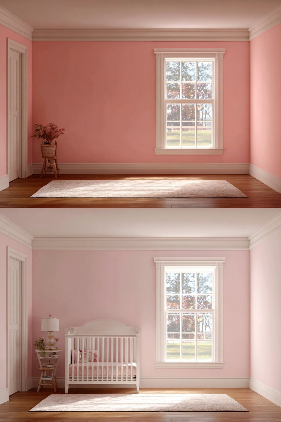
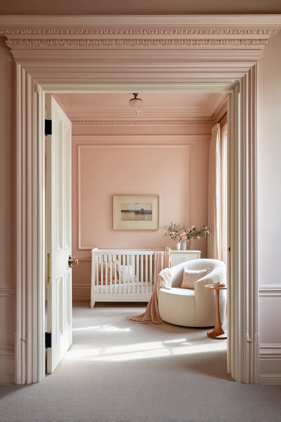
The specific pink you want for a calming, nurturing nursery environment is a warm, desaturated blush that carries subtle beige or grey-pink undertones without tipping decisively toward purple, orange, or true grey. This tone — variously described as antique pink, petal, dusty blush, or vintage rose in different paint ranges — has a quality of softness and depth that distinguishes it from its brighter, flatter relatives. It reads as undeniably pink in warm light while remaining sophisticated and almost neutral in cooler, greyer conditions.
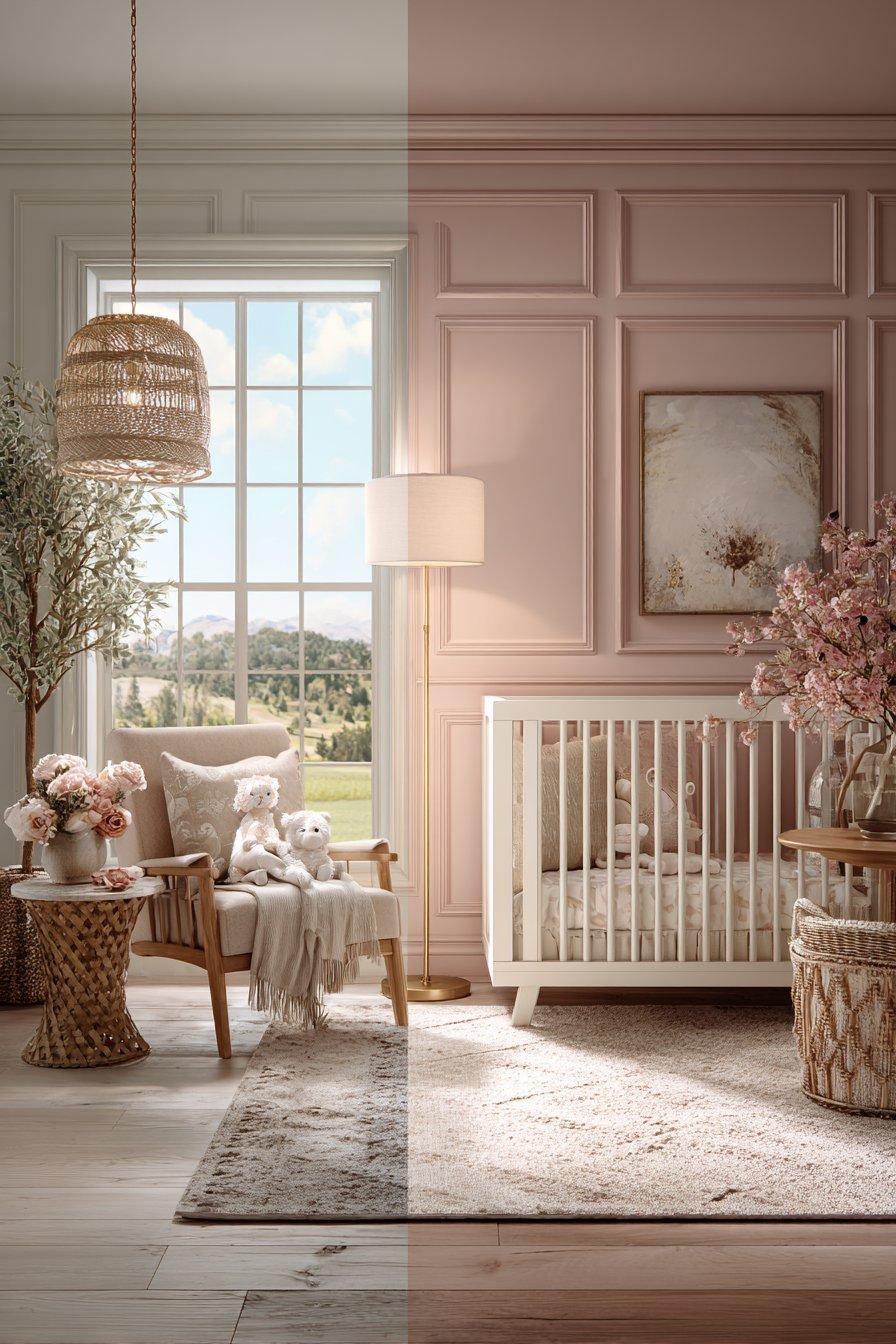
Testing paint samples is non-negotiable when selecting a blush for a nursery wall, yet it is one of the steps most commonly skipped by time-pressured expectant parents. A small paint chip held against a white card in a paint store reveals almost nothing about how a color will behave across an entire nursery wall. Paint a large sample — at least A3 size — directly onto the nursery wall and observe it at multiple times of day: early morning, midday, late afternoon, and under the room’s artificial lighting in the evening. Only then can you make a truly informed color decision.
- Choose a blush pink with warm beige or grey-pink undertones rather than cool purple or orange undertones
- Look for shades described as antique pink, dusty blush, petal, or vintage rose for the most sophisticated result
- Paint a large sample — minimum A3 size — directly on the nursery wall before committing
- Observe the sample in natural morning light, afternoon light, and evening artificial light before deciding
- Avoid bright, saturated pink tones — they introduce visual stimulation that works against nursery calm
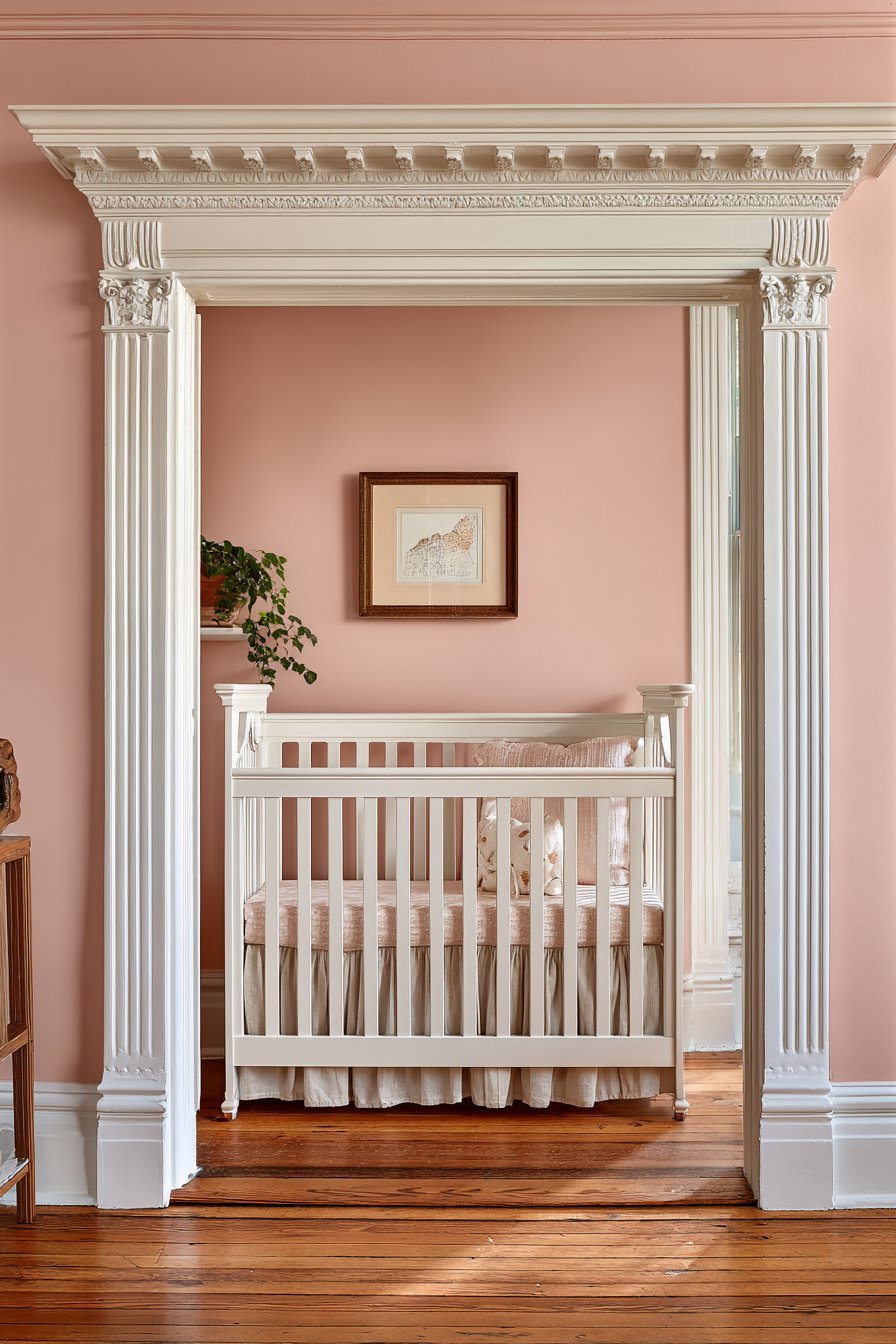
2. Pairing Blush Pink With the Wrong White
The white you pair with blush pink is almost as important as the blush itself — and choosing the wrong white is one of the most common and most visually damaging mistakes in blush nursery design. White is never simply white; every white paint contains undertones of blue, green, yellow, pink, or grey that interact profoundly with the colors around them. A white with cool blue undertones paired with a warm blush pink creates an uncomfortable visual tension that makes the pink appear more orange and the white appear distinctly chilly.
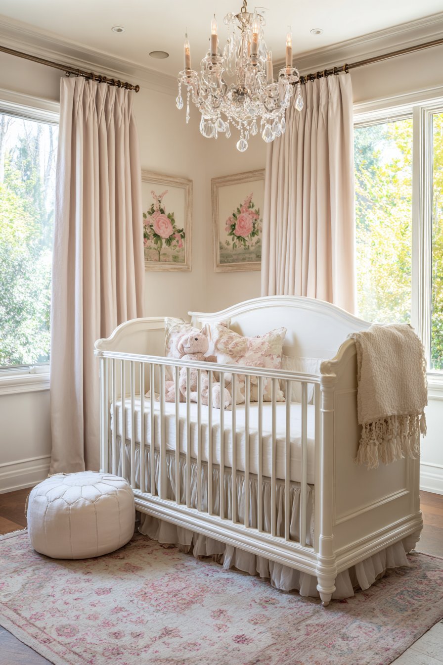
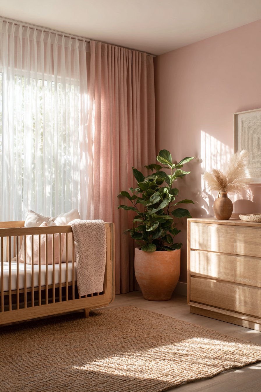
The correct white for a blush pink nursery is always a warm white — one with subtle undertones of yellow, beige, or the faintest blush. These warm-toned whites — often described as linen white, antique white, cream, or oyster — harmonize with blush pink to create a unified, enveloping warmth that makes the entire room feel like a single, cohesive color world. The distinction between the blush wall and the warm white trim becomes gentle and harmonious rather than sharp and contrasting.
This pairing principle extends to all white elements in the nursery — furniture, ceiling paint, textile bases, and architectural trim. A blush pink wall paired with a brilliant white gloss on the skirting and door frames will always feel slightly wrong without the viewer being able to immediately identify why. The cold brightness of brilliant white creates a visual jolt every time the eye moves between the warm blush wall and the cool white trim — an almost subliminal discomfort that undermines the room’s ability to feel truly calming and cohesive.
- Always pair blush pink walls with a warm white — linen, antique white, cream, or oyster
- Avoid brilliant white or whites with cool blue undertones anywhere in a blush pink nursery
- Apply the warm white consistently to ceilings, trim, skirting, door frames, and white furniture
- Test your chosen white alongside your chosen blush on the actual nursery wall before committing
- Use the same warm white family across all painted surfaces for a seamlessly unified color environment
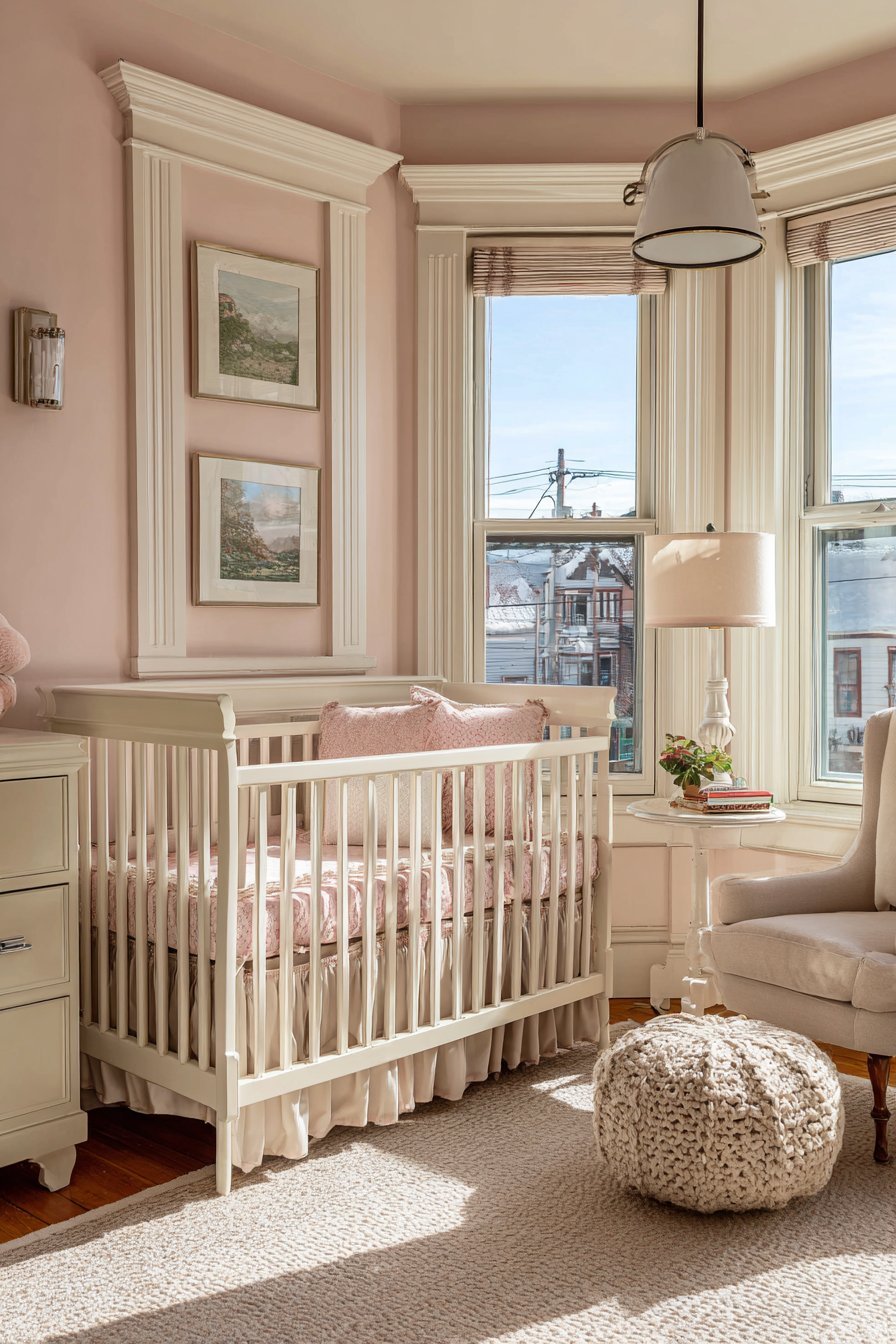
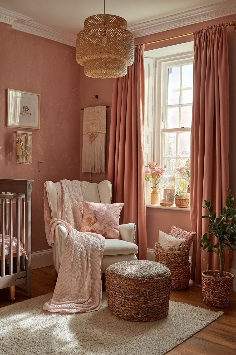
3. Using Too Much Pink Without Sufficient Balance
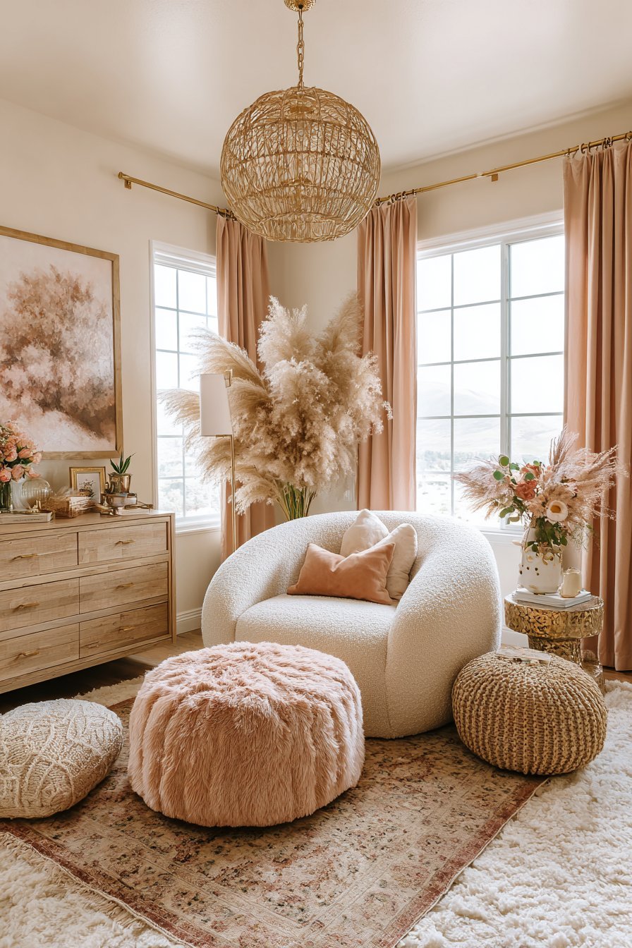
The most visually overwhelming blush nurseries are almost always the result of applying pink to every surface and filling every element with more pink — pink walls, pink curtains, pink rug, pink furniture, pink accessories — until the room has no visual breathing room and the color that was meant to feel soft and nurturing has become relentlessly, almost aggressively pink. Too much of any single color, regardless of how beautiful that color is, creates a visual monotony that is actually more stimulating and less restful than a thoughtfully balanced palette.
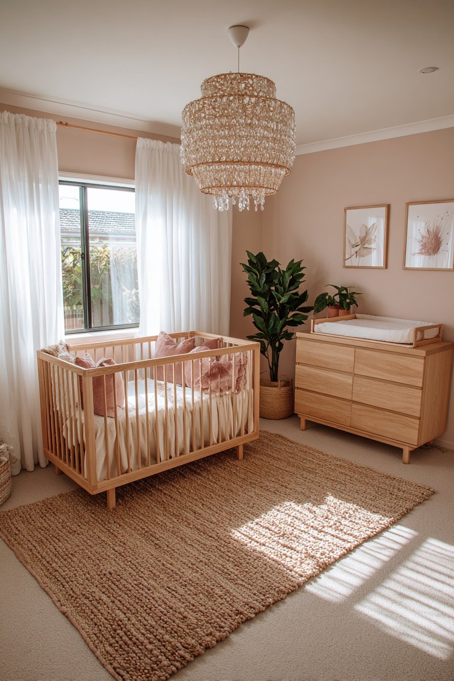
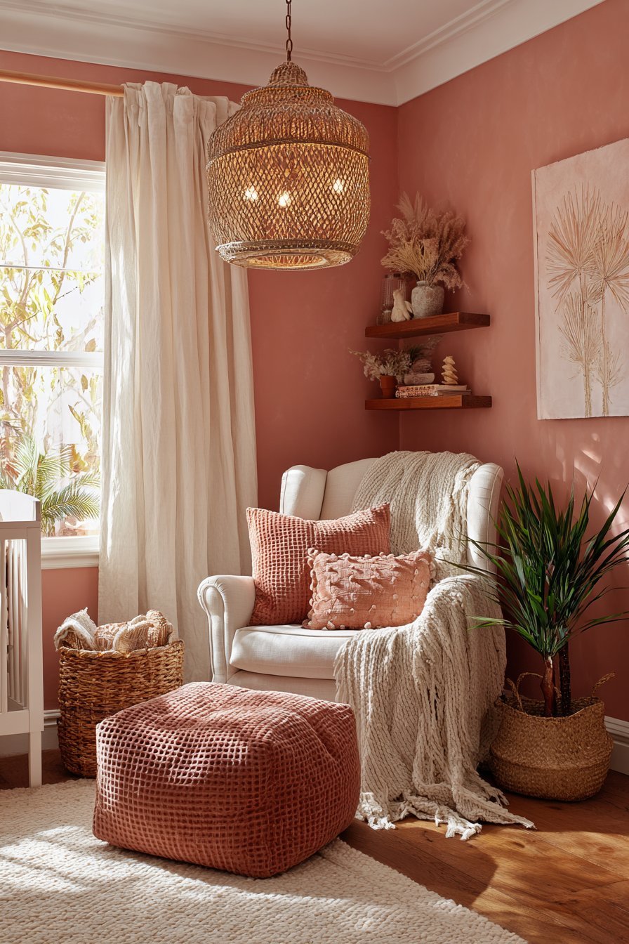
The 60-30-10 rule is the most reliable guide to color balance in any room, and it applies with particular force in a nursery context. Use blush pink as your dominant tone — approximately 60% of the visual environment — through wall color and one or two large textile pieces. Introduce a secondary tone — warm white, sage green, natural timber, soft terracotta — across approximately 30% of the room through furniture, curtains, and larger accessories. Reserve the final 10% for accent color details that add the final layer of visual interest and personality.
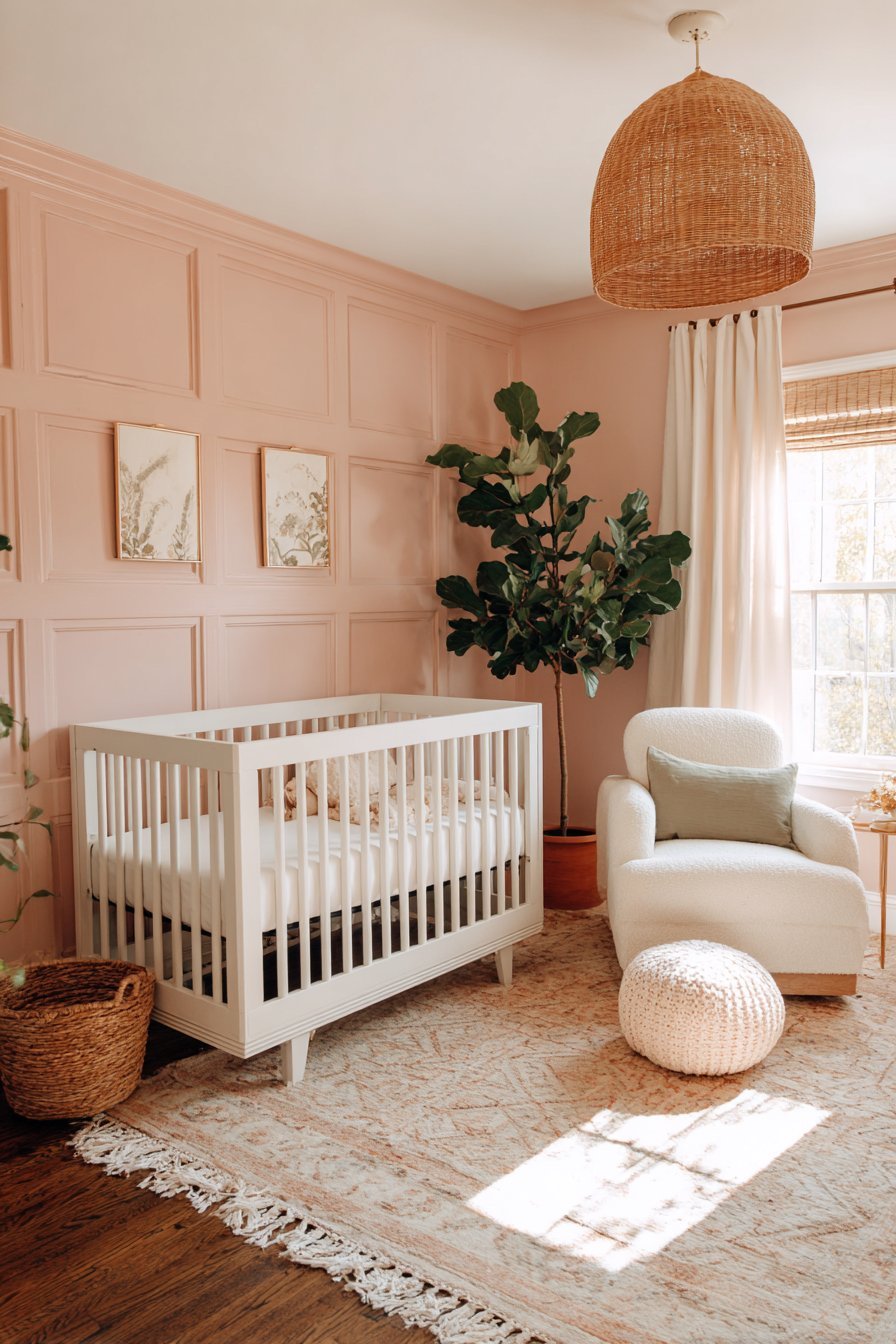
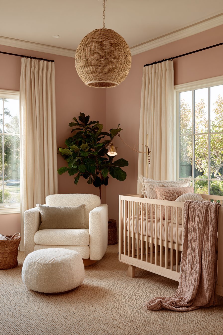
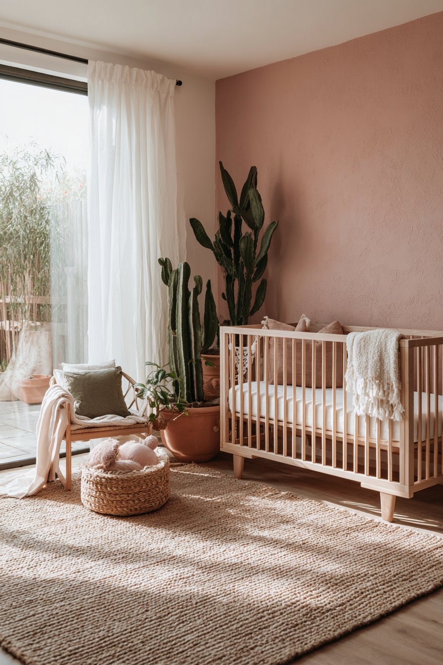
Non-pink elements are not compromises in a blush nursery — they are essential contributors to the pink’s beauty. A natural timber crib against a blush wall makes the pink look warmer and more sophisticated than a white crib against the same wall. Sage green cushions on a blush nursing chair make both the sage and the blush appear more beautiful than either would in isolation. The contrast and complement provided by non-pink elements is precisely what allows blush to do its best visual work — it is the space between the pink that gives the color room to breathe and be truly seen.
- Apply the 60-30-10 rule — 60% blush, 30% secondary tone, 10% accent details
- Introduce natural timber, sage green, warm white, or soft terracotta as essential non-pink elements
- Use blush on walls and one or two large textiles — not on every surface simultaneously
- Choose a natural timber or white-painted crib to provide visual relief against the blush walls
- Treat non-pink elements as contributors to the blush’s beauty, not as compromises of the pink vision
4. Neglecting the Impact of Artificial Lighting on Blush Pink
Lighting transforms blush pink more dramatically than it affects almost any other nursery color — and designing a blush nursery without thinking carefully about both natural and artificial lighting is one of the most common reasons beautiful blush pink rooms end up looking flat, washed out, or strangely orange after dark. The quality, color temperature, and placement of your lighting determines how the blush appears during the hours when you will use the nursery most intensively — the early morning feeds, the evening bath and bedtime routine, and the nighttime settling sessions.
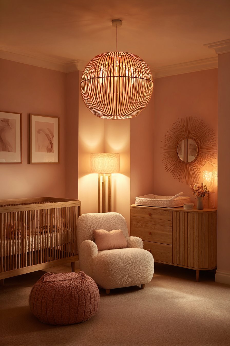
Cool white or daylight-spectrum artificial lighting — bulbs in the 4000K to 6500K range — is one of the most damaging things you can introduce into a blush pink nursery. These cool-toned light sources strip the warmth from blush pink, causing it to appear flat, grey-tinged, and almost hospital-like in the evenings. The blush tones that looked warm and beautiful in natural afternoon light suddenly appear cold and clinical under cool white overhead lighting — a transformation that surprises and disappoints many parents who did not test their paint color under artificial lighting before committing.
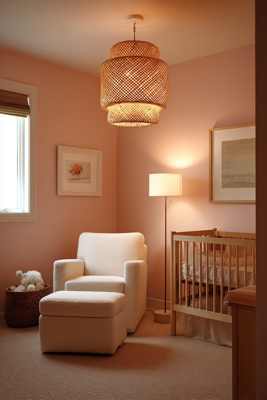
The solution is consistent warm-spectrum lighting throughout the nursery — bulbs in the 2200K to 2700K range that emit the golden, amber-tinged light that enhances every warm tone in the room, making blush walls glow with richness, timber furniture deepen with honey warmth, and cream textiles radiate with soft luminosity. Install dimmer switches on all overhead lighting and layer the room’s light sources — overhead pendant, nursing chair lamp, and nightlight — so that the room can shift from moderately bright during the day to deeply warm and dim during the evening settling routine.
- Install warm-spectrum LED bulbs throughout the nursery — 2200K to 2700K range only
- Never use cool white or daylight-spectrum bulbs in a blush pink nursery at any light point
- Test blush paint samples under the room’s actual artificial lighting before making a final color commitment
- Install dimmer switches on all overhead lighting for flexible atmosphere control throughout the day
- Layer light sources — ceiling, floor lamp, nightlight — to create a warm, graduated lighting environment
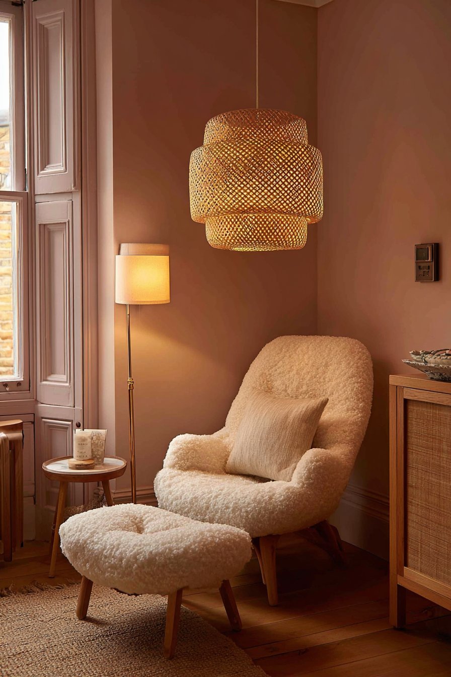
5. Ignoring Texture and Relying Solely on Color
A blush pink nursery that relies entirely on color without investing in textural variety is one of the most common design disappointments in this style — and one of the most easily avoided. A flat, single-texture environment, regardless of how beautiful its color, feels one-dimensional and cold in a way that no amount of additional pink can remedy. Texture is what gives a room its tactile warmth — the quality of depth and richness that makes a space feel genuinely cocooning rather than merely painted.
The most beautiful blush nurseries layer texture relentlessly — waffle-knit cotton blankets draped over bouclé nursing chairs, linen curtains filtering light across textured plaster walls, a plush rug meeting smooth timber floorboards, embroidered cushions piled against velvet ones. Each textural layer catches the light differently, creates different shadows, and contributes a different kind of visual and tactile richness that a flat, smooth environment simply cannot offer. The collective effect of these layered textures is what creates the warm, enveloping, deeply comfortable atmosphere that the best blush nurseries are known for.
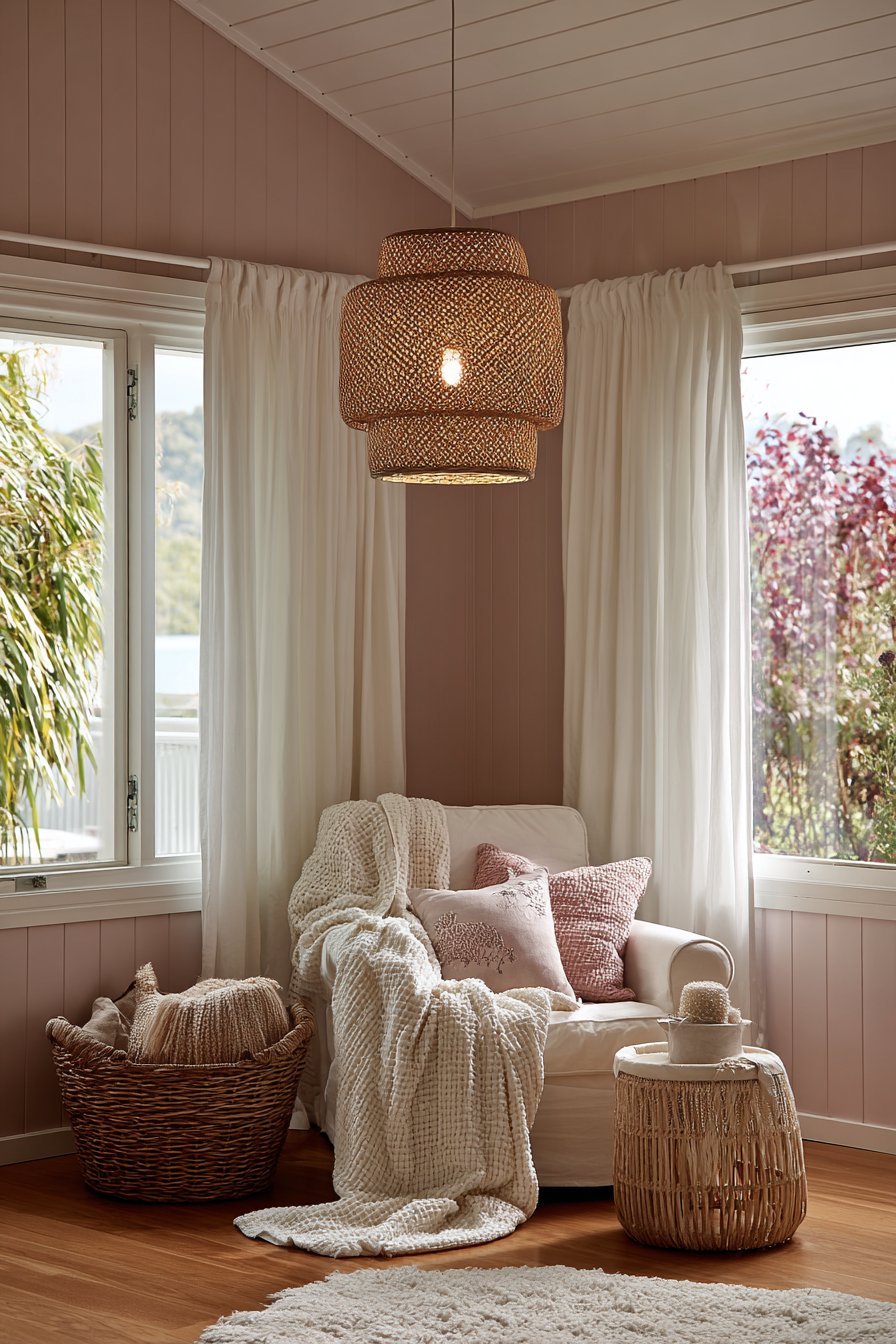
The nursery wall itself is one of the most overlooked opportunities for introducing texture. A flat emulsion finish on a smooth plaster wall is the most common approach — and the one that least serves the blush pink’s potential. A limewash finish, a textured specialist paint, or a quality embossed wallpaper used as the backdrop for the blush color introduces a layer of visual complexity that makes the pink appear deeper, richer, and more sophisticated than it ever could on a perfectly smooth surface. The way textured walls catch and scatter light creates a living, shifting quality that transforms the nursery atmosphere entirely.
- Layer multiple textures — waffle knit, bouclé, linen, velvet, embroidery — across all nursery textiles
- Choose a textured wall finish — limewash, specialist texture paint, embossed wallpaper — for the blush walls
- Combine smooth surfaces (polished timber, ceramic) with rough surfaces (jute, rattan, wicker) for contrast
- Invest in a quality, plush rug as the foundational floor texture — it adds warmth underfoot and visually
- Never rely on color alone to create atmosphere — texture is what makes a room feel genuinely luxurious
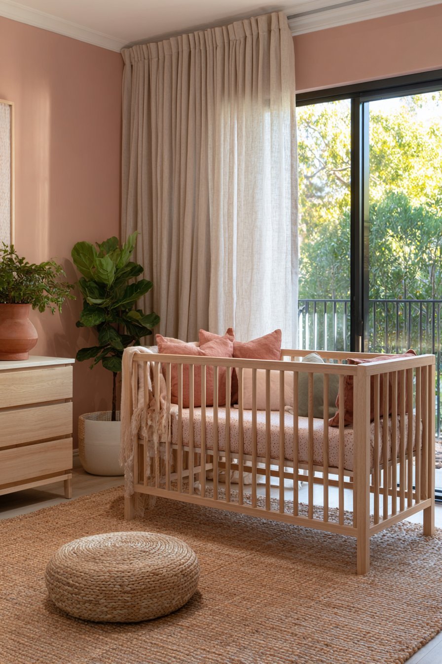
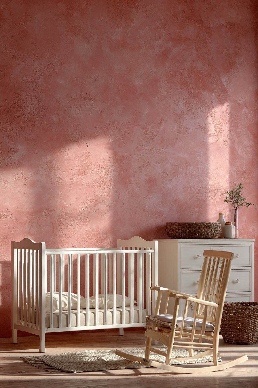
6. Choosing Blush Pink Furniture Instead of Contrasting Pieces
One of the subtler but most consistent blush nursery mistakes is selecting blush pink or pale rose furniture to match the blush wall color — an instinct that seems logical but produces a result that is visually flat, poorly defined, and lacking the contrast and depth that makes a nursery feel beautifully designed. When furniture blends into a same-color wall, the room loses its architectural definition — the visual separation between surfaces that gives a space its sense of structure, proportion, and composed beauty.
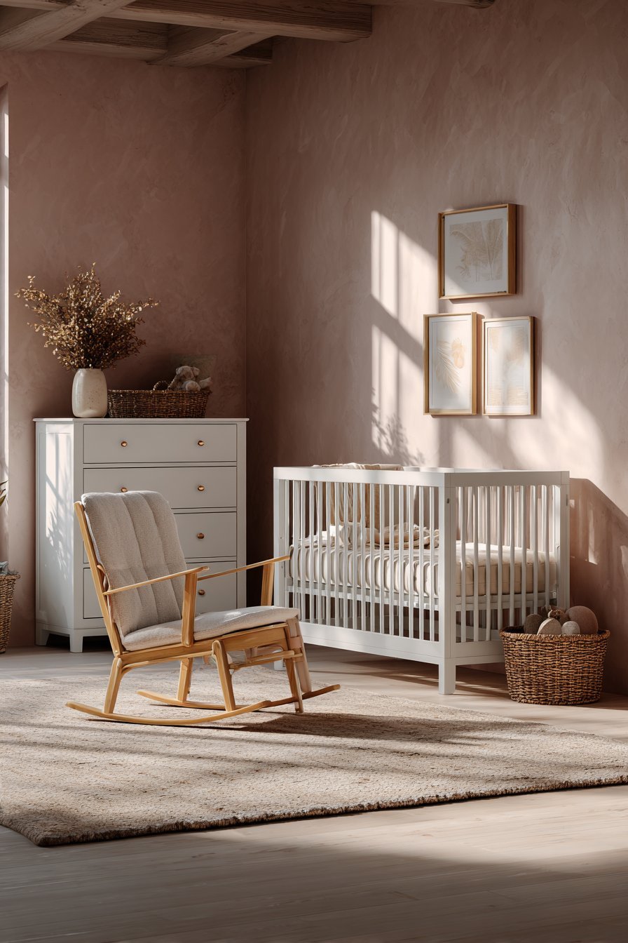
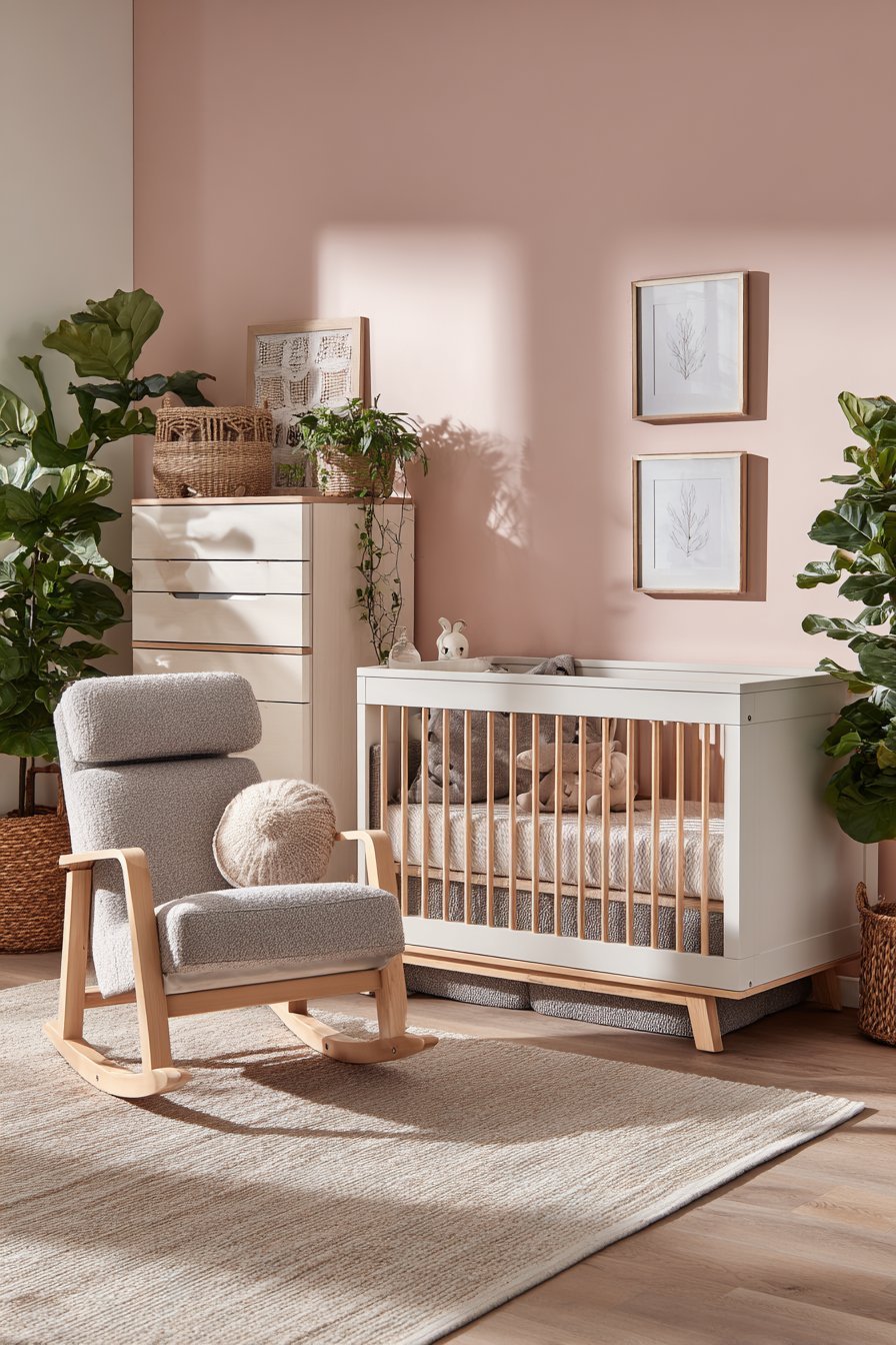
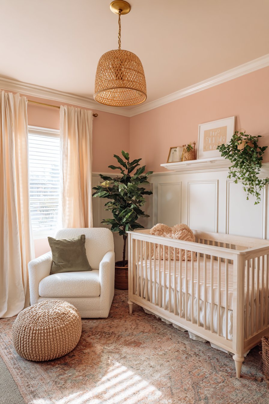
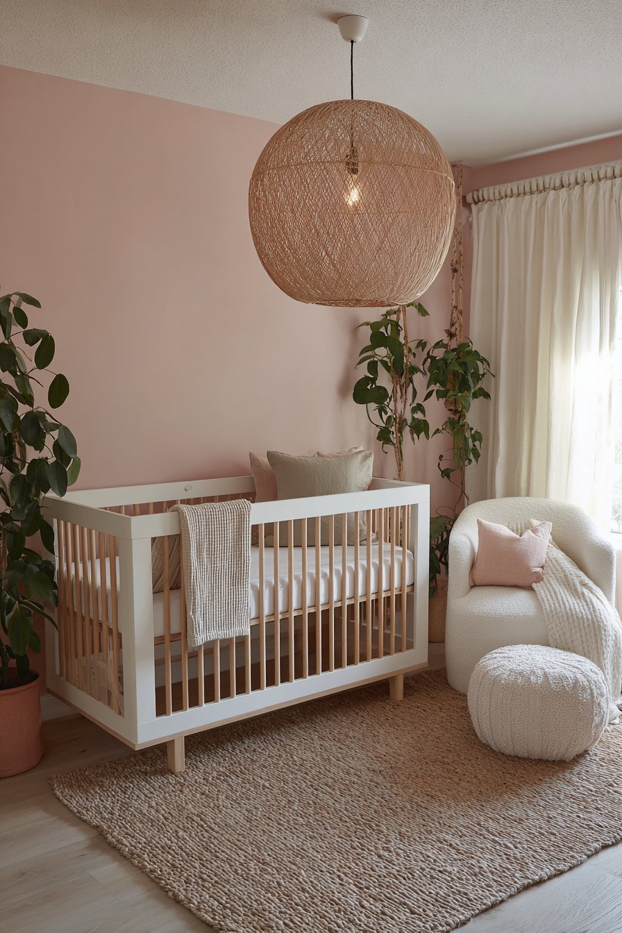
White-painted furniture against a blush wall is the most classic and most reliable combination — the crisp, warm white of the furniture creating a clean visual separation from the blush while remaining completely harmonious within the warm color palette. This contrast gives the crib, dresser, and wardrobe visual weight and presence that same-color furniture against a same-color wall completely lacks. The room reads more clearly, the furniture appears more intentional, and the blush wall color appears richer and more beautiful against the white contrast.
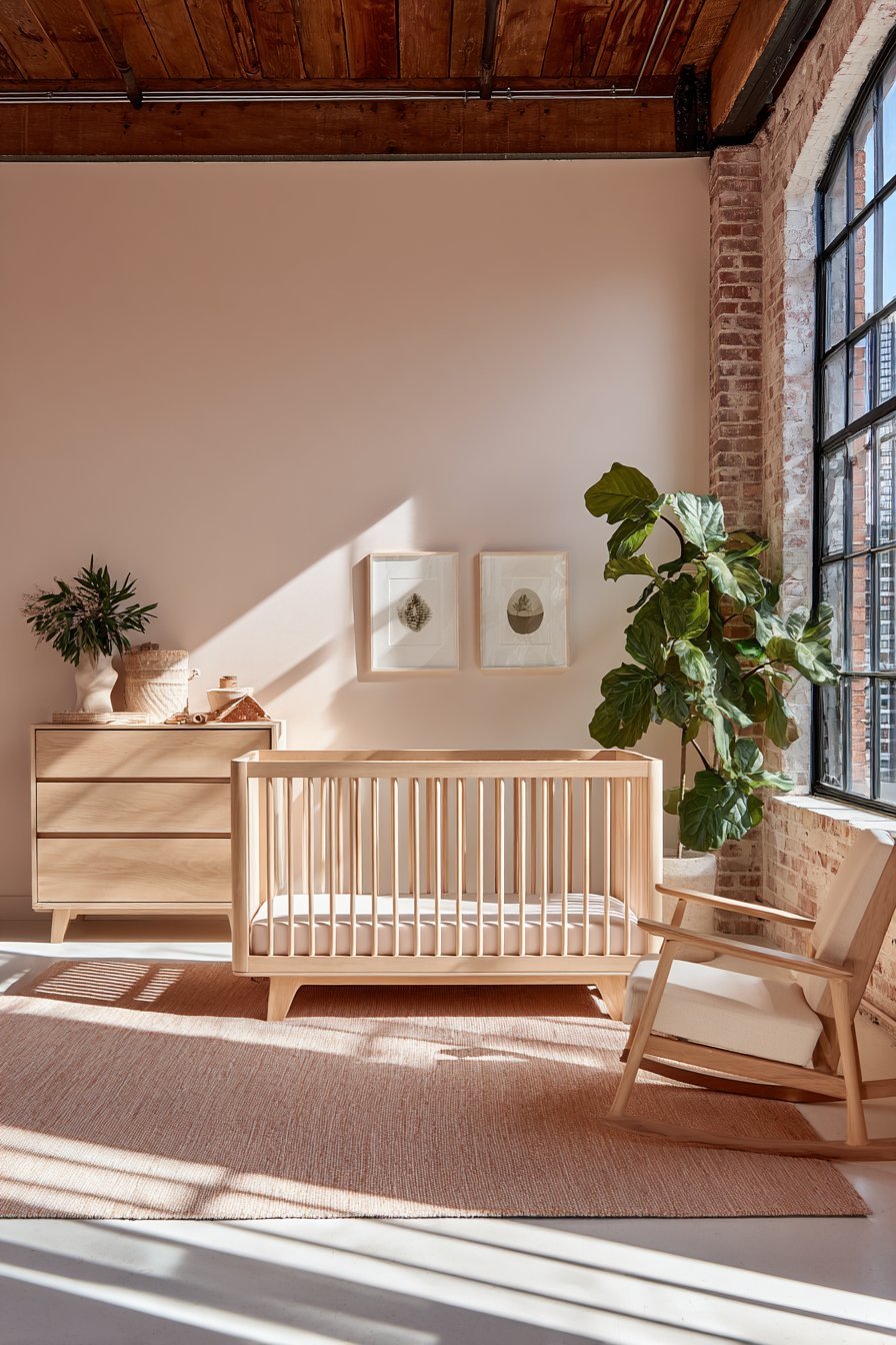
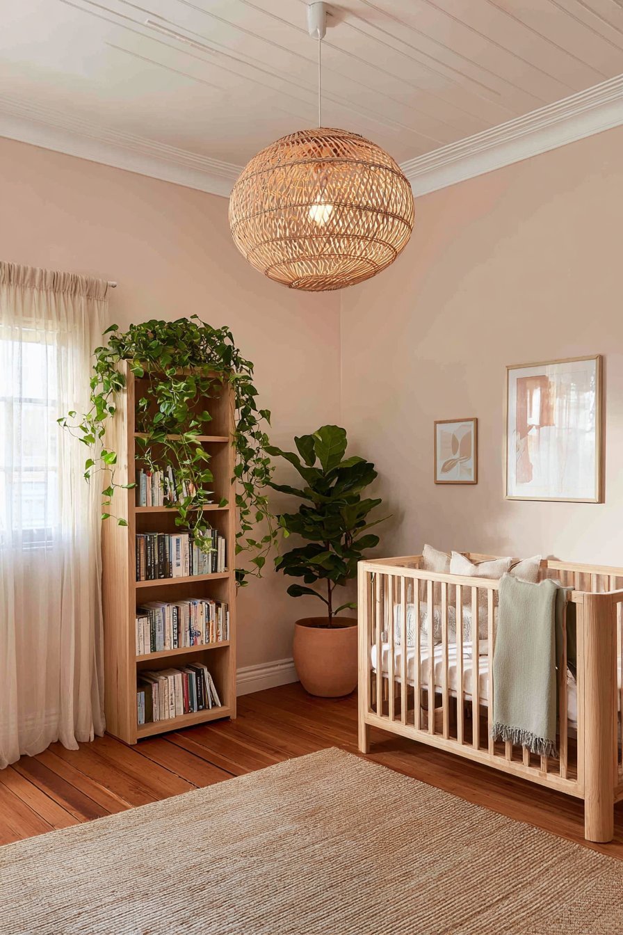
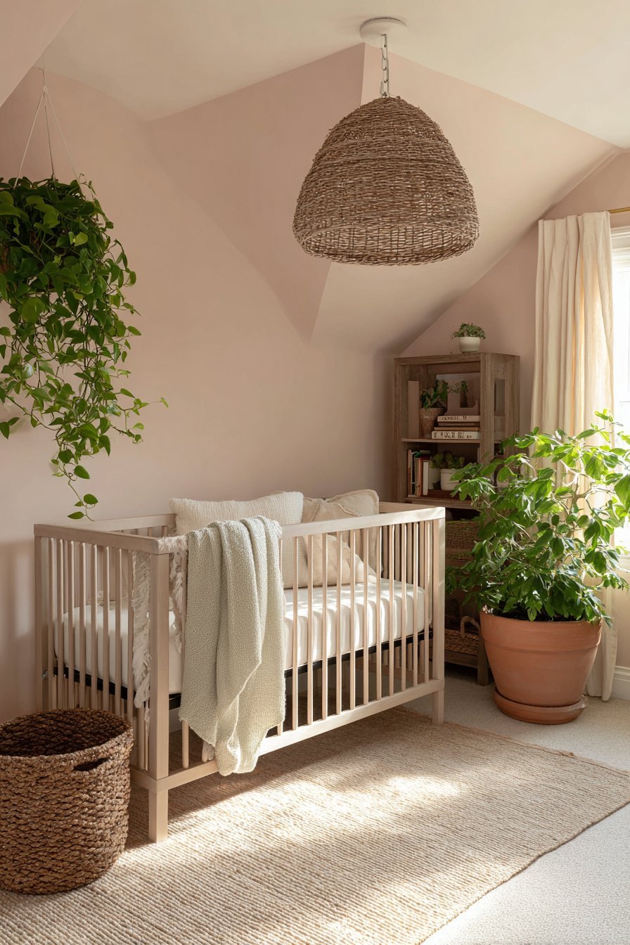
Natural timber furniture against a blush wall is arguably even more beautiful than white — the warm honey and amber tones of light oak or maple creating a deeply harmonious, organic contrast with blush pink that feels simultaneously sophisticated and nurturing. This combination is one of the most beloved in contemporary nursery design for good reason: it balances the femininity of blush with the grounded warmth of natural wood in a way that feels genuinely timeless. Avoid dark timber finishes such as walnut or ebony against blush walls — the contrast is too stark and introduces a visual heaviness that works against the room’s calming intention.
- Choose white-painted or natural timber furniture rather than blush or pale pink pieces
- Use furniture contrast to give the nursery visual definition and architectural clarity
- Pair blush walls with light oak, pale maple, or ash timber furniture for a warm, sophisticated result
- Avoid dark timber finishes — walnut, ebony, dark mahogany — against blush pink walls
- If a pink nursing chair is desired, ensure it is a tone deeper or lighter than the wall for visual separation
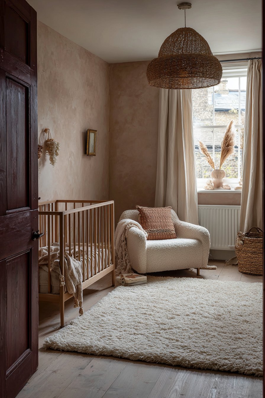
7. Skipping the Grounding Elements That Prevent the Room Feeling Too Sweet
The final and most sophisticated mistake in blush pink nursery design is creating a room that feels too sweet — too uniformly soft, too relentlessly pretty, too pink-and-precious in a way that lacks the grounding, grown-up quality that the best nursery designs possess. A room without any visual weight or anchoring elements floats away from beauty into something that feels saccharine, insubstantial, and oddly unsatisfying despite being technically pretty in every individual element.
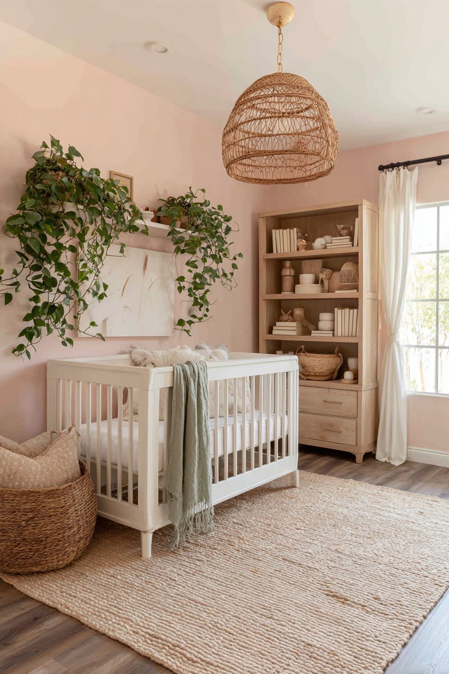
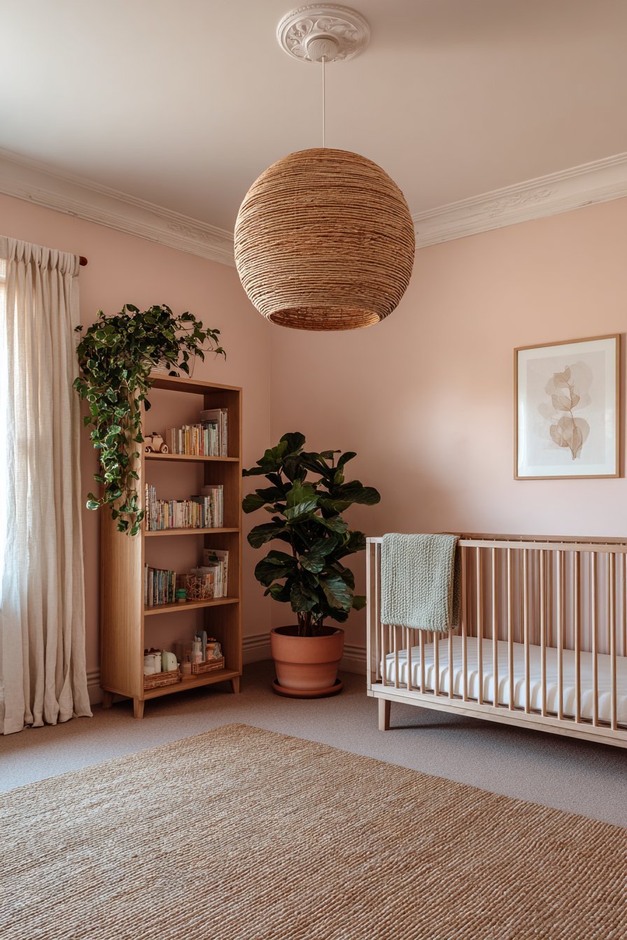
Grounding elements are the design components that give a blush nursery its depth, seriousness, and sense of considered intention. Natural materials — real timber, stone, jute, rattan, and terracotta — introduce an organic earthiness that counterbalances the sweetness of pink with something more rugged, tactile, and genuinely natural. A jute rug underfoot, a rattan pendant light overhead, a terracotta ceramic pot holding a trailing plant, a timber bookshelf holding worn, loved books — these elements anchor the room in the physical world and prevent it from floating into an atmosphere of excessive delicacy.
A single deeper accent color is perhaps the most powerful grounding tool available to the blush nursery designer. Introducing dusty terracotta, warm sage green, muted navy, or deep forest green as a deliberate accent — in a single cushion, a plant pot, a picture frame, a throw — immediately gives the room a more composed, considered quality. This accent color does not need to appear frequently or in large quantities; a single confident accent is often more effective than several tentative ones. It tells the viewer that the room was designed with full awareness of the blush’s sweetness and the deliberate intention to balance it.
- Introduce natural materials — jute, rattan, terracotta, real timber — to ground the blush palette in earthy reality
- Add a single, confident deeper accent color — sage, terracotta, navy — to balance the pink’s sweetness
- Include at least one piece of genuine visual weight — a substantial rug, a solid timber dresser, a large plant
- Avoid filling every surface with small pink accessories — edit ruthlessly for a more considered, composed result
- Place a medium-to-large indoor plant in the nursery — its green botanical presence grounds the pink beautifully
Conclusion
Blush pink is one of the most extraordinary nursery colors available — but like all truly beautiful things, it rewards thoughtfulness and punishes carelessness. The seven mistakes explored in this article represent the specific, avoidable decisions that consistently prevent blush pink nurseries from reaching their full, breathtaking potential — and their solutions are all within straightforward reach of any parent willing to approach the project with care and intentionality.
Choose your shade with patience, pair it with warm whites, balance it with contrasting furniture and grounding accents, layer it with texture, and light it with warmth — and the blush pink nursery you create will be everything this beautiful color promises: soft without being saccharine, warm without being overwhelming, and genuinely, enduringly beautiful in a way that serves your baby, your family, and your home for years to come.