The world of interior design is always evolving. Color trends shift with culture, lifestyle, and collective mood. For over a decade, cool gray ruled the design world. It was everywhere — walls, sofas, kitchen cabinets, and flooring. But something significant has changed. Warm neutrals are now taking center stage, and the shift feels less like a passing trend and more like a lasting design revolution.
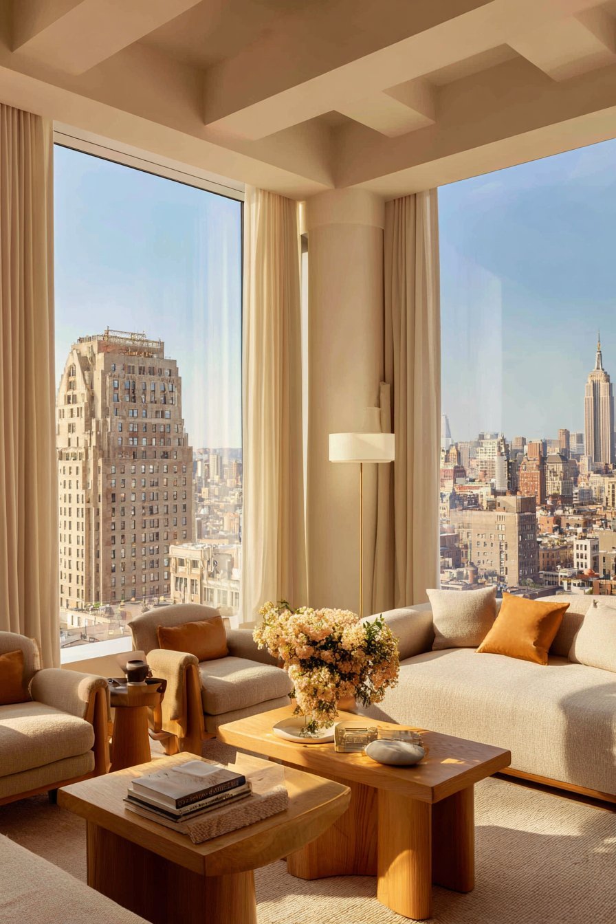
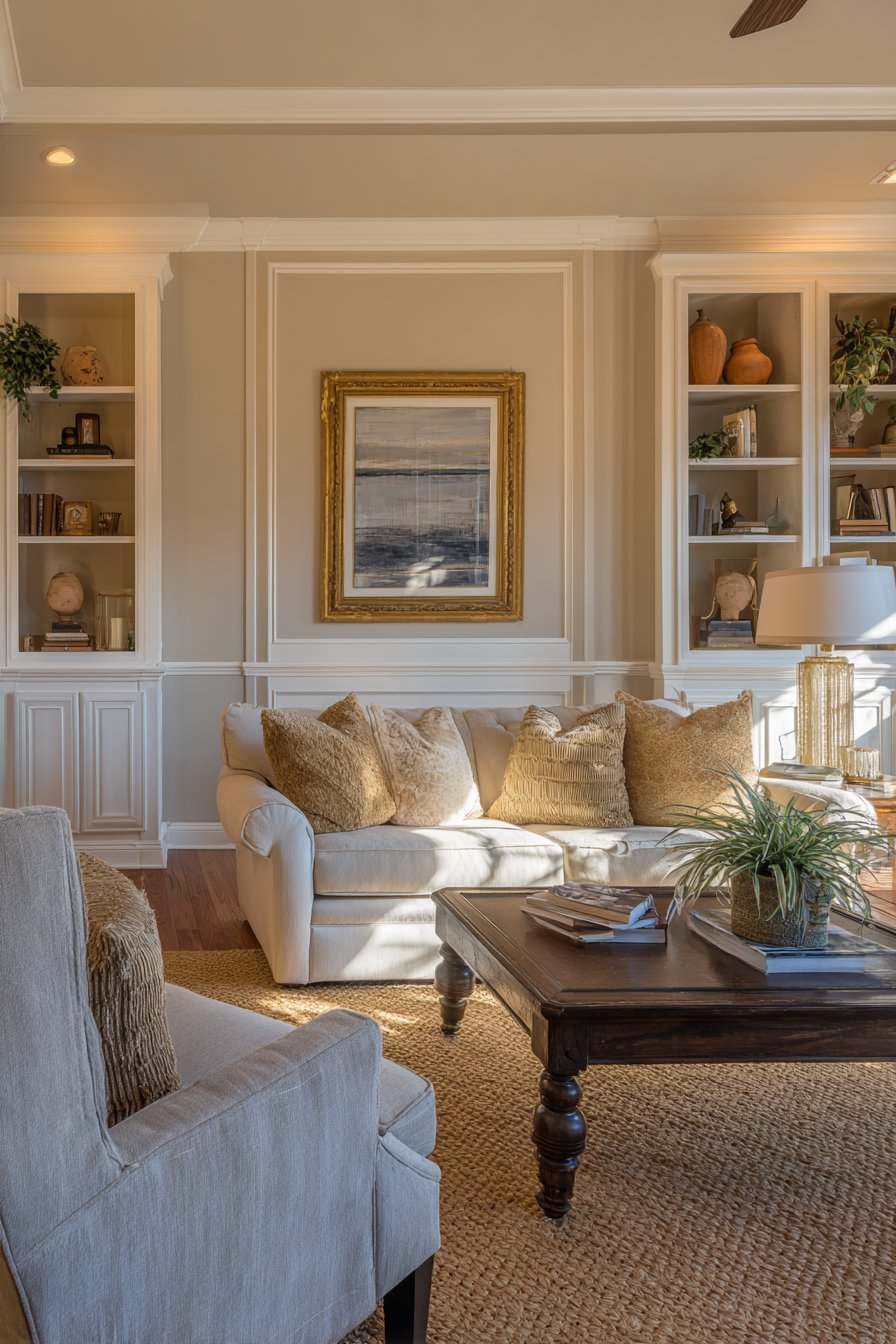
Today’s homeowners are craving spaces that feel inviting and emotionally resonant. The cold, clinical perfection of cool gray no longer satisfies that need. People want warmth, texture, and soul in their living spaces. Warm neutrals — think creamy whites, sandy beiges, soft taupes, terracotta, and muted ochres — deliver exactly that. They create environments that feel alive, personal, and deeply comfortable.
This article explores the key reasons why warm neutrals are replacing cool grays across homes worldwide. Whether you are redesigning a single room or overhauling your entire home, understanding this shift will help you make timeless design choices that feel both current and enduring.
1. The Emotional Appeal of Warmth
Color psychology plays a major role in how we experience spaces. Cool grays tend to feel detached, formal, and even cold — especially in rooms with limited natural light. Warm neutrals, by contrast, trigger feelings of comfort, security, and belonging. These are the emotions most people want to feel at home.
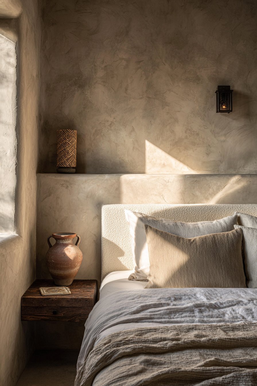
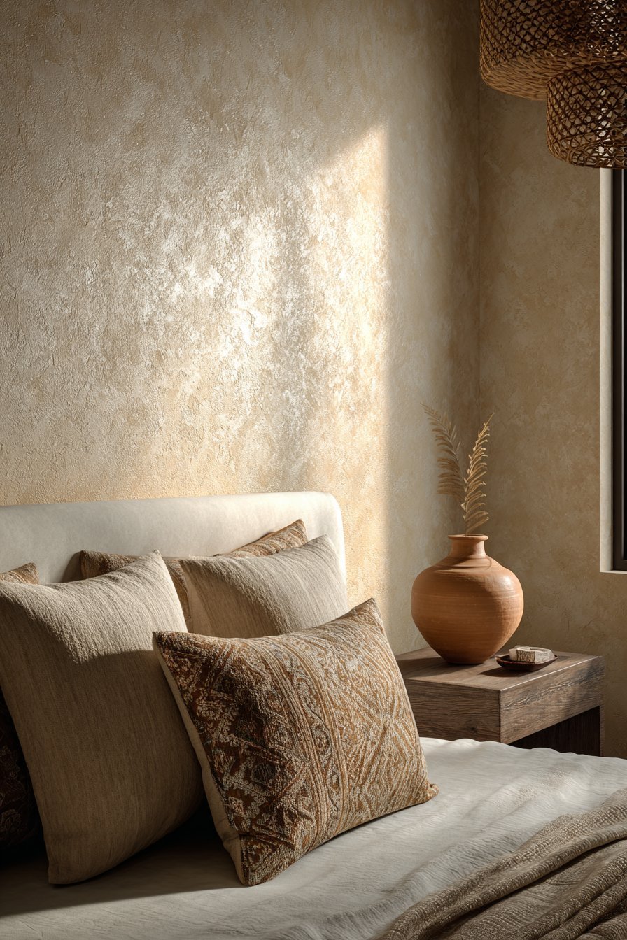
Research in environmental psychology consistently shows that warm-toned environments reduce stress and encourage relaxation. Shades like warm beige, soft camel, and creamy ivory wrap a room in a sense of gentle warmth. They mimic the natural hues of sand, earth, and stone — materials humans have found comforting for thousands of years.
This emotional resonance is one reason why interior designers are increasingly recommending warm neutrals for living rooms, bedrooms, and family spaces. These are the rooms where emotional comfort matters most. A warm neutral wall color can make even a modest-sized room feel like a genuine sanctuary.
- Choose warm white or ivory for bedroom walls to promote restful sleep
- Use soft taupe in living areas to create a welcoming, cozy atmosphere
- Layer warm camel and terracotta tones for emotional depth
- Avoid stark gray in rooms where relaxation is the priority
- Test paint swatches under both natural and artificial light before committing
- Consider warm greige as a transitional tone between gray and beige
2. Better Performance in Natural Light
One of the most practical reasons for the shift away from cool gray is how these colors behave in natural daylight. Cool grays can shift dramatically depending on the light source. In north-facing rooms or on cloudy days, they often read as blue, purple, or even green — a frustrating phenomenon many homeowners have experienced firsthand.
Warm neutrals are far more light-stable. They hold their tone across different lighting conditions, maintaining a consistent and pleasing appearance from morning to evening. A warm greige or soft sand color looks beautiful in bright afternoon sun and equally appealing under soft evening lamplight.
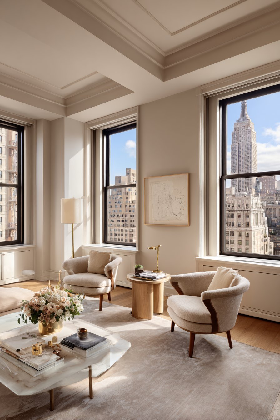
This predictable performance gives homeowners and designers confidence. When you invest in repainting a room, you want to know exactly what you are getting. Warm neutrals rarely surprise you with unwanted undertones. They behave consistently and reliably — a major practical advantage over their cooler counterparts.
- Always test paint colors in the actual room before purchasing full quantities
- Note how your chosen warm neutral looks at different times of day
- North-facing rooms benefit most from warm, golden-toned neutrals
- Use warm neutrals in open-plan spaces to maintain color harmony throughout
- Pair warm walls with natural light-enhancing mirrors and reflective surfaces
- Avoid cool undertones in rooms with fluorescent or blue-toned lighting
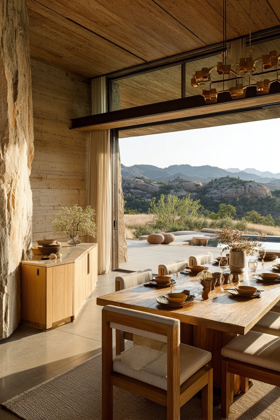
3. The Rise of Biophilic Design
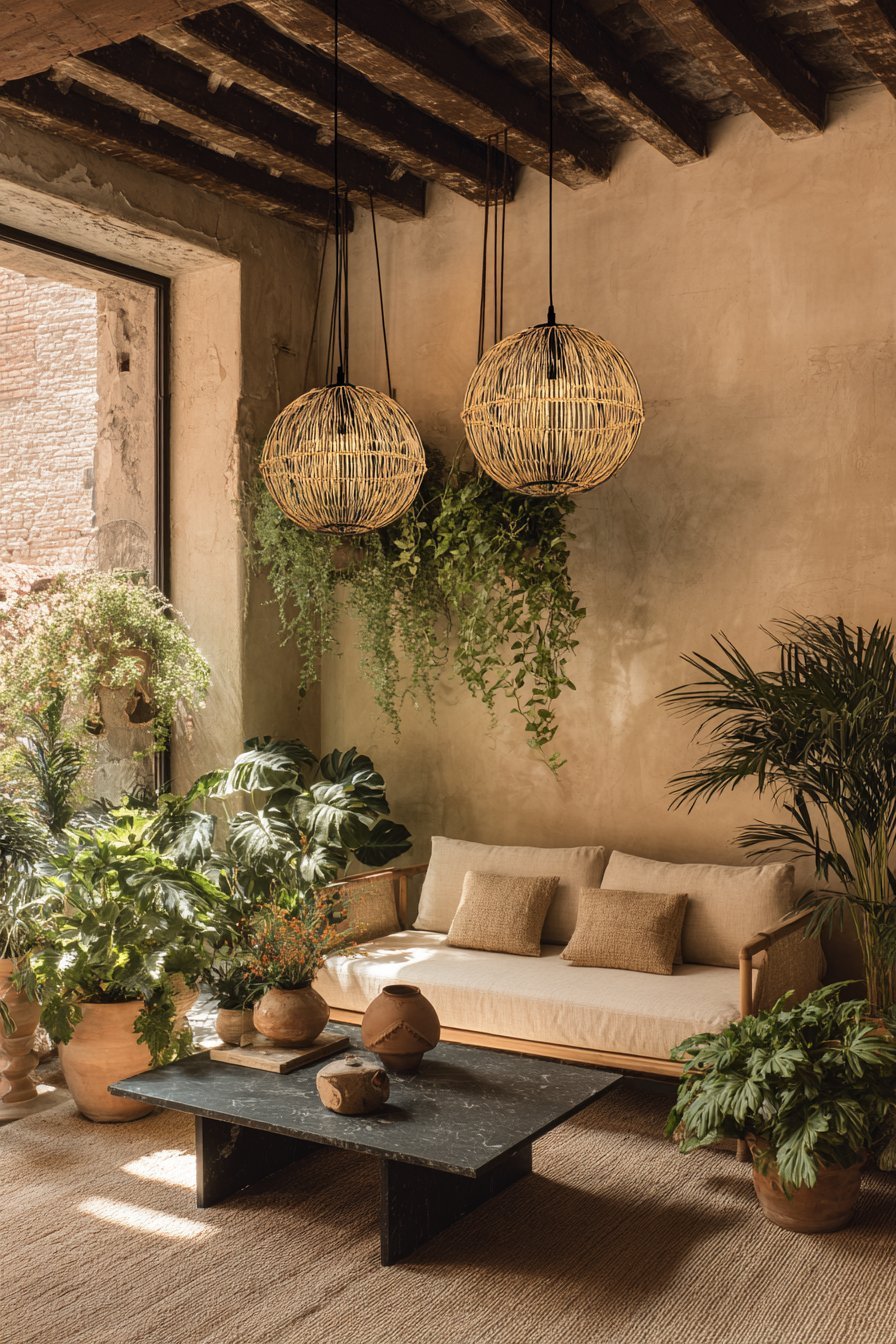
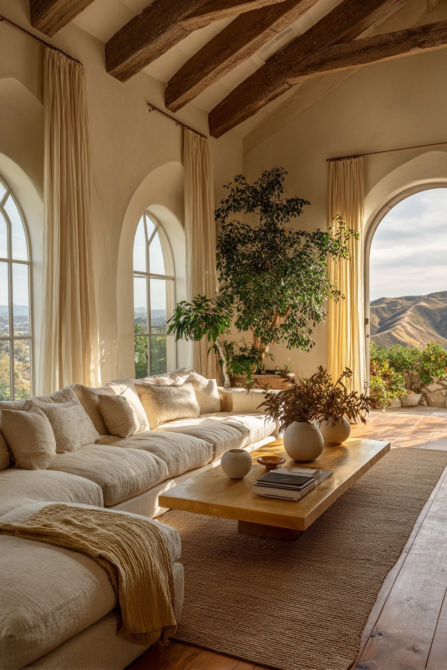
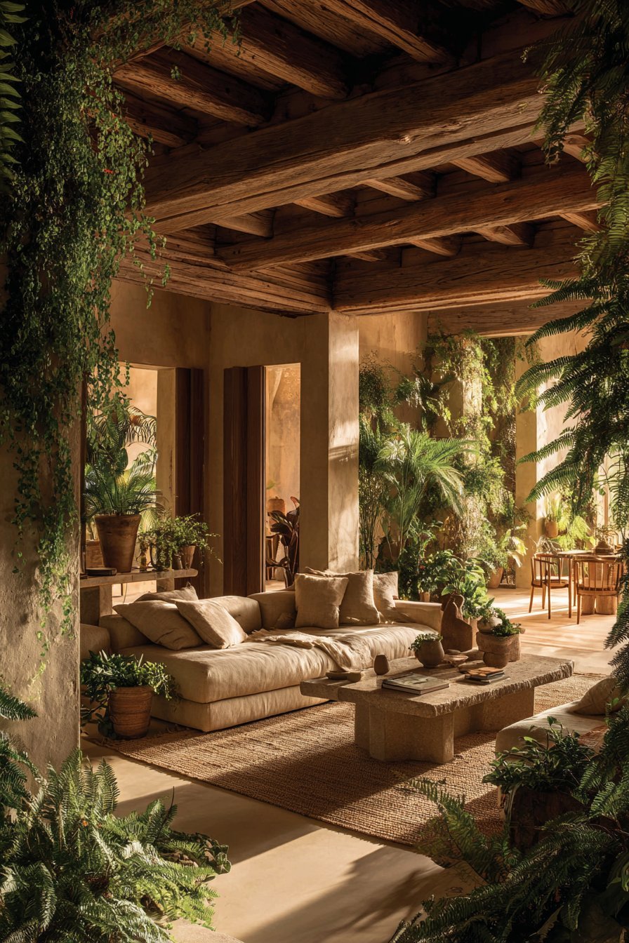
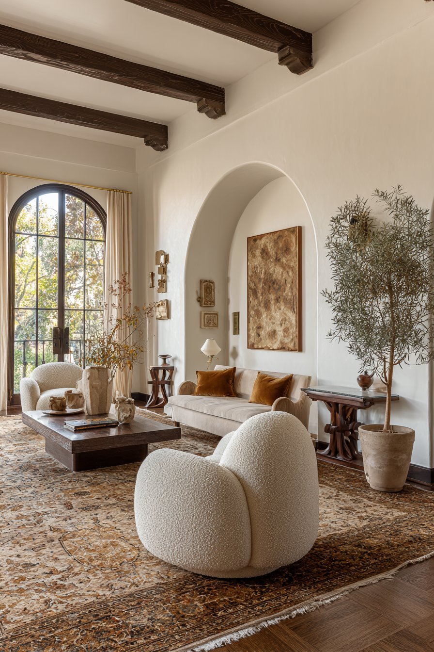
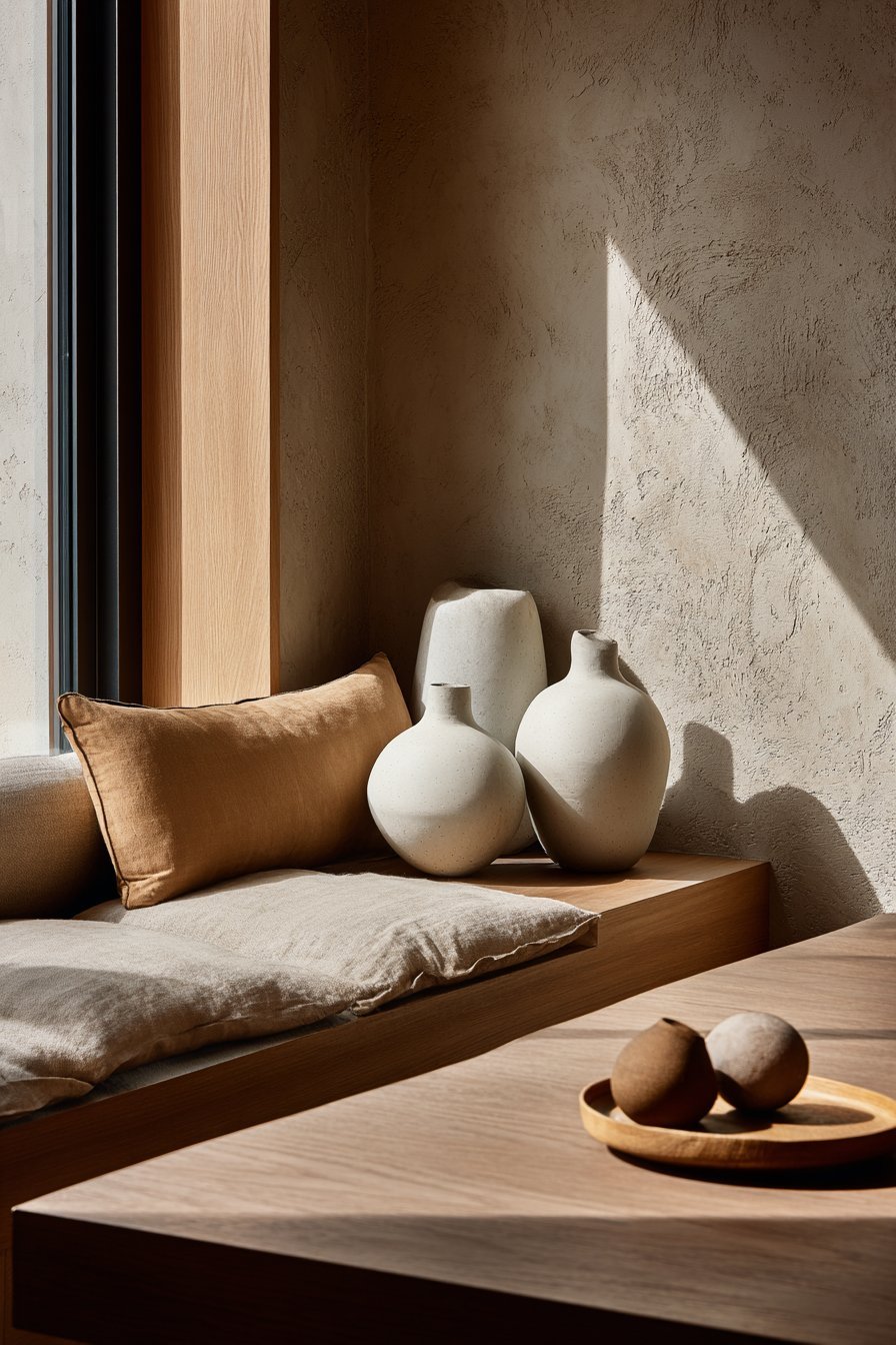
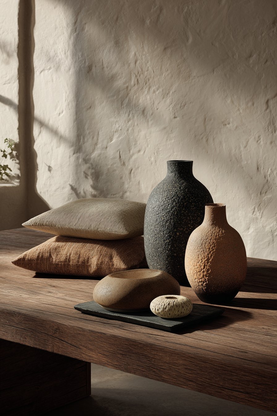
Biophilic design — the practice of connecting interiors to nature — has become one of the most influential movements in contemporary interior design. Warm neutrals are the natural palette of the biophilic aesthetic. They echo the colors of soil, bark, stone, sand, and dried grasses — the very tones found in the natural world.
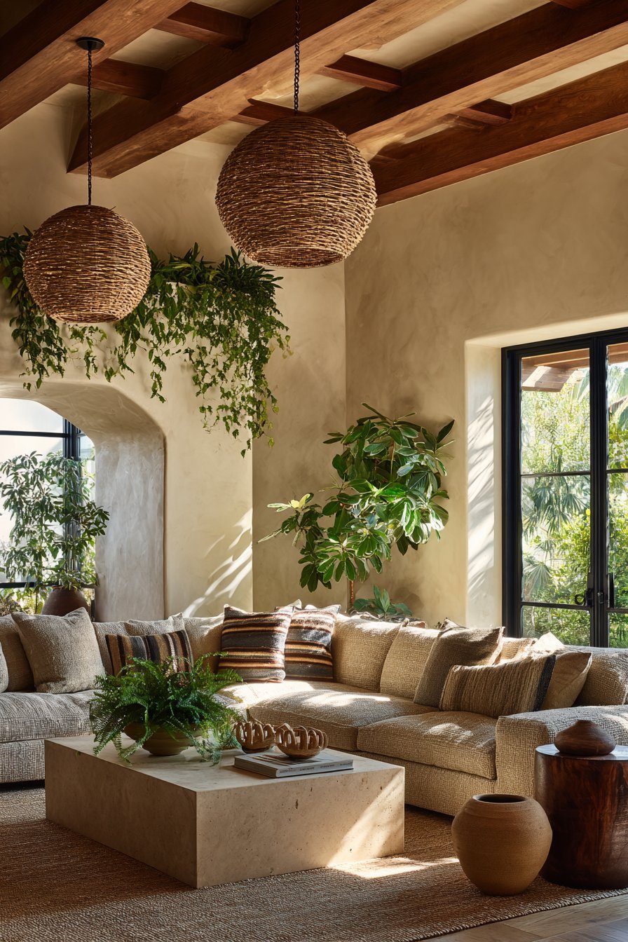
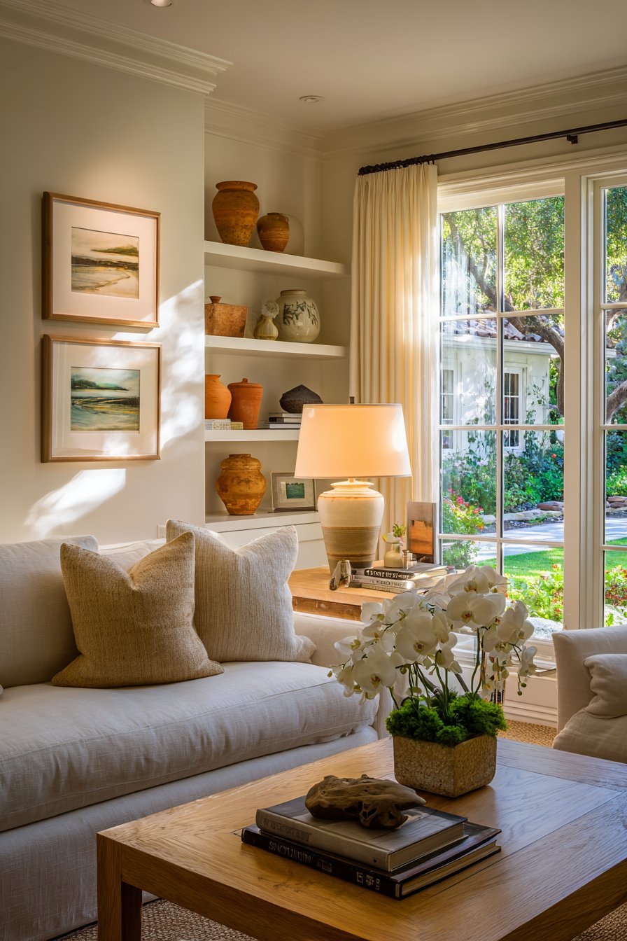
As more people have sought to bring the outdoors inside, cool gray has started to feel out of place. Gray is rarely found in nature. It is the color of concrete and steel — materials associated with urban environments rather than organic, living spaces. Warm neutrals, on the other hand, feel organically right alongside natural materials like wood, rattan, linen, jute, and terracotta.
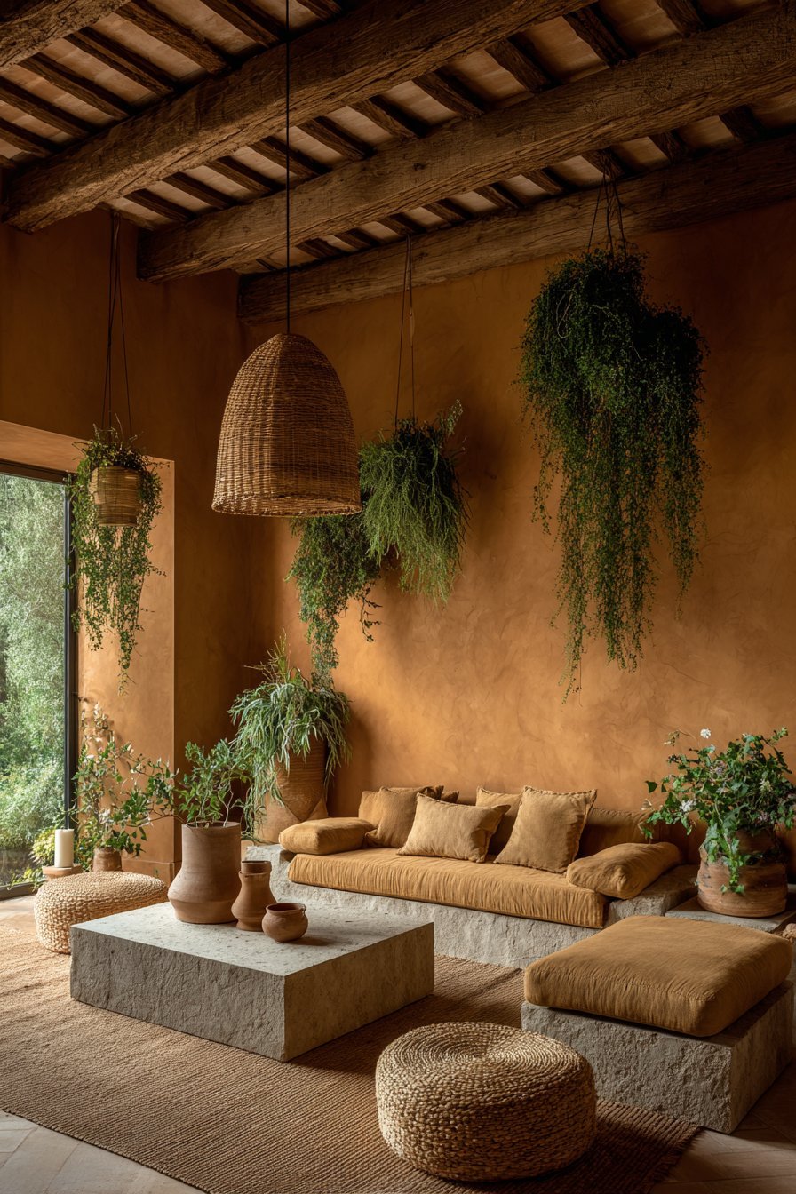
This connection to nature is not merely aesthetic. Studies suggest that nature-inspired interiors genuinely improve wellbeing, reduce cortisol levels, and increase feelings of calm. When a warm neutral palette is combined with indoor plants, natural textiles, and organic shapes, the result is a space that truly nourishes its inhabitants.
- Pair warm sandy tones with exposed wood beams or timber flooring
- Combine warm neutrals with indoor greenery for a biophilic effect
- Use natural materials like linen, jute, and rattan to reinforce the palette
- Incorporate stone or clay accessories in earthy warm tones
- Choose terracotta accents to bring rich, natural warmth to any room
- Layer textures — smooth plaster, woven fabric, raw wood — for organic depth
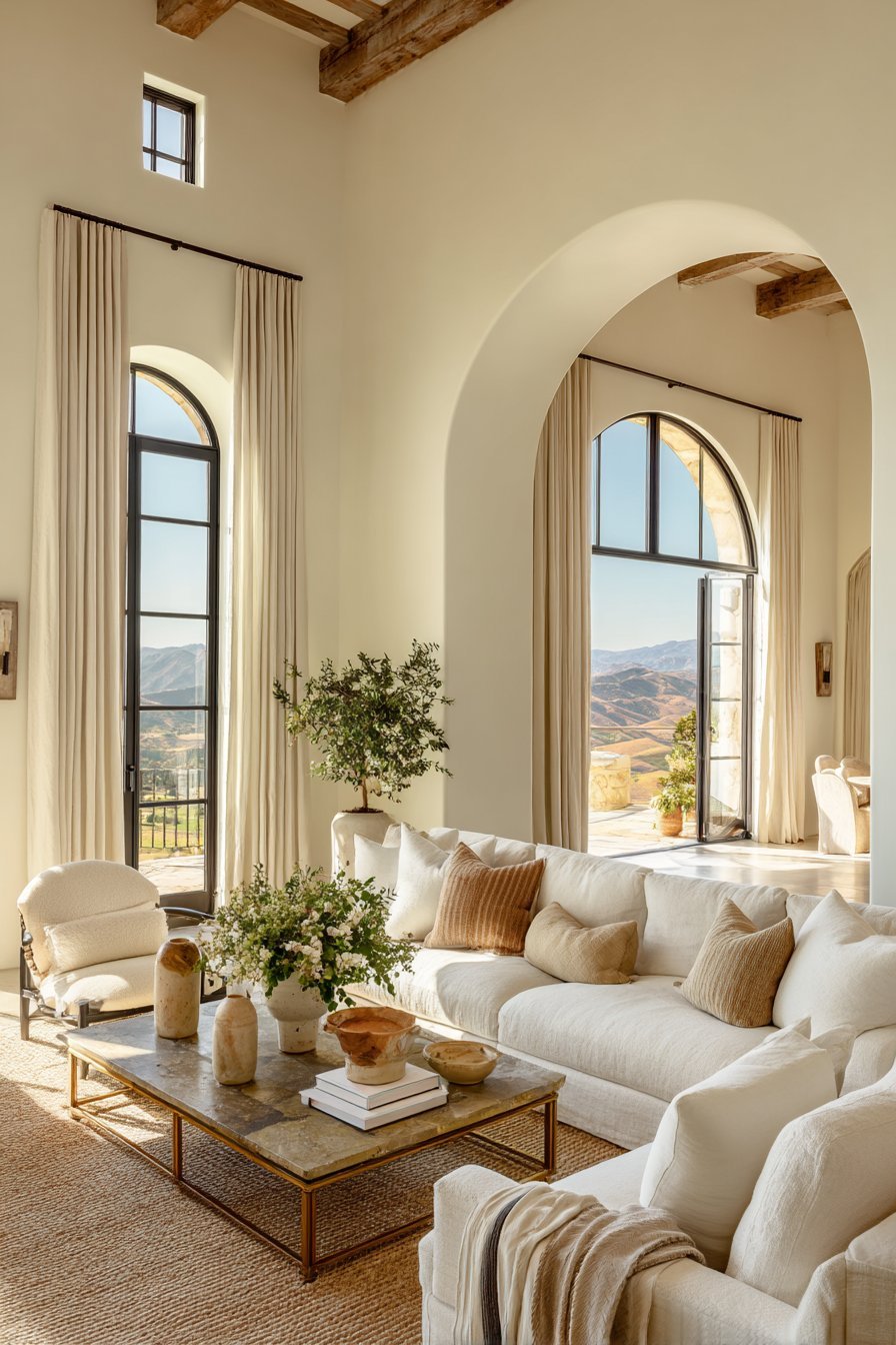
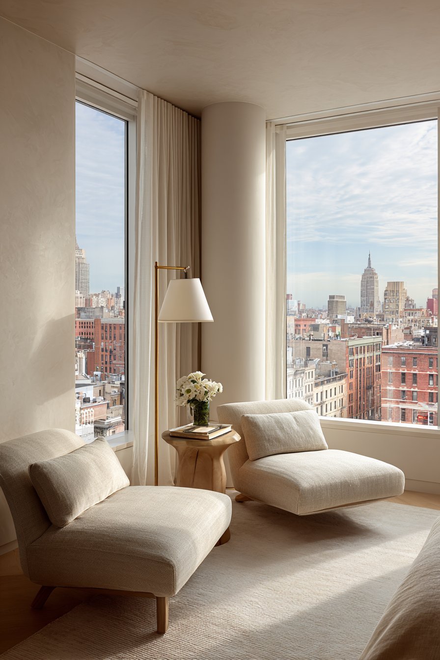
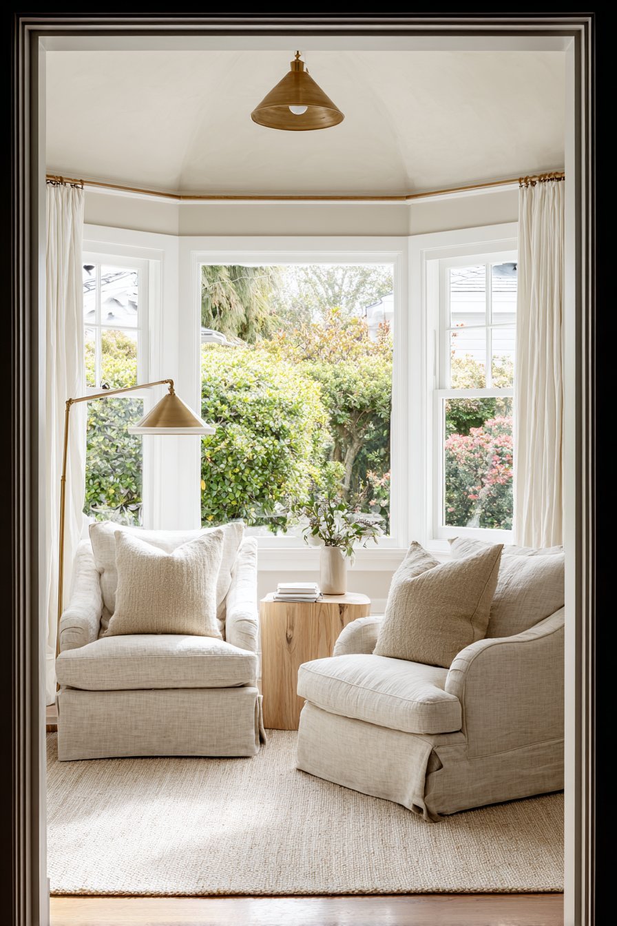
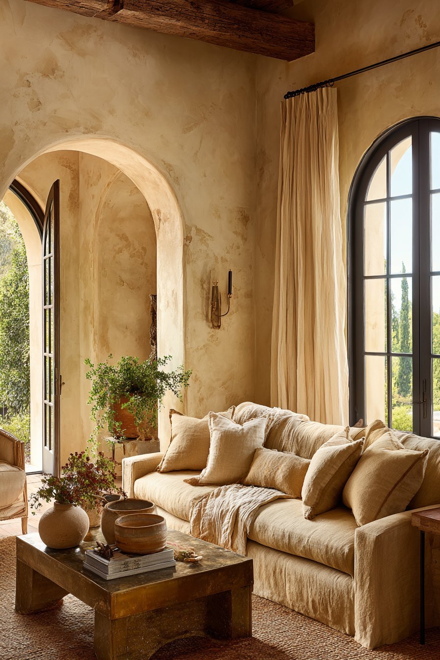
4. Versatility Across Design Styles
One of the greatest strengths of warm neutrals is their extraordinary versatility. They work beautifully across a wide range of interior design styles — from Scandinavian minimalism to Mediterranean warmth, from modern farmhouse to transitional elegance. Cool gray, despite its popularity, always felt firmly anchored in contemporary and industrial aesthetics.
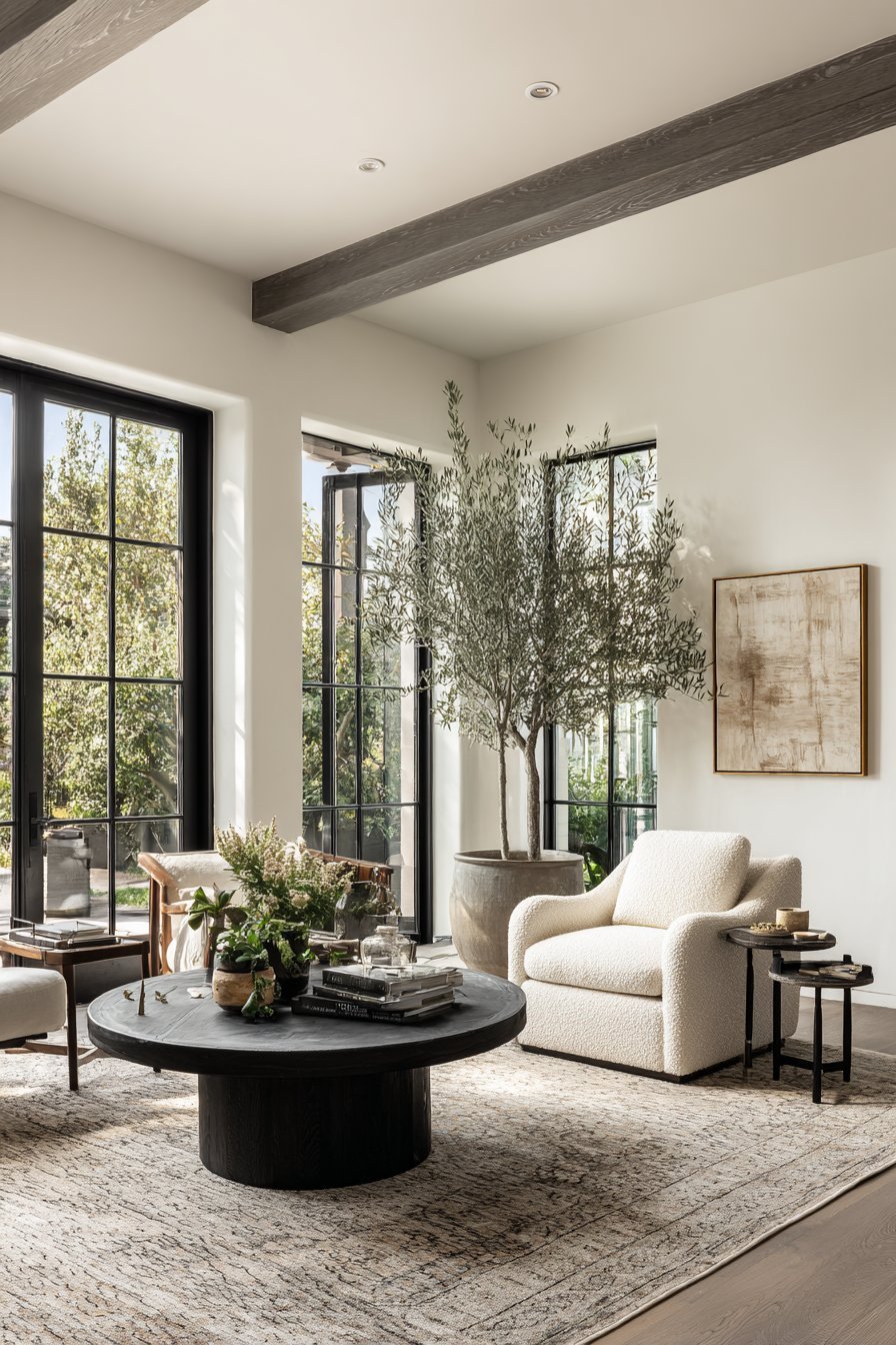
Warm neutrals are style-agnostic in the best possible way. A creamy white works in a coastal cottage. A deep warm taupe feels right in a moody, sophisticated apartment. A soft sand tone suits a minimalist Japandi interior just as comfortably as it suits a bohemian, layered space. This adaptability makes warm neutrals a smarter long-term investment.
Designers particularly appreciate how warm neutrals serve as a neutral canvas that allows furniture, artwork, and accessories to shine. Rather than competing with the decor, a warm neutral wall recedes gracefully and lets the design elements take center stage. This quality makes the overall room feel more curated, intentional, and polished.
- Use warm off-white as a base in minimalist Scandinavian or Japandi interiors
- Layer warm taupes and creams in traditional or transitional spaces
- Choose muted ochre as an accent in bohemian or eclectic schemes
- Combine warm neutrals with bold furniture to create sophisticated contrast
- Use warm greige as a unifying tone across open-plan living areas
- Match warm neutral walls with antique brass or matte gold hardware
5. Timelessness Over Trend
Trend fatigue is real. After years of cool gray dominating every design magazine, showroom, and home renovation show, many homeowners grew weary of the look. There is a growing desire for spaces that feel timeless rather than trendy — interiors that will not look dated in five years.
Warm neutrals have an inherent timelessness. Creamy whites, warm beiges, and soft taupes have appeared in beautiful homes for centuries. They were the preferred palette of Georgian townhouses, Mediterranean villas, and Japanese tea rooms alike. Their endurance across time and culture speaks to a deep and universal aesthetic resonance.
This longevity is especially appealing for major design investments like kitchen cabinetry, tile work, and architectural finishes. Choosing a warm neutral for these elements means they will remain stylish and relevant regardless of what color trends emerge in the coming years. It is a design choice that prioritizes lasting beauty over fleeting fashion.
- Choose warm white cabinetry for a kitchen that will never go out of style
- Invest in warm neutral tiles for bathrooms as a long-term decision
- Avoid committing to on-trend colors in permanent architectural finishes
- Use bolder trend colors in easily changeable accessories like cushions and throws
- Study timeless interiors for inspiration — look beyond current design media
- Trust the enduring appeal of natural, earth-inspired tones over cool industrial hues
6. The Influence of Global Design Movements
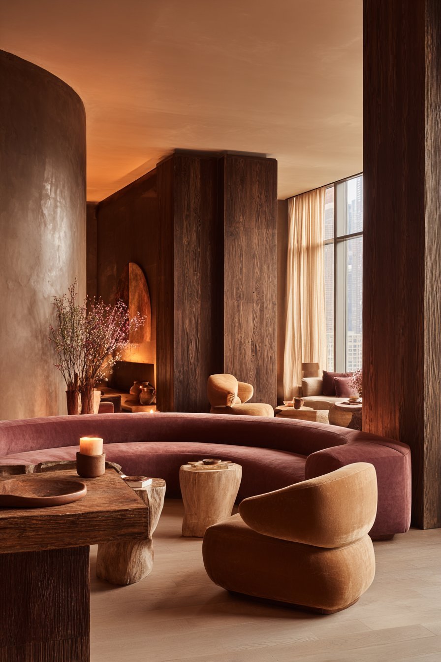
The shift toward warm neutrals has been powerfully accelerated by global design influences. The Japandi aesthetic — a fusion of Japanese minimalism and Scandinavian hygge — relies heavily on warm, muted, earthy tones. Similarly, the Mediterranean revival, Wabi-Sabi philosophy, and the popularity of Moroccan and Tunisian design have all pushed warm, organic palettes into the mainstream.
Social media platforms, particularly Pinterest and Instagram, have amplified these global design movements to an unprecedented degree. Millions of users have been exposed to the soft warmth of Italian linen, the earthy richness of Moroccan clay plaster, and the quiet elegance of Japanese natural interiors. These aesthetics feel deeply different from the cool, gray-dominated spaces that previously dominated design feeds.
As a result, consumer taste has evolved globally. The appetite for warm, textured, nature-connected interiors has become cross-cultural. This is not simply a Western trend but a worldwide design realignment — one that strongly favors warm neutrals over cool grays.
- Research Japandi interiors for elegant warm-neutral inspiration
- Look to Mediterranean design for rich, earthy tonal palettes
- Study Wabi-Sabi philosophy to understand the beauty of natural imperfection
- Follow global design influencers to stay ahead of the warm-neutral movement
- Incorporate globally inspired textiles and accessories in warm earthy tones
- Use soft clay plaster or limewash paint for an authentically warm, textured wall finish
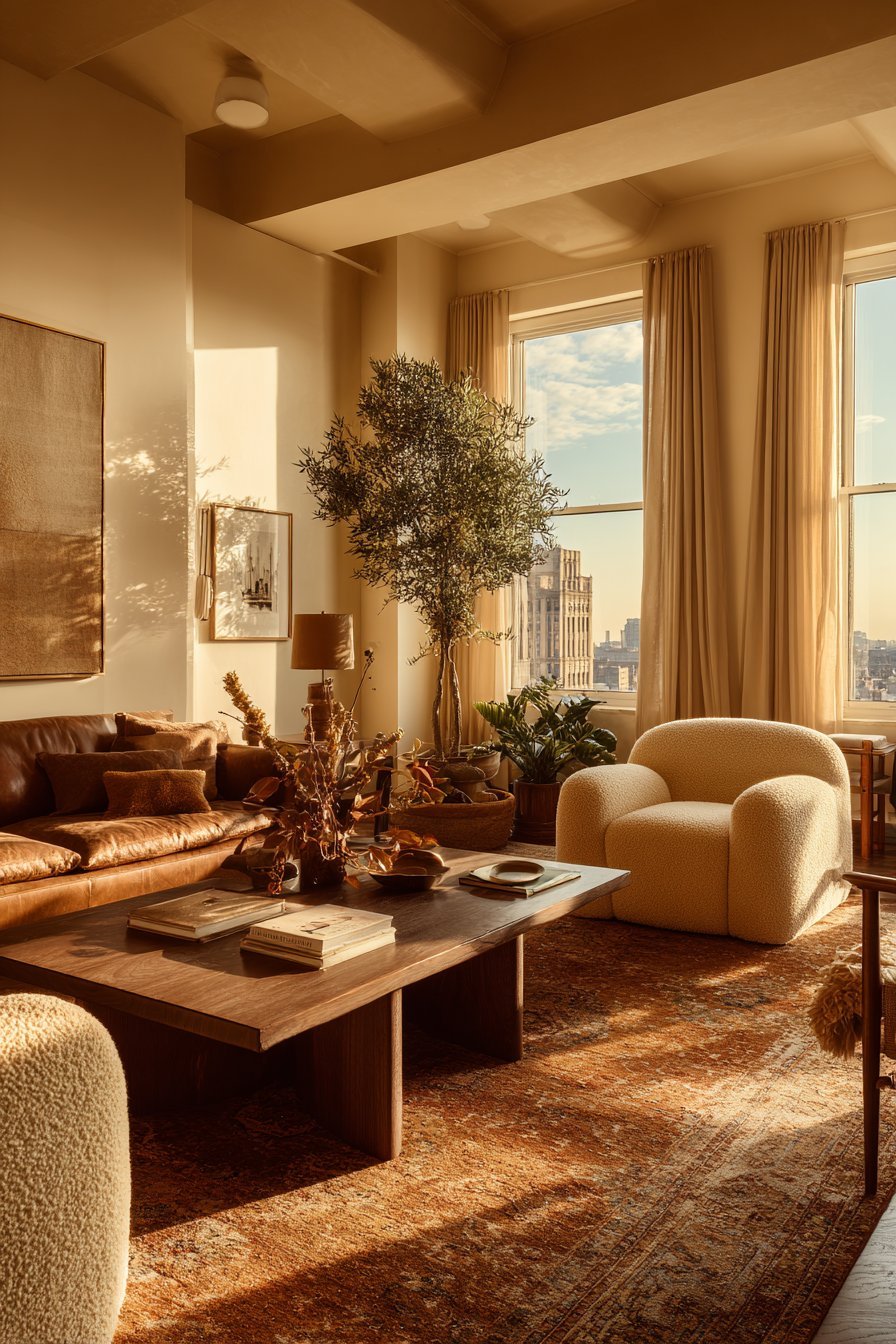
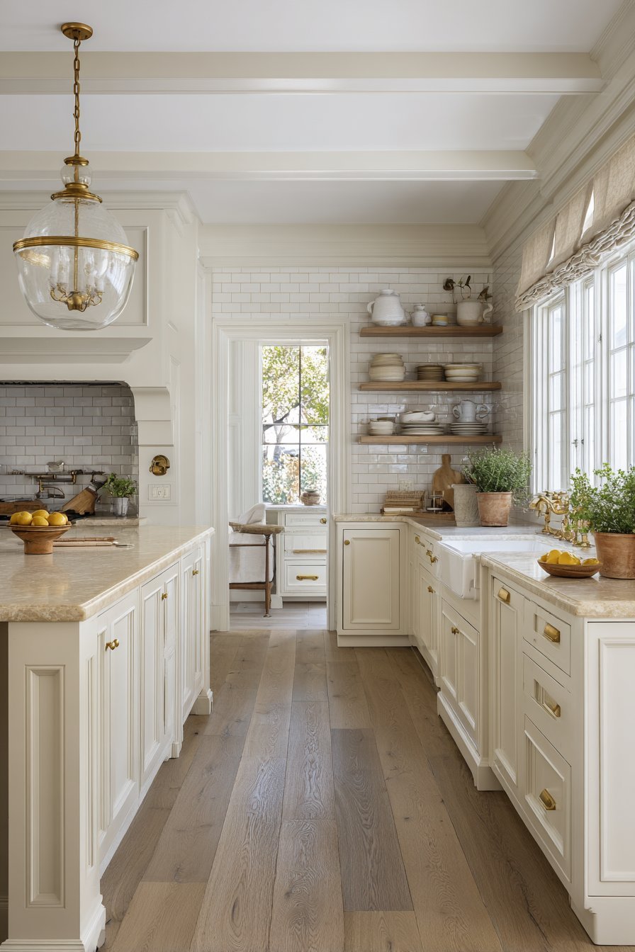
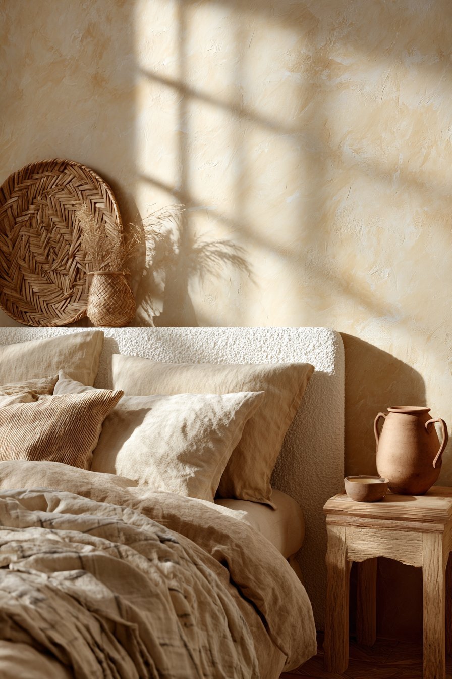
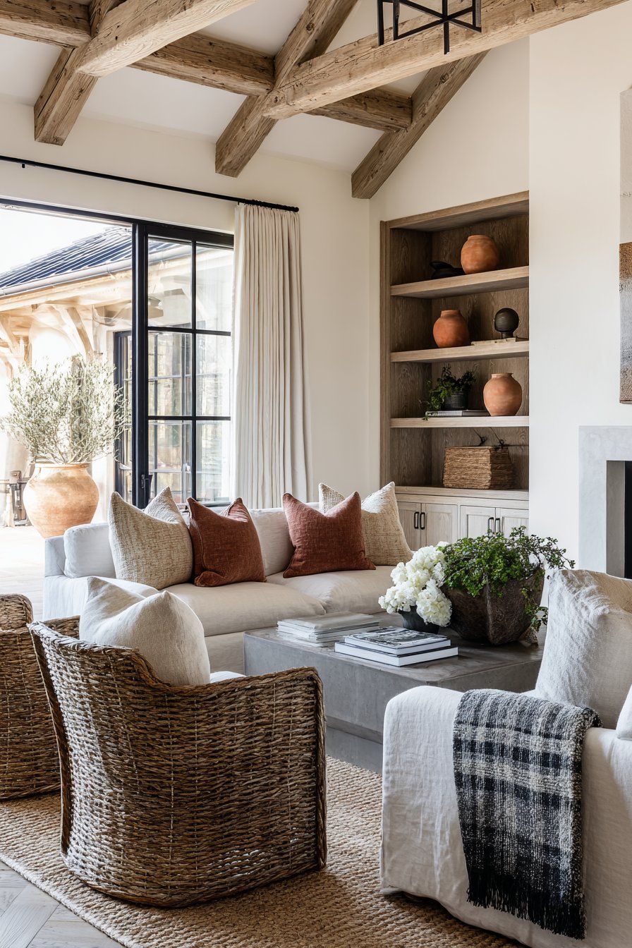
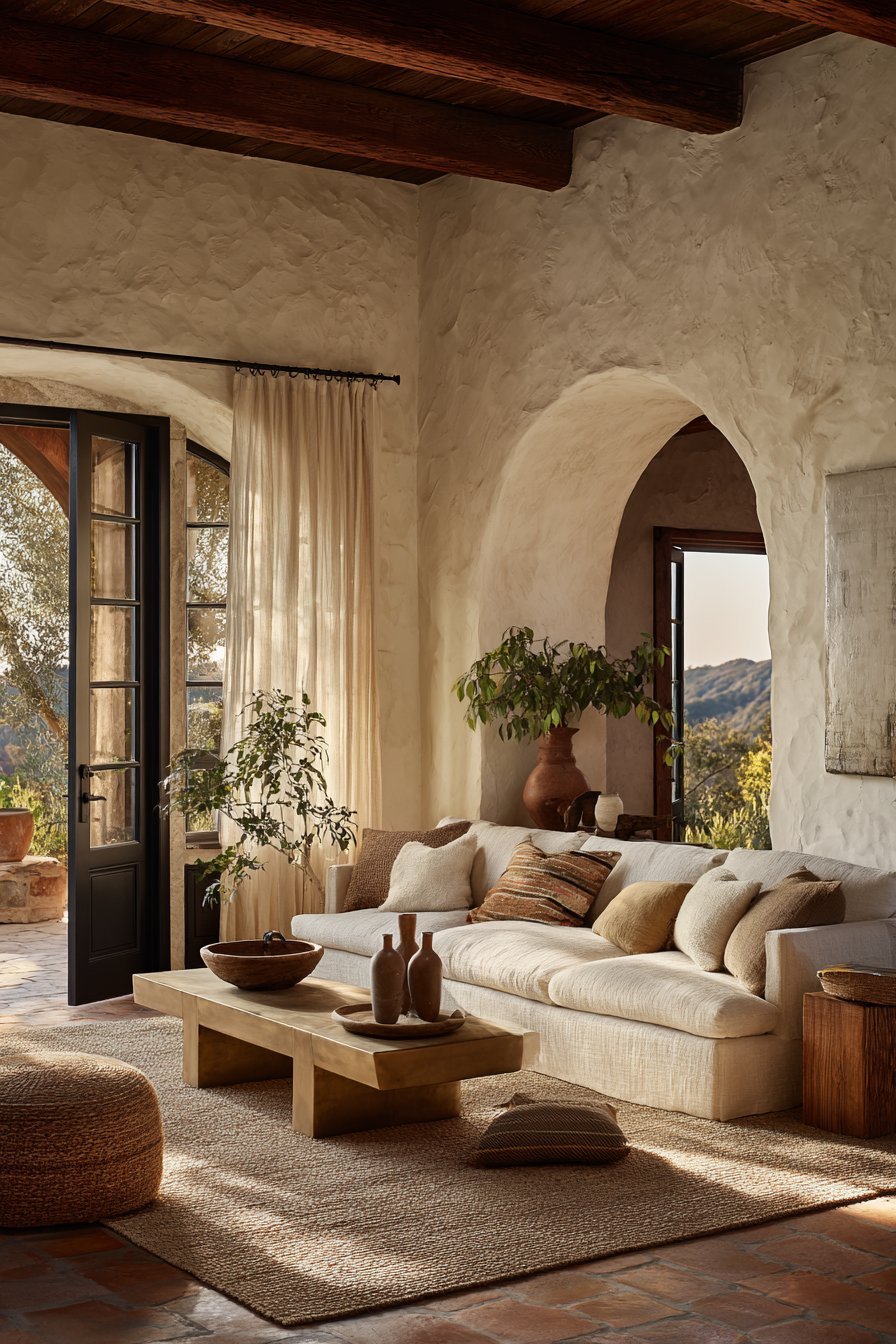
7. Pairing Potential With Wood and Natural Materials
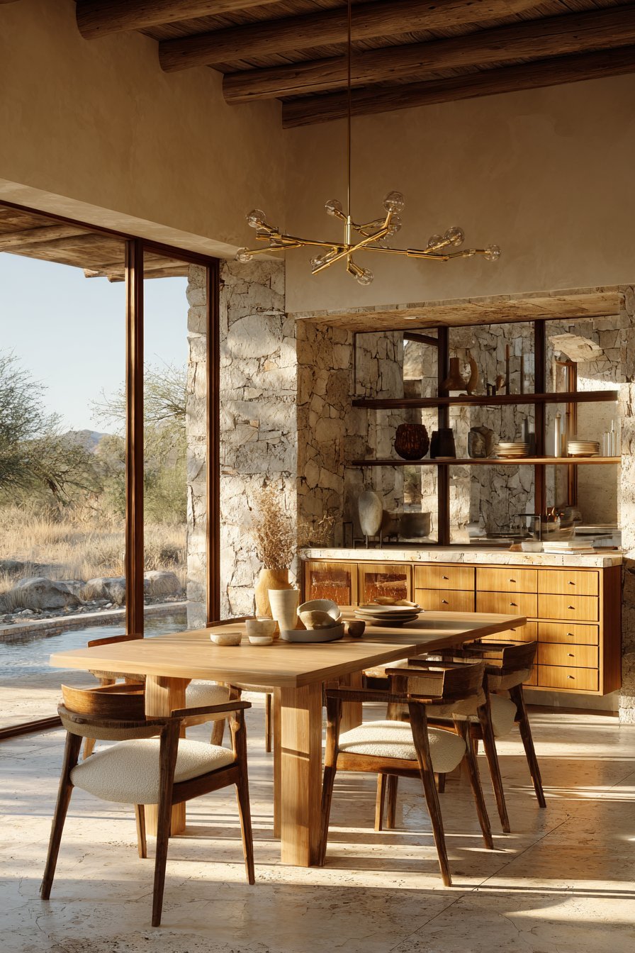
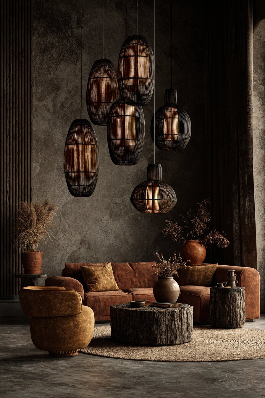
Warm neutrals have an almost magical compatibility with wood. Oak, walnut, ash, and pine all look stunning against warm beige, creamy white, or soft taupe backgrounds. By contrast, cool grays often fight with the natural warmth of timber, creating a visual tension that feels slightly off.
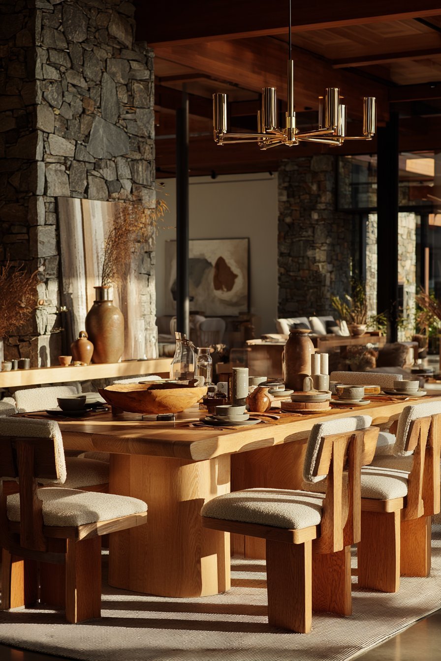
As natural wood has reclaimed its place as the premier material in contemporary interiors, the demand for warm neutrals has risen in parallel. Blonde oak floors look breathtaking against a warm linen wall. Dark walnut furniture takes on a richer, more luxurious quality when surrounded by warm, creamy tones. The two elements elevate each other in a way that cool gray simply cannot replicate.
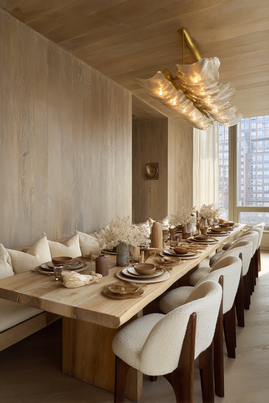
This symbiotic relationship between warm neutrals and natural materials extends beyond wood. Warm neutrals also pair beautifully with unlacquered brass, matte black, terracotta, raw linen, stone, and handmade ceramics — the very materials that define sophisticated, contemporary interiors today.
- Choose warm greige or sandy beige walls to showcase natural wood furniture
- Pair blonde oak flooring with creamy white or warm ivory wall colors
- Use warm neutrals to highlight the grain and texture of natural wood surfaces
- Combine warm wall tones with unlacquered brass hardware for a refined look
- Layer natural linen textiles against warm neutral walls for tonal sophistication
- Avoid cool grays with warm-toned wood — the contrast rarely works harmoniously
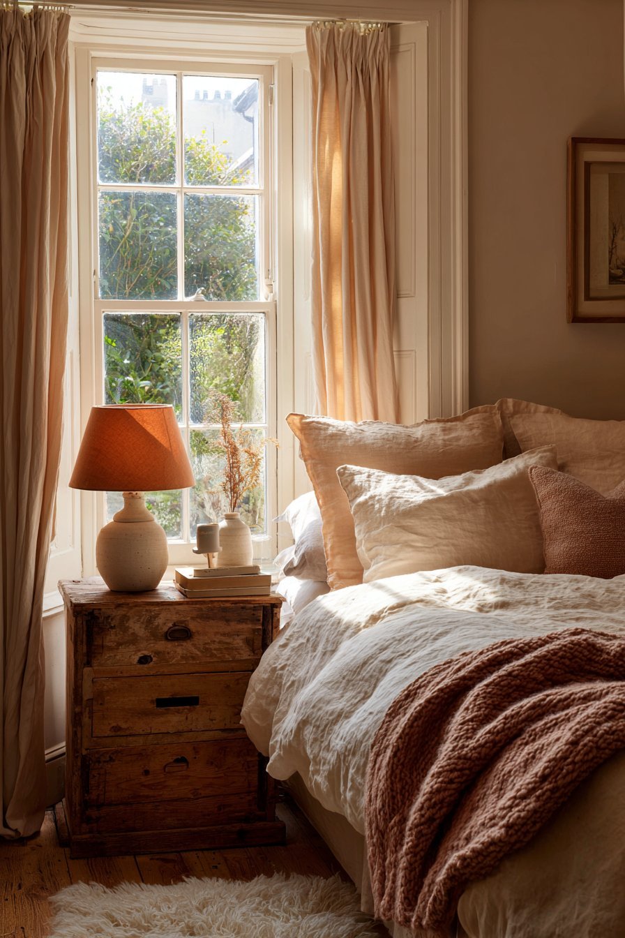
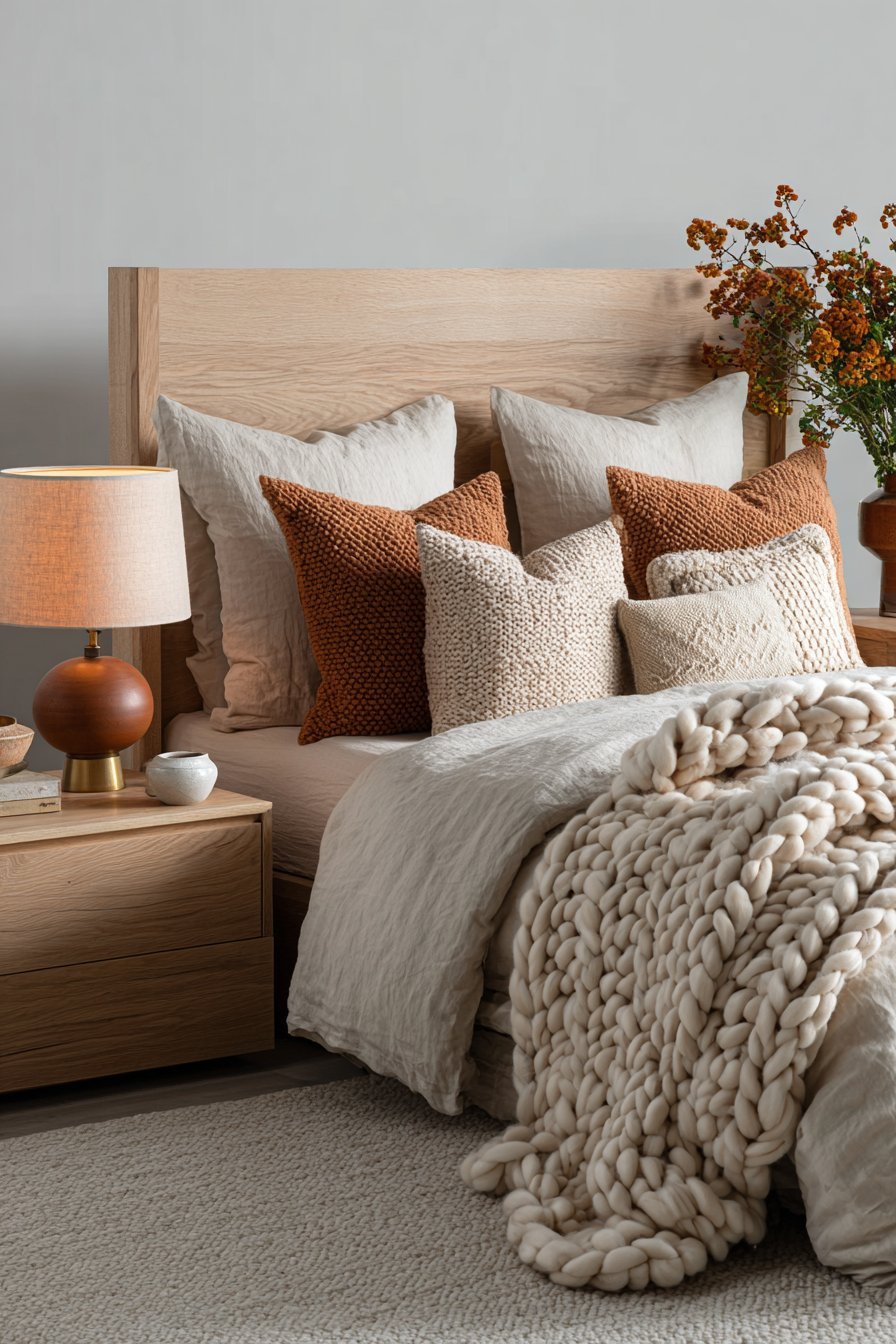
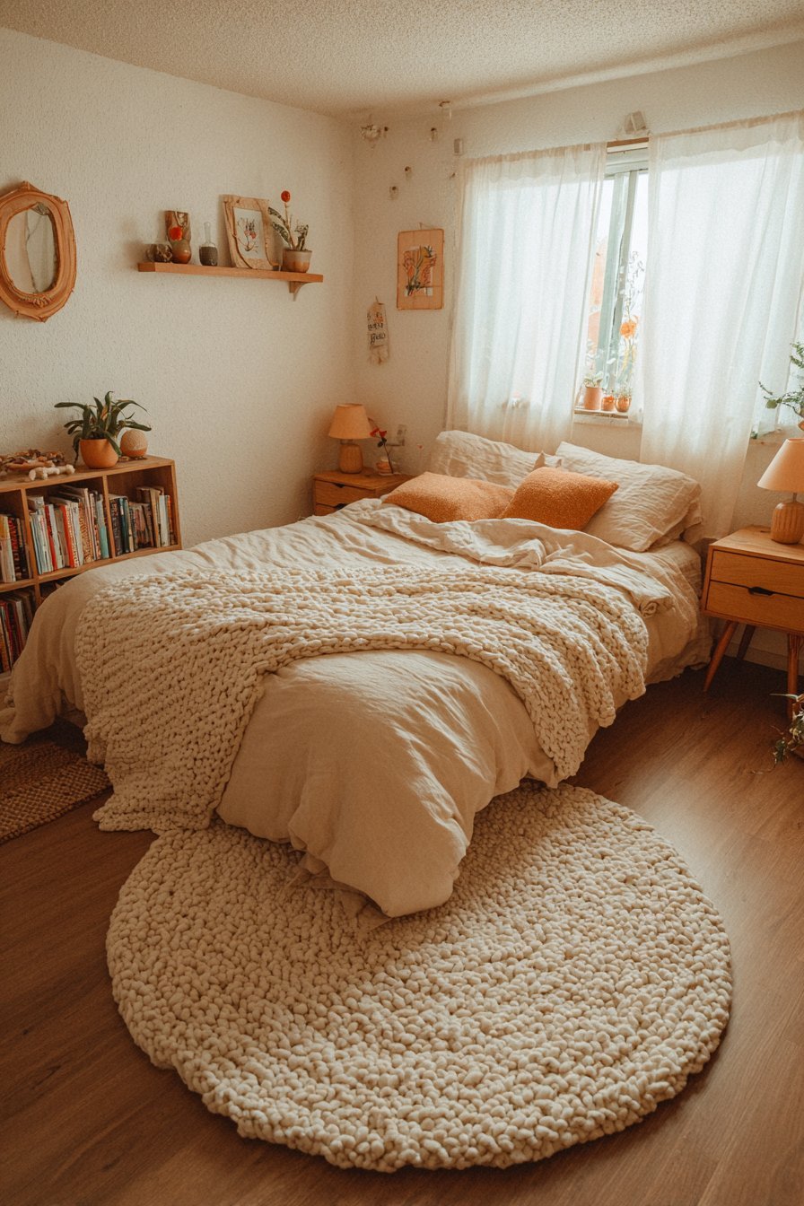
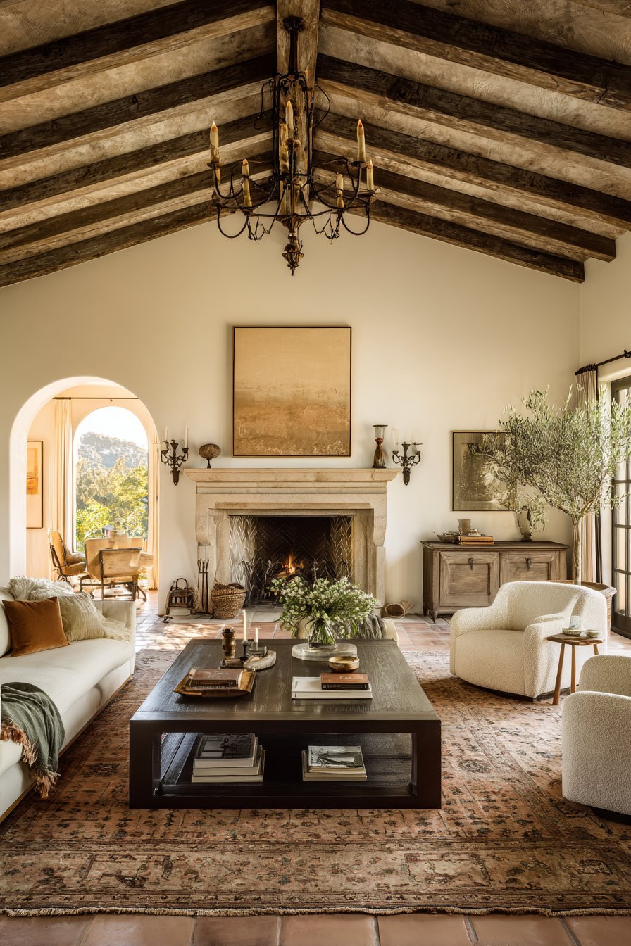
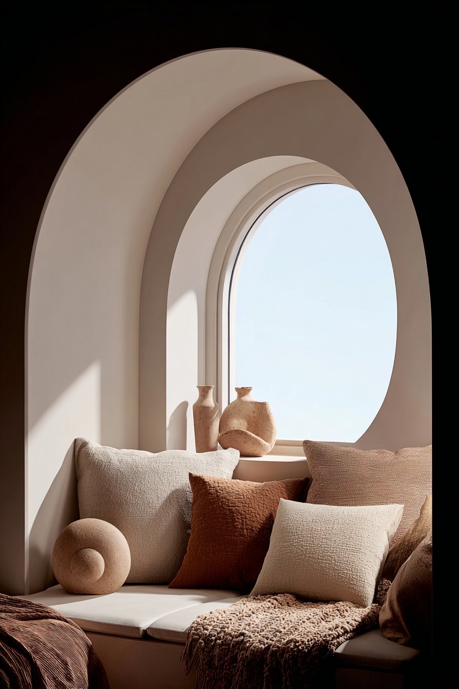
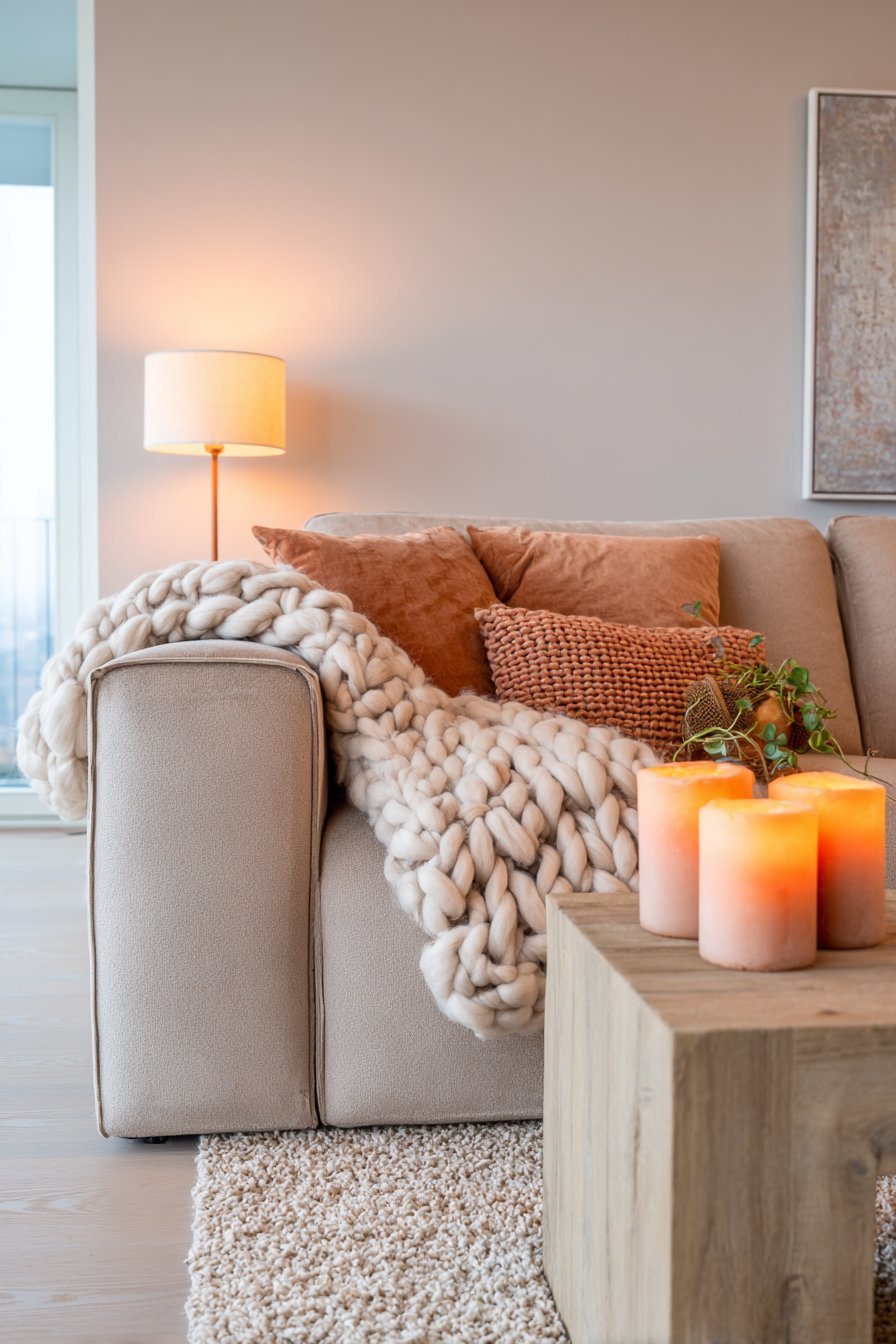
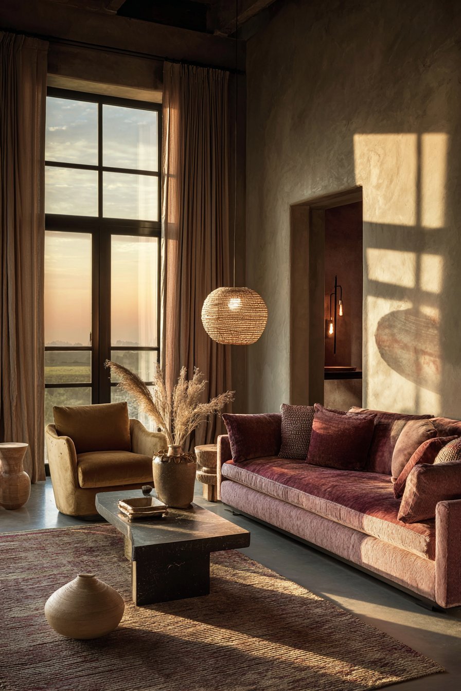
8. A Response to the Desire for Coziness
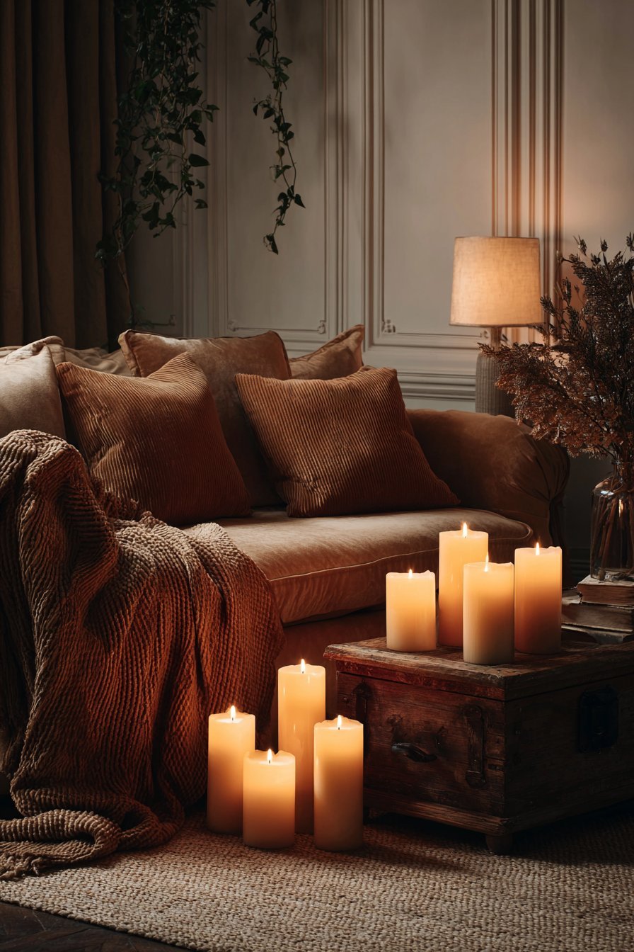
The concept of hygge — the Danish philosophy of coziness, comfort, and conviviality — has profoundly influenced interior design culture worldwide. Warm neutrals are the visual language of hygge. They create spaces that feel embracing, soft, and deeply livable — the antithesis of the cool, polished gray interiors that defined the previous decade.
Post-pandemic, the home took on renewed emotional significance. People spent more time at home and became acutely aware of how their environments affected their mood and wellbeing. Cold, clinical spaces began to feel insufficient. The desire for warmth, softness, and genuine comfort drove a massive shift in design priorities.
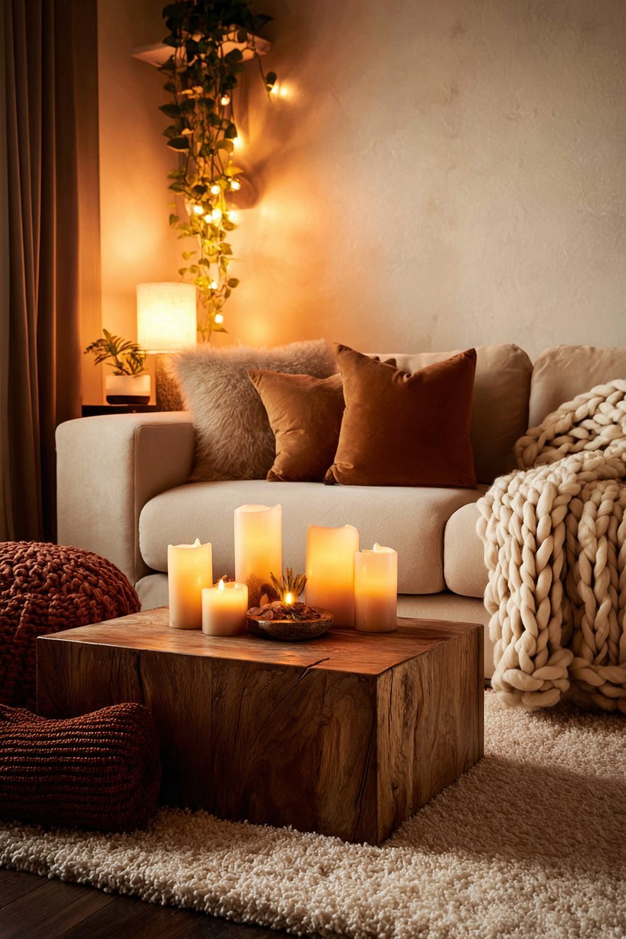
Warm neutrals answered this call perfectly. A room bathed in creamy ivory or warm sand feels inherently more welcoming than a cool gray space. Combined with soft lighting, plush textiles, and layered natural materials, a warm neutral palette can transform any home into a true refuge from the outside world.
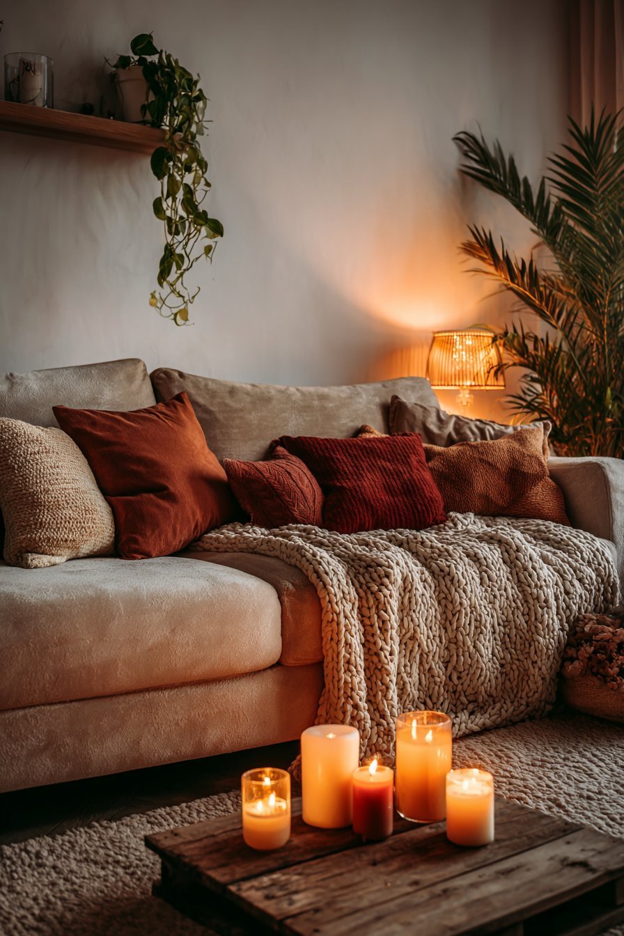
- Layer multiple warm neutral tones for a cozy, enveloping atmosphere
- Use warm-toned lighting — amber bulbs or candlelight — alongside warm neutral walls
- Add plush textiles like chunky knit throws and velvet cushions in earthy tones
- Choose rounded furniture shapes to reinforce the soft, cozy aesthetic
- Create intimate seating vignettes using warm neutral upholstery
- Incorporate soft rugs in warm beige or camel tones to anchor cozy spaces
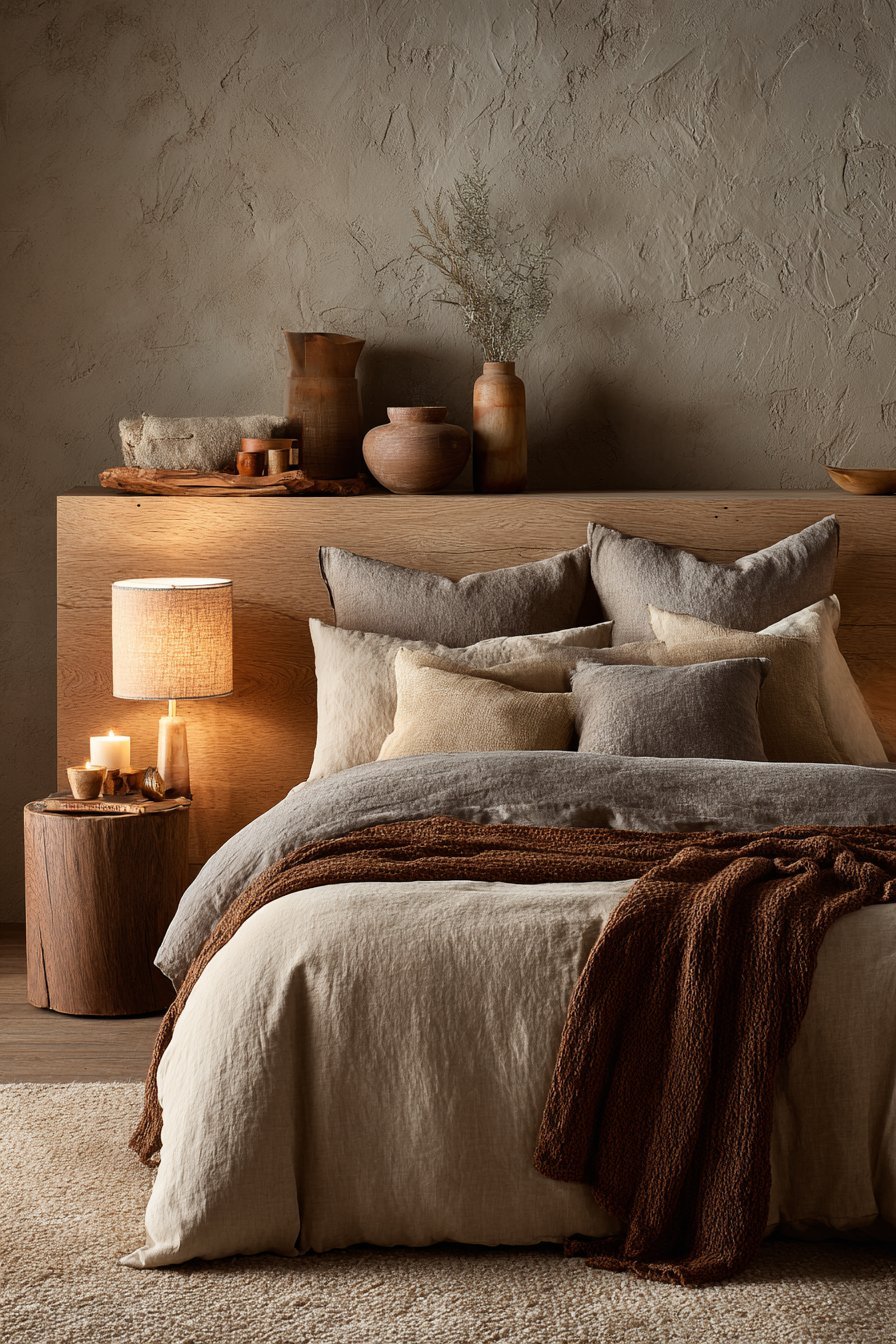
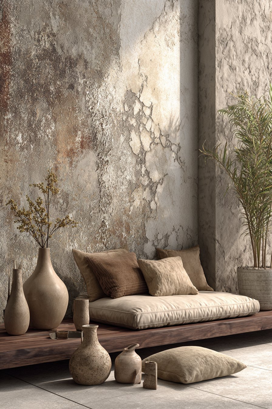
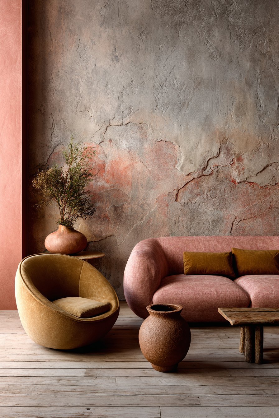
9. The Role of Texture in the Warm Neutral Palette
One reason warm neutrals feel so rich and interesting is the role that texture plays within this palette. Unlike cool gray, which can look flat and featureless without careful styling, warm neutrals interact beautifully with texture. The interplay of light and shadow across a textured warm surface creates extraordinary visual depth and complexity.
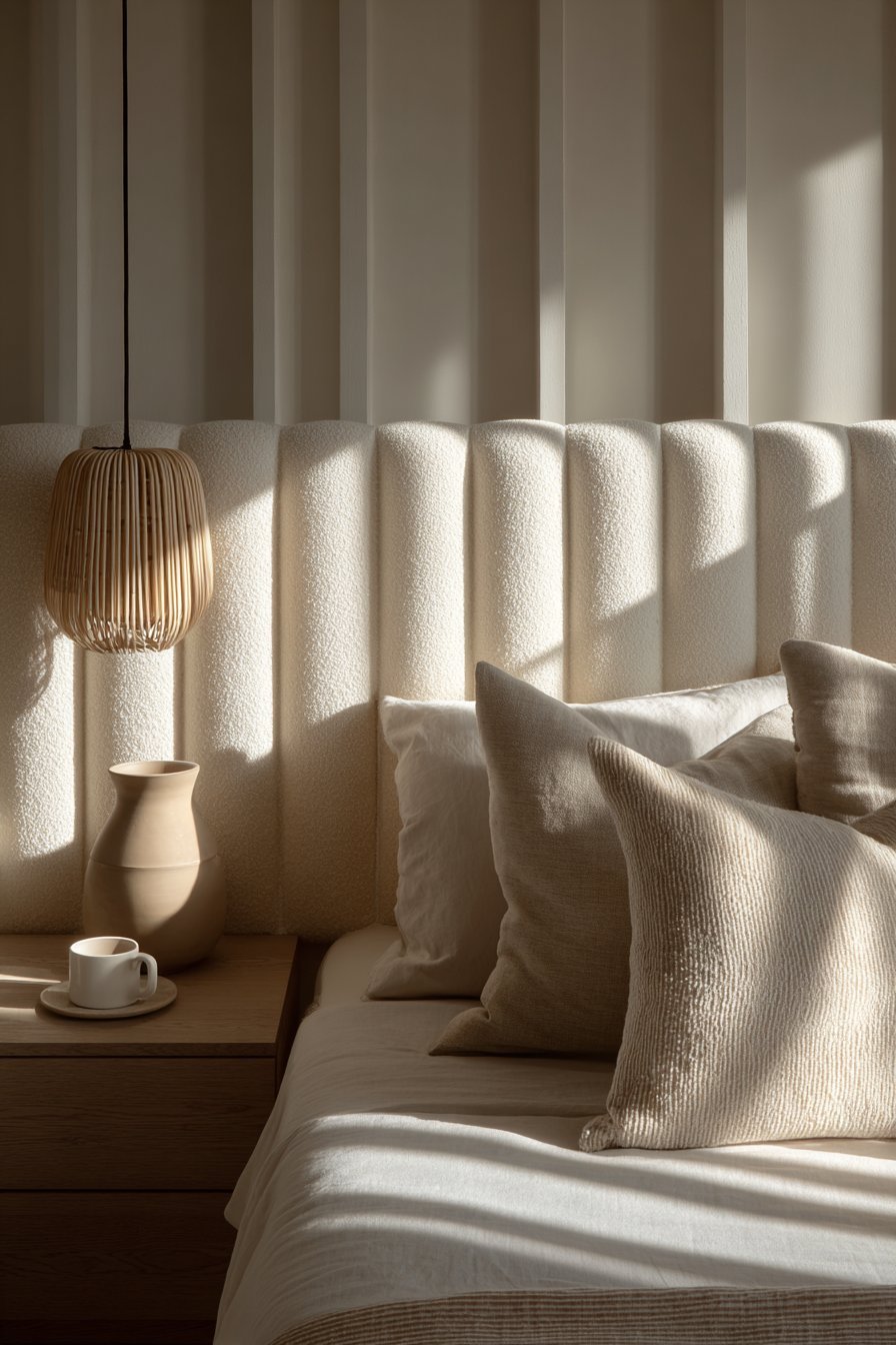
Materials like limewash plaster, microcement, bouclé fabric, and linen all take on a particularly beautiful quality in warm neutral tones. The warmth of the color amplifies the texture, making it feel more pronounced and intentional. A simple warm white limewash wall, for example, can be one of the most visually sophisticated surfaces in a contemporary interior.
This textural richness means that warm neutral rooms rarely feel boring. By layering different textures within the same tonal family — rough linen, smooth plaster, matte clay, polished wood — designers can create spaces with extraordinary visual interest while maintaining a serene, cohesive palette.
- Experiment with limewash or microcement for highly textured warm neutral walls
- Layer bouclé, linen, and velvet textiles in warm tonal shades
- Choose handmade ceramics and organic shapes as accessories
- Mix matte and glossy finishes within the same warm neutral palette
- Use woven wall hangings or textured artwork in earthy warm tones
- Incorporate natural stone surfaces for additional textural contrast
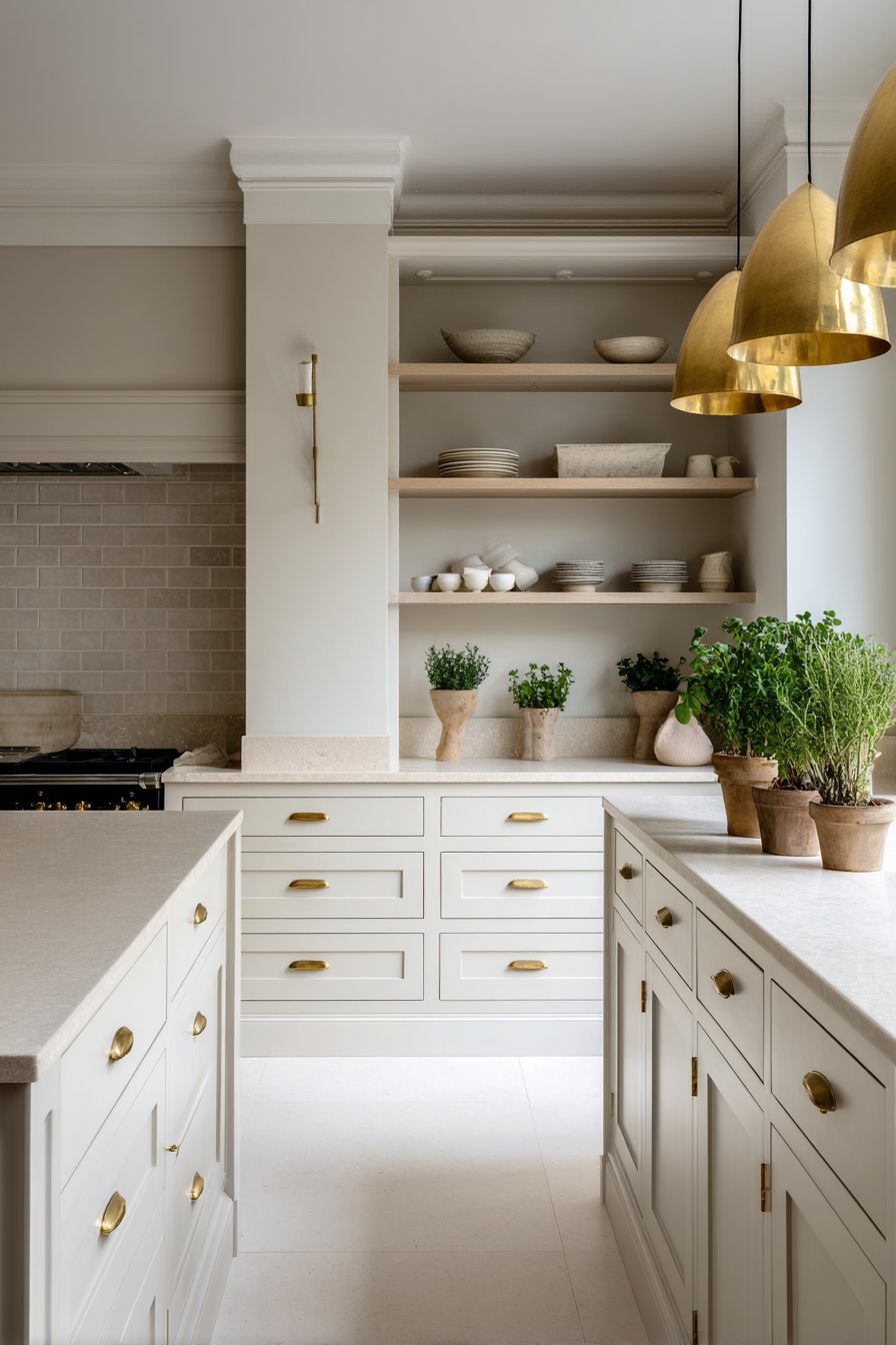
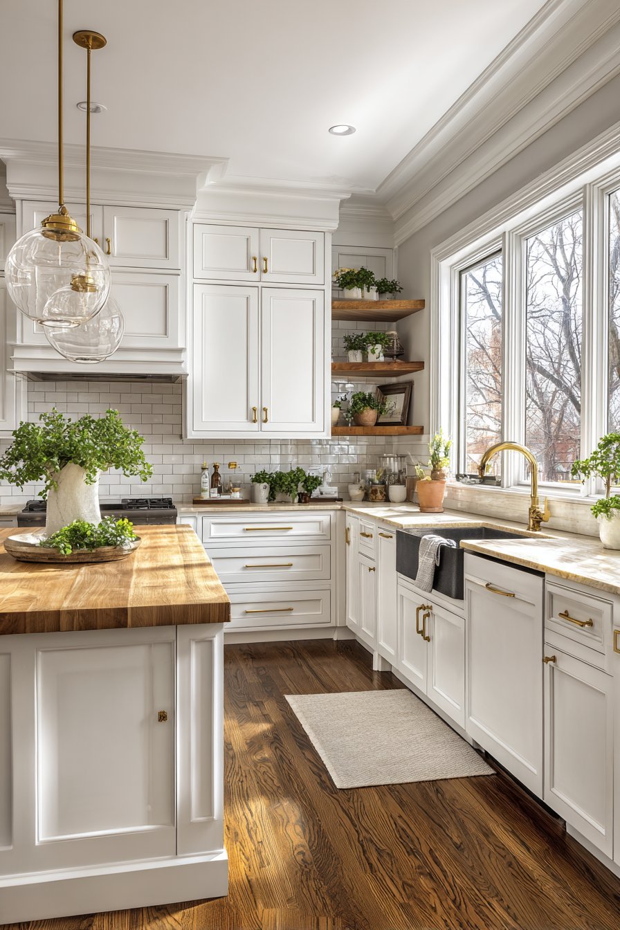
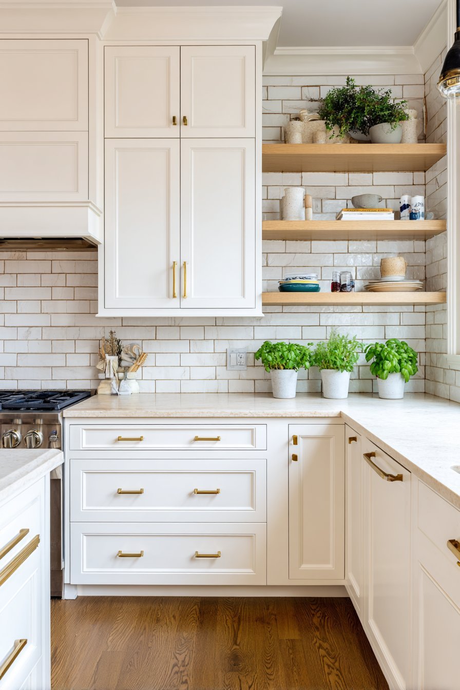
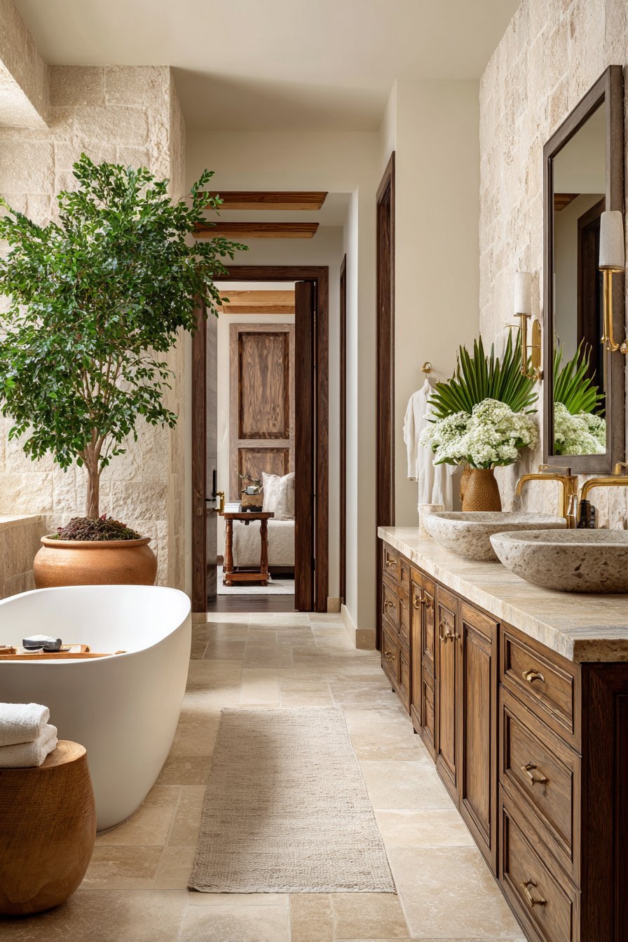
10. Warm Neutrals in the Kitchen and Bathroom
The kitchen and bathroom are perhaps the spaces where the shift from cool gray to warm neutral has been most dramatic. For years, cool gray kitchen cabinets and gray subway tiles were considered the pinnacle of contemporary design. Today, they are beginning to look dated.
Warm white cabinetry, creamy shaker doors, and soft putty-toned units are now the most requested finishes in kitchen design. They feel cleaner, fresher, and more inviting than cool gray ever did. Paired with warm wood countertops, natural stone, or unlacquered brass hardware, a warm neutral kitchen achieves a level of timeless elegance that cool gray struggles to match.
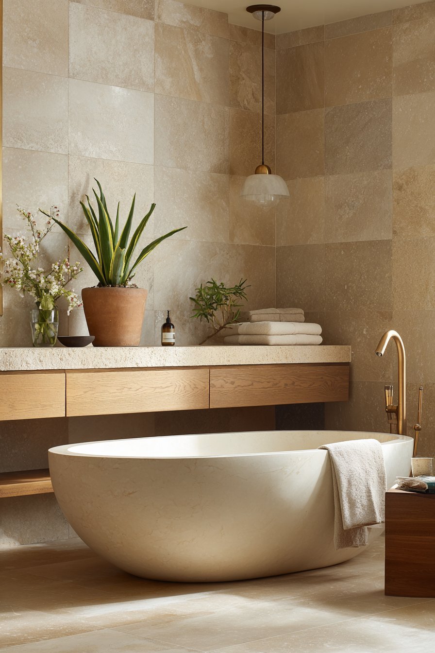
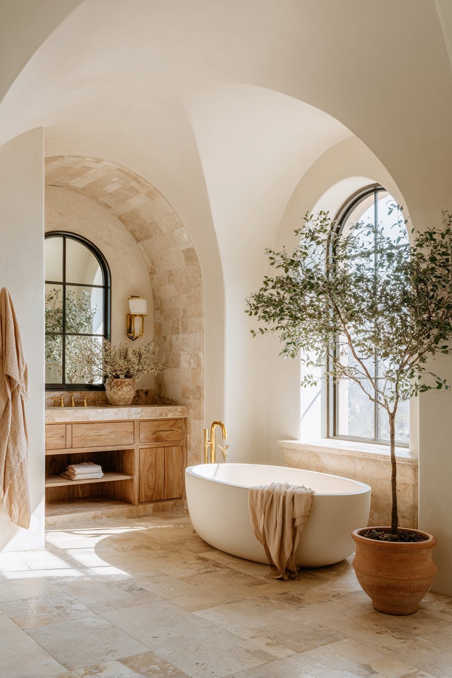
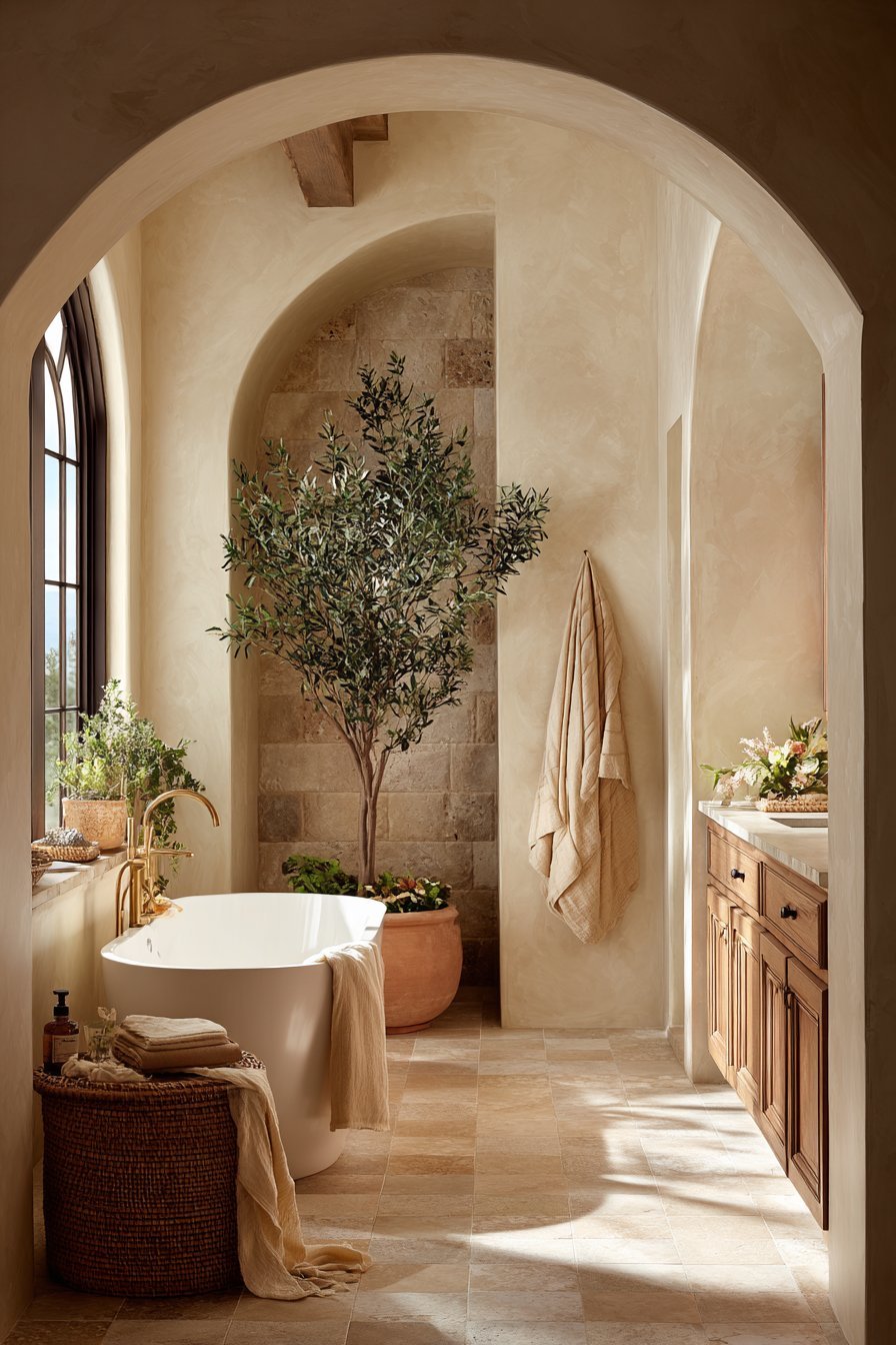
In bathrooms, warm travertine, creamy plaster walls, and sandy stone tiles have replaced the cool gray and white combination that dominated for so long. These materials create spa-like spaces that feel genuinely restorative. The warmth of the palette transforms the bathroom from a purely functional room into a personal sanctuary.
- Choose warm white or putty-toned shaker cabinets for a timeless kitchen
- Pair warm cabinetry with unlacquered brass or matte gold hardware
- Use travertine or warm limestone in bathrooms for a luxurious, natural feel
- Replace cool gray grout with warm ivory or sand-toned alternatives
- Choose warm-toned stone or quartz countertops over cool gray options
- Add natural wood open shelving to reinforce the warm, organic kitchen palette
11. How to Transition From Gray to Warm Neutrals
If your home is currently decorated in cool gray tones, transitioning to warm neutrals does not have to be overwhelming. The most effective approach is to start with the largest surfaces — walls and flooring — and work outward from there. Even a single wall color change can dramatically shift the entire feel of a space.
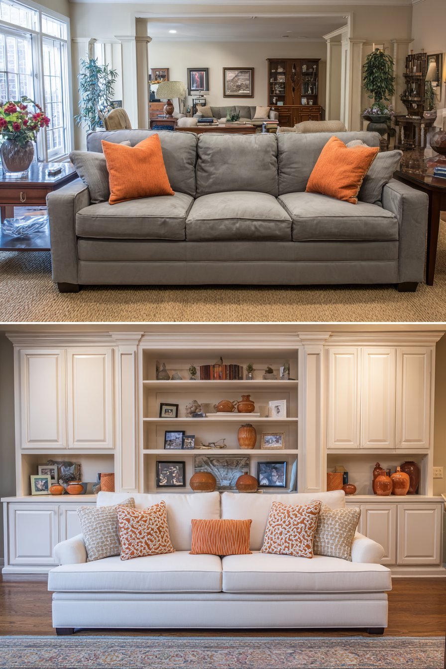
Painting walls is the fastest and most cost-effective way to introduce warm neutrals. Choose a warm white, soft taupe, or creamy greige as your base and see how the room transforms. In many cases, existing furniture and accessories will look significantly better against a warm backdrop than they ever did against cool gray.
For those not ready to redecorate entirely, layering warm neutral accessories is an excellent starting point. Replace cool-toned cushions, throws, and rugs with warm beige, camel, and ivory alternatives. Add natural wood accessories, terracotta pots, and linen textiles. These changes alone can meaningfully shift the mood of a gray room toward greater warmth and comfort.
- Start with wall color — choose a warm greige or soft ivory as your base
- Replace cool-toned textiles with warm beige, camel, and ivory alternatives
- Introduce natural wood accessories and furniture to warm up cool spaces
- Swap cool gray rugs for warm sand, jute, or natural fiber options
- Update hardware and fixtures to warm-toned metals like brass or bronze
- Add terracotta, clay, and ceramic accessories as affordable warm accents
12. The Future of Warm Neutrals in Interior Design
The dominance of warm neutrals is not merely a momentary reaction against cool gray. It represents a deeper cultural shift toward authenticity, natural living, and emotional wellbeing in the home. These are enduring values that are unlikely to reverse any time soon.
Leading design forecasters and trend agencies predict that warm, earthy palettes will continue to grow in influence over the coming years. The broader moves toward sustainability, biophilic living, and artisanal craftsmanship all align naturally with a warm neutral aesthetic. As these movements gain strength, warm neutrals will only become more central to contemporary interior design.
The most forward-thinking designers are already moving beyond simple beige and taupe, exploring richer and more complex warm neutrals — clay, warm mushroom, dusty rose, aged plaster, and deep ochre. These sophisticated tones offer the warmth and comfort of the neutral palette while introducing greater depth and personality. The future of warm neutrals is nuanced, rich, and deeply exciting.
- Follow emerging warm neutral tones like clay, warm mushroom, and aged plaster
- Explore dusty rose and muted terracotta as sophisticated warm neutral options
- Invest in artisanal, handmade pieces that align with the warm neutral aesthetic
- Study sustainability-focused design for warm, natural palette inspiration
- Embrace imperfection and organic texture as hallmarks of the warm neutral future
- Look to nature as your ultimate guide for endlessly inspiring warm neutral tones
Conclusion
The shift from cool gray to warm neutrals is one of the most significant and meaningful movements in recent interior design history. It reflects a collective desire for homes that feel genuinely nurturing — spaces rooted in nature, rich in texture, and aligned with human emotional needs. Cool gray served its moment well, but warm neutrals offer something deeper and more enduring.
Whether you are starting a full renovation or simply refreshing a single room, embracing warm neutrals is a decision you are unlikely to regret. The warmth, versatility, and timelessness of this palette make it one of the smartest design choices available today. Start small, trust the transformation, and allow your home to become the warm, welcoming sanctuary it was always meant to be.