Neutral bedrooms have long been celebrated for their calming, timeless appeal. However, even the most beautifully designed neutral spaces can sometimes feel incomplete without strategic pops of color. The challenge lies in introducing vibrant elements without overwhelming the serene atmosphere that makes neutral palettes so desirable. Adding color to a neutral bedroom isn’t about abandoning minimalism or sophistication—it’s about enhancing visual interest while maintaining balance.
The beauty of neutral foundations is their versatility and adaptability to various color schemes. Whether your bedroom features soft grays, warm beiges, or crisp whites, these backdrops provide the perfect canvas for experimentation. From bold accent walls to subtle textile choices, there are countless ways to infuse personality and energy into your space. This article explores six intelligent approaches to incorporating color that complement rather than compete with your neutral base, ensuring your bedroom remains a restful sanctuary with added character.
Understanding how to layer color effectively transforms a bland room into a dynamic yet peaceful retreat. The key is selecting the right intensity, placement, and quantity of colorful elements. Each method discussed here offers practical guidance for homeowners looking to refresh their bedrooms without undertaking major renovations. These strategies work across different design styles and budgets, making beautiful bedroom transformations accessible to everyone.
1. Statement Bedding and Textiles
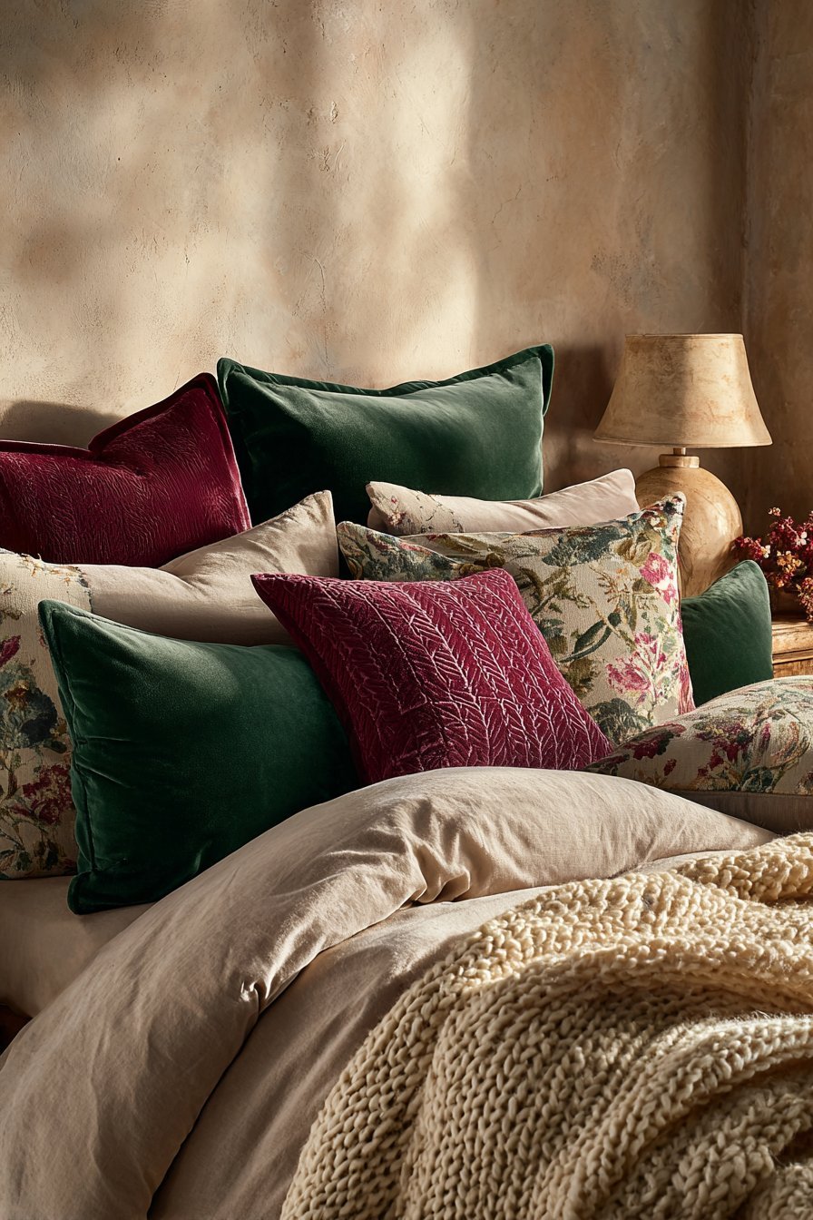
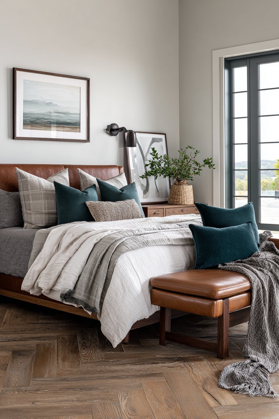
Bedding serves as the focal point of any bedroom and offers the easiest way to introduce color without permanent commitment. Duvet covers, quilts, and comforters in vibrant hues instantly transform the visual dynamics of neutral spaces. Consider jewel tones like emerald, sapphire, or ruby against gray or beige walls for sophisticated contrast. The advantage of using bedding for color injection is the flexibility to change with seasons or evolving preferences.
Layering textiles creates depth and visual richness beyond what single-color bedding achieves alone. Combine patterned throw pillows in complementary colors with solid decorative cushions for dimensional interest. Textured blankets draped at the foot of the bed add both tactile appeal and additional color opportunities. Mixing patterns—florals with geometrics or stripes with abstracts—prevents the space from feeling too coordinated or sterile when done with a consistent color palette.
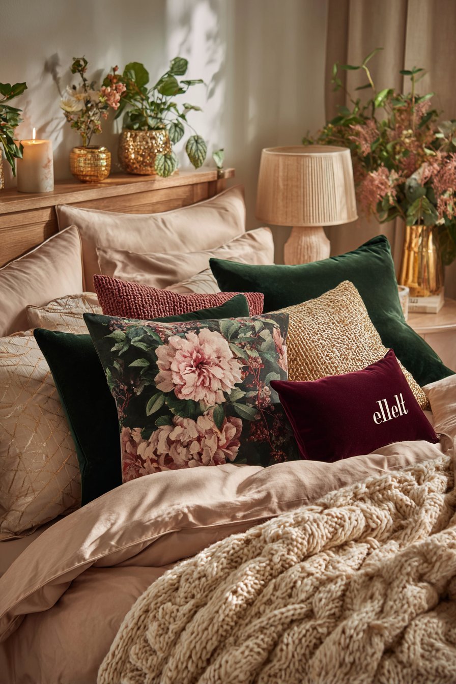
The 60-30-10 rule applies beautifully to bedroom textiles for balanced color distribution. Use your neutral base as the 60 percent, introduce a primary color as 30 percent through bedding, and add an accent color as the remaining 10 percent through smaller elements. This professional approach ensures colors enhance rather than overwhelm. Pay attention to fabric quality and texture alongside color, as materials like linen, velvet, and cotton each reflect light differently, affecting color perception.
- Choose washable bedding for easy seasonal color rotation
- Layer multiple shades of one color family for cohesive depth
- Select patterns with your neutral base color included to tie the room together
- Consider temperature when selecting colors—cool tones calm, warm tones energize
- Invest in quality pillows and throws that withstand frequent use
- Test bedding colors in your room’s natural and artificial lighting before committing
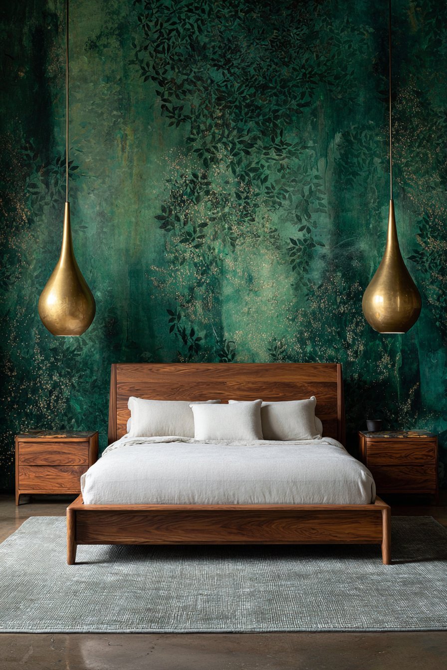
2. Accent Wall with Bold Paint or Wallpaper
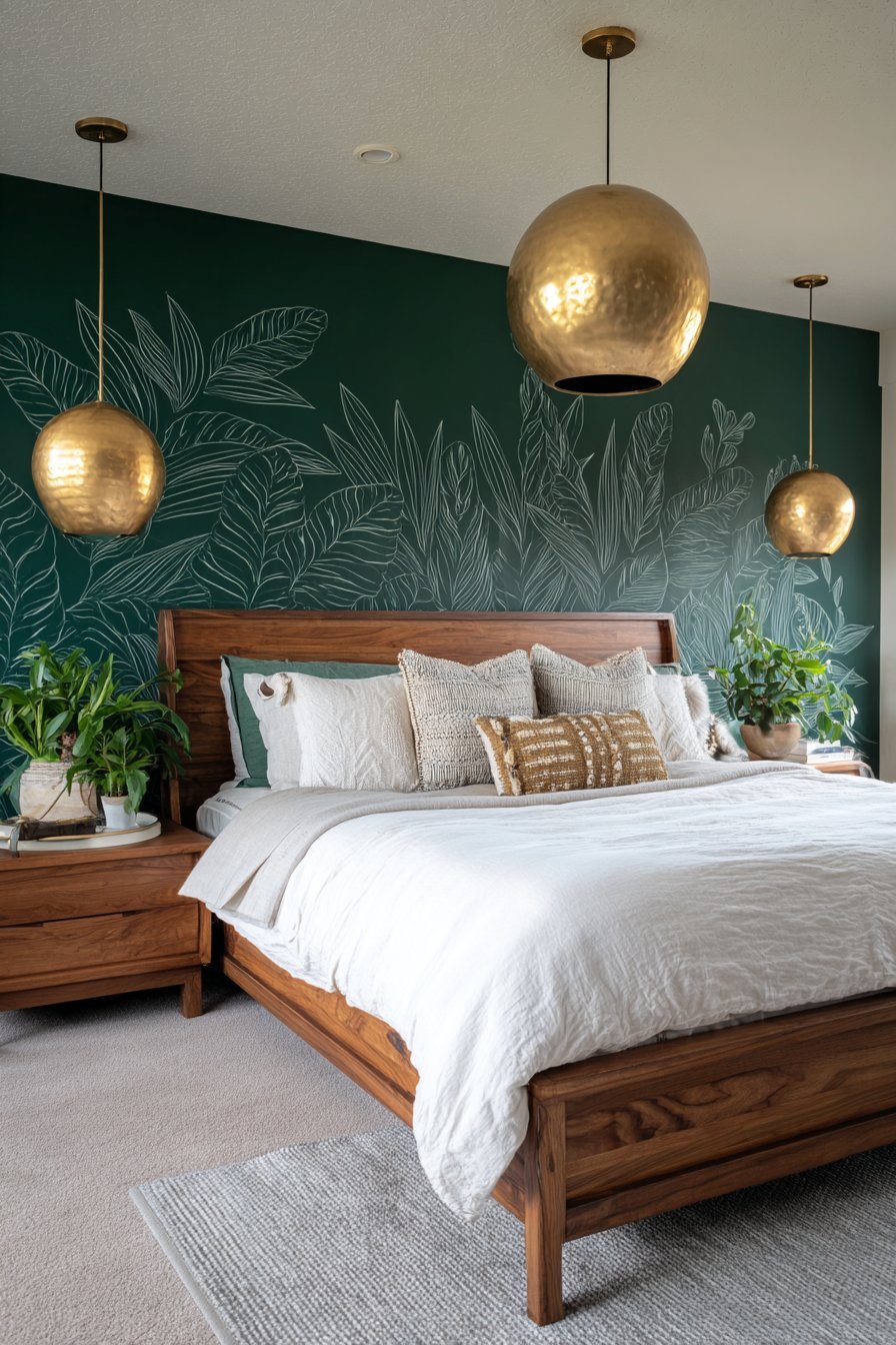
An accent wall delivers maximum visual impact with relatively minimal effort and investment. Painting a single wall in a bold color creates an immediate focal point without overwhelming the room’s neutral character. The wall behind the bed typically serves as the ideal location, as it anchors the space and draws the eye naturally. Colors like deep navy, forest green, or terracotta work exceptionally well against neutral surroundings, adding sophistication and warmth.
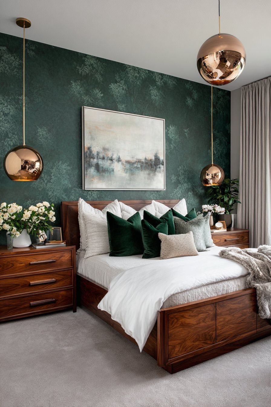
Wallpaper offers even greater creative possibilities with patterns, textures, and colors that paint alone cannot achieve. Modern removable wallpapers make this option particularly appealing for renters or those hesitant about permanent changes. Consider botanical prints, geometric designs, or abstract patterns that incorporate your chosen color alongside neutrals. The three-dimensional quality of textured wallpapers adds depth that flat paint cannot replicate, creating subtle shadows and highlights throughout the day.
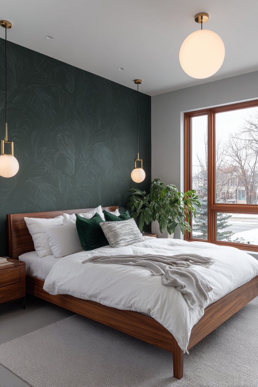
When selecting your accent wall color or pattern, consider the room’s natural light exposure and existing furniture placement. North-facing rooms benefit from warmer colors that compensate for cooler natural light, while south-facing spaces can handle cooler tones without feeling cold. Test large paint samples or wallpaper swatches on your wall and observe them at different times throughout the day. The transformative power of a single colored wall proves that dramatic change doesn’t require painting the entire room.
- Limit accent walls to one per room to maintain focus
- Use painter’s tape for crisp, professional-looking edges
- Select colors two to three shades darker than your desired outcome, as walls appear lighter when fully painted
- Consider the five-foot rule—step back five feet to evaluate color intensity
- Prep walls properly by cleaning and priming for best paint adhesion
- Extend accent wall color to the ceiling for a cocooning effect in larger rooms
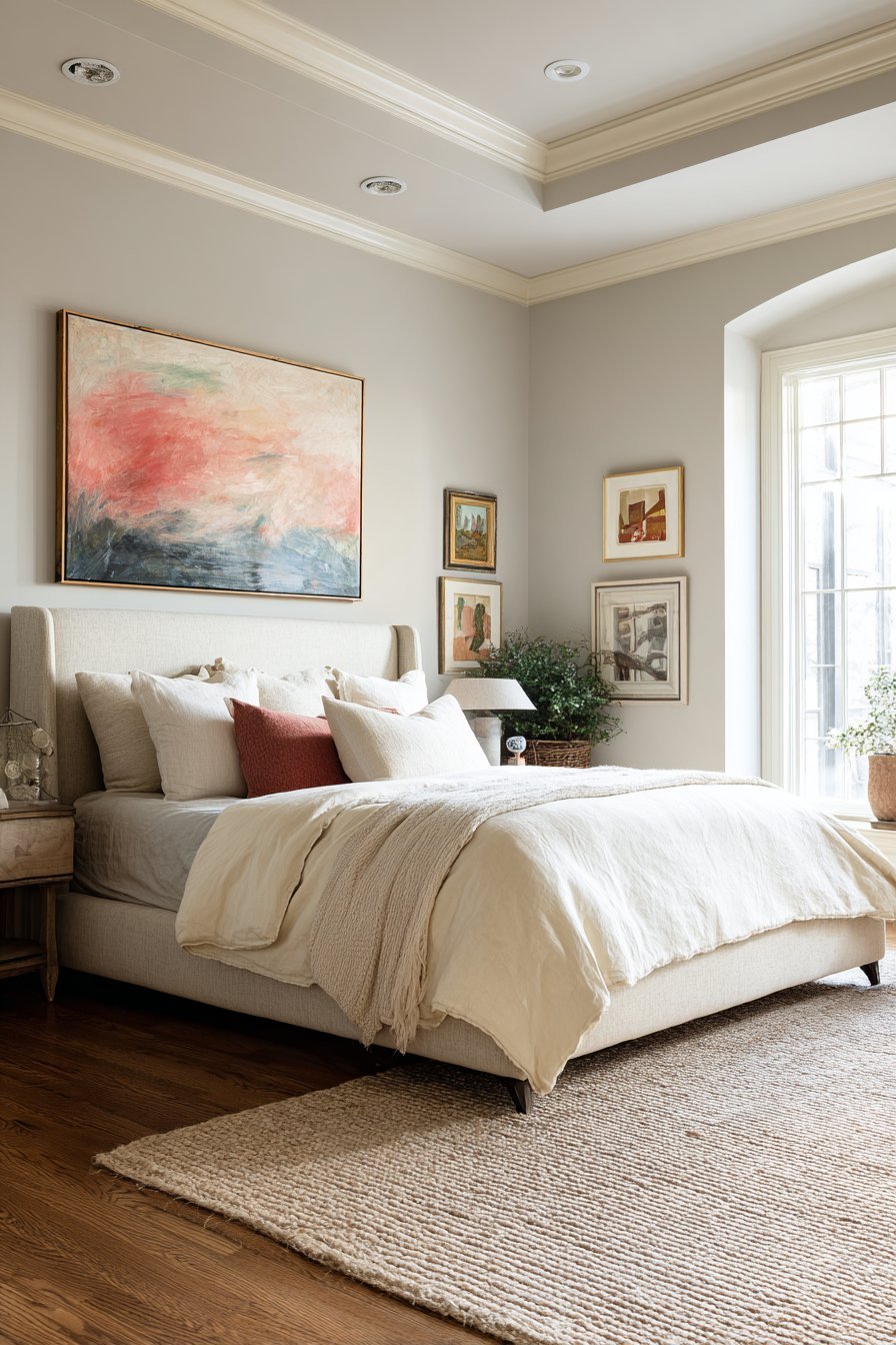
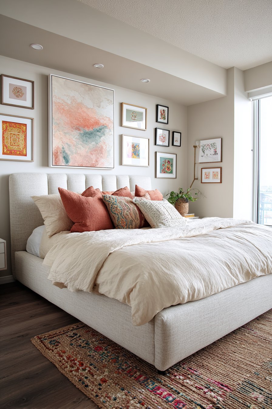
3. Colorful Artwork and Wall Decor
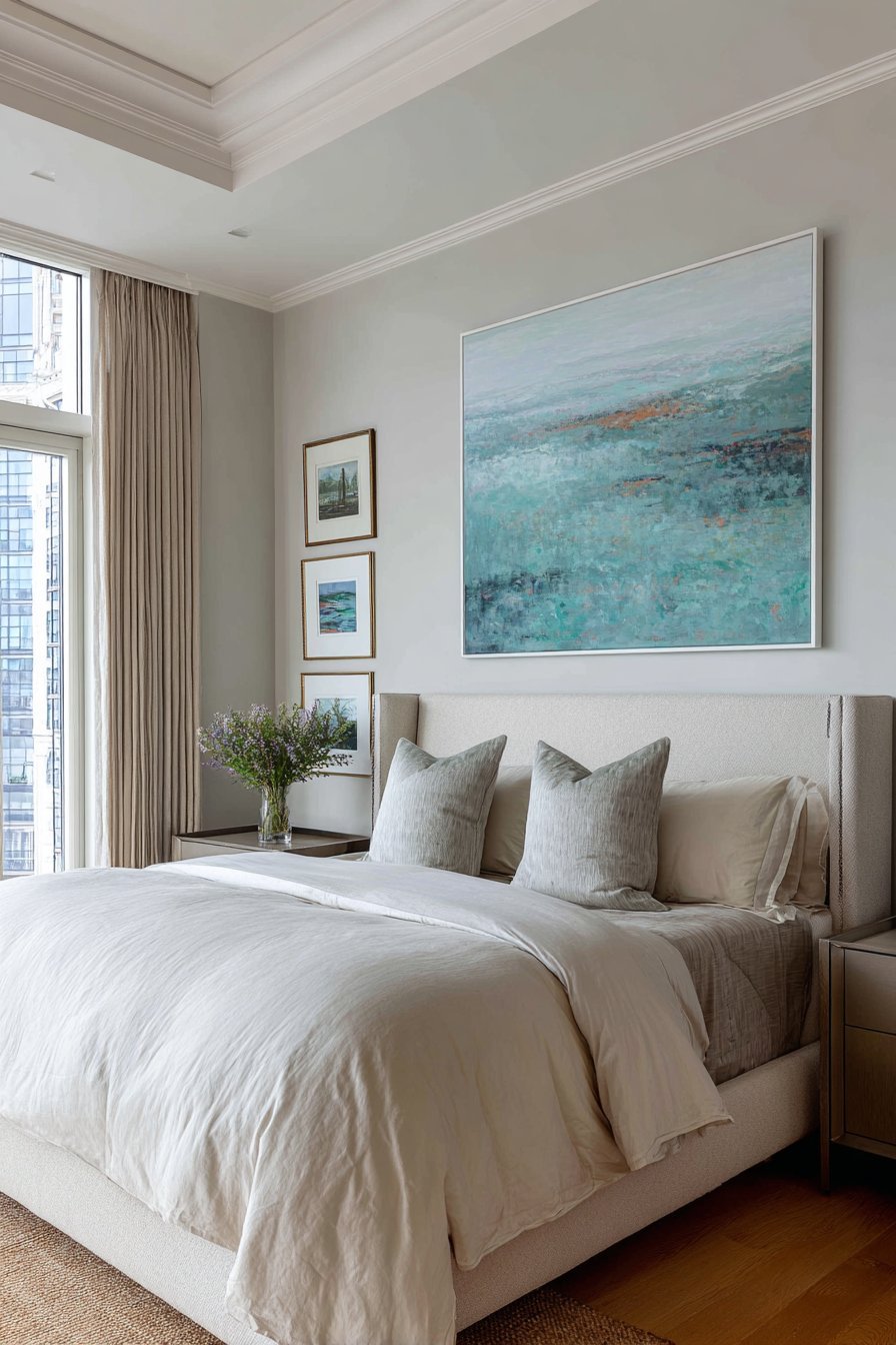
Artwork provides the most flexible and personal approach to adding color to neutral bedrooms. Unlike permanent fixtures, art pieces can be easily switched, repositioned, or updated as your taste evolves. A large statement piece above the bed creates an instant focal point, while gallery walls offer opportunities to incorporate multiple colors and styles simultaneously. Original paintings, prints, or photographs introduce color while expressing your personality and interests.
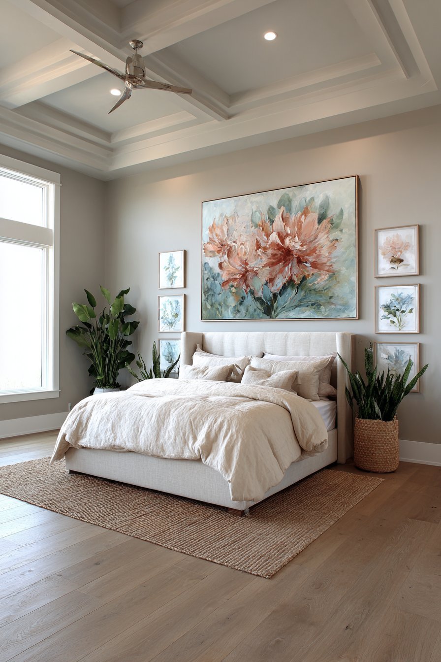
The framing and matting choices significantly impact how artwork integrates with your neutral palette. White or natural wood frames maintain the room’s serene quality while allowing colorful artwork to pop. Alternatively, colored frames that match elements within the artwork create cohesive visual connections throughout the space. Consider the proportional relationship between artwork size and wall space—pieces should command attention without overwhelming, generally taking up 60-75 percent of available wall width.
Mixed media wall decor extends beyond traditional framed art to include textile hangings, metal sculptures, or wooden pieces with painted elements. Three-dimensional wall art creates visual interest through shadows and depth that flat artwork cannot achieve. Color psychology plays a crucial role in bedroom art selection—blues and greens promote relaxation and tranquility, while warmer tones like coral or yellow energize the space. Select artwork that resonates emotionally while serving your color introduction goals.
- Hang artwork at eye level, approximately 57-60 inches from the floor to center
- Create gallery walls with a consistent element (color, frame style, or theme) for cohesion
- Use removable hanging strips for rental-friendly installations
- Balance large statement pieces with smaller complementary works on adjacent walls
- Consider lighting artwork with picture lights or track lighting to enhance colors
- Rotate seasonal artwork to refresh your bedroom’s color palette throughout the year
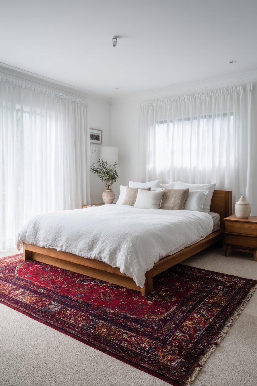
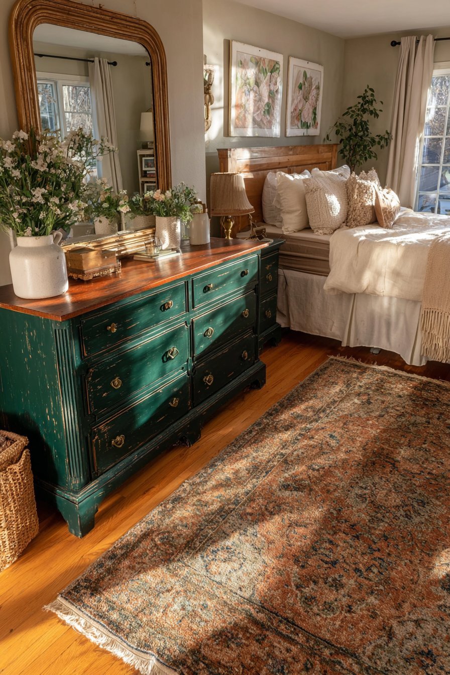
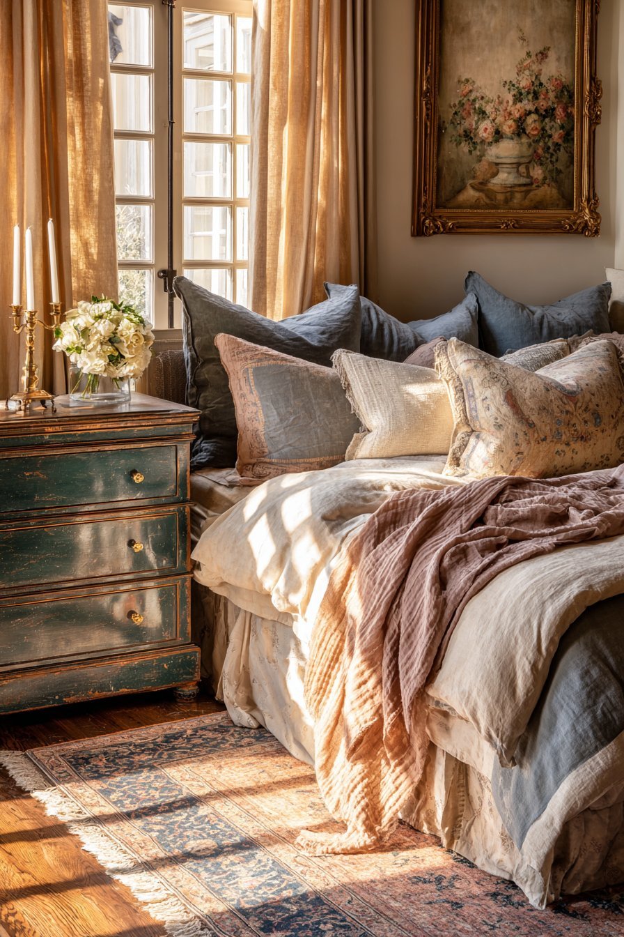
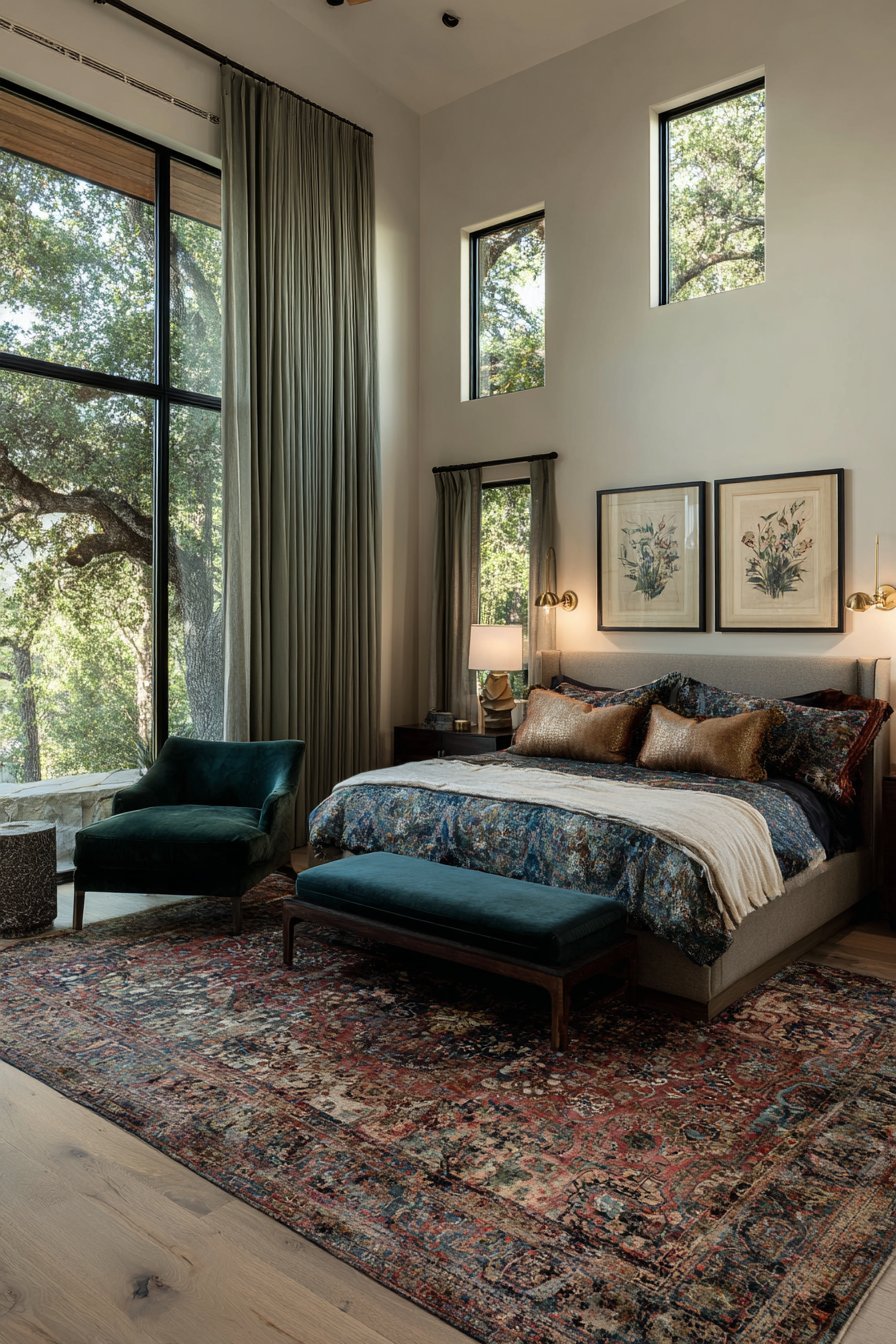
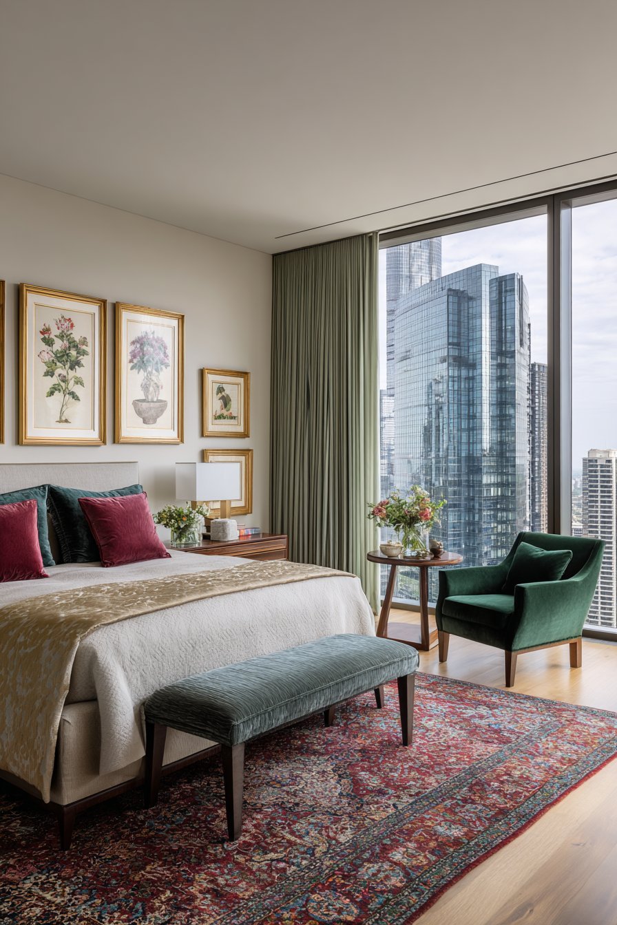
4. Vibrant Area Rugs and Floor Coverings
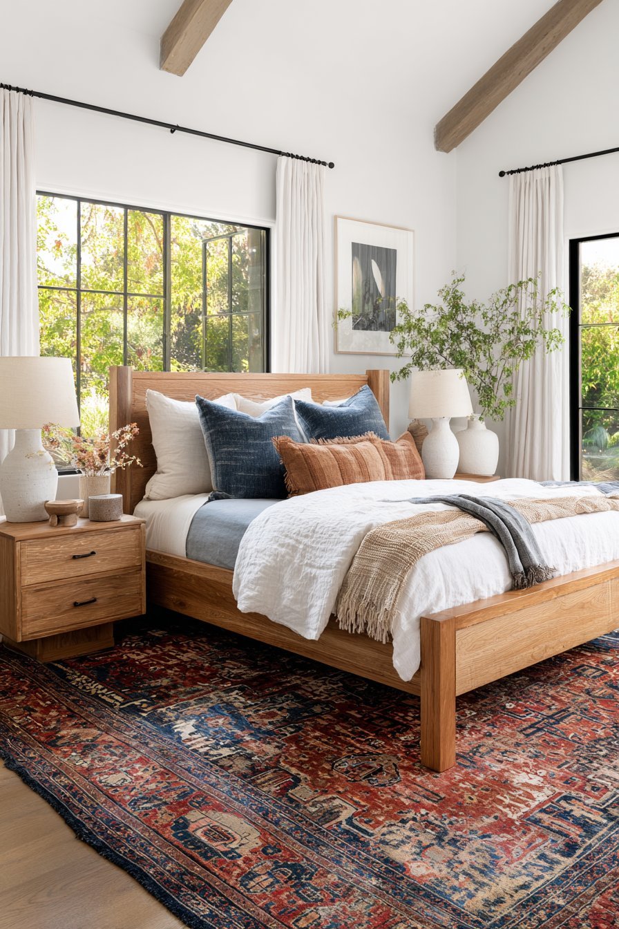
Area rugs deliver color from the ground up while adding warmth, texture, and sound absorption to neutral bedrooms. A colorful rug anchors the space and defines the sleeping area within larger rooms. Persian or Oriental rugs in rich reds, blues, and golds bring traditional elegance, while contemporary geometric patterns in bold colors create modern sophistication. The rug’s size matters tremendously—ideally, it should extend at least 18-24 inches beyond each side of the bed.
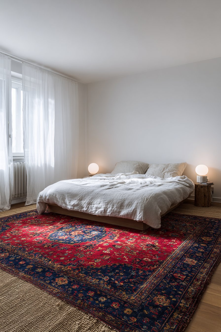
Layering rugs creates unexpected visual interest and allows for more adventurous color combinations. Place a smaller, colorful rug atop a larger neutral jute or sisal base for dimension and contrast. This technique works particularly well in rental situations where you cannot replace existing carpeting. The textural contrast between materials adds depth beyond color alone, with plush wool rugs offering different visual weight than flat-weave kilims or shaggy options.
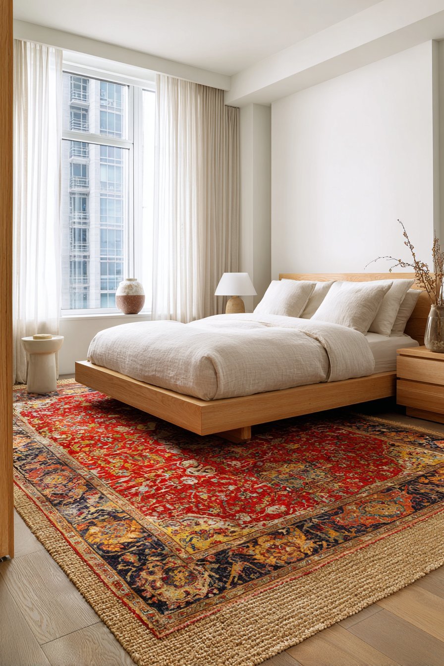
Rug placement and proportion significantly affect how color impacts the overall room design. Runner rugs along bedside areas introduce color without dominating the space, ideal for smaller rooms or tentative color introduction. Consider how the rug’s colors relate to other elements in the room—pulling one accent color from your bedding or artwork into the rug creates harmonious visual flow. Maintenance considerations matter too, as darker, patterned rugs hide stains better than light solids in high-traffic areas.
- Measure your room and bed dimensions before purchasing to ensure proper rug sizing
- Choose rugs with colors that appear in at least one other bedroom element
- Opt for indoor-outdoor rugs in bedrooms prone to spills for easy cleaning
- Use rug pads to prevent slipping and extend rug life
- Consider seasonal rug swaps—lighter colors for summer, deeper tones for winter
- Test rug samples in your space, as colors appear different on floors versus vertical displays
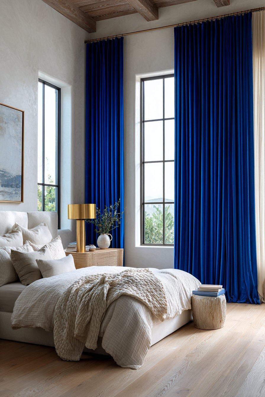
5. Colorful Window Treatments and Drapery
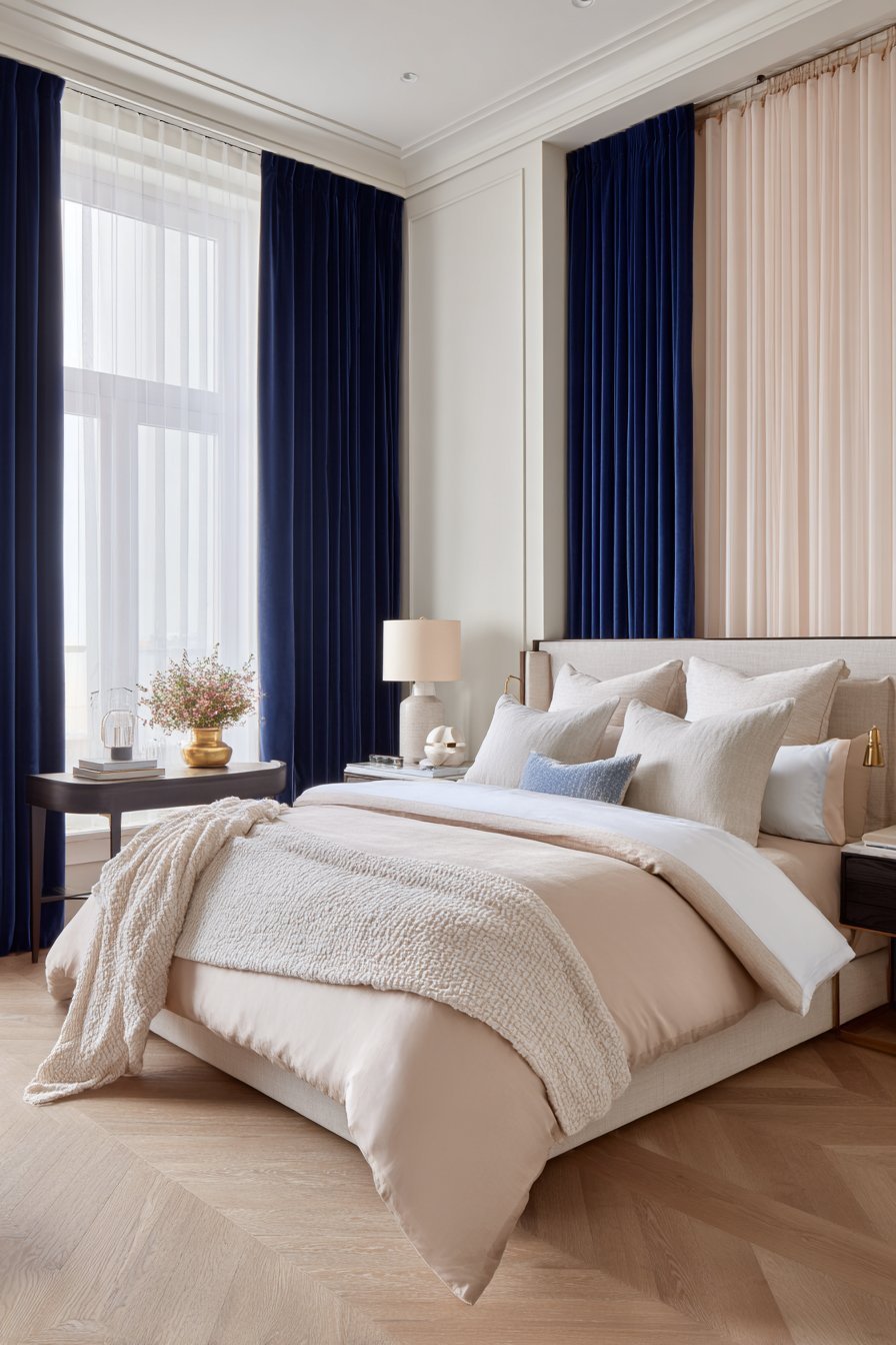
Window treatments offer dual functionality—controlling light while introducing significant color to neutral spaces. Floor-length curtains in vibrant colors draw the eye upward, making ceilings appear higher and rooms more spacious. Solid-colored drapes in jewel tones or saturated hues create dramatic elegance, while patterned options introduce multiple colors simultaneously. The fabric’s weight and opacity affect both color intensity and practical light control.
Layering window treatments provides maximum versatility for color, light, and privacy management. Combine sheer curtains in soft colors with heavier drapes in bolder hues for adjustable options throughout the day. Roman shades in colorful patterns work beautifully beneath neutral drapes for subtle color reveals. The hardware and finials supporting your treatments present additional opportunities for metallic color accents—brass, copper, or colorful painted rods enhance the overall design scheme.
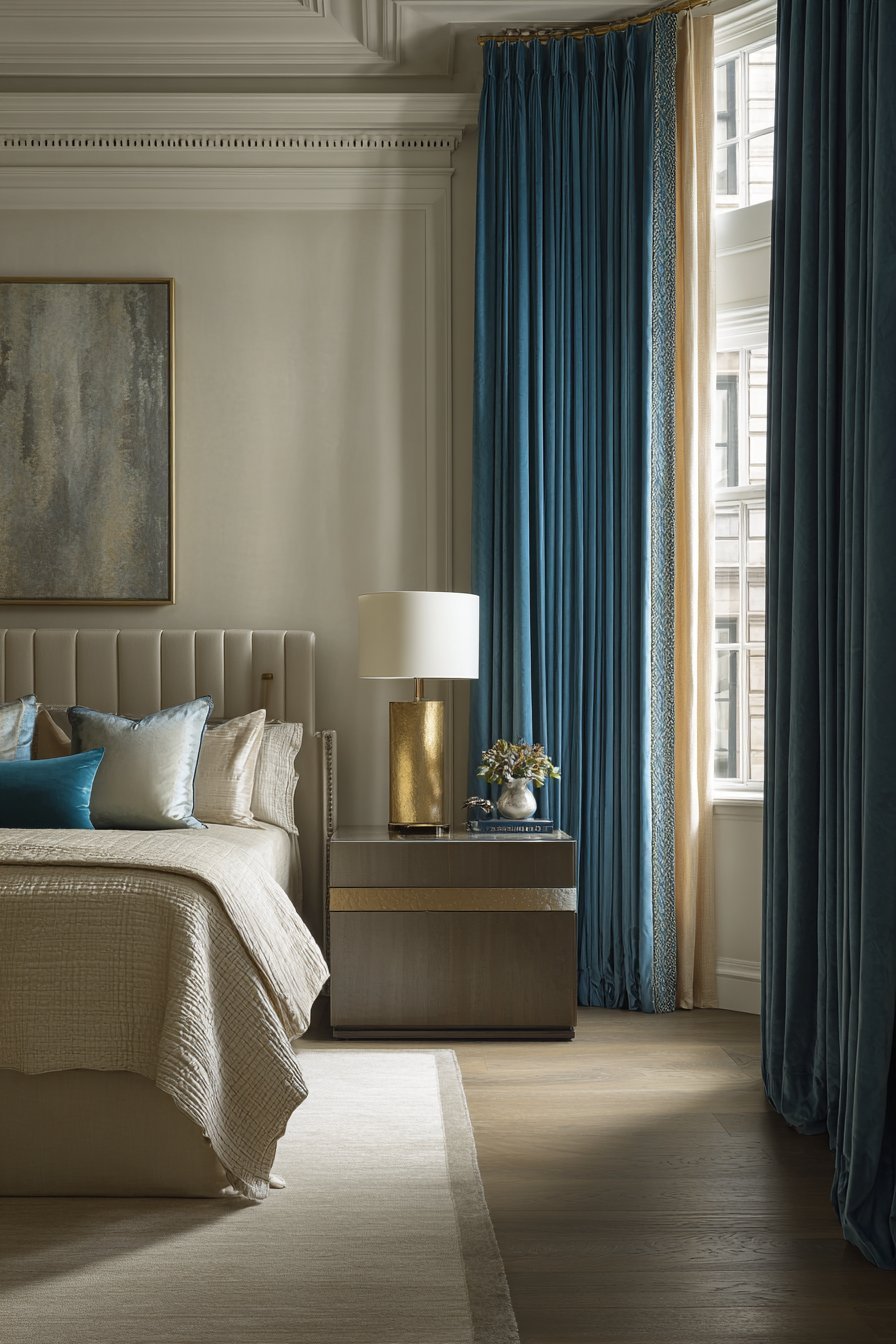
The proportion of window treatments to wall space significantly impacts color perception in the room. Hanging curtain rods 4-6 inches above the window frame and extending them beyond the window width creates the illusion of larger windows and more color impact. Puddle-length drapes pooling slightly on the floor evoke luxurious sophistication, while curtains just kissing the floor offer cleaner, more modern aesthetics. Consider how natural light filters through your chosen fabric during different times of day.
- Mount curtain rods closer to the ceiling to make rooms appear taller
- Choose curtains at least twice the window width for proper fullness when closed
- Line curtains with white fabric to create consistent exterior appearance
- Steam or iron curtains before hanging for professional presentation
- Consider blackout linings in bright colors for light control without compromising color
- Use tieback hardware in coordinating colors to introduce additional color touches
6. Decorative Accessories and Accent Pieces
Small decorative accessories deliver concentrated color doses without overwhelming commitment or expense. Table lamps with colored bases or shades, decorative vases, picture frames, and sculptural objects introduce color through curated vignettes. These pieces allow for seasonal rotation and easy updates as your preferences evolve. Grouping accessories in odd numbers (three or five) creates more visually appealing arrangements than even-numbered displays.
Nightstands and dressers provide perfect surfaces for colorful styling opportunities. A stack of books with vibrant spines, a colored jewelry box, or a ceramic dish in your chosen accent color adds personality without dominating the space. Fresh flowers or potted plants bring living color that changes with seasons and occasions. The beauty of accessory-based color introduction lies in its flexibility—pieces can be added, removed, or relocated as you discover what works best.
The strategic placement of colorful accessories guides the eye around the room, creating visual rhythm and balance. If your accent wall is behind the bed, place complementary colored objects on the opposite wall or in corners to encourage visual circulation. Mirrors with colored frames both introduce color and reflect other colorful elements, multiplying their impact. Consider the sight lines from your bed—what you see upon waking and before sleeping matters for the room’s emotional impact.
- Use the rule of three when styling surfaces—group items in triangular arrangements
- Vary heights of accessories to create visual interest and prevent flatness
- Select one or two accent colors and repeat them in multiple accessories throughout the room
- Incorporate metallic accessories (gold, brass, copper) to bridge color transitions
- Change out smaller accessories seasonally for fresh color without major investment
- Shop your home first—repurpose colorful items from other rooms before buying new
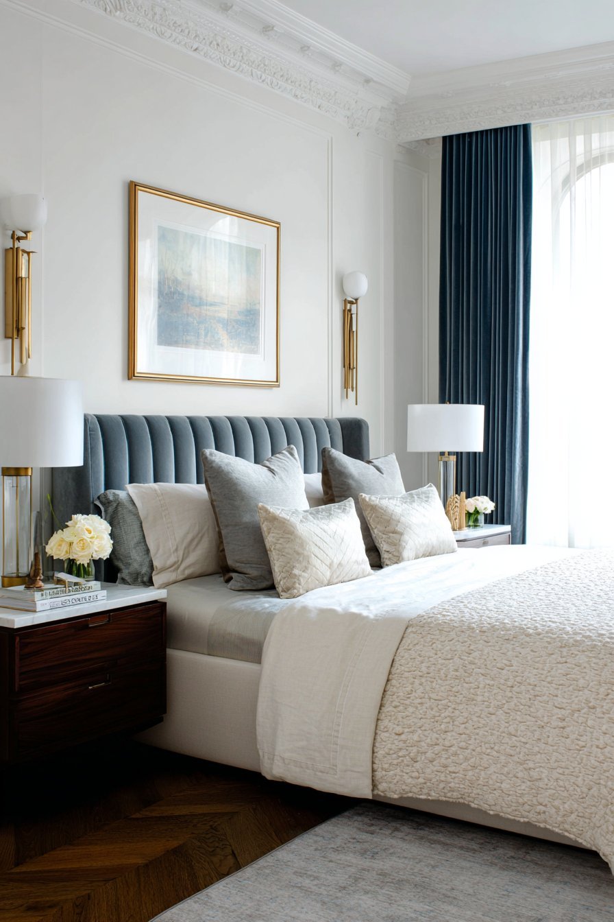
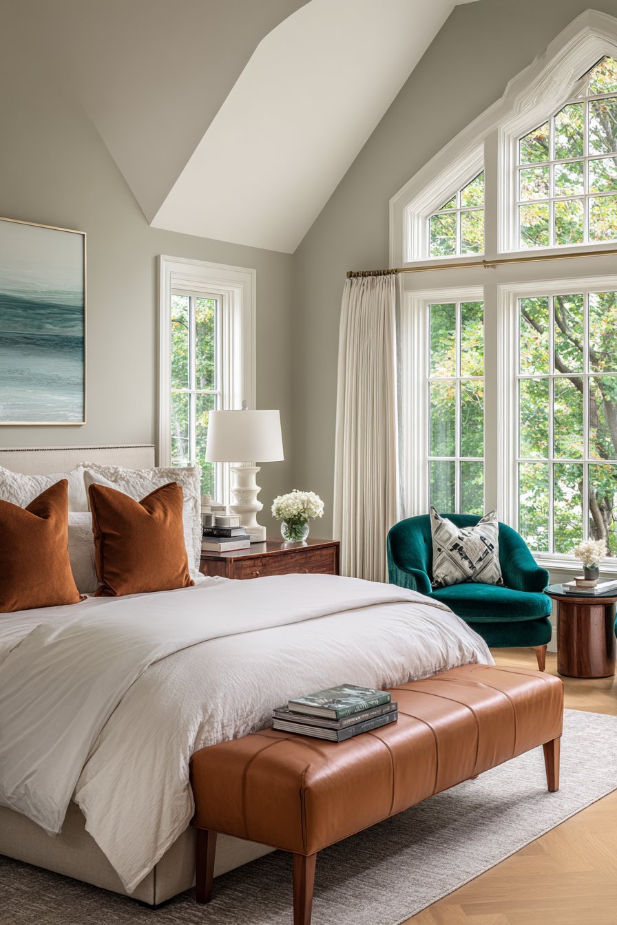
7. Upholstered Furniture in Bold Hues
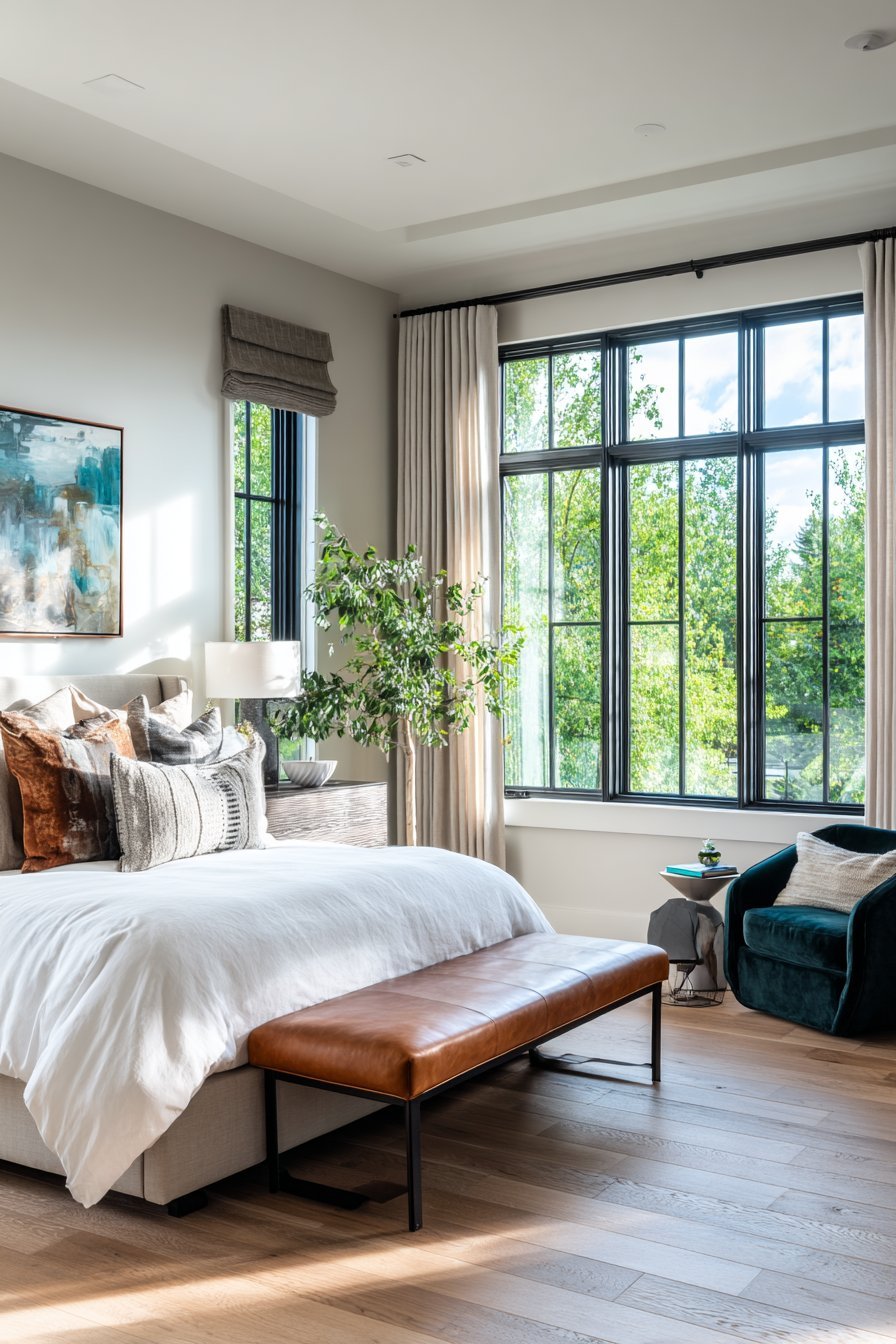
Upholstered furniture pieces provide substantial color impact with the added benefit of functionality and comfort. An accent chair in velvet emerald or leather cognac creates an instant focal point in bedroom corners or reading nooks. Upholstered benches at the foot of the bed introduce color while providing practical seating and storage. The permanence of furniture makes color selection more critical—choose hues you’ll appreciate long-term or select pieces with removable, washable covers.
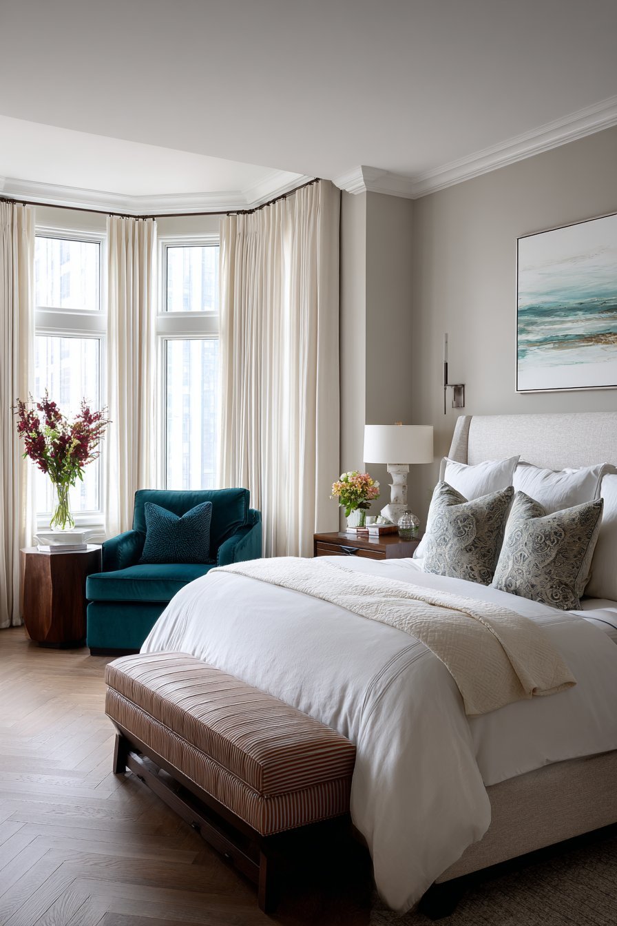
The fabric choice dramatically affects how color appears and ages in your bedroom. Velvet upholstery reflects light beautifully, creating depth and richness in jewel tones. Linen offers more casual, relaxed color presentation perfect for coastal or farmhouse aesthetics. Leather and faux leather in cognac, burgundy, or forest green bring masculine sophistication while proving durable and easy to maintain. Consider how the fabric’s texture interacts with your room’s overall textural palette.
Furniture placement determines how effectively colored pieces integrate with your neutral scheme. An accent chair positioned near windows benefits from natural light that enhances color vibrancy. Ottoman storage benches in bold colors serve multiple purposes—seating, storage, and color injection simultaneously. When selecting furniture colors, consider existing wood tones in the room—warm-toned woods pair beautifully with warm colors, while cool-toned woods complement cooler hues.
- Measure available space carefully before purchasing furniture pieces
- Consider dual-purpose furniture to maximize small bedroom functionality
- Request fabric swatches to test colors in your room’s lighting
- Protect upholstered pieces with stain-resistant treatments
- Balance one large colorful furniture piece with smaller neutral pieces
- Coordinate furniture leg finish with other wood elements in the room
8. Painted or Colorful Furniture Refinishing
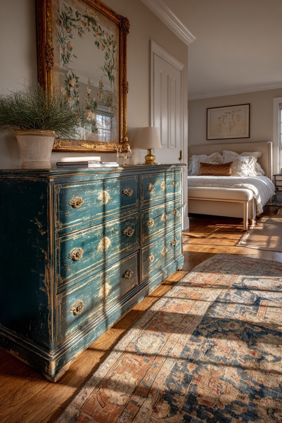
Existing furniture transformed through paint or refinishing techniques offers budget-friendly color introduction. A dated dresser becomes a statement piece when painted in deep teal or vibrant coral. This approach combines sustainability with personalization, breathing new life into thrift store finds or inherited pieces. Modern chalk paints require minimal preparation and offer beautiful matte finishes in hundreds of colors, making furniture painting accessible to beginners.
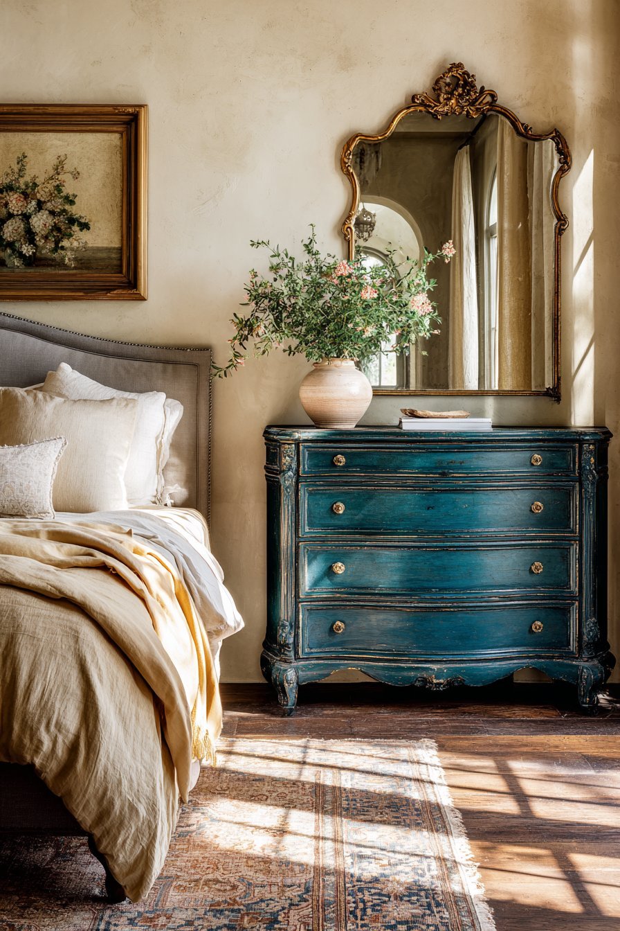
The degree of color coverage affects the final aesthetic and project complexity. Full coverage in solid colors creates bold, contemporary statements ideal for modern or eclectic spaces. Distressed finishes revealing neutral wood beneath colored paint offer farmhouse or vintage charm while introducing color more subtly. Two-toned approaches—painting drawer fronts while leaving the frame neutral—provide compromise for those hesitant about full color commitment.
Proper preparation ensures painted furniture looks professional rather than amateur. Cleaning, sanding, and priming create surfaces where paint adheres properly and lasts for years. Sealing painted furniture with clear topcoats protects against scratches and allows for easy cleaning. Consider painting interior drawers and cabinet backs in unexpected bright colors for delightful surprises during daily use. Hardware updates in brass, black, or colored glass complement painted furniture beautifully.
- Remove all hardware before painting and clean pieces thoroughly
- Use small foam rollers for smooth finishes on flat surfaces
- Apply multiple thin coats rather than one thick coat to prevent drips
- Allow adequate drying time between coats (usually 2-4 hours minimum)
- Distress painted edges lightly with sandpaper for vintage character
- Protect painted surfaces with furniture wax or polyurethane topcoats
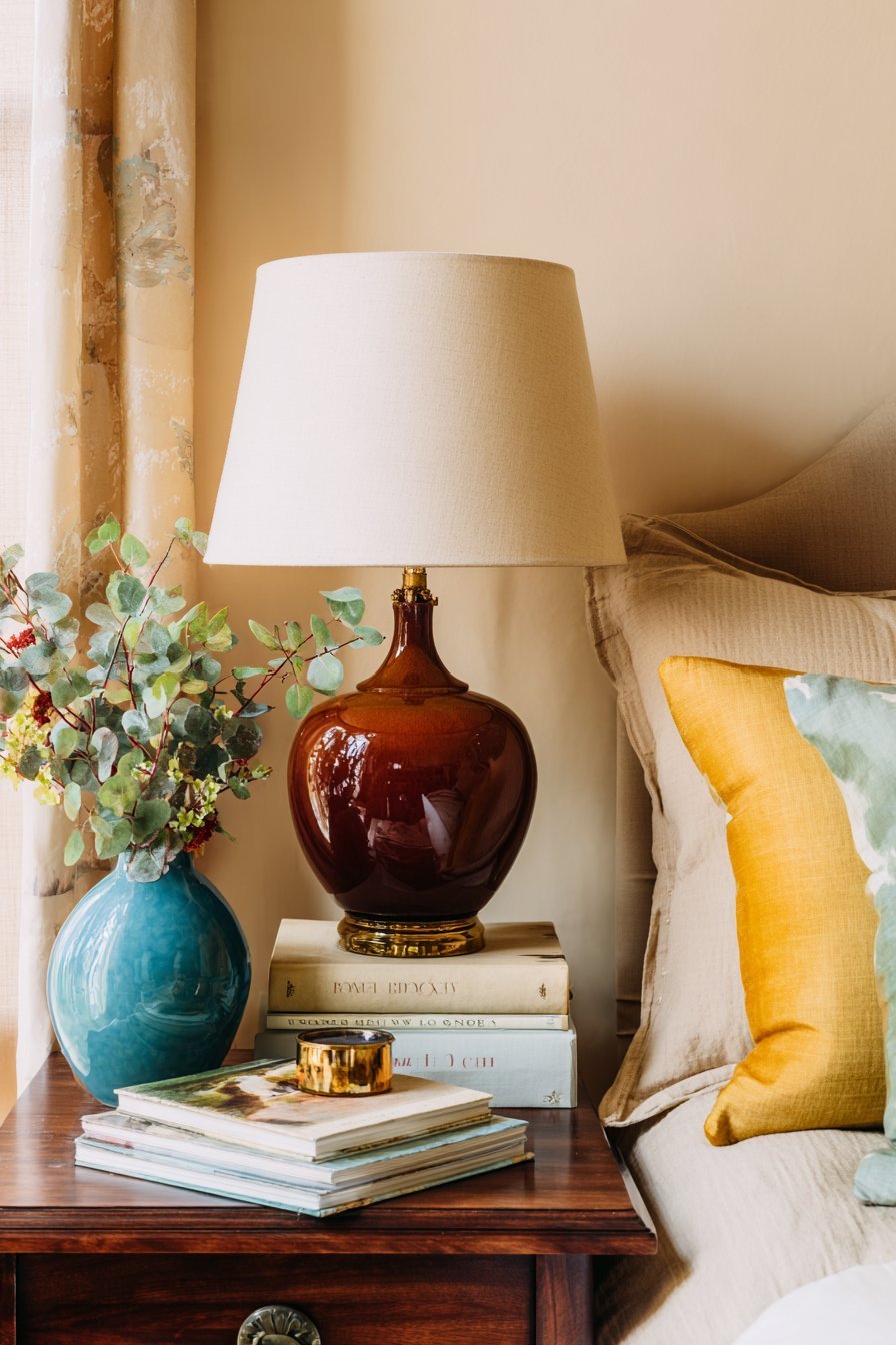
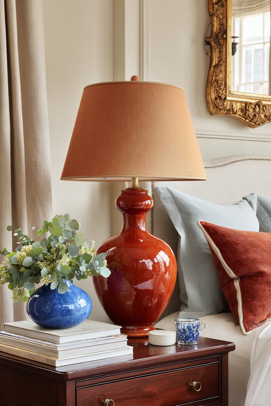
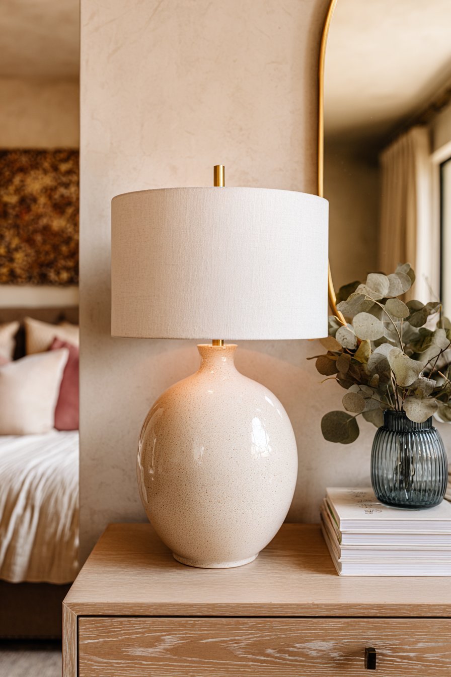
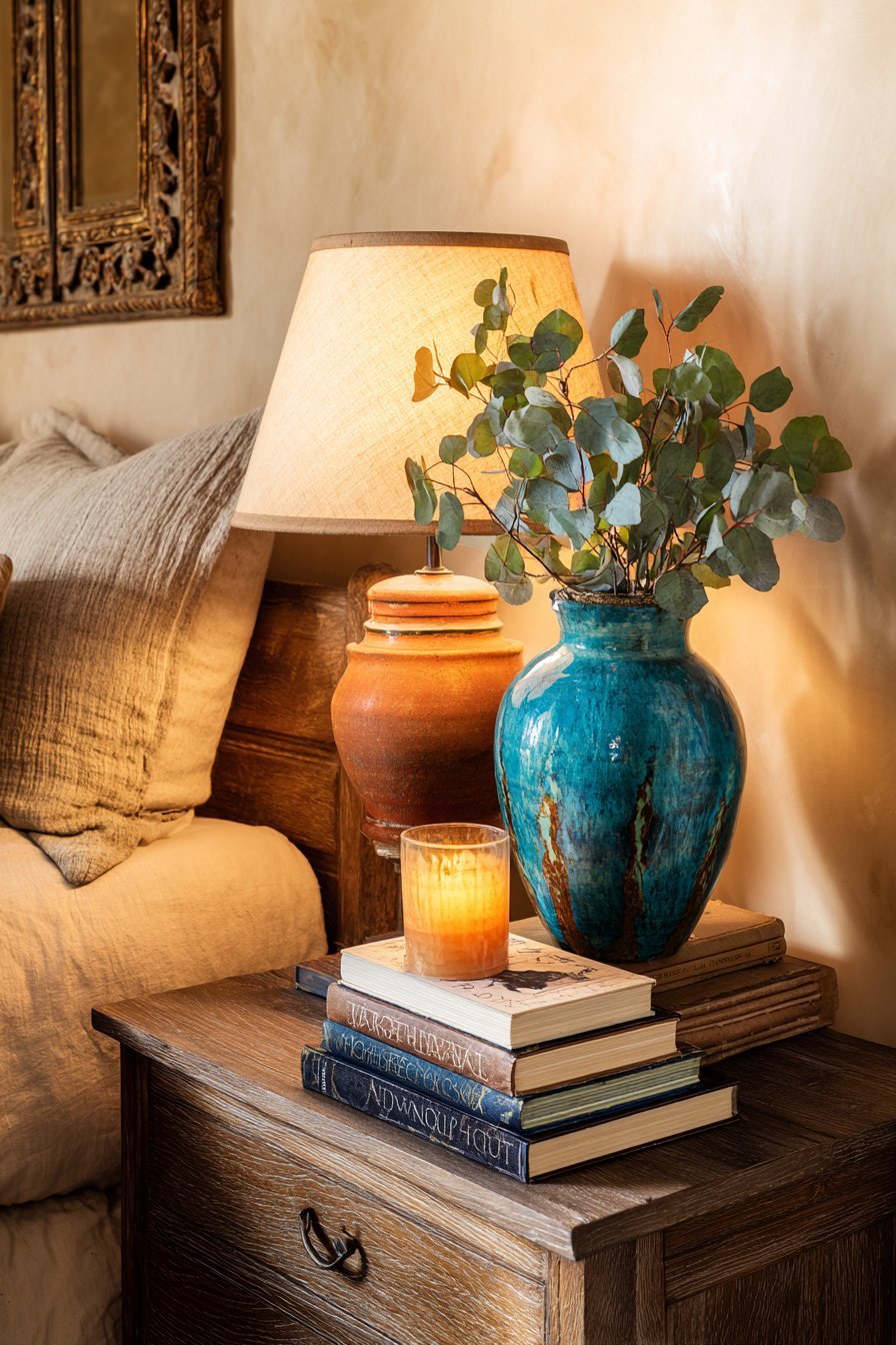
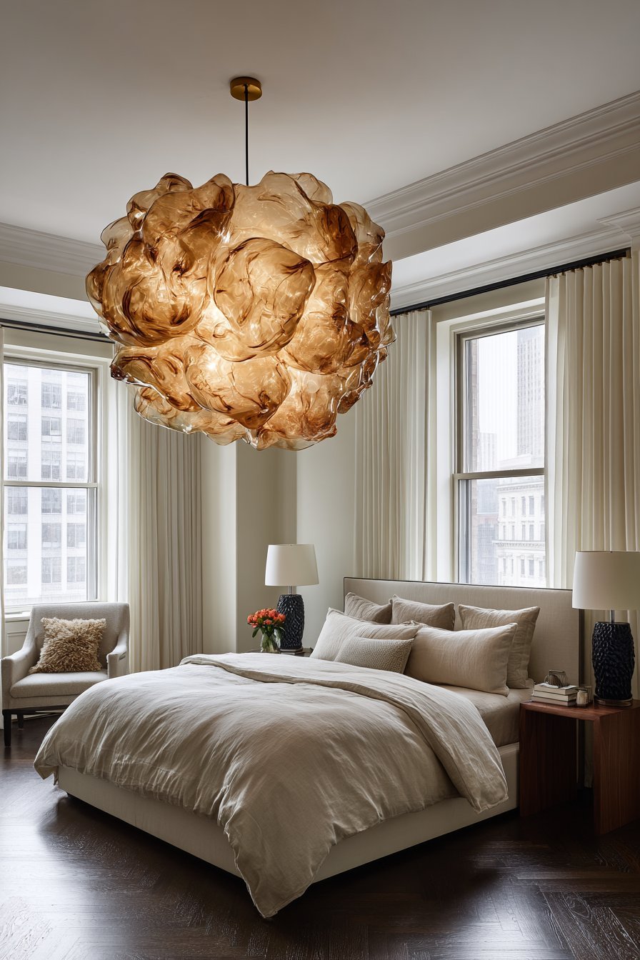
9. Lighting Fixtures as Colorful Statements
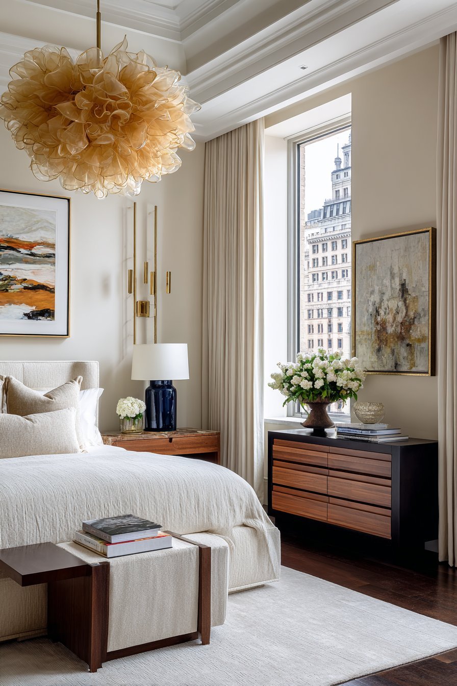
Lighting fixtures serve as functional sculpture that introduces color overhead and at eye level. Pendant lights or chandeliers in colored glass—amber, blue, or rose—cast beautiful tinted light while adding visual interest. Table lamps with ceramic bases in saturated colors become sculptural elements even when turned off. The advantage of colorful lighting is it serves dual purposes—providing necessary illumination while functioning as decorative art.
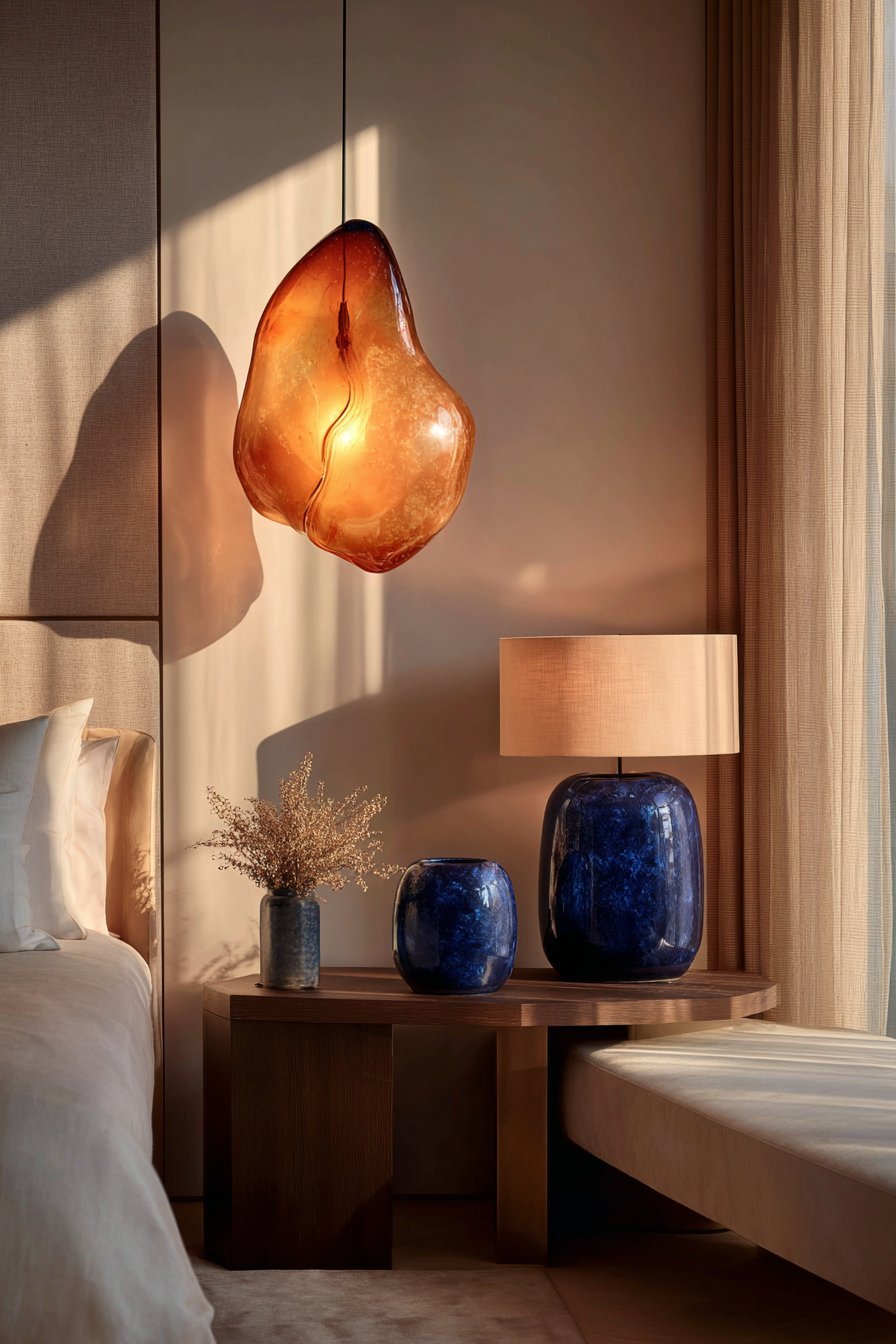
Lamp shades present easy color-change opportunities without replacing entire fixtures. Swapping neutral shades for colored versions updates the room’s palette instantly and inexpensively. Patterned shades introduce multiple colors simultaneously, while solid colored shades make bolder statements. Consider how light filters through colored shades—warm bulbs through amber shades create cozy ambiance, while cool bulbs through blue shades evoke tranquility.
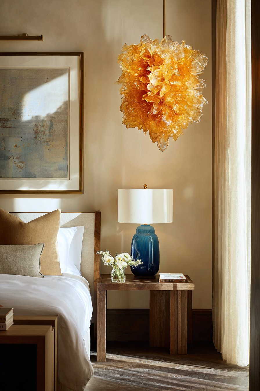
The scale and proportion of lighting fixtures to room size dramatically affects their visual impact. Oversized drum pendants make powerful statements in rooms with high ceilings, while smaller bedside lamps provide intimate color touches. Matching lamp pairs flanking the bed create symmetry and double the color impact. Smart bulbs allow you to change light color temperature throughout the day without multiple fixtures, supporting circadian rhythms while introducing color flexibility.
- Install dimmer switches to control color intensity from colorful fixtures
- Choose LED bulbs for colored glass fixtures to prevent overheating
- Consider cordless rechargeable lamps for flexible placement without outlet constraints
- Clean colored glass fixtures regularly to maintain color vibrancy
- Balance one colorful statement light with neutral supplementary fixtures
- Layer lighting types—ambient, task, and accent—for fully functional bedrooms
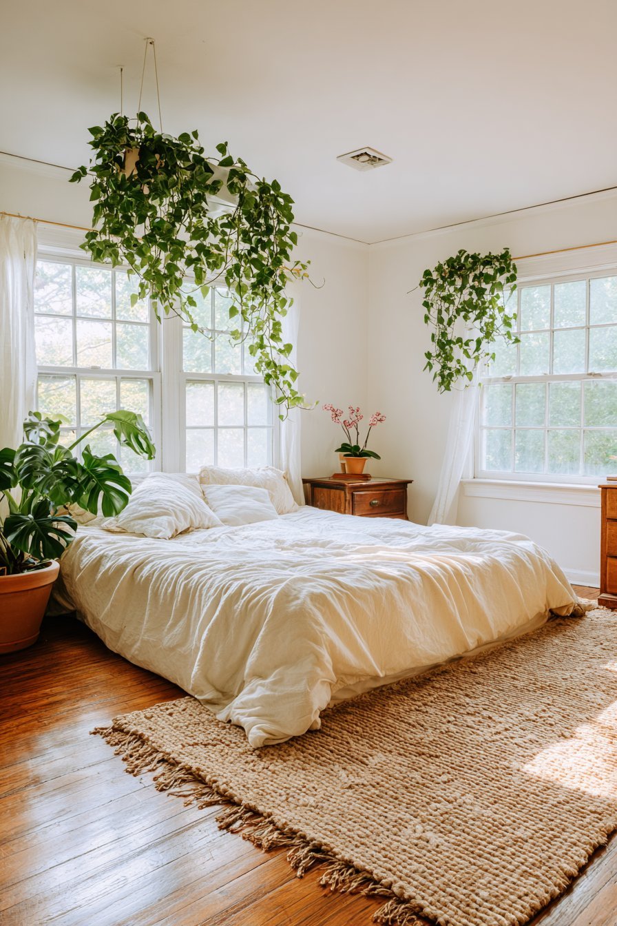
10. Living Plants and Natural Color Elements
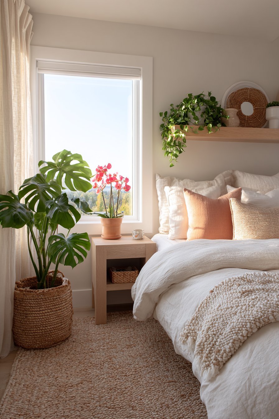
Living plants introduce organic color that changes with growth and seasons, bringing life and energy to neutral bedrooms. Flowering plants like orchids, African violets, or peace lilies add pops of pink, purple, or white against neutral backgrounds. Even non-flowering plants contribute color through varied green tones and textures—from deep forest green to bright chartreuse. Plants improve air quality while fulfilling aesthetic and biophilic design principles.
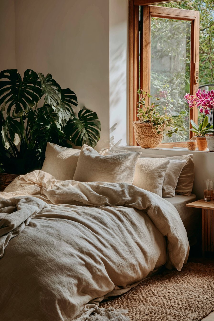
The containers housing plants present additional color opportunities beyond the plants themselves. Ceramic pots in vibrant glazes, woven baskets with colored accents, or modern geometric planters in bold hues amplify the color impact. Grouping multiple plants at varying heights creates dynamic vignettes with layered color and texture. Hanging plants in colorful macramé holders utilize vertical space while introducing color at unexpected heights.
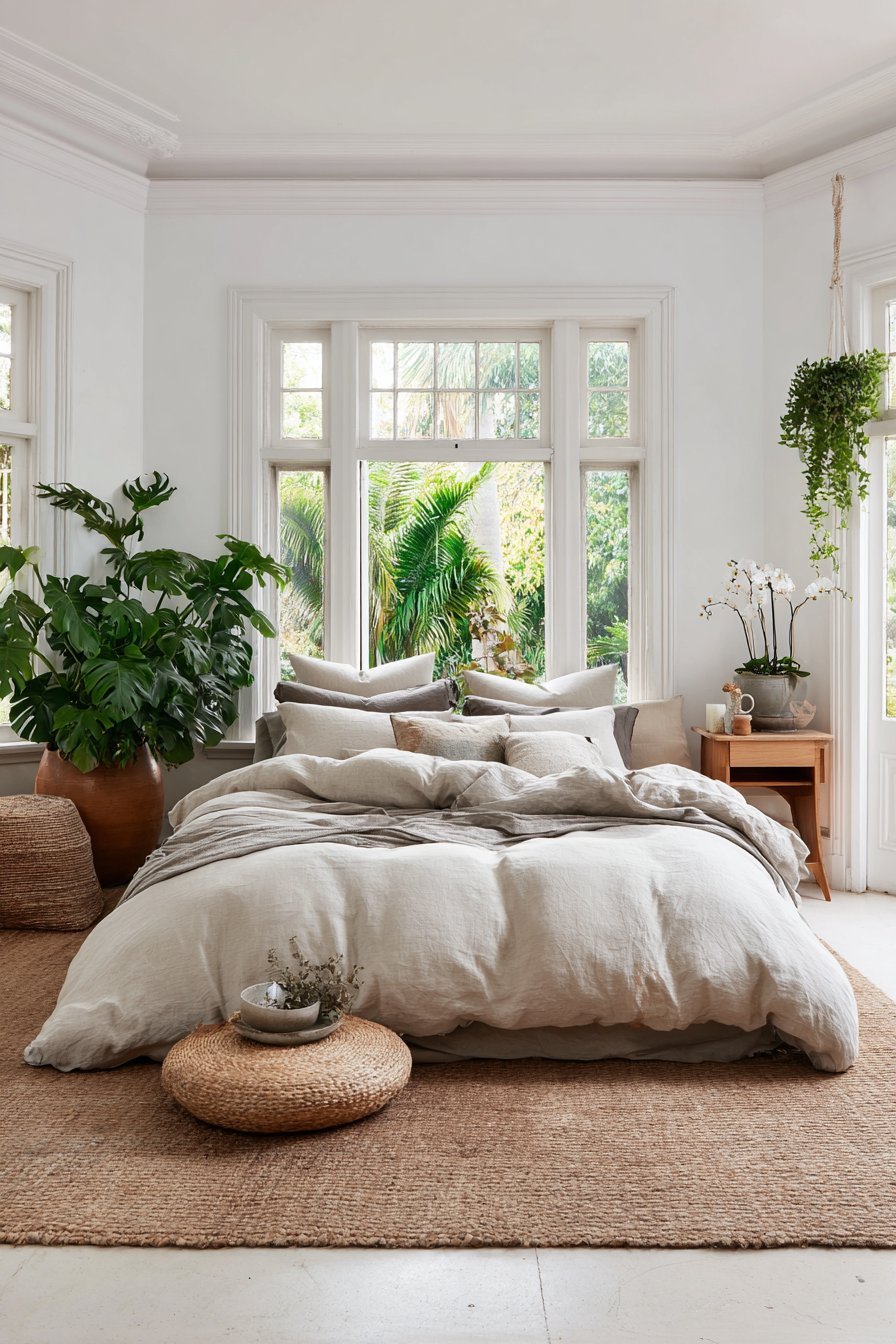
Plant selection should consider your bedroom’s light conditions and maintenance commitment. Low-light tolerant plants like pothos, snake plants, or ZZ plants thrive in bedrooms with limited natural light while offering varied green tones. Bedrooms with abundant sunlight support flowering plants and succulents in colorful containers. Consider seasonal bulbs like amaryllis or paperwhites for temporary color bursts during specific months. The living, changing nature of plants adds dynamism that static decor cannot replicate.
- Research plant care requirements before purchasing to ensure success
- Group plants with similar water and light needs together
- Use decorative saucers beneath pots to protect furniture surfaces
- Rotate plants quarterly for even growth and light exposure
- Propagate successful plants to create more colorful displays affordably
- Combine real plants with high-quality faux options in very low-light areas
Conclusion
Introducing color to neutral bedrooms enhances visual interest while maintaining the serene foundation that makes these spaces so appealing. The six strategies outlined—from textiles and accent walls to furniture and plants—offer various commitment levels and budgets, ensuring everyone can find an approach that suits their circumstances. The key to success lies in thoughtful selection and strategic placement, allowing colors to complement rather than compete with your neutral base.
Start with one or two methods that resonate most with your style and comfort level, gradually layering additional color as confidence grows. Remember that color preferences evolve, and the beauty of most these approaches is their flexibility and reversibility. Whether you choose bold jewel tones or soft pastels, colorful additions transform neutral bedrooms from simple to sophisticated, from bland to personally expressive. Your bedroom should reflect your personality while supporting rest and rejuvenation—the perfect balance of calm neutrality and energizing color achieves exactly that.