The walls of a living room are its largest canvases — surfaces of enormous visual potential that, when thoughtfully decorated, transform the entire atmosphere of the space. Bare walls whisper missed opportunity; walls decorated without intention whisper something worse. But a living room where the wall decor has been chosen with genuine care, creative vision, and design intelligence speaks with a confident, beautiful voice that elevates everything else in the room and leaves every visitor with the impression that they have entered somewhere truly special.
The challenge of living room wall decor lies in the extraordinary range of options available and the equally extraordinary range of ways those options can go wrong. Too much, too little, wrong scale, poor placement, mismatched frames, or simply the wrong piece for the room’s style — these are the pitfalls that separate a living room that looks beautifully finished from one that feels unsettled, generic, or visually incoherent. The difference between these outcomes is almost never about budget; it is almost always about knowledge, intention, and a clear design framework.
This article shares seven of the most practical, designer-tested tips for choosing living room wall decor that genuinely pops — that creates visual impact, expresses personality, and contributes to the room’s overall atmosphere in a way that feels deliberate, cohesive, and truly beautiful. Whether you are starting with completely blank walls or reassessing what is already there, these ideas will give you the clarity and confidence to make decisions that transform your living room from the walls outward.
1. Start With Scale — and Go Bigger Than You Think
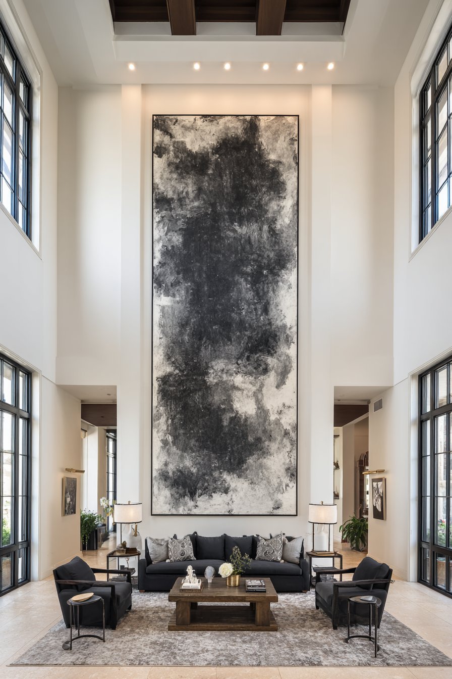
Scale is the single most important principle in living room wall decor — and the single most consistently violated one. The most common mistake made by homeowners decorating living room walls is choosing artwork, mirrors, and decorative pieces that are far too small for the wall they are meant to occupy. A small picture on a large wall does not look modest or tasteful; it looks timid, unfinished, and vaguely wrong, drawing attention to the emptiness around it rather than filling the space with beauty.
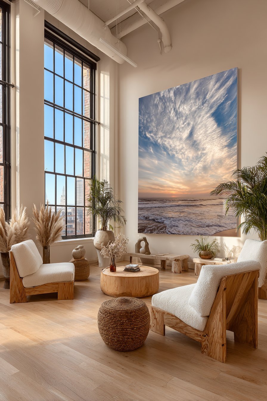
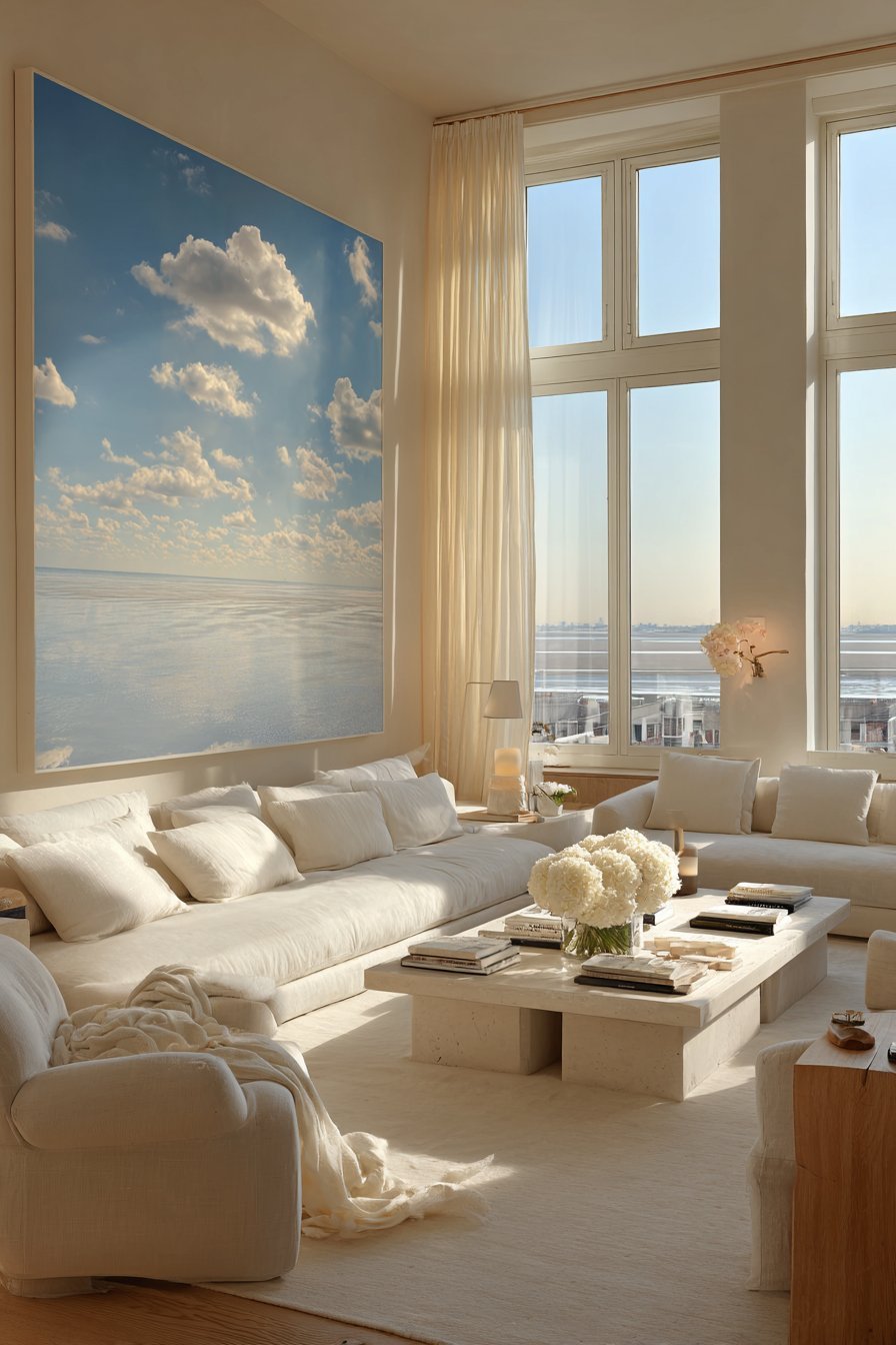
The minimum width rule for a piece of wall art above a sofa is that it should span at least two-thirds to three-quarters of the sofa’s width. A standard three-seater sofa of 220 centimeters requires a piece or arrangement that spans at least 145 to 165 centimeters to look properly proportioned. This measurement surprises most people when they see it written down — it sounds enormous — but a correctly scaled piece of art above a sofa creates a visual harmony between furniture and wall that immediately makes the room feel more designed and intentional.
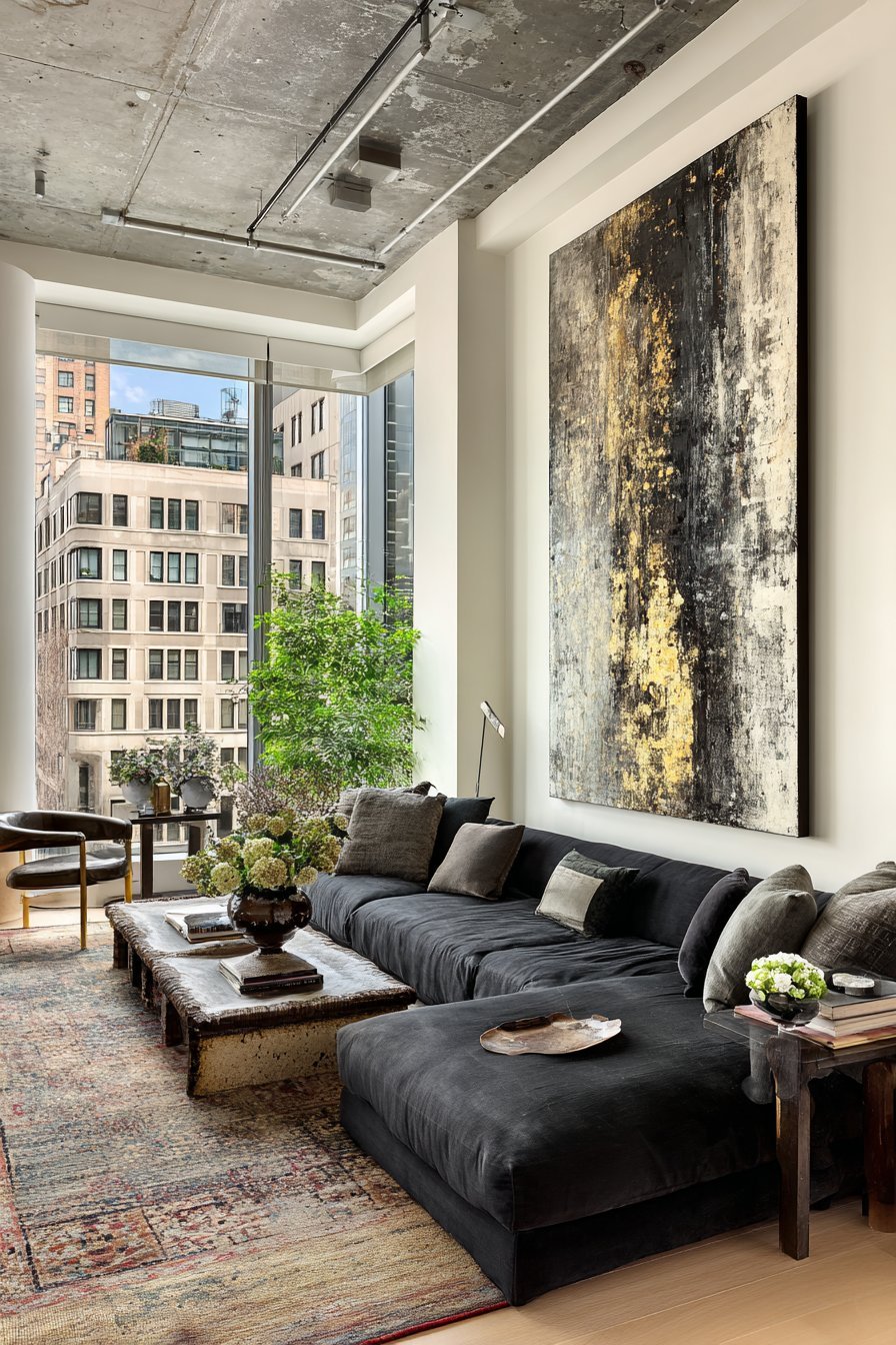
When in doubt, go larger. This is one of the most reliable pieces of advice in all of interior design, and it applies particularly to living room wall decor. A single large-scale statement piece — a canvas, a framed print, a mirror, or a textile wall hanging — always creates more visual impact than multiple small pieces scattered across the same wall. One bold, correctly scaled piece commands attention, anchors the room, and communicates confidence and design conviction in a way that a collection of timid small pieces never can.
- Measure your sofa width before purchasing any wall art for above it — art should span at least two-thirds of the sofa
- When choosing between two sizes, always choose the larger — it will look more correct on the wall
- Avoid small prints on large walls — they create the visual impression of a room that is unfinished
- Use painter’s tape on the wall to mock up the dimensions of a piece before purchasing
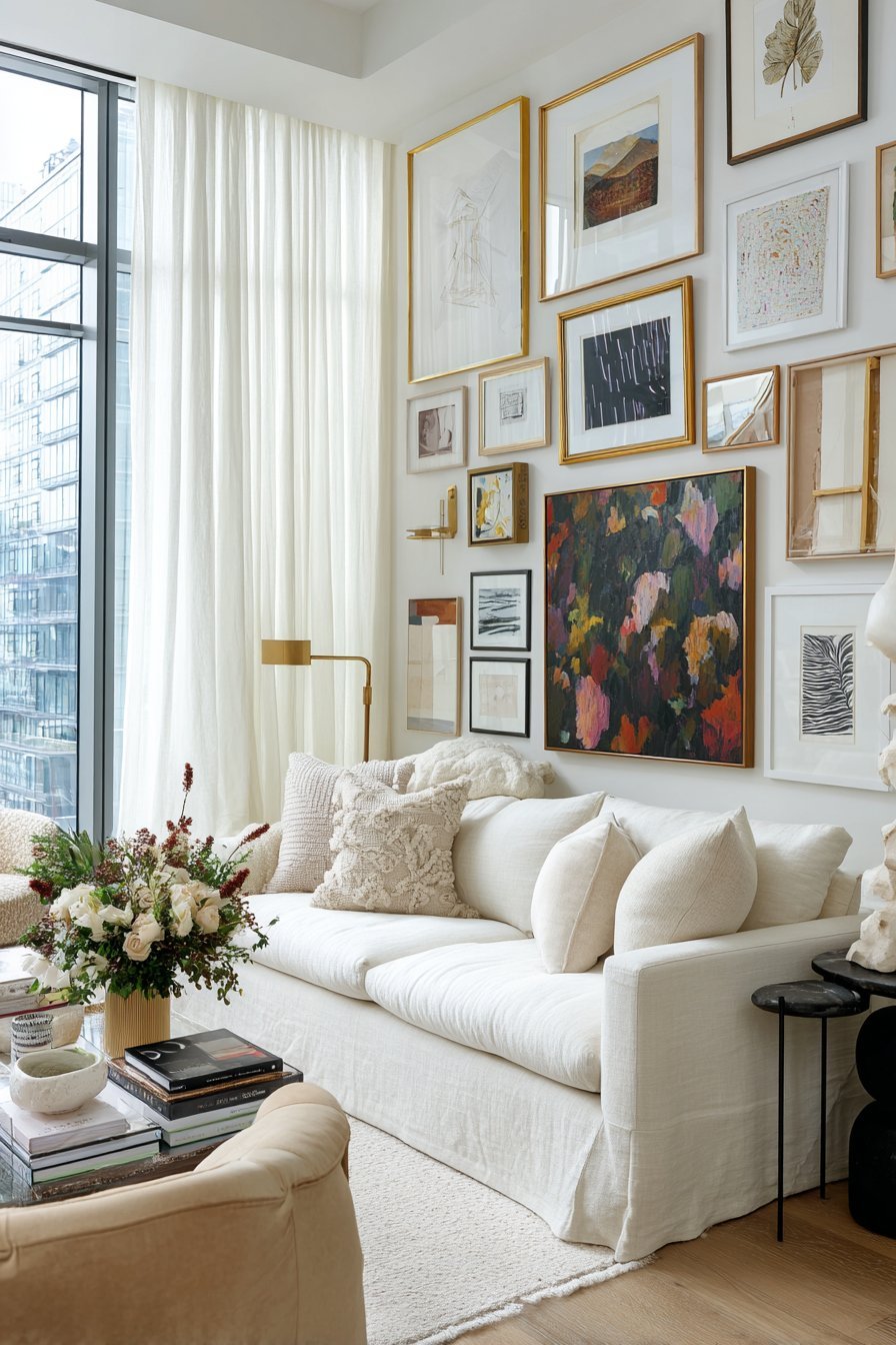
- For a gallery wall, plan the overall composition dimensions first — treat the whole arrangement as one large piece
2. Choose a Clear Focal Point and Build Around It
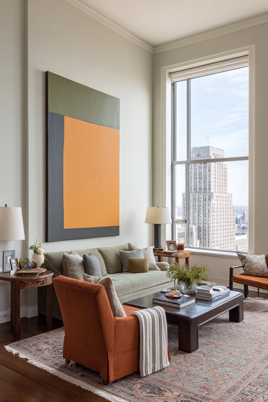
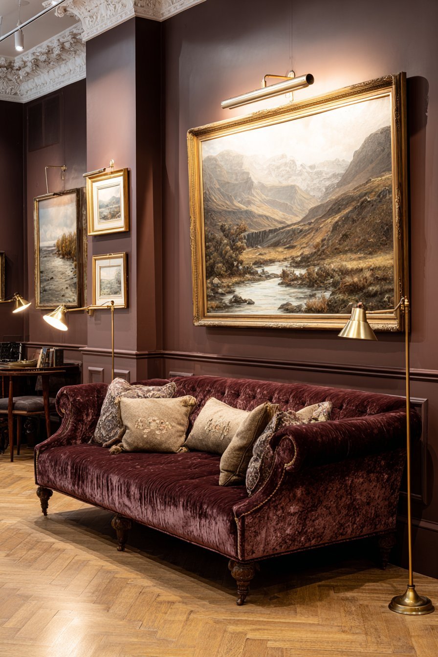
Every well-designed living room has a clear focal point — a single element that draws the eye first, anchors the spatial composition, and gives the room its defining visual identity. In many living rooms, the fireplace or the main window serves this function architecturally. But where no strong architectural feature exists, or where the architectural focal point is not on the primary wall, a well-chosen piece of wall decor can create the focal point the room needs from scratch.
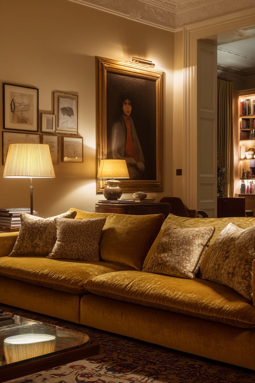
The art of creating a wall focal point lies in the combination of scale, placement, and visual weight. A single large artwork hung at the correct height — center point at approximately 145 to 155 centimeters from the floor, which places it at average adult eye level — immediately establishes itself as the room’s primary visual anchor. Everything else in the room — furniture arrangement, lighting, decorative objects — then organizes itself in response to this focal point, creating a sense of visual order and spatial coherence that rooms without a clear focal point conspicuously lack.
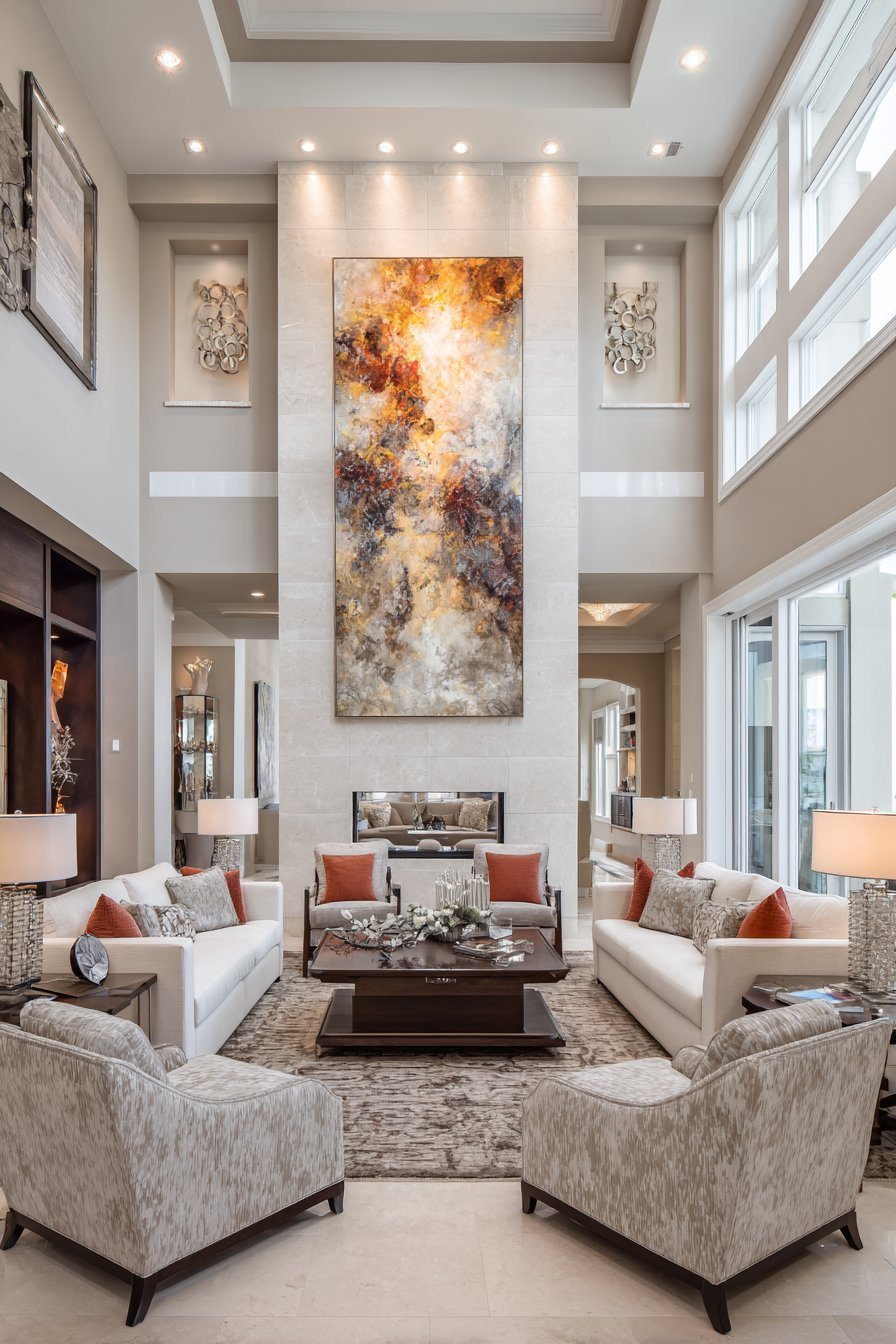
The focal point piece should be the room’s most visually powerful element — not necessarily its most expensive, but its most commanding. This might be a large abstract canvas in colors that respond to the room’s palette, a beautifully framed vintage mirror of substantial scale, a dramatic textile wall hanging with genuine visual complexity, or a curated gallery wall composition that functions as a single large visual statement. The focal point earns its position through genuine visual authority — not through being the most elaborately framed or most expensively sourced item in the room.
- Identify or create the primary focal point wall before selecting any wall decor pieces
- Hang the focal point piece with its center at 145 to 155 centimeters from the floor for correct eye-level placement
- Ensure the focal point piece has sufficient visual weight to anchor the entire room composition
- All other wall decor in the room should support and complement the focal point, never compete with it
- In rooms with strong architectural focal points — fireplace, large window — build wall decor around rather than against them
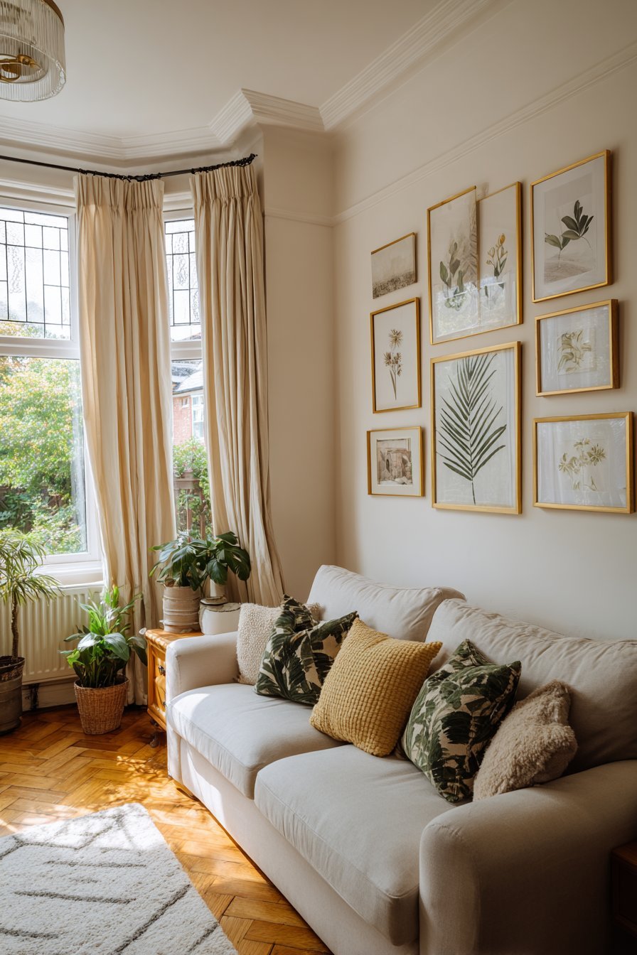
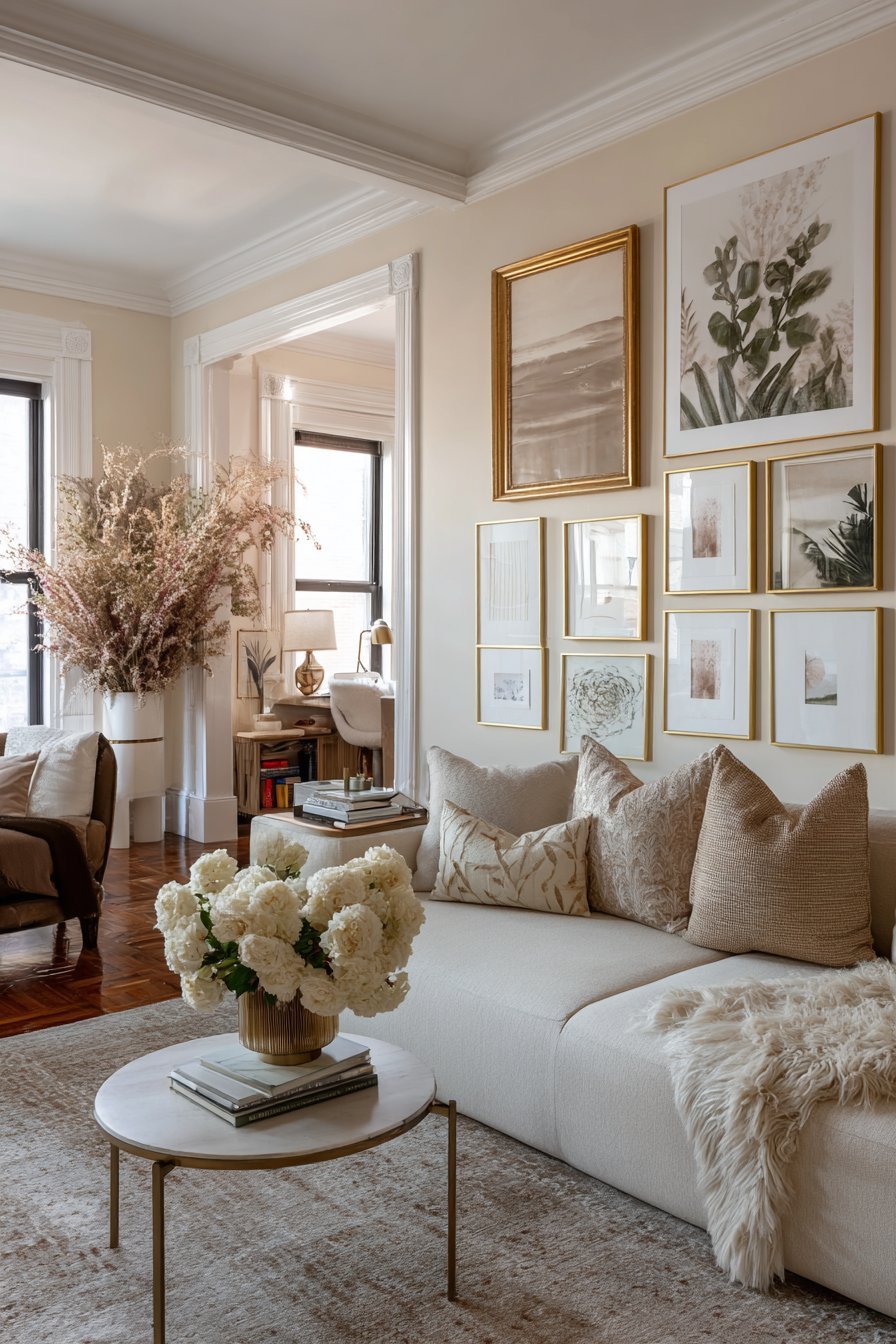
3. Create Cohesion Through a Unified Color Story
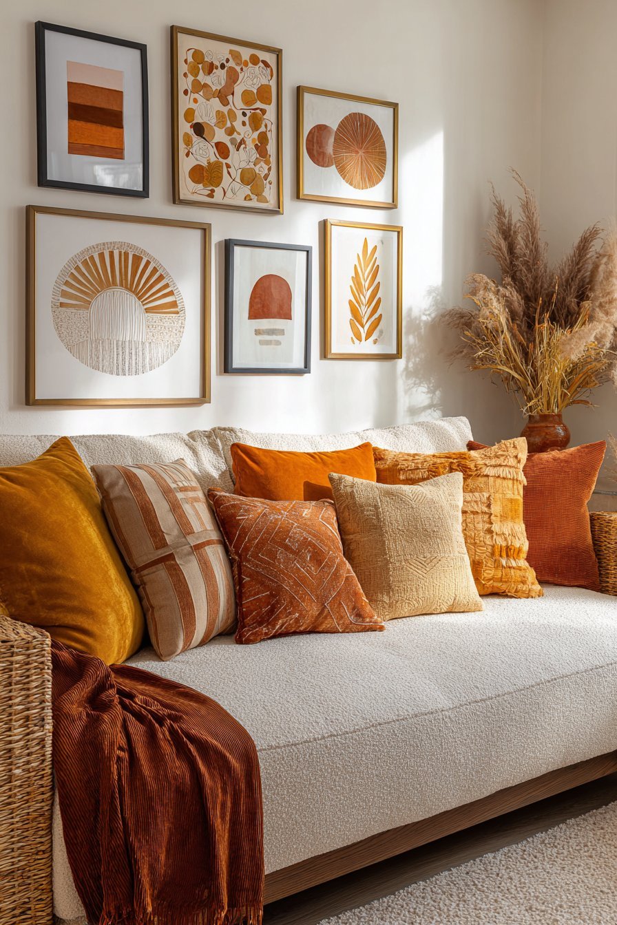
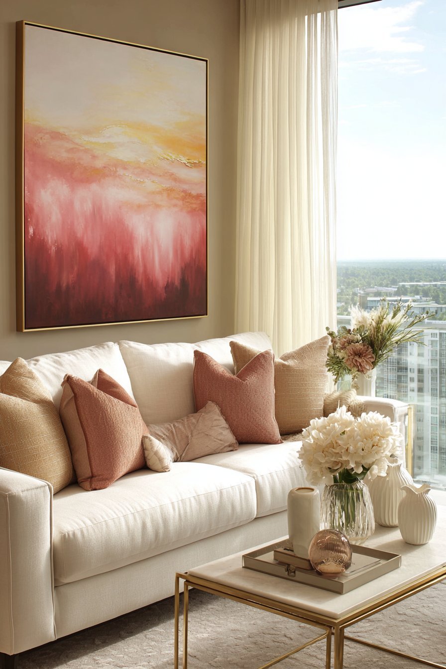
Color cohesion is the invisible thread that holds a collection of different wall decor pieces together into something that reads as designed rather than accumulated. A gallery wall of ten pieces from different sources, in different styles and media, can look magnificently curated and intentional when all pieces share a common color language — and chaotic and incomprehensible when they do not. Color is the single most powerful tool available for creating visual unity across diverse wall decor elements.
There are two effective approaches to color cohesion in living room wall decor. The first is tonal cohesion — selecting pieces that all draw from the same color family, even if they vary significantly in subject, medium, and style. A collection of artwork, textiles, and decorative objects that all work within a palette of terracotta, warm ochre, and burnt sienna creates a visually unified wall story even when the individual pieces are wildly different from one another. The shared color language does the work of cohesion.
The second approach is complementary contrast — selecting wall decor pieces in colors that are harmoniously different from one another rather than similar. A deep teal painting paired with a warm terracotta ceramic wall piece creates a dynamic, energized visual relationship that feels intentionally composed. This approach requires a stronger color instinct to execute well but produces living room walls of genuine visual excitement and sophistication. In both cases, the critical principle is that color relationships are deliberate — never accidental, never ignored.
- Before purchasing wall decor, define a color palette of two to four tones that the pieces should draw from
- Use the room’s existing furniture, rug, and textile colors as the starting point for the wall decor palette
- Choose tonal cohesion for a calm, harmonious wall story or complementary contrast for dynamic visual energy
- Include the wall paint color in the color story — every piece should feel connected to the wall behind it
- Avoid mixing cool-toned and warm-toned pieces without a deliberate bridging element to connect them
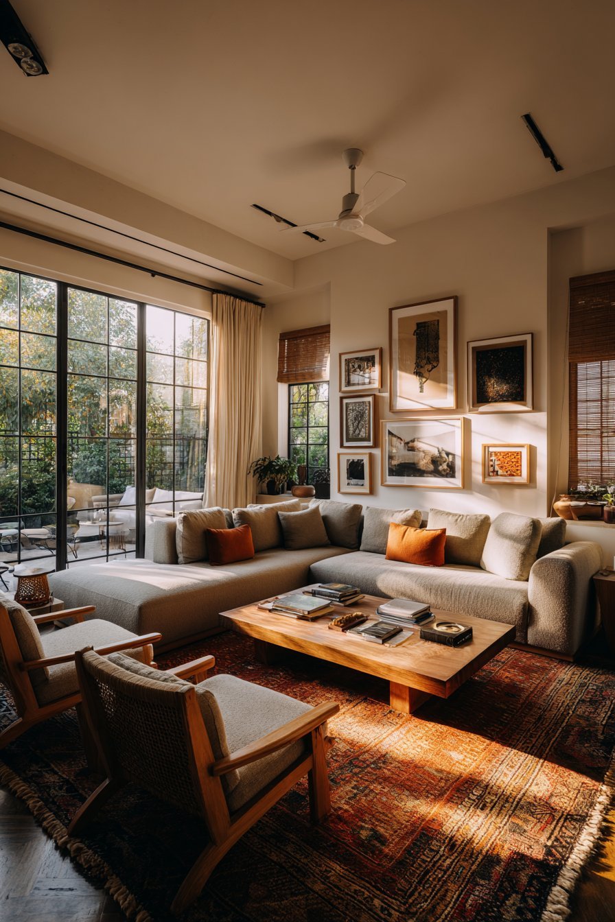
4. Mix Mediums and Textures for Visual Depth
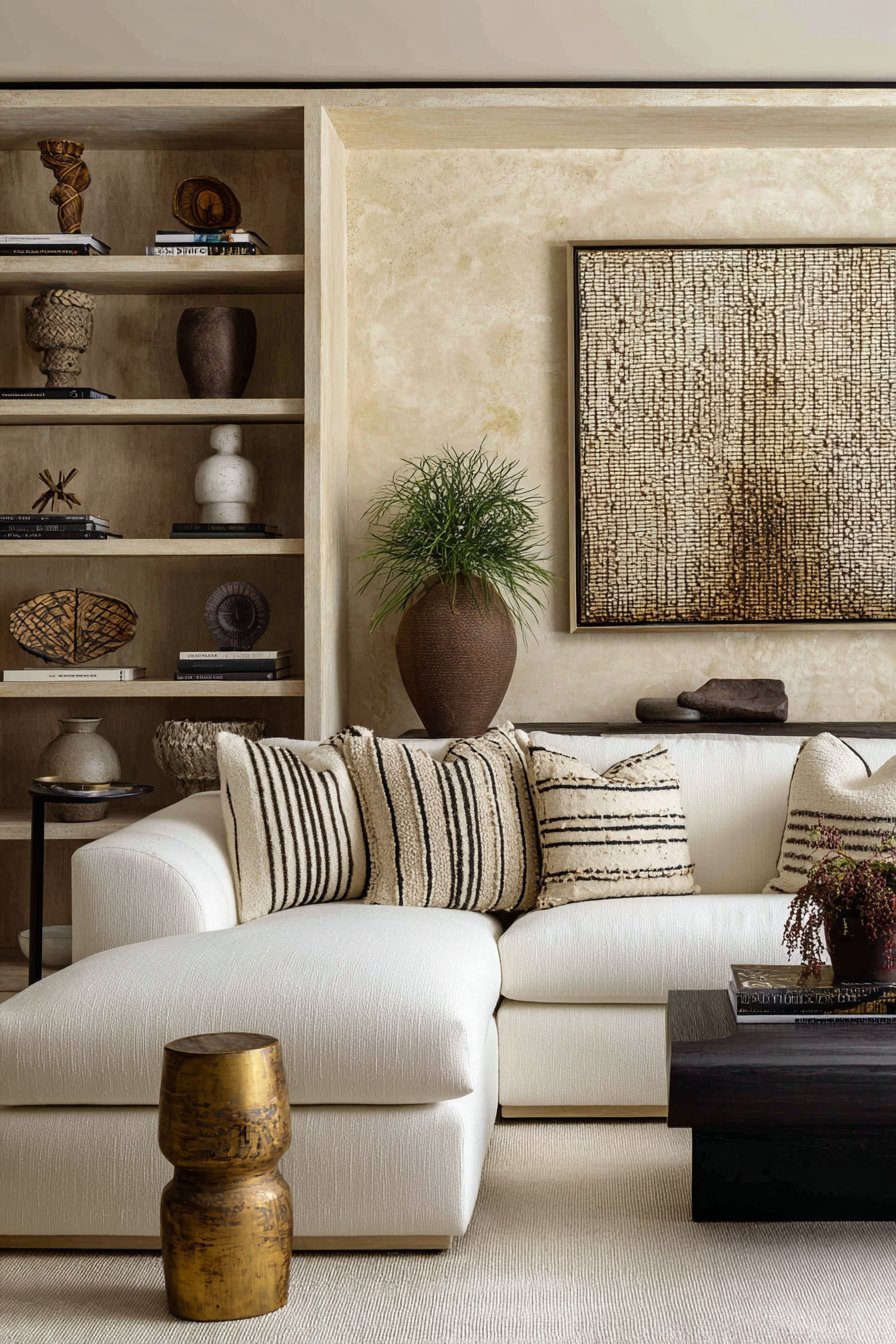
The most visually compelling living room walls are almost never filled exclusively with framed prints and paintings. The walls that truly pop — that create an instant sense of richness, sophistication, and three-dimensional depth — are those that layer multiple mediums and textures: a large canvas painting alongside a ceramic wall sculpture, a textile wall hanging beside a framed mirror, a collection of shadow boxes punctuated by a single dramatic photograph. This mix of materials, surfaces, and dimensional qualities creates the kind of visual complexity that makes a wall endlessly interesting to look at.
Introducing three-dimensional wall elements — ceramic plates, sculptural wall objects, woven baskets, metal wall art, macramé panels, and bas-relief artwork — adds a depth dimension that flat prints and paintings alone cannot achieve. These pieces catch and respond to light in constantly changing ways, creating shadows and highlights that shift throughout the day as natural light moves across the wall. A wall that includes both flat and three-dimensional elements has a living, dynamic quality that a wall of purely flat artwork never achieves regardless of the quality of the individual pieces.
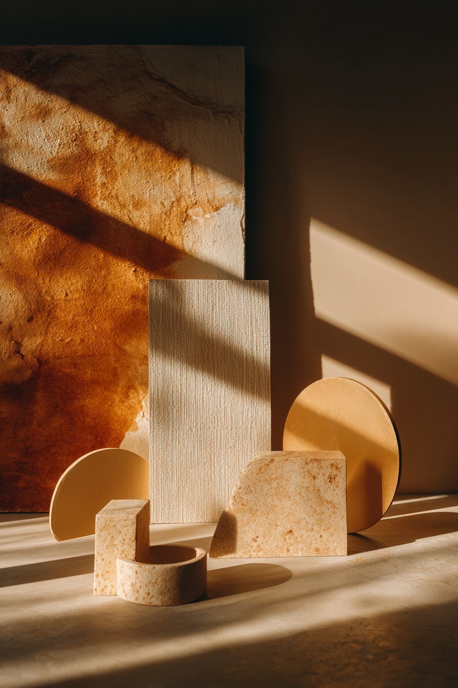
Textural contrast between adjacent elements is as important as medium variety. A smooth, high-gloss photographic print placed beside a rough-textured woven textile wall hanging creates a visual dialogue between surfaces that is genuinely fascinating to the eye. A polished metal mirror beside a raw timber-framed print creates a similar contrast of surface quality that adds layers of visual interest to the wall composition. Deliberate textural contrast is one of the hallmarks of genuinely sophisticated interior design — and it is equally achievable at every budget level.
- Mix flat artwork with three-dimensional elements — ceramics, sculptures, woven pieces — for visual depth
- Include at least one reflective surface — a mirror, metallic frame, or glazed ceramic — to animate the wall with light
- Combine rough and smooth textures within the same wall arrangement for sophisticated visual contrast
- Consider a large textile wall hanging as a soft, sound-absorbing, visually rich alternative to framed prints
- Layer wall decor at different projection depths — flat prints, shallow relief, deeper sculptural pieces — for maximum dimensionality
5. Frame Thoughtfully and Consistently
Framing decisions have an outsized impact on how wall decor looks in a living room — and they are one of the most commonly underestimated aspects of the entire wall decor process. The wrong frame on a beautiful piece of artwork can undermine its impact entirely; the right frame can elevate even a modest print into something that looks genuinely gallery-quality. Frame selection is not a finishing detail — it is a design decision of significant consequence.
Consistency in frame finish is the most reliable principle for creating a cohesive wall display. Choosing a single metal finish — all brushed brass, all matte black, all polished chrome — or a single material — all natural timber, all white-painted wood — across the primary frames in a gallery arrangement immediately creates the sense of unified curation that distinguishes a designed wall from an accumulated one. This consistency does not require identical frames; varying frame widths, profiles, and dimensions within a single finish family creates visual variety while maintaining cohesion.
Frame weight and profile should be matched to the scale and character of the artwork inside. A thin, minimal frame — a simple satin metal profile or a narrow timber float mount — suits contemporary, abstract, and photographic artwork where the frame’s job is to define the artwork’s edge without competing with its content. A wider, more substantial frame suits traditional oil paintings, vintage prints, and botanical illustrations where the frame’s visual weight contributes to the piece’s sense of historical depth and authority. Mismatching frame weight to artwork character — a heavy ornate gold frame on a minimal line drawing, a thin wire frame on a Victorian portrait — creates a visual dissonance that is immediately felt even when it cannot always be articulated.
- Choose a consistent frame finish — all brass, all black, all timber — for all primary gallery wall pieces
- Match frame weight and profile to the character and era of the artwork inside
- Use a thin, minimal frame for contemporary and photographic work; a wider frame for traditional and vintage pieces
- Invest in quality framing for your most important pieces — cheap frames undermine even excellent artwork
- Consider custom framing for oversized or oddly proportioned pieces where off-the-shelf frames will not fit correctly
6. Use Lighting to Make Wall Decor Come Alive
Lighting is the element that most dramatically separates living room wall decor that truly pops from wall decor that simply exists. A beautiful piece of artwork in a well-lit room looks magnificent; the same piece in an unlit room looks flat, dull, and forgettable. Intentional wall lighting — gallery lights, picture lights, adjustable spotlights, and strategically placed floor and table lamps — elevates every piece of wall decor it illuminates and gives the living room an atmosphere of gallery-level sophistication that no amount of furniture spending can replicate.
Dedicated picture lighting — a light mounted directly to the frame or on the wall above the artwork — is the most traditional and most effective way to illuminate individual statement pieces. Brass or bronze picture lights with warm incandescent or halogen-equivalent LED bulbs create a golden, flattering glow that brings out the warmth and depth of painting surfaces, textile textures, and decorative wall objects. These lights also signal intentionality — they communicate that the artwork beneath them is worth specifically illuminating, which increases the perceived value and significance of the piece in the viewer’s eye.
Adjustable ceiling spotlights or track lighting directed at the primary wall decor creates a flexible, professional-quality lighting solution that can be redirected as the wall arrangement changes over time. This approach works especially well in living rooms with gallery walls or frequently updated displays, as the lighting can be adjusted to highlight new pieces without requiring any new electrical work. Pair wall-directed spotlights with warmer ambient lighting from table and floor lamps to create the layered lighting environment that makes living rooms feel genuinely luxurious in the evening hours.
- Install a picture light above your primary living room artwork for dedicated, flattering illumination
- Use adjustable ceiling spotlights or track lighting directed at wall decor for flexible gallery-quality lighting
- Choose warm-spectrum bulbs — 2700K to 3000K — for picture lighting to enhance warm tones in artwork
- Position floor and table lamps to wash light upward across adjacent wall surfaces for soft ambient wall illumination
- Consider LED strip lighting mounted above a picture rail for a contemporary, evenly distributed gallery lighting effect
7. Edit Ruthlessly and Leave Considered Breathing Room
The final and most counterintuitive tip for living room wall decor that truly pops is to do less than you think you need. The instinct to fill every empty surface — to add more pieces, more frames, more objects until every inch of wall is accounted for — is one of the most common and most visually damaging approaches to living room decoration. Visual breathing room — the deliberate leaving of empty wall space around and between decor elements — is not a sign of a room that is unfinished. It is a sign of a room that understands the power of restraint.
Empty space is not wasted space in wall design — it is active, functional design space that performs several critical roles. It creates visual contrast that makes the pieces within it appear more significant and more beautiful. It provides the eye with places to rest between moments of visual engagement, preventing the sensory fatigue that overcrowded walls consistently produce. And it communicates a quality of deliberate selection — the impression that every piece on the wall was chosen and placed with genuine intention, that nothing is there by default, and that everything present has earned its position.
The practice of editing — removing pieces that do not contribute to the wall’s overall composition, resisting the urge to fill gaps with new additions, and periodically reassessing the entire wall arrangement with fresh eyes — is one of the most important ongoing disciplines in living room interior design. A regular seasonal edit of your living room wall decor, in which you remove anything that no longer serves the room’s composition or atmosphere, allows the pieces that remain to breathe more fully and appear more powerfully. The most beautiful living rooms are not those with the most wall decor — they are those where every piece is exactly right and exactly where it should be.
- Resist the urge to fill every inch of wall — deliberate empty space enhances the pieces around it
- Step back and assess your wall arrangement from the room’s entrance point before finalizing any installation
- Remove any piece that you are not certain about — doubt is a reliable signal that a piece is not right for the wall
- Conduct a seasonal reassessment of your wall display — remove anything that no longer contributes to the composition
- Prioritize fewer, better pieces over many mediocre ones — one extraordinary piece outperforms ten adequate ones every time
Conclusion
Living room wall decor that truly pops is always the result of the same combination of qualities: correct scale, clear focal point, unified color story, varied texture and medium, thoughtful framing, intentional lighting, and the discipline of editing. None of these principles requires an enormous budget or a professional interior designer — they require knowledge, patience, and a willingness to make decisions with genuine conviction rather than defaulting to safe, generic choices.
Start with the biggest wall in the room, choose the most important piece first, and build everything else in response to it. Get the scale right, light it beautifully, and give it the breathing room it deserves. A living room decorated with these principles will have walls that do not merely occupy space — they transform it, giving every person who enters the room an immediate, visceral sense that they are somewhere genuinely beautiful, thoughtfully made, and absolutely worth remembering.